浏览器私有前缀、CSS3:2D转换、动画、3D转换
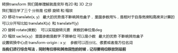
1.2D转换
transform:实现元素的位移、旋转、缩放等效果。
移动:translate
旋转:rotate
缩放:scale
1)移动translate
语法:
transform:translate(x, y);
transform:translateX(n);
transform:translateY(n);
重点:
定义2D转换中的移动,沿着X和Y轴移动元素
translate最大的优点:不会影响其他元素的位置
translate中的百分比单位是相对于自身元素的translate:(50%,50%);
对行内标签没有效果
让盒子实现水平垂直居中,之前我们用的是margin-top、margin-left做的,如果盒子大小变化,那么这两个数值也要改,而transform很好的解决了这个问题。
<style>.box1 {position: relative;width: 500px;height: 500px;background-color: skyblue;transform: translateX(50%);}.box {position: absolute;top: 50%;left: 50%;width: 200px;height: 200px;background-color: pink;transform: translate(-50%, -50%);}</style>
<doby><div class="box1"><div class="box"></div></div></doby>2)旋转rotate
语法:
transform:rotate(度数)重点:
rotate里面跟度数,单位是deg,比如rotate(45deg)
角度为正时,顺时针,负时,为逆时针
默认旋转的中心点是元素的中心点
让图片旋转:
<style>img {width: 200px;transform: rotate(45deg);}</style>同时,我们可以做出,当鼠标放在图片上时,图片可以旋转360°,我们会发现当设置transform: rotate(360deg);后,鼠标放上去,图片没有动,这是因为图片旋转360°后,还是这个样子,此时加个过渡即可,eg:
<style>img {width: 200px;/* transform: rotate(45deg); *//* 过渡写到本身上,谁做过渡给谁加 */transition: all 1s;}img:hover {transform: rotate(360deg);}</style>
<doby><img src="images/1.jpg" alt="">
</doby>
三角形案例,只需要一个正方形的盒子,然后只要盒子的右边框和下边框即可,eg:
<style>div {position: relative;width: 250px;height: 40px;border: 1px solid gray;}div::after {content: '';position: absolute;top: 15px;right: 10px;width: 10px;height: 10px;border-right: 1px solid #000;border-bottom: 1px solid #000;transform: rotate(-45deg);}</style>
<doby><div></div>
</doby>
让三角旋转:
<style>div {position: relative;width: 250px;height: 40px;border: 1px solid gray;}div::after {content: '';position: absolute;top: 15px;right: 10px;width: 10px;height: 10px;border-right: 1px solid #000;border-bottom: 1px solid #000;transform: rotate(-45deg);transition: all 0.5s;}div:hover::after {transform: rotate(45deg);}</style>3)2D转换中心点transform-origin
语法:
transform-origin:x y;重点:
注意后面的参数x和y用空格隔开
x y默认转换的中心点是元素的中心点(50%,50%)
还可以给x y设置像素或者方位名词(top bottom left right center)
<style>div {position: relative;width: 250px;height: 200px;background-color: skyblue;margin: 100px auto;transition: all 1s;/* transform-origin: 0 100%; */transform-origin: 50px 50px;}div:hover {transform: rotate(360deg);}</style>案例:
<style>div {overflow: hidden;position: relative;width: 200px;height: 200px;border: 1px solid skyblue;margin: 100px auto;}div::before {content: "CSDN";display: block;width: 100%;height: 100%;background-color: pink;transform: rotate(180deg);transform-origin: left bottom;transition: all 1s;}div:hover::before {transform: rotate(0deg);}</style>4)缩放scale
语法:
transform:scale(x,y);注意:
x,y用逗号分隔
transform:scale(1,1):宽和高都放大一倍,相当于没用放大
transform:scale(2,2):宽和高都放大2倍
transform:scale(2):只写一个参数,第二个参数则和第一个参数一样,相当于scale(2,2)
transform:scale(0.5,0.5):缩小
sacle缩放最大的优势:可以设置转换中心点缩放,默认以中心点缩放的,而且不影响其他盒子
<style>div {width: 200px;height: 200px;background-color: skyblue;margin: 100px auto;transition: all 1s;}div:hover {/* 缩小 *//* transform: scale(0.5, 0.5); *//* 放大 */transform: scale(2);}</style>图片放大案例:
<style>div {overflow: hidden;width: 500px;height: 200px;background-color: skyblue;margin: 100px auto;}img {height: 100%;width: 100%;transition: all 1s;}div img:hover {/* 缩小 *//* transform: scale(0.5, 0.5); *//* 放大 */transform: scale(2);}</style>
<doby><div><a href="#"><img src="images/1.jpg" alt=""></a></div><div><a href="#"><img src="images/1.jpg" alt=""></a></div><div><a href="#"><img src="images/1.jpg" alt=""></a></div>
</doby>
案例:分页按钮
<style>li {float: left;width: 30px;height: 30px;border: 1px solid skyblue;margin: 10px;text-align: center;line-height: 30px;list-style: none;border-radius: 50%;/* 鼠标变成小手 */cursor: pointer;transition: all 0.5s;}li:hover {transform: scale(1.2);}</style>
<doby><ul><li>1</li><li>2</li><li>3</li><li>4</li><li>5</li><li>6</li><li>7</li></ul>
</doby>
5)复合写法
注意:
同时使用多个转换,其格式为:transform:translate() rotate() scale() ...等
其顺序会影响转换的效果(先旋转会改变坐标轴方向)
当我们同时有位移和其他属性的时候,记得要将位移放到最前
6)总结
注:倒数第三行是scale
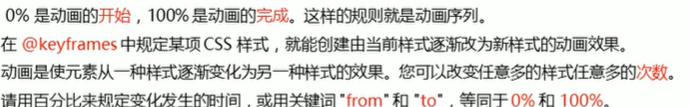
2、动画
---通过设置多个节点来精确控制一个或一组动画
相比较过渡,动画可以实现更多变化,更多控制,连续自动播放等效果。
1)基本使用
制作动画:先定义动画、再使用(调用)动画
用keyframes定义动画(类似定义类选择器)
@keyframes 动画名称 {0%{width:100px;}100%{width:200px;}
}
使用动画
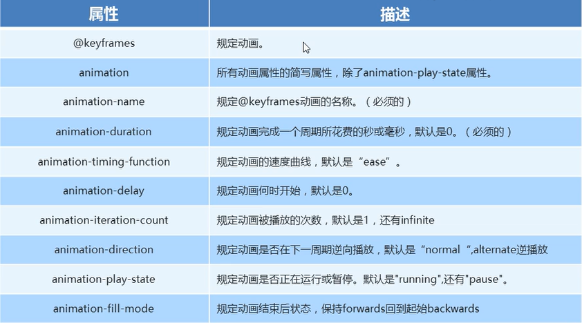
animation-name: 动画名称;/* 持续时间 */animation-duration: 持续时间;2)动画序列
案例:
<style>/* 可以做多个状态的变化 keyframe 关键帧 里面的百分比要是整数 里面的百分比就是总的时间的划分*/@keyframes move {0% {transform: translate(0);}25% {transform: translate(1000px, 0);}50% {transform: translate(1000px, 500px);}75% {transform: translate(0, 500px);}100% {transform: translate(0);}}div {width: 200px;height: 200px;background-color: skyblue;transition: all .5s;/* 调用动画 */animation-name: move;/* 持续时间 */animation-duration: 10s;}</style>3)动画常用属性
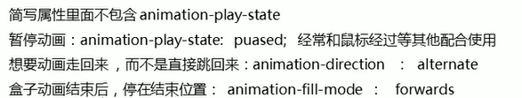
注:倒数第二行pause改为paused
简写属性:animation:动画名称 持续时间 运动曲线 何时开始 播放次数 是否反方向 动画起始或者结束的状态。
4)热点图案例
<style>body {background-color: #333;}.map {position: relative;width: 747px;height: 617px;background: url(images/map.png) no-repeat;margin: 0 auto;}.city {position: absolute;top: 227px;right: 193px;color: #fff;}.tb {top: 500px;right: 80px;}.gz {top: 544px;right: 191px;}.dotted {width: 8px;height: 8px;background-color: #09f;border-radius: 50%;}.city div[class^="pulze"] {/* 保证小波纹在父盒子里面水平垂直居中 放大之后中心向四周发散*/position: absolute;top: 50%;left: 50%;transform: translate(-50%, -50%);width: 8px;height: 8px;box-shadow: 0 0 12px #009dfd;border-radius: 50%;animation: pulse 1.2s linear infinite;}.map .city .pulze2 {animation-delay: 0.4s;}.map .city .pulze3 {animation-delay: 0.8s;}@keyframes pulse {0% {}70% {width: 40px;height: 40px;/* 透明度 */opacity: 1;}100% {width: 70px;height: 70px;opacity: 0;}}</style>
<doby><div class="map"><div class="city"><div class="dotted"></div><div class="pulze1"></div><div class="pulze2"></div><div class="pulze3"></div></div><div class="city tb"><div class="dotted"></div><div class="pulze1"></div><div class="pulze2"></div><div class="pulze3"></div></div><div class="city gz"><div class="dotted"></div><div class="pulze1"></div><div class="pulze2"></div><div class="pulze3"></div></div></div>
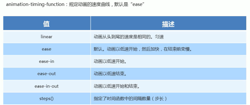
</doby>5)速度曲线细节
6)案例:奔跑的熊大

小熊奔跑:只需要一个盒子,盒子只能装一个画面,第一次装第一个,依次类推即可(关键帧动画)。
<style>.bgcr {position: absolute;width: 3840px;height: 336px;background: url(images/bg1.png);animation: bgcr 20s infinite;}@keyframes bgcr {0% {background-position: 0 0;}100% {background-position: -3840px 0;}}.bear {position: absolute;top: 202px;width: 200px;height: 100px;background: url(images/bear.png) no-repeat;/* 元素可以添加多个动画,用逗号分隔 */animation: bear 1s steps(8) infinite, run 8s forwards;}@keyframes bear {0% {background-position: 0 0;}100% {/* 熊忘左走 */background-position: -1600px 0;}}@keyframes run {0% {left: 0;}100% {left: 50%;/* 不要把代码写死 */transform: translateX(-50%);/* margin-left: -100px; */}}</style>
<doby><div class="bgcr"><div class="bear"></div></div></doby>3、3D转换
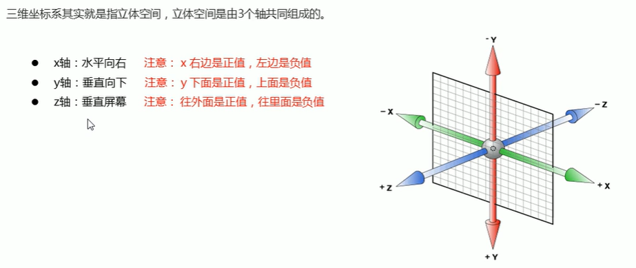
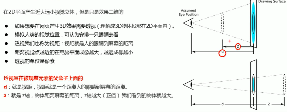
特点:近大远小、物体后面遮挡不可见
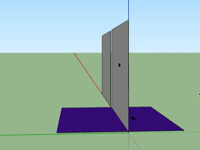
1)三维坐标轴
2)3D转换
主要知识点:
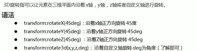
3D位移:translate(x,y,z)
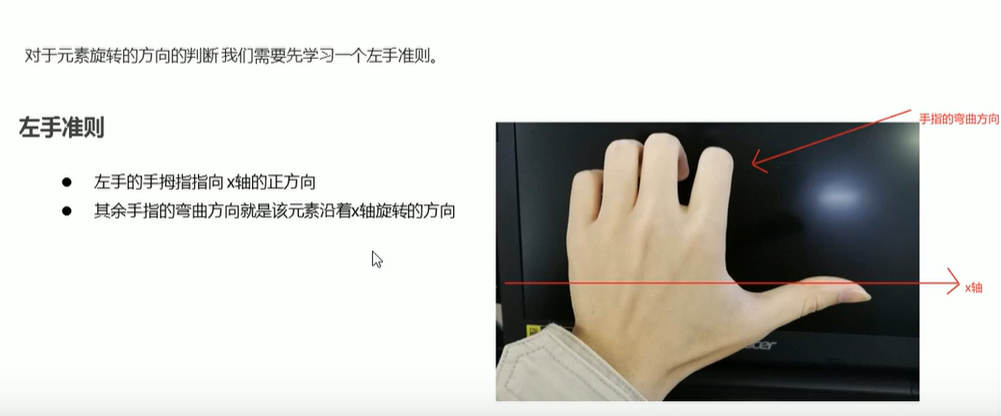
3D旋转:rotate(x,y,z)
透视:perspective
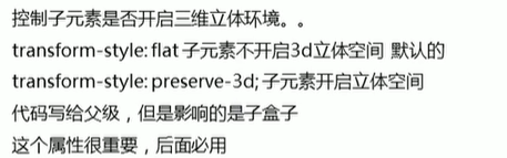
3D呈现transform-style
(1)3D位移translate3d
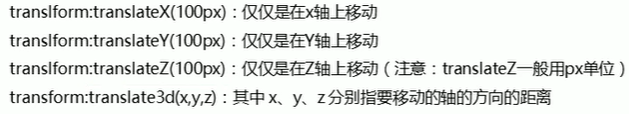
注意:是transform;x,y,z不可省略
(2)透视perspective
(3)3D旋转rotate3d
(4) 3D呈现transform-style
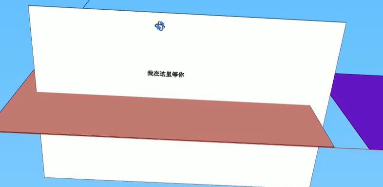
(5)案例:两面翻转的盒子
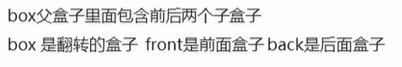
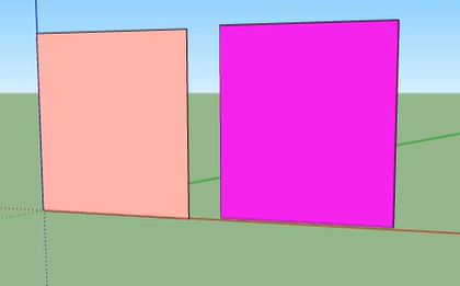
两个盒子叠在一起,有颜色的一面朝向相同,将其中一个盒子翻转,让他们背对背
<style>body {perspective: 500px;}.box {position: relative;width: 300px;height: 300px;margin: 100px auto;transition: all 1s;/* 让背面的粉色盒子保留立体空间 */transform-style: preserve-3d;}.box:hover {transform: rotateY(60deg);}.front,.back {position: absolute;top: 0;left: 0;width: 100%;height: 100%;border-radius: 50%;font-size: 30px;color: #fff;/* 水平居中 */text-align: center;/* 垂直居中 */line-height: 300px;/* 由于front盒子加了z-index,所以当盒子旋转时,front盒子还会在上面我需要把底部的 div的 z-index 给调上来, 这样当顶部 div 的翻转的时候, 底部的 div 才能显示出来backface-visibility:当旋转的角度 >= 90deg ,如果 value 是 hidden的话, 该 div 会自动隐藏*/backface-visibility: hidden;}.front {background-color: skyblue;z-index: 1;}.back {background-color: pink;transform: rotateY(180deg);}</style>
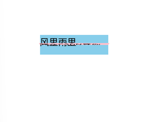
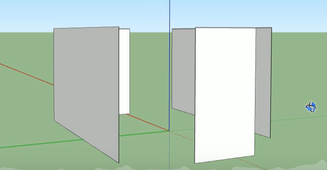
<doby><div class="box"><div class="front">风里雨里</div><div class="back">我在CSDN等你</div></div></doby>(6)案例:3D导航栏
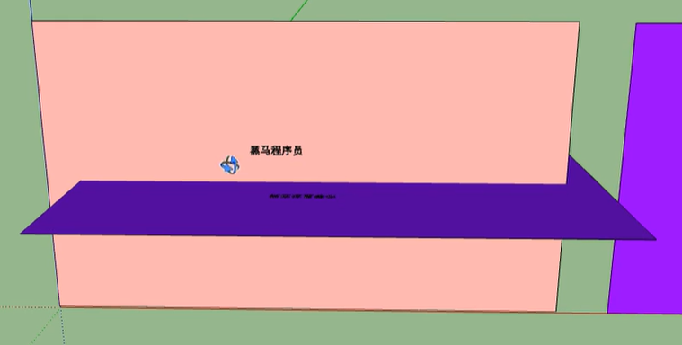
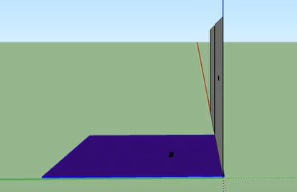
根据左手准则,从第二张图翻转到第三张图,是顺时针的,但是我们需要做的是从第三张图翻转到第二张图,让第二个盒子可以正着显示,因此应该逆时针旋转。
由此可以看出,粉盒子应该沿y轴正方向移动,如下图:
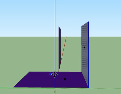
如果将下面的盒子移成如下图情况,当盒子旋转时,是绕着上面盒子的中心点旋转的,此时,下面的盒子会跑偏。
因此,我们可以将上面的盒子沿z轴移动,如图所示:
<style>* {margin: 0;padding: 0;}li {list-style: none;}ul {margin: 100px;}ul li {float: left;margin: 0 5px;width: 120px;height: 35px;/* 由于我们想要3D效果,可以给box盒子加透视,同时,box需要实现翻转效果,也需要透视,因此写在li中 */perspective: 500px;}.box {position: relative;width: 100%;height: 100%;transform-style: preserve-3d;transition: all .4s;}.box:hover {transform: rotateX(90deg);}.front,.back {position: absolute;top: 0;left: 0;width: 100%;height: 100%;backface-visibility: hidden;}.front {background-color: skyblue;z-index: 1;transform: translateZ(17.5px);}.back {background-color: pink;/* 如果有移动或者其他样式,必须先写移动 */transform: translateY(17.5px) rotateX(-90deg);}</style>
<doby><ul><li><div class="box"><div class="front">风里雨里</div><div class="back">我在CSDN等你</div></div></li><li><div class="box"><div class="front">风里雨里</div><div class="back">我在CSDN等你</div></div></li><li><div class="box"><div class="front">风里雨里</div><div class="back">我在CSDN等你</div></div></li><li><div class="box"><div class="front">风里雨里</div><div class="back">我在CSDN等你</div></div></li></ul></doby>(7)综合案例:旋转木马
只需要将盒子摆放好,让盒子绕主轴旋转,再加上透视,即可实现近大远小的效果
<style>body {perspective: 1000px;}section {/* position: inherit; */width: 400px;height: 250px;margin: 300px auto;transform-style: preserve-3d;animation: rotate 10s linear infinite;background: url(images/8.jpg) no-repeat;}@keyframes rotate {0% {transform: rotateY(0);}100% {transform: rotateY(360deg);}}section:hover {/* 鼠标放入section 停止动画 */animation-play-state: paused;}section div {position: absolute;top: 0;left: 0;}section div:nth-child(1) {transform: translateZ(400px);}section div:nth-child(2) {/* 先旋转好了,在移动 */transform: rotateY(60deg) translateZ(400px);}section div:nth-child(3) {/* 先旋转好了,在移动 */transform: rotateY(120deg) translateZ(400px);}section div:nth-child(4) {/* 先旋转好了,在移动 */transform: rotateY(180deg) translateZ(400px);}section div:nth-child(5) {/* 先旋转好了,在移动 */transform: rotateY(240deg) translateZ(400px);}section div:nth-child(6) {/* 先旋转好了,在移动 */transform: rotateY(300deg) translateZ(400px);}img {width: 400px;height: 250px;}</style>
<body><section><div><img src="images/2.jpg" alt=""></div><div><img src="images/3.jpg" alt=""></div><div><img src="images/4.jpg" alt=""></div><div><img src="images/5.jpg" alt=""></div><div><img src="images/6.jpg" alt=""></div><div><img src="images/7.jpg" alt=""></div></section>
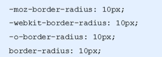
</body>4、浏览器私有前缀
1)私有前缀
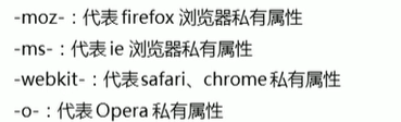
2)写法