uniapp 弹窗
1. uniapp 弹窗
在uni-app中,有多种方式可以实现弹窗功能。以下是一些常见的弹窗类型及其使用方法:
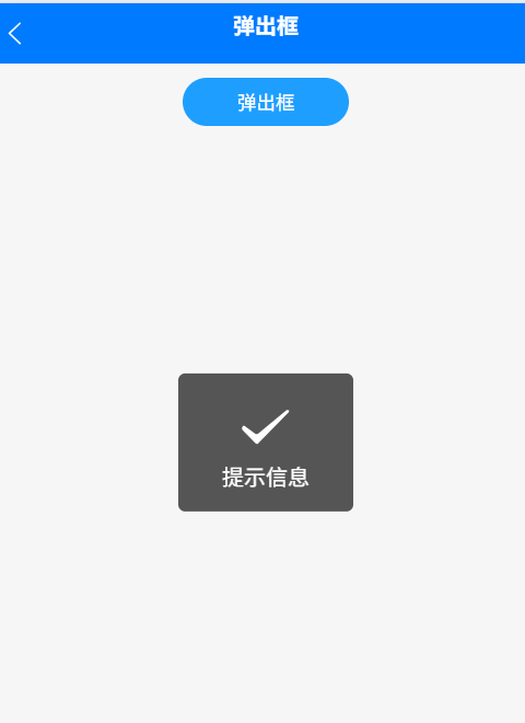
1.1. uni.showToast(OBJECT)
uni.showToast(OBJECT):消息提示框,用于显示简短的提示信息。
uni.showToast({title: '提示信息',icon: 'success', // 可以是 'success', 'loading', 'none' 等duration: 2000 // 显示时间,单位为毫秒});
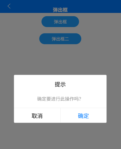
1.2. uni.showModal(OBJECT)
uni.showModal(OBJECT):显示带按钮的提示框,用于确认操作或获取用户选择。
uni.showModal({title: '提示',content: '确定删除?',cancelText: "取消", // 取消按钮的文字  confirmText: "确认", // 确认按钮的文字  showCancel: true, // 是否显示取消按钮,默认为 trueconfirmColor: '#f55850',cancelColor: '#39B54A',success: (res) => {if(res.confirm) {  console.log('comfirm') //点击确定之后执行的代码} else {  console.log('cancel') //点击取消之后执行的代码}  }
})
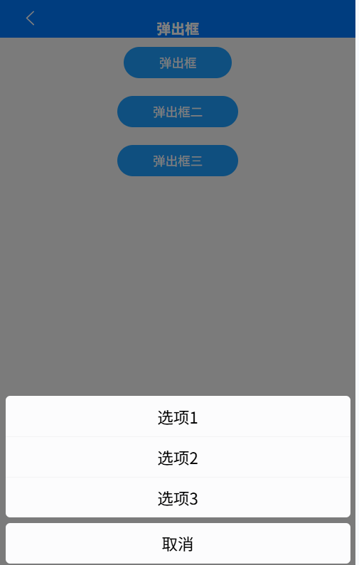
1.3. uni.showActionSheet(OBJECT)
uni.showActionSheet(OBJECT):从底部向上弹出操作菜单,用于提供多个操作选项。
uni.showActionSheet({itemList: ['选项1', '选项2', '选项3'],success: function (res) {console.log('选中了第' + (res.tapIndex + 1) + '个按钮');},fail: function (res) {console.log(res.errMsg);}
});
1.4. uni.showActionSheet(OBJECT)
自定义弹出框:通过HTML和CSS布局实现自定义弹出框,适用于需要高度定制的场景。
<template><view class="modal" @tap.stop.prevent><view class="modal-content"><view class="modal-header"><h2>弹出框标题</h2><i class="fa fa-times" @click="closeModal"></i></view><view class="modal-body"><p>这里是弹出框的主体内容</p></view><view class="modal-footer"><button type="button" @click="submit">确定</button><button type="button" @click="closeModal">取消</button></view></view></view>
</template><script>
export default {methods: {closeModal() {// 关闭弹出框的逻辑},submit() {// 提交操作的逻辑}}
};
</script><style>
.modal {position: fixed;top: 0;left: 0;width: 100%;height: 100%;background-color: rgba(0, 0, 0, 0.5);display: flex;justify-content: center;align-items: center;
}.modal-content {background-color: #fff;width: 80%;height: 80%;border-radius: 5px;
}.modal-header {display: flex;justify-content: space-between;align-items: center;padding: 10px;
}.modal-body {padding: 10px;
}.modal-footer {display: flex;justify-content: flex-end;padding: 10px;
}
</style>