Echarts如何实现line的实线虚线的分段,并且虚实线连接点平滑过度效果(未来预测场景)?
chart图表实线的未来预测效果:
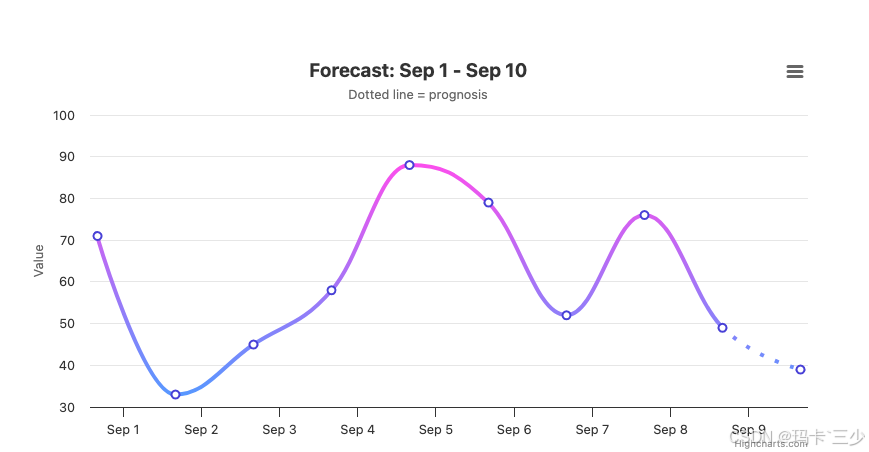
在echarts中没有找到能解决平滑过度的实线方案,在Highcharts中找到了,效果如上,下面是demo地址、代码:
https://www.highcharts.com/demo/highcharts/line-forecast
下面代码粘贴到上面地址中即可预览:
(async () => {// 生成 9月1日 到 9月10日 的数据const data = [];for (let i = 0; i < 10; i++) {const date = new Date('2024-09-01T00:00:00');date.setDate(date.getDate() + i);const value = Math.floor(Math.random() * 61) + 30;data.push([date.getTime(), value]);}// ✅ 关键修复:today 设为 9月9日(倒数第二个点)// 这样最后一条线段(9/9 → 9/10)会变成点线const today = new Date('2024-09-09T00:00:00').getTime();Highcharts.chart('container', {title: { text: 'Forecast: Sep 1 - Sep 10' },subtitle: { text: 'Dotted line = prognosis' },xAxis: { type: 'datetime' },yAxis: { title: { text: 'Value' } },legend: { enabled: false },tooltip: { valueSuffix: '' },series: [{name: 'Data',type: 'spline',data,zoneAxis: 'x',lineWidth: 4,marker: {lineWidth: 2,lineColor: '#4840d6',fillColor: '#fff'},color: {linearGradient: { x1: 0, x2: 0, y1: 0, y2: 1 },stops: [[0, '#fa4fed'], [1, '#5897ff']]},zones: [{ value: today },        // x < today → 实线{ dashStyle: 'Dot' }     // x >= today → 点线]}]});
})();