手搓3D轮播图组件以及倒影效果
场景
我想实现一个轮播图组件:
1.展示5张轮播图,有切换按钮,并且支持自动滚动切换下一张且循环播放。
2.关于slide的样式:每个slide的尺寸是竖向3/2,每个slide之间设置gap,数组的第一个item在初始状态下展示在最中间的位置(没有旋转的角度,作为中心轴),数组的第二个item在初始状态下展示在最中间位置的右边第一个(向外轻微旋转15度),数组的第三个item在初始状态下展示在最中间位置的右边第二个(向外轻微旋转30度),数组的第四个item在初始状态下展示在最中间位置的左边第一个(向外轻微旋转15度),数组的第五个item在初始状态下展示在最中间位置的左边第二个(向外轻微旋转30度)
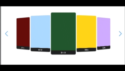
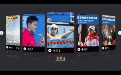
效果如下:
不仅可以自动播放,可以滑动图片,还可以按钮切换,非常nice!
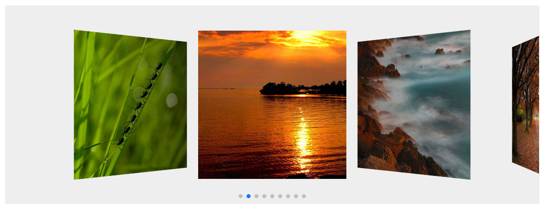
一开始我使用了Swiper库,它的demo是这样的:
但这个库存在一个问题:官方的demo中没设置loop: true,如果没有设置是这样的:
但我们实际业务场景中一般都是需要循环的,明显不符合业务场景。但如果设置了会出现如下的效果:
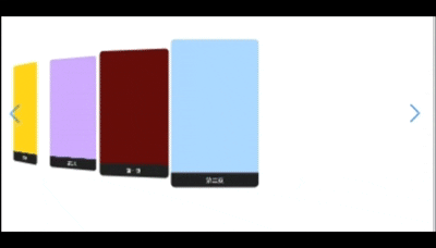
没法保证图片的顺序,所有图片都堆在左边,没有完全对称,切换或者滑动时都会出现乱序的情况。因为用到了effect="coverflow",在loop=true的时候,即使设置了loopedSlides、watchSlidesProgress ,依旧会排布错乱(这是 Swiper 8/9/10 都有人报 issue 的老问题)。
局限案例
这里贴上使用的代码:(仅供参考)
<template><div class="control-board-swiper"><swiper:modules="[EffectCoverflow, Navigation]"effect="coverflow":centered-slides="true":slides-per-view="5":initial-slide="2":loop="false":coverflow-effect="{rotate: -15,stretch: -20,depth: 200,modifier: 1,slideShadows: false}":grab-cursor="true":slide-to-clicked-slide="true"navigationclass="my-swiper"><swiper-slide v-for="(item, i) in items" :key="i"><div class="card"><img :src="item.img" alt="" /><div class="title">{{ item.title }}</div></div></swiper-slide></swiper></div>
</template><script setup>
import { Swiper, SwiperSlide } from "swiper/vue"
import { EffectCoverflow, Navigation } from "swiper/modules"
import "swiper/css"
import "swiper/css/effect-coverflow"
import "swiper/css/navigation"const items = [{ img: temp1, title: "第一页" },{ img: temp2, title: "第二页" },{ img: temp3, title: "第三页" },{ img: temp4, title: "第四页" },{ img: temp5, title: "第五页" }
]
</script><style scoped>
.my-swiper {width: 100%;height: 100%;
}.card {width: 100%;height: 100%;border-radius: 12px;overflow: hidden;background: #222;display: flex;flex-direction: column;align-items: center;
}.card img {width: 100%;height: 80%;display: block;object-fit: cover;
}.title {padding: 8px;color: #fff;
}
</style>
除此之外,我还尝试了一下其他组件库,但他们的属性甚至无法设置旋转的角度,决定手搓!
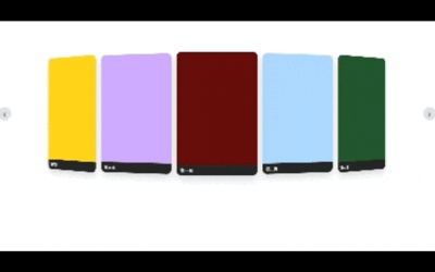
最终实现
<template><divclass="carousel"ref="root"@mouseenter="pause"@mouseleave="play":style="cssVars"><divclass="stage"ref="stageEl":class="{ dragging: isDragging }"@pointerdown="onPointerDown"@pointermove="onPointerMove"@pointerup="onPointerUp"@pointercancel="onPointerUp"@pointerleave="onPointerUp"><divv-for="(it, i) in items":key="i"class="slide":style="getStyle(i)"><div class="card"><img v-if="it.img" :src="it.img" alt="" /><div class="title">{{ it.title }}</div></div></div></div><button class="nav prev" @click="prev" aria-label="Prev">‹</button><button class="nav next" @click="next" aria-label="Next">›</button></div>
</template>
<script setup>
import { ref, computed, onMounted, onBeforeUnmount } from 'vue'const items = ref([{ img: temp1, title: "第一页" },{ img: temp2, title: "第二页" },{ img: temp3, title: "第三页" },{ img: temp4, title: "第四页" },{ img: temp5, title: "第五页" }
])const active = ref(0)
const interval = 2500
const autoplay = true
let timerfunction next() { active.value = (active.value + 1) % items.value.length }
function prev() { active.value = (active.value - 1 + items.value.length) % items.value.length }function play() { if (!autoplay) return; clearInterval(timer); timer = setInterval(next, interval) }
function pause() { clearInterval(timer) }function ringDiff(i, center, n) {let d = i - centerif (d > n / 2) d -= nif (d < -n / 2) d += nreturn d
}const root = ref(null)
const stageEl = ref(null)
const GAP = 10
const slideW = ref(120)
const slideH = ref(180)
const perspective = ref(1000)const cssVars = computed(() => ({'--slide-w': slideW.value + 'px','--slide-h': slideH.value + 'px','--gap': GAP + 'px','--persp': perspective.value + 'px',
}))function computeSize(rect) {const W = Math.max(0, rect.width)const H = Math.max(0, rect.height)const wByRow = (W - 4 * GAP) / 5const wByCol = H / 1.5const w = Math.max(24, Math.min(wByRow, wByCol) * 0.96)slideW.value = Math.floor(w)slideH.value = Math.floor(w * 1.5)perspective.value = Math.max(600, Math.round(Math.max(W, H) * 1.6))
}let ro
onMounted(() => {if (root.value) {computeSize(root.value.getBoundingClientRect())ro = new ResizeObserver(es => es.forEach(e => computeSize(e.contentRect)))ro.observe(root.value)}play()
})
onBeforeUnmount(() => {pause()ro && ro.disconnect()
})const isDragging = ref(false)
const startX = ref(0)
const deltaX = ref(0)
const dragOffset = ref(0)function onPointerDown(e) {isDragging.value = truestartX.value = e.clientXdeltaX.value = 0dragOffset.value = 0pause()e.currentTarget.setPointerCapture?.(e.pointerId)
}function onPointerMove(e) {if (!isDragging.value) returndeltaX.value = e.clientX - startX.valueconst base = slideW.value + GAPdragOffset.value = base ? (deltaX.value / base) : 0
}function onPointerUp() {if (!isDragging.value) returnisDragging.value = falseconst base = slideW.value + GAPconst threshold = Math.max(40, base * 0.25)if (deltaX.value > threshold) prev()else if (deltaX.value < -threshold) next()deltaX.value = 0dragOffset.value = 0play()
}function getStyle(i) {const n = items.value.lengthconst center = active.value - dragOffset.valueconst d = ringDiff(i, center, n)const absD = Math.abs(d)const show = absD <= 2.2const base = (slideW.value + GAP)const edgeTight = absD > 1.5 ? 0.86 : absD > 0.5 ? 0.96 : 1.0const tx = d * base * edgeTightconst scale = absD < 0.5 ? 1 : absD < 1.5 ? 0.96 : 0.92const deg = 20 * dreturn {'--tx': `${tx}px`,'--deg': `${deg}deg`,'--scale': scale,opacity: show ? 1 : 0,zIndex: 100 - Math.round(absD * 10),pointerEvents: show ? 'auto' : 'none',transition: isDragging.value ? 'none' : 'transform 360ms ease, opacity 360ms ease',}
}
</script>
<style scoped>
.carousel { --slide-w:120px; --slide-h:180px; --gap:10px; --persp:1000px; }
.slide { --tx:0px; --deg:0deg; --scale:1; }.carousel {position: relative;width: 100%;height: 100%;margin: 0 auto;user-select: none;
}.stage {position: relative;width: 100%;height: 100%;perspective: var(--persp);overflow: hidden;touch-action: pan-y;cursor: grab;
}.stage.dragging { cursor: grabbing; }.slide {position: absolute;left: 50%;top: 50%;transform:translate(-50%, -50%)translateX(var(--tx, 0px))rotateY(var(--deg, 0deg))scale(var(--scale, 1));transform-style: preserve-3d;will-change: transform, opacity;
}.card {width: var(--slide-w, 120px);height: var(--slide-h, 180px);border-radius: 14px;overflow: hidden;box-shadow: 0 10px 24px rgba(0,0,0,.18);display: flex;flex-direction: column;justify-content: flex-end;
}.card img {width: 100%;height: 100%;object-fit: cover;ser-drag: none;-webkit-user-drag: none;user-select: none;-webkit-user-select: none;pointer-events: none;
}.card .title {font-size: 12px;color: #fff;background: rgba(0,0,0,.85);padding: 6px 10px;
}.nav {position: absolute;top: 50%;transform: translateY(-50%);border: none;background: rgba(0,0,0,.12);width: 36px;height: 36px;border-radius: 50%;cursor: pointer;font-size: 22px;line-height: 36px;z-index: 1000;
}.nav:hover { background: rgba(0,0,0,.2); }
.prev { left: 0; }
.next { right: 0; }
</style>
倒影效果
将整个card复制一份之后,最外层包裹一个div用于做对称设置,再对复制之后的card部分做过渡效果,js部分代码不变,这里只展示html和css:
<template><div class="carousel" ref="root" @mouseenter="pause" @mouseleave="play" :style="cssVars"><div class="stage" ref="stageEl" :class="{ dragging: isDragging }" @pointerdown="onPointerDown" @pointermove="onPointerMove" @pointerup="onPointerUp" @pointercancel="onPointerUp" @pointerleave="onPointerUp"><div v-for="(it, i) in items" :key="i" class="slide" :style="getStyle(i)"><div class="card" :style="{ border: i === active ? '2px solid red' : 'none' }"><img v-if="it.img" :src="it.img" alt="" /><div class="title"><div class="title-img-box"><img :src="'/image/icon/' + it.pt + '.png'" alt=""></div><div class="title-content">{{ it.title }}</div></div></div><div class="card-reflection"><div class="card" :style="{ border: i === active ? '2px solid red' : 'none' }"><img v-if="it.img" :src="it.img" alt="" /><div class="title"><div class="title-img-box"><img :src="'/image/icon/' + it.pt + '.png'" alt=""></div><div class="title-content">{{ it.title }}</div></div></div></div><div v-if="i === active" class="center-title">{{ it.mname }}</div></div></div><button class="nav prev" @click="prev" aria-label="Prev">‹</button><button class="nav next" @click="next" aria-label="Next">›</button></div>
</template>
<style scoped>
.carousel { --slide-w:120px; --slide-h:180px; --gap:10px; --persp:1000px; }
.slide {position: relative;--tx: 0px;--deg: 0deg;--scale: 1;
}.carousel {position: relative;width: 100%;height: 100%;margin: 0 auto;user-select: none;
}.stage {position: relative;width: 100%;height: 100%;perspective: var(--persp);overflow: hidden;touch-action: pan-y;cursor: grab;background-color: #2e2d32;
}
.stage.dragging { cursor: grabbing; }.slide {position: absolute;left: 50%;top: 50%;transform:translate(-50%, -50%)translateX(var(--tx, 0px))rotateY(var(--deg, 0deg))scale(var(--scale, 1));transform-style: preserve-3d;will-change: transform, opacity;
}.card {position: relative;width: var(--slide-w, 120px);height: var(--slide-h, 180px);border-radius: 14px;overflow: hidden;box-shadow: 0 10px 24px rgba(0,0,0,.18);display: flex;flex-direction: column;justify-content: flex-end;
}.card-reflection {position: absolute;top: 100%;left: 50%;transform: translateX(-50%) scaleY(-1);width: var(--slide-w);height: calc(var(--slide-h) * 0.25);pointer-events: none;
}.card-reflection .card {border: none !important;width: 100%;height: 100%;opacity: 0.4;mask-image: linear-gradient(to bottom,rgba(0,0,0,0) 0%,rgba(0,0,0,0.3) 70%,rgba(0,0,0,0) 100%);mask-repeat: no-repeat;mask-size: 100% 100%;
}.card img {width: 100%;height: 100%;object-fit: cover;-webkit-user-drag: none;user-select: none;-webkit-user-select: none;pointer-events: none;
}.card .title {display: flex;justify-content: space-between;align-items: center;font-size: 0.5vw;color: #fff;background: rgba(0,0,0,.85);padding: 6px 10px;
}.title-img-box {display: flex;justify-content: center;align-items: center;background-color: #fff;width: 25px;height: 25px;border-radius: 50%;
}.title-img-box img {width: 60%;height: 60%;object-fit: cover;
}.title-content {max-width: 2vw;overflow: hidden;text-overflow: ellipsis;white-space: nowrap;
}.center-title {position: absolute;bottom: -1.6vw;left: 50%;transform: translate(-50%, -50%);font-size: 0.6vw;font-weight: bold;text-decoration-line: underline;text-decoration-color: #eab983;text-decoration-thickness: 2px;text-decoration-style: solid;text-underline-offset: 6px;color: #eab983;
}.nav {position: absolute;top: 50%;transform: translateY(-50%);border: none;background: #fff;width: 36px;height: 36px;border-radius: 50%;cursor: pointer;font-size: 0.7vw;line-height: 36px;z-index: 1000;
}
.nav:hover { background: #fff; }
.prev { left: 0; }
.next { right: 0; }
</style>
通过以上代码即可实现倒影效果~