不练不熟,不写就忘 之 compose 之 动画之 animateDpAsState动画练习
实现效果
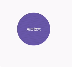
1.控件尺寸动态变化
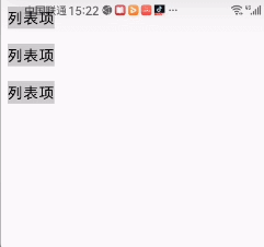
2. 布局间距 / 边距动画
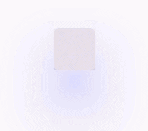
3. 阴影 /elevation 动画
4. 动态边框宽度
5. 折叠 / 展开动画(部分尺寸)
按钮的点击效果
当控件的尺寸(宽 / 高、内外边距等)需要随状态变化时,使用 animateDpAsState 实现平滑过渡。
@Composable
fun AnimateDpTest(){val interactionSource = remember { MutableInteractionSource() }val isPress by interactionSource.collectIsPressedAsState()var isExpanded by remember { mutableStateOf(false) }val buttonSize by animateDpAsState(targetValue = if (isExpanded) 120.dp else 130.dp,animationSpec = tween(durationMillis = 300))LaunchedEffect(isPress) {Log.i("bl_zqq","isPress>>${isPress}")isExpanded = isPress}Button(onClick = {},modifier = Modifier.size(buttonSize),interactionSource = interactionSource) {Text("点击效果")}
}
布局间距 / 边距动画
布局中的间距(如 padding、margin)随状态变化时,用动画避免突兀的跳动。
var isSelected by remember { mutableStateOf(false) }val itemPadding by animateDpAsState(targetValue = if (isSelected) 16.dp else 8.dp)Box(modifier = Modifier.padding(itemPadding).background(Color.LightGray).clickable { isSelected = !isSelected }) {Text("列表项")}
阴影 /elevation 动画
控件的阴影大小(elevation)变化时,通过 animateDpAsState 实现平滑过渡(阴影大小与 Dp 相关)。
var isSelected by remember { mutableStateOf(false) }val cardEvaluation by animateDpAsState(targetValue = if(isSelected) 10.dp else 100.dp,animationSpec = tween(durationMillis = 2000))val colorEvaluation by animateFloatAsState(targetValue = if(isSelected) 0f else 1f,animationSpec = tween(2000))val interactionSource = remember { MutableInteractionSource() }val isHover by interactionSource.collectIsPressedAsState()LaunchedEffect(isHover) {Log.i("bl_zqq","isHover>>${isHover}")isSelected = isHover}Card(onClick = {},modifier = Modifier.size(100.dp).shadow(elevation = cardEvaluation,ambientColor = Color.Blue.copy(alpha = colorEvaluation),spotColor = Color.Blue.copy(alpha = colorEvaluation)),interactionSource = interactionSource,){ }
这里做了2s的动画及颜色变化,更加清晰看到效果
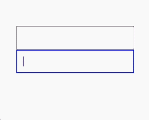
动态边框宽度
控件边框(border)的宽度随状态变化时,用动画过渡更自然。
var isFocused by remember { mutableStateOf(false) }val borderWidth by animateDpAsState(targetValue = if (isFocused) 2.dp else 1.dp)OutlinedTextField(value = "",onValueChange = { },modifier = Modifier.border(width = borderWidth,color = if (isFocused) Color.Blue else Color.Gray).onFocusChanged(){isFocused = it.isFocused})
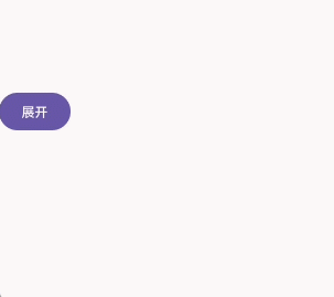
5. 折叠 / 展开动画(部分尺寸)
在折叠面板、抽屉等组件中,若只需要部分尺寸(如高度)动画,可单独对 Dp 值动画。
var isExpanded by remember { mutableStateOf(false) }val contentHeight by animateDpAsState(targetValue = if (isExpanded) 200.dp else 0.dp)Column {Button(onClick = { isExpanded = !isExpanded }) {Text(if (isExpanded) "收起" else "展开")}Box(modifier = Modifier.height(contentHeight).fillMaxWidth().background(Color.LightGray))}
抽屉效果
@Composable
fun SlideDrawerDemo() {// 控制抽屉是否打开的状态var isDrawerOpen by remember { mutableStateOf(false) }// 抽屉宽度(固定为280dp)val drawerWidth = 280.dp// 动画控制抽屉的水平偏移量:关闭时偏移量为负的抽屉宽度(隐藏),打开时为0(显示)val drawerOffset by animateDpAsState(targetValue = if (isDrawerOpen) 0.dp else -drawerWidth,animationSpec = tween(durationMillis = 300), // 动画时长300mslabel = "抽屉偏移动画")Box(modifier = Modifier.fillMaxSize()) {// 主内容区域Box(modifier = Modifier.fillMaxSize().background(Color.LightGray),contentAlignment = Alignment.Center) {Button(onClick = { isDrawerOpen = !isDrawerOpen }) {Text(if (isDrawerOpen) "关闭抽屉" else "打开抽屉")}}// 抽屉组件(位于主内容上方)Box(modifier = Modifier.fillMaxHeight().width(drawerWidth)// 通过偏移控制显示/隐藏.offset(x = drawerOffset).background(Color.White)// 避免抽屉滑出时内容溢出显示.clipToBounds(),contentAlignment = Alignment.Center) {Text(text = "这是一个抽屉",fontSize = 20.sp,color = Color.Black)}}
}