文章目录
- 1 动画属性与使用
- 2 实现斜线动画
- 3 实现弧线动画
- 4 波纹动画
- 5 旋转动画(点绕圆旋转)
- 6 浮动动画
1 动画属性与使用
如果示例代码无动画效果属于正常,因为未定义动画开始时间/完成需要时间/运动曲线等等。
示例均为连写方式,也可指定动画属性名独立书写
###1.1 动画属性
- @keyframes:用于定义动画关键帧的属性,里面是动画在不同时间点的状态。
- animationName:表示动画的名称;
- from:定义动画的开头,相当于 0%;
- percentage:定义动画的各个阶段,为百分比值,可以添加多个;
- to:定义动画的结尾,相当于 100%;
- properties:不同的样式属性名称,例如 color、left、width 等等。
@keyframes animationName {from {properties: value;}percentage {properties: value;}to {properties: value;}
}
@keyframes animationName {0% {properties: value;}50% {properties: value;}100% {properties: value;}
}
@keyframes ball {0% { top: 0px; left: 0px;}25% { top: 0px; left: 350px;}50% { top: 200px; left: 350px;}75% { top: 200px; left: 0px;}100% { top: 0px; left: 0px;}
}
- animation-name:指定使用哪个@keyframes规则描述动画。
| 值 | 描述 |
|---|
| keyframename | 要绑定到 HTML 元素的动画名称,可以同时绑定多个动画,动画名称之间使用逗号进行分隔 |
<!DOCTYPE html>
<html lang="en">
<head><meta charset="UTF-8"><title>示例</title><style>@keyframes animationCss{0% { top: 0px; left: 0px;}25% { top: 0px; left: 350px;}50% { top: 200px; left: 350px;}75% { top: 200px; left: 0px;}100% { top: 0px; left: 0px;} }div {width: 100px;height: 100px;border-radius: 50%;border: 3px solid black;position: relative;animation: animationCss;}</style>
</head>
<body><div></div>
</body>
</html>
- animation-duration:指定动画从开始到结束的持续时间。
<!DOCTYPE html>
<html lang="en">
<head><meta charset="UTF-8"><title>示例</title><style>@keyframes animationCss{0% { top: 0px; left: 0px;}25% { top: 0px; left: 350px;}50% { top: 200px; left: 350px;}75% { top: 200px; left: 0px;}100% { top: 0px; left: 0px;} }div {width: 100px;height: 100px;border-radius: 50%;border: 3px solid black;position: relative;animation: animationCss 2s;}</style>
</head>
<body><div></div>
</body>
</html>
- animation-timing-function:指定动画的变化速度曲线,如"ease"、 “linear”、 “ease-in”、 "ease-out"等。
| 值 | 描述 |
|---|
| linear | 动画从开始到结束的速度是相同的 |
| ease | 默认值,动画以低速开始,然后加快,在结束前变慢 |
| ease-in | 动画以低速开始 |
| ease-out | 动画以低速结束 |
| ease-in-out | 动画以低速开始,并以低速结束 |
| cubic-bezier(n, n, n, n) | 使用 cubic-bezier() 函数来定义动画的播放速度,参数的取值范围为 0 到 1 之间的数值 |
<!DOCTYPE html>
<html lang="en">
<head><meta charset="UTF-8"><title>示例</title><style>@keyframes animationCss{0% {left: 0px;}50% {left: 350px;}100% {left: 0px;}}div {width: 100px;height: 100px;border-radius: 50%;line-height: 100px;text-align: center;border: 3px solid black;position: relative;}.one {animation: animationCss 2s ease;}.two {animation: animationCss 2s ease-in;}.three {animation: animationCss 2s ease-out;}.four {animation: animationCss 2s ease-in-out;}</style>
</head>
<body><div class="one">ease</div><div class="two">ease-in</div><div class="three">ease-out</div><div class="four">ease-in-out</div>
</body>
</html>
- animation-fill-mode:指定动画结束后元素的样式,如"none"、 “forwards”、 “backwards”、 “both”。
| 值 | 描述 |
|---|
| none | 不改变动画的默认行为 |
| forwards | 当动画播放完成后,保持动画最后一个关键帧中的样式 |
| backwards | 在 animation-delay 所指定的时间段内,应用动画第一个关键帧中的样式 |
| both | 同时遵循 forwards 和 backwards 的规则 |
<!DOCTYPE html>
<html lang="en">
<head><meta charset="UTF-8"><title>示例</title><style>@keyframes animationCss{0% {left: 0px;}50% {left: 350px;}100% {left: 0px;}}div {width: 100px;height: 100px;border-radius: 50%;border: 3px solid black;position: relative;animation: animationCss 2s ease forwards;}</style>
</head>
<body><div></div>
</body>
</html>
- animation-delay:指定动画何时开始,单位为秒或毫秒。
<!DOCTYPE html>
<html lang="en">
<head><meta charset="UTF-8"><title>示例</title><style>@keyframes animationCss{0% {left: 0px;}50% {left: 350px;}100% {left: 0px;}}div {width: 100px;height: 100px;border-radius: 50%;border: 3px solid black;position: relative;animation: animationCss 2s ease forwards 2s;}</style>
</head>
<body><div></div>
</body>
</html>
- animation-iteration-count:指定动画的循环次数,可以是一个具体的数字,也可以是"infinite"无限循环。
| 值 | 描述 |
|---|
| n | 使用具体数值定义动画播放的次数,默认值为 1 |
| infinite | 表示动画无限次播放 |
<!DOCTYPE html>
<html lang="en">
<head><meta charset="UTF-8"><title>示例</title><style>@keyframes animationCss{0% {left: 0px;}50% {left: 350px;}100% {left: 0px;}}div {width: 100px;height: 100px;border-radius: 50%;border: 3px solid black;position: relative;animation: animationCss 2s ease 2s forwards infinite;}</style>
</head>
<body><div></div>
</body>
</html>
- animation-direction:指定动画的播放方向,可以是"normal"、 “reverse”、 “alternate"和"alternate-reverse”。
| 值 | 描述 |
|---|
| normal | 以正常的方式播放动画 |
| reverse | 以相反的方向播放动画 |
| alternate | 播放动画时,奇数次(1、3、5 等)正常播放,偶数次(2、4、6 等)反向播放 |
| alternate-reverse | 播放动画时,奇数次(1、3、5 等)反向播放,偶数次(2、4、6 等)正常播放 |
<!DOCTYPE html>
<html lang="en">
<head><meta charset="UTF-8"><title>示例</title><style>@keyframes animationCss{0% {left: 0px;}50% {left: 350px;}100% {left: 0px;}}div {width: 100px;height: 100px;border-radius: 50%;border: 3px solid black;position: relative;animation: animationCss 2s ease 2s forwards infinite reverse;} </style>
</head>
<body><div></div>
</body>
</html>
- animation-play-state:指定动画播放的状态,可以是"running"、 “paused”。
| 值 | 描述 |
|---|
| paused | 暂停动画的播放 |
| running | 正常播放动画 |
<!DOCTYPE html>
<html lang="en">
<head><meta charset="UTF-8"><title>示例</title><style>@keyframes animationCss{0% {left: 0px;}50% {left: 350px;}100% {left: 0px;}}div {width: 100px;height: 100px;border-radius: 50%;border: 3px solid black;position: relative;animation: animationCss 2s ease 2s forwards infinite reverse running;} </style>
</head>
<body><div></div>
</body>
</html>
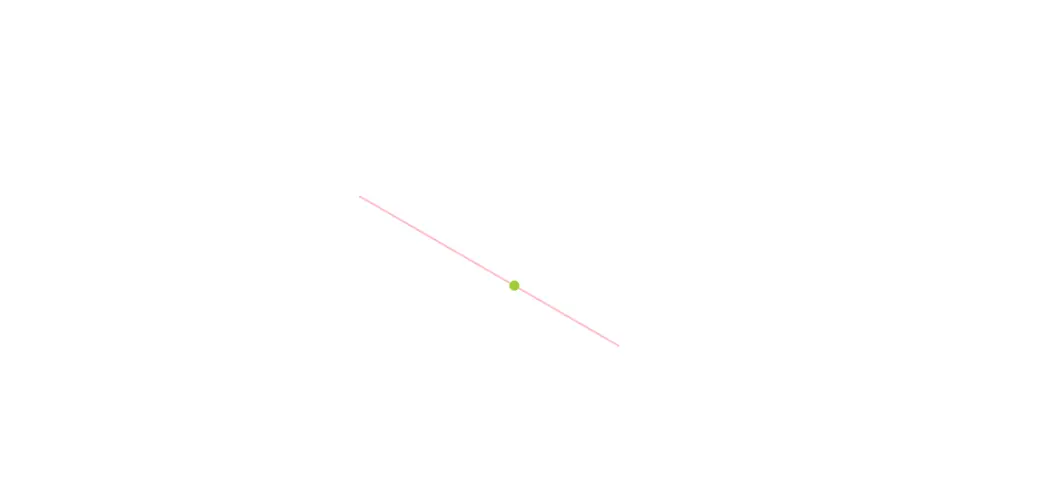
2 实现斜线动画
- 斜线动画其实就是直线动画进行了角度旋转,下面示例为一个圆点在一条线上运动的动画
<!DOCTYPE html><html lang="en"><head><meta charset="UTF-8"><title>示例</title><style>* {margin: 0;padding: 0;}html,body {width: 100%;height: 100%;}@keyframes animationCss {0% {transform: translate(0px, 0px) rotate(30deg);}100% {transform: translate(300px, 0px) rotate(30deg);}}div {width: 300px;height: 2px;background-color: pink;position: relative;left: 50%;top: 50%;transform: translate(-50%, -50%) rotate(30deg);}div::before {content: "";display: inline-block;width: 10px;height: 10px;border-radius: 50%;background-color: yellowgreen;position: absolute;left: 0px;top: -4px;animation: animationCss 2s infinite;}</style></head><body><div></div></body></html>
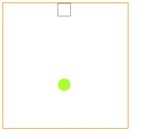
3 实现弧线动画
- 弧线动画其实可以这么理解,如果一个元素进行X轴平移运动,那么给这个元素添加一个伪元素进行Y轴移动,因为伪元素是基本元素本身存在的,所以伪元素此时会同时做XY轴运动,也就是斜线运动,但需求是弧线,那么同时指定元素与伪元素的运动曲线
(animation-timing-function)即可 通过修改运动曲线或者修改伪元素的Y轴移动距离即可获得不同的运动弧度
<!DOCTYPE html>
<html lang="en"><head><meta charset="UTF-8"><title>示例</title><style>.box {width: 400px;height: 400px;border: 2px solid #ff8800;}span {display: block;width: 40px;height: 40px;border: 1px solid #222;animation: animationCss1 2s ease-in forwards;}span:after {content: '';display: block;width: 40px;height: 40px;border-radius: 20px;background: greenyellow;animation: animationCss2 2s cubic-bezier(0.3, 0.5, 0.3, 0.3) forwards;}@keyframes animationCss1 {to {transform: translateX(360px)}}@keyframes animationCss2 {to {transform: translateY(360px)}}</style>
</head><body><div class="box"><span></span></div>
</body></html>
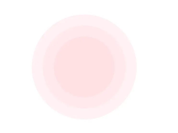
4 波纹动画
- 使用多个圆形进行覆盖折叠,每个圆大小不一样,使其放大的时候进行透明度修改以达到波纹淡化效果,具体波纹淡化效果等针对不同图层修改即可
<!DOCTYPE html>
<html lang="en"><head><meta charset="UTF-8"><title>示例</title><style>.circle-1 {position: absolute;left: 30%;top: 30%;width: 220px;height: 220px;background-color: pink;border-radius: 50%;z-index: 99;transform: translate(-50%, -50%);animation: animationCss 1.5s infinite linear;}.circle-2 {position: absolute;left: 30%;top: 30%;width: 300px;height: 300px;background-color: pink;opacity: 0.5;border-radius: 50%;transform: translate(-50%, -50%);animation: animationCss 1.5s infinite linear;}.circle-3 {position: absolute;left: 30%;top: 30%;width: 380px;height: 380px;background-color: pink;opacity: 0.5;border-radius: 50%;transform: translate(-50%, -50%);animation: animationCss 1.5s infinite linear;}@keyframes animationCss {0% {transform: translate(-50%, -50%) scale(1);opacity: 0.3;}100% {transform: translate(-50%, -50%) scale(1.8);opacity: 0;}}</style>
</head><body><div class="circle-1"></div><div class="circle-2"></div><div class="circle-3"></div>
</body></html>
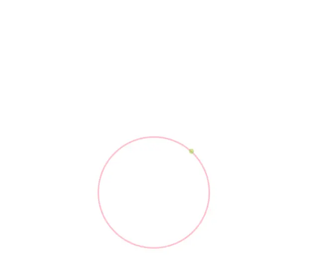
5 旋转动画(点绕圆旋转)
- 没必要纠结于这个点怎么转,既然旋转体是个圆为何不去转那个圆来制造一种假象,相当于点在转,如果容器不方便旋转,那再画个圆圈套上去,再把套上去的圆圈隐藏掉也是可以的。
<!DOCTYPE html>
<html lang="en"><head><meta charset="UTF-8"><title>示例</title><style>html,body {width: 100%;height: 100%;}.circle-1 {position: relative;left: 30%;top: 30%;width: 220px;height: 220px;border: 3px solid pink;border-radius: 50%;z-index: 99;animation: animationCss 1.5s infinite linear;}.circle-2 {position: absolute;left: 40%;top: 0%;width: 10px;height: 10px;background-color: yellowgreen;opacity: 0.5;border-radius: 50%;transform: translate(-50%,-50%);}@keyframes animationCss {0% {transform:  rotate(0deg);}100% {transform:  rotate(360deg);}}</style>
</head><body><div class="circle-1"><div class="circle-2"></div></div></body></html>
6 浮动动画
@keyframes animationCss {0% {transform: translateY(0px) scale(1);}50% {transform: translateY(-7px) scale(1.1);}100% {transform: translateY(0px) scale(1);}
}