Vue DIY 内容文本超出组件
Vue DIY 内容文本超出组件
- 效果图
- 组件一
- 组件二
- 使用
diy了两种文本超出处理组件,组件一是在原位置呈现全部文本,组件二是弹窗显示全部文本,直接复制可食用,废话不多说,直接上菜
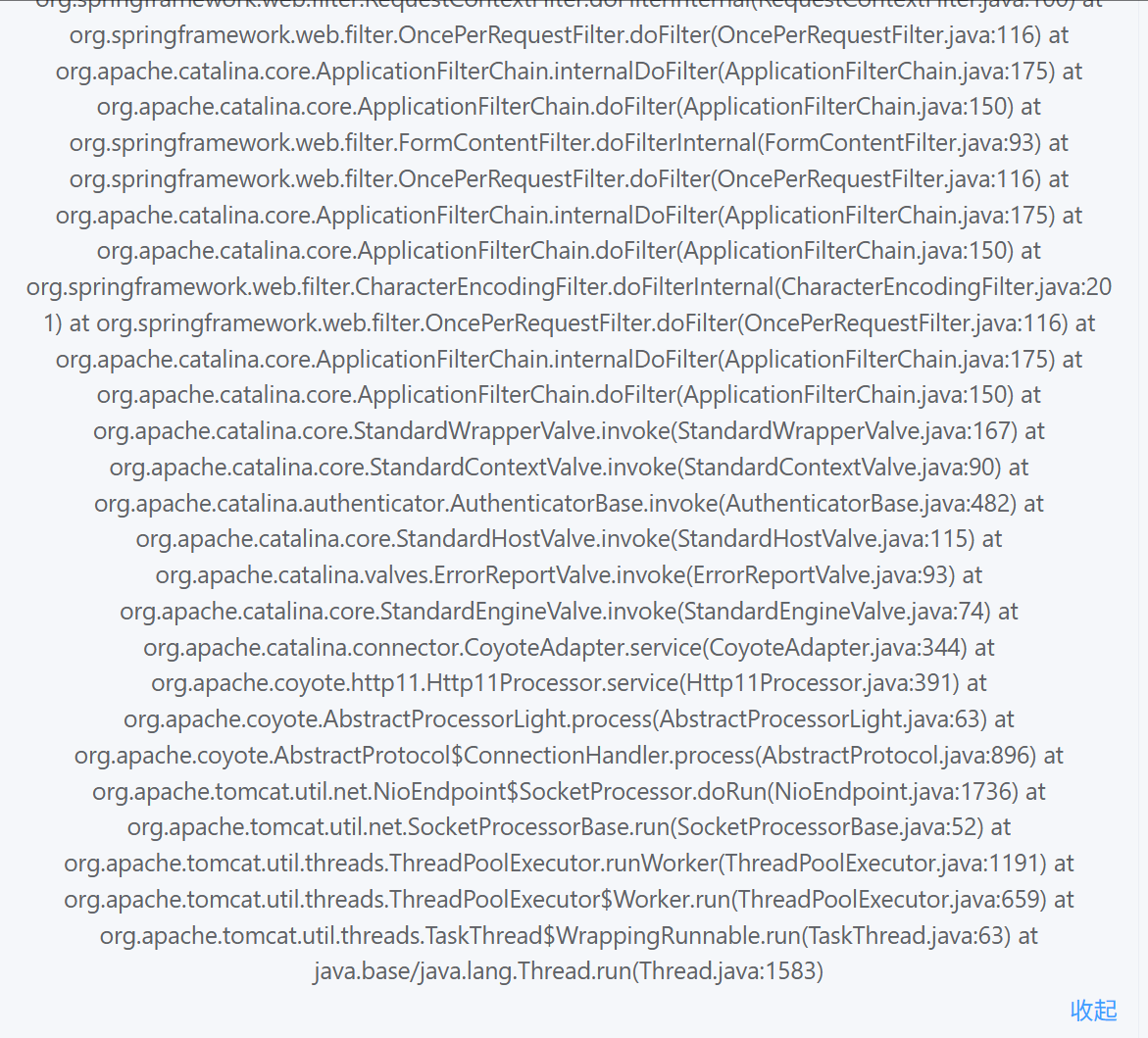
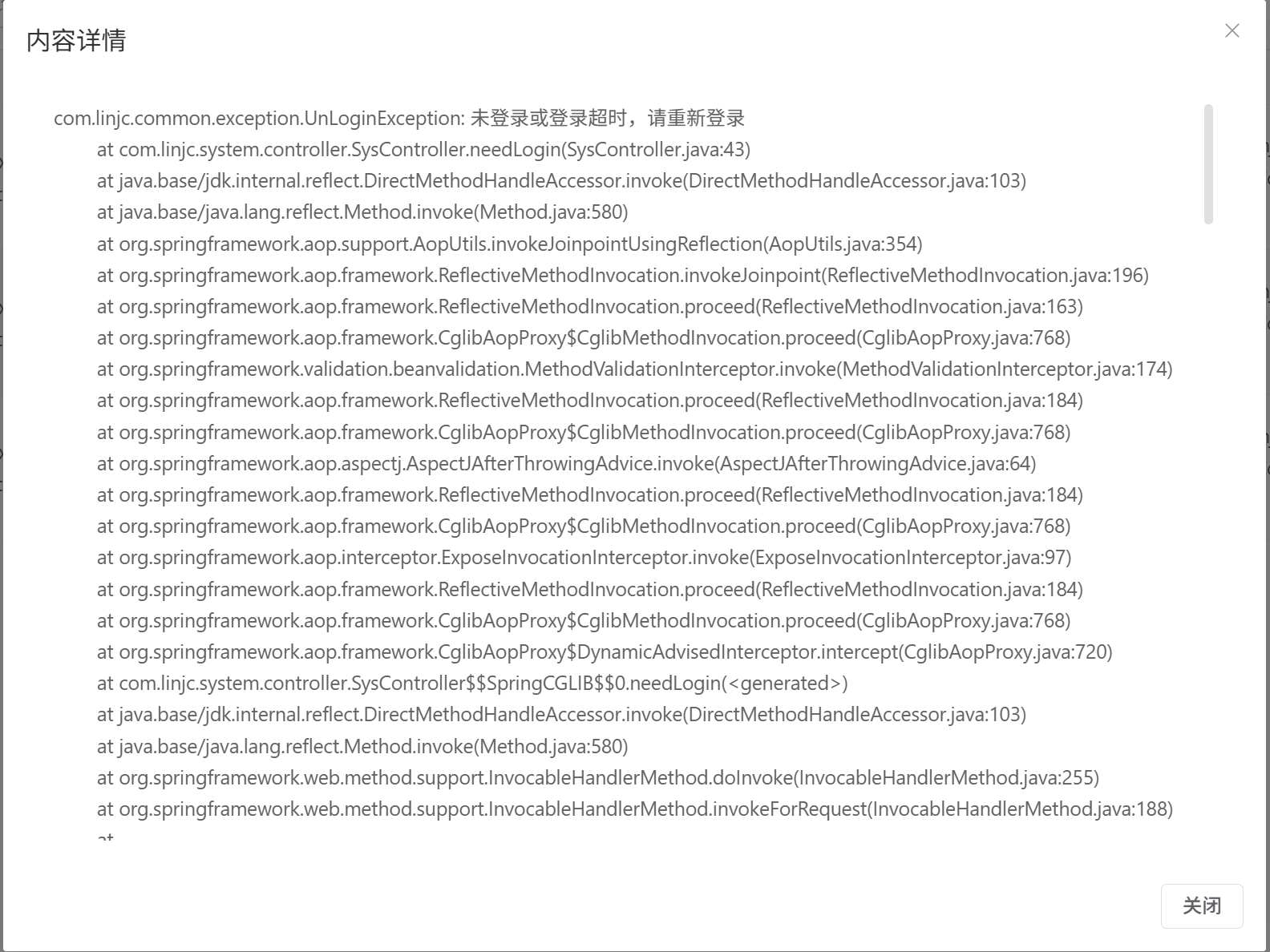
效果图
缩略效果图
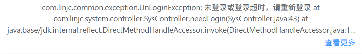
组件一展开效果
组件二展开效果
组件一
TextOverflow
<template><!-- 内容容器 --><div class="content-box" ref="containerRef"><!-- 文本内容区域,根据是否展开切换样式 --><divref="contentRef"class="content-text":class=" isExpanded ? 'text-expanded': 'text-ellipsis'"@click="handleTextClick">{{ content }}</div><divv-if="showMoreBtn"class="show-more"@click.stop="toggleExpand">{{ isExpanded ? '收起' : '查看更多' }}</div></div>
</template><script>
export default {props: {// 文本内容content: {type: String,default: ''},// 最大显示行数maxLines: {type: Number,default: 3}},data() {return {isExpanded: false, // 是否展开全部内容showMoreBtn: false // 是否需要显示"查看更多"按钮}},mounted() {// 初始化时检查文本是否溢出this.checkTextOverflow()// 添加窗口resize事件监听window.addEventListener('resize', this.handleResize)},beforeDestroy() {// 组件销毁前移除事件监听window.removeEventListener('resize', this.handleResize)},methods: {/*** 检查文本是否超出指定行数*/checkTextOverflow() {this.$nextTick(() => {const contentEl = this.$refs.contentRefif (!contentEl) return// 获取行高和内容高度const lineHeight = parseInt(window.getComputedStyle(contentEl).lineHeight)const scrollHeight = contentEl.scrollHeight // 内容总高度const clientHeight = contentEl.clientHeight // 可视高度// 判断是否需要显示"查看更多"按钮this.showMoreBtn = scrollHeight > clientHeight ||(scrollHeight > (lineHeight * this.maxLines))})},/*** 切换展开/收起状态*/toggleExpand() {this.isExpanded = !this.isExpanded},/*** 处理文本点击事件*/handleTextClick() {// 如果内容超出,点击文本也可以切换展开状态if (this.showMoreBtn) {this.toggleExpand()}},/*** 防抖处理的resize事件处理函数*/handleResize: debounce(function() {// 如果已经展开,不需要处理if (this.isExpanded) return// 重新检查文本溢出情况this.checkTextOverflow()}, 100)},// 监听content变化watch: {content() {this.isExpanded = falsethis.checkTextOverflow()}}
}/*** 防抖函数* @param {Function} fn 要执行的函数* @param {Number} delay 延迟时间(ms)*/
function debounce(fn, delay) {let timer = nullreturn function() {clearTimeout(timer)timer = setTimeout(() => {fn.apply(this, arguments)}, delay)}
}
</script><style scoped>
/* 内容容器样式 */
.content-box {position: relative;padding-bottom: 24px; /* 为"查看更多"按钮预留空间 */
}/* 文本基础样式 */
.content-text {line-height: 1.5; /* 行高 */word-break: break-word; /* 长单词换行 */cursor: pointer; /* 鼠标手型 */
}/* 省略号样式 - 当文本未展开时 */
.text-ellipsis {display: -webkit-box;-webkit-box-orient: vertical;-webkit-line-clamp: 3; /* 限制显示行数 */line-clamp: 3;overflow: hidden;text-overflow: ellipsis; /* 文本溢出显示省略号 */
}/* 展开样式 - 当文本展开时 */
.text-expanded {display: block; /* 恢复默认显示 */
}/* 查看更多/收起按钮样式 */
.show-more {position: absolute;right: 0;bottom: 0;color: #409EFF; /* 主题蓝色 */cursor: pointer;padding-left: 8px; /* 左侧内边距 */font-size: 14px;
}/* 按钮悬停效果 */
.show-more:hover {text-decoration: underline; /* 添加下划线 */
}
</style>
组件二
TextOverflowShowDialog
<template><!-- 内容容器 --><div class="content-box" ref="containerRef"><!-- 文本内容区域 --><divref="contentRef"class="content-text":class="showMoreBtn ? 'text-ellipsis' : 'text-expanded'"@click="handleTextClick">{{ content }}</div><!-- 显示更多按钮 --><divv-if="showMoreBtn"class="show-more"@click.stop="openDialog">查看更多</div></div><!-- 内容详情弹窗 --><el-dialogv-model="showDialog"class="custom-content-dialog":title="dialogTitle"@close="showDialog = false"append-to-bodywidth="900px"><el-scrollbar class="custom-dialog-scrollbar" height="60vh"><div class="custom-dialog-content">{{ content }}</div></el-scrollbar><template #footer><el-button @click="showDialog = false">关闭</el-button></template></el-dialog>
</template><script>
export default {props: {// 文本内容content: {type: String,default: ''},// 最大显示行数,默认为3行maxLines: {type: Number,default: 3},// 弹窗标题dialogTitle: {type: String,default: '内容详情'}},data() {return {showDialog: false, // 是否显示弹窗showMoreBtn: false // 是否需要显示"查看更多"按钮}},mounted() {this.checkTextOverflow()window.addEventListener('resize', this.handleResize)},beforeDestroy() {window.removeEventListener('resize', this.handleResize)},methods: {/*** 检查文本是否超出指定行数*/checkTextOverflow() {this.$nextTick(() => {const contentEl = this.$refs.contentRefif (!contentEl) returnconst lineHeight = parseInt(window.getComputedStyle(contentEl).lineHeight)const scrollHeight = contentEl.scrollHeightconst clientHeight = contentEl.clientHeightthis.showMoreBtn = scrollHeight > clientHeight ||(scrollHeight > (lineHeight * this.maxLines))})},/*** 打开详情弹窗*/openDialog() {this.showDialog = true},/*** 处理文本点击事件*/handleTextClick() {if (this.showMoreBtn) {this.openDialog()}},/*** 防抖处理的resize事件处理函数*/handleResize: debounce(function() {this.checkTextOverflow()}, 100)},watch: {content() {this.showDialog = falsethis.checkTextOverflow()}}
}/*** 防抖函数*/
function debounce(fn, delay) {let timer = nullreturn function() {clearTimeout(timer)timer = setTimeout(() => {fn.apply(this, arguments)}, delay)}
}
</script><style scoped>
/* 内容容器样式 */
.content-box {position: relative;padding-bottom: 24px;
}/* 文本基础样式 */
.content-text {line-height: 1.5;word-break: break-word;cursor: pointer;
}/* 省略号样式 */
.text-ellipsis {display: -webkit-box;-webkit-box-orient: vertical;-webkit-line-clamp: 3;line-clamp: 3;overflow: hidden;text-overflow: ellipsis;
}/* 展开样式 */
.text-expanded {display: block;
}/* 查看更多按钮样式 */
.show-more {position: absolute;right: 0;bottom: 0;color: #409EFF;cursor: pointer;padding-left: 8px;font-size: 14px;
}.show-more:hover {text-decoration: underline;
}
</style><style>
.custom-content-dialog {max-height: 80vh;
}.custom-content-dialog .el-dialog__body {padding: 15px 20px;
}.custom-dialog-scrollbar {max-height: 60vh;
}.custom-dialog-content {white-space: pre-wrap;word-break: break-word;line-height: 1.6;padding-right: 10px;
}
</style>
使用
需要的地方直接引入使用即可
<!-- <text-overflow :content="row.excMessage"></text-overflow>--><text-overflow-show-dialog :content="row.excMessage"></text-overflow-show-dialog>