Qt for HarmonyOS 3D图片轮播组件开源鸿蒙开发实战
📱 项目简介
项目地址:https://gitcode.com/szkygc/HarmonyOs_PC-PGC/tree/main/Carousel3DView
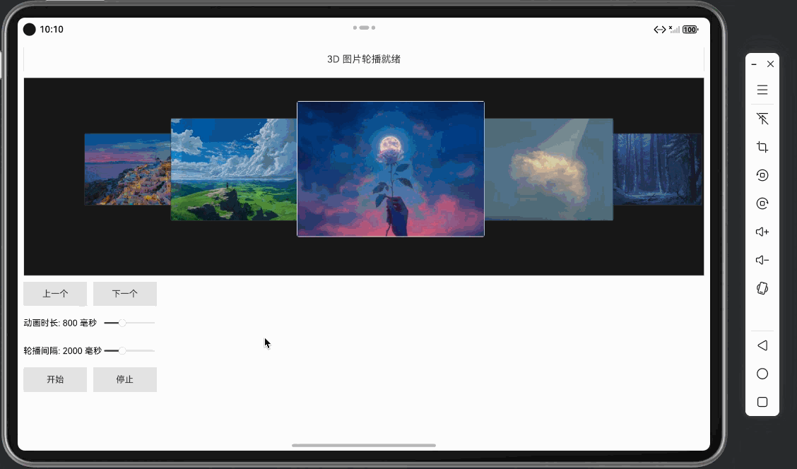
本文将详细介绍如何使用 Qt Quick/QML 在 HarmonyOS 平台上开发一个功能完整、视觉效果出色的 3D 图片轮播组件。该组件支持 7 张图片的 3D 轮播展示,具有流畅的动画效果、自动轮播功能、交互控制等特性,是学习 Qt + HarmonyOS UI 组件开发和动画实现的优秀实战案例。
项目特点:
- 🎨 3D 视觉效果:7 个位置的不同大小、透明度和层级,营造 3D 空间感
- ✨ 流畅动画:使用 Behavior 和 NumberAnimation 实现平滑的位置、大小、透明度变化
- 🖼️ 图片展示:支持 7 张图片的轮播展示,自动处理图片加载和错误
- 🔄 自动轮播:支持自动循环播放,可随时开始/停止
- 🎯 交互控制:支持点击跳转、悬停暂停、手动切换等交互
- ⚙️ 参数可调:动画时长、轮播间隔等参数可实时调整
🛠️ 技术栈
- 开发框架: Qt 5.15+ for HarmonyOS
- 编程语言: QML / C++
- 动画系统: PropertyAnimation, Behavior
- 界面框架: Qt Quick Controls 2
- 布局系统: ColumnLayout, GridLayout
- 构建工具: CMake
- 目标平台: HarmonyOS (OpenHarmony)
🏗️ 项目架构
Carousel3DView/
├── entry/src/main/
│   ├── cpp/
│   │   ├── main.cpp              # 应用入口(HarmonyOS适配)
│   │   ├── main.qml              # 主界面(控制面板)
│   │   ├── Carousel3DView.qml   # 3D轮播组件(核心)
│   │   ├── CMakeLists.txt        # 构建配置
│   │   ├── qml.qrc               # QML资源文件
│   │   └── images/               # 图片资源目录
│   │       ├── image1.png
│   │       ├── image2.png
│   │       └── ... (共7张图片)
│   ├── module.json5              # 模块配置
│   └── resources/                # 资源文件
组件层次结构
ApplicationWindow (main.qml)
├── ColumnLayout
│   ├── Text (状态显示)
│   ├── Rectangle (轮播视图容器)
│   │   └── Carousel3DView (核心组件)
│   │       └── Repeater (7个轮播项)
│   │           └── Item (单个轮播项)
│   │               ├── Rectangle (背景容器)
│   │               │   ├── Image (图片显示)
│   │               │   └── Text (文字标签)
│   │               └── MouseArea (交互区域)
│   └── ScrollView (控制面板)
│       └── ColumnLayout
│           ├── RowLayout (导航按钮)
│           ├── GridLayout (参数滑块)
│           └── RowLayout (播放控制)
📝 核心功能实现
1. Carousel3DView - 3D轮播核心组件
Carousel3DView.qml 是整个项目的核心,负责 3D 轮播效果的实现。
1.1 属性定义
Item {id: root// 动画参数property int animationDuration: 800          // 动画时长(毫秒)property int autoRotationInterval: 2000      // 自动轮播间隔(毫秒)property bool autoRotationEnabled: true      // 是否启用自动轮播property bool isRunning: false                // 是否正在运行// 轮播状态property int currentIndex: 3                 // 中心索引property int offset: 4                        // 旋转偏移量(初始为4,确保中心位置显示项目1)// 数据源readonly property var itemData: [{ image: "qrc:/images/image1.png", text: "项目 1", color: "#FF6B6B" },{ image: "qrc:/images/image2.png", text: "项目 2", color: "#4ECDC4" },// ... 共7个项目]
}
1.2 3D 布局配置
通过预定义的布局数组,实现 7 个位置的 3D 空间分布:
readonly property var layouts: [{ x: 0.22, y: 0.28, width: 0.15, height: 0.375, z: 1, opacity: 0.4 },   // 左3{ x: 0.075, y: 0.25, width: 0.162, height: 0.425, z: 2, opacity: 0.6 }, // 左2{ x: 0.212, y: 0.19, width: 0.212, height: 0.545, z: 3, opacity: 0.8 }, // 左1{ x: 0.4, y: 0.1, width: 0.28, height: 0.72, z: 4, opacity: 1.0 },     // 中心{ x: 0.66, y: 0.19, width: 0.212, height: 0.545, z: 3, opacity: 0.8 },   // 右1{ x: 0.85, y: 0.25, width: 0.162, height: 0.425, z: 2, opacity: 0.6 },  // 右2{ x: 0.695, y: 0.28, width: 0.15, height: 0.375, z: 1, opacity: 0.4 }   // 右3
]
布局设计要点:
- 中心位置:z=4,opacity=1.0,尺寸最大(width=0.28, height=0.72)
- 左右两侧:z 值递减,opacity 递减,尺寸递减,营造远近效果
- 位置计算:使用相对比例(0.0-1.0),实现响应式布局
1.3 偏移量计算
通过 offset 属性实现轮播逻辑,使用模运算实现循环:
// 根据偏移量计算实际显示的项
function getItem(index) {var actualIndex = (index + offset) % itemData.lengthreturn itemData[actualIndex]
}function rotateToNext() {offset = (offset + 1) % itemData.lengthcurrentIndex = (currentIndex + 1) % itemData.length
}function rotateToPrevious() {offset = (offset - 1 + itemData.length) % itemData.lengthcurrentIndex = (currentIndex - 1 + itemData.length) % itemData.length
}
关键实现细节:
- 模运算:
(offset + 1) % itemData.length实现循环 - 负数处理:
(offset - 1 + itemData.length) % itemData.length处理负数情况 - 初始偏移:
offset: 4确保启动时中心位置显示"项目 1"
1.4 自动轮播实现
使用 Timer 组件实现自动轮播:
Timer {id: autoRotationTimerinterval: root.autoRotationIntervalrunning: root.isRunning  // 只检查是否运行,不检查开关状态repeat: trueonTriggered: {root.rotateToNext()}
}function startAutoRotation() {isRunning = true
}function stopAutoRotation() {isRunning = false
}
设计要点:
- 简单控制:通过
isRunning属性直接控制播放/停止 - 循环播放:
repeat: true实现无限循环 - 间隔可调:
interval绑定到autoRotationInterval,支持实时调整
2. 轮播项实现
使用 Repeater 创建 7 个轮播项,每个项根据布局配置和偏移量动态更新:
2.1 位置和尺寸绑定
Repeater {model: root.itemData.lengthItem {id: itemContainerproperty int itemIndex: indexproperty var layout: root.layouts[index]property real itemScale: layout.z === 4 ? 1.0 : (0.7 + layout.z * 0.1)x: layout.x * root.widthy: layout.y * root.heightwidth: layout.width * root.widthheight: layout.height * root.heightz: layout.zopacity: layout.opacityscale: itemScaletransformOrigin: Item.Center}
}
关键实现:
- 响应式布局:
layout.x * root.width实现相对位置 - 缩放计算:中心项 scale=1.0,其他项根据 z 值计算(0.7 + z * 0.1)
- 变换原点:
transformOrigin: Item.Center确保缩放以中心为基准
2.2 动画效果
使用 Behavior 实现平滑的属性变化动画:
Behavior on x {NumberAnimation {duration: root.animationDurationeasing.type: Easing.OutCubic}
}Behavior on y {NumberAnimation {duration: root.animationDurationeasing.type: Easing.OutCubic}
}Behavior on width {NumberAnimation {duration: root.animationDurationeasing.type: Easing.OutCubic}
}Behavior on height {NumberAnimation {duration: root.animationDurationeasing.type: Easing.OutCubic}
}Behavior on opacity {NumberAnimation {duration: root.animationDurationeasing.type: Easing.OutCubic}
}Behavior on scale {NumberAnimation {duration: root.animationDurationeasing.type: Easing.OutCubic}
}
动画要点:
- 统一时长:所有动画使用相同的
animationDuration - 缓动函数:
Easing.OutCubic实现平滑的减速效果 - 自动触发:属性变化时自动触发动画,无需手动控制
2.3 图片显示
实现图片加载、显示和错误处理:
Rectangle {id: itemRectanchors.fill: parentproperty var currentItem: root.getItem(index)color: currentItem.colorborder.color: layout.z === 4 ? "#FFFFFF" : "#333333"border.width: layout.z === 4 ? 3 : 2radius: 8// 图片显示Image {id: itemImageanchors.fill: parentanchors.margins: 2source: itemRect.currentItem ? itemRect.currentItem.image : ""fillMode: Image.PreserveAspectCropsmooth: trueasynchronous: falsecache: trueonStatusChanged: {if (status === Image.Error) {itemRect.color = itemRect.currentItem ? itemRect.currentItem.color : "#CCCCCC"} else if (status === Image.Ready) {itemRect.color = "transparent"}}}// 文字标签(图片加载失败时显示)Text {id: itemTextanchors.centerIn: parenttext: currentItem ? currentItem.text : ""font.pixelSize: Math.min(parent.width, parent.height) * 0.15font.bold: truecolor: "#FFFFFF"visible: !itemImage.source || itemImage.status === Image.Error || itemImage.status === Image.Nullz: 10style: Text.OutlinestyleColor: "#80000000"}// 监听 offset 变化,更新内容Connections {target: rootfunction onOffsetChanged() {var newItem = root.getItem(index)itemRect.currentItem = newItem}}
}
图片处理要点:
- 错误处理:图片加载失败时显示颜色背景和文字标签
- 动态更新:通过
Connections监听offset变化,更新显示内容 - 填充模式:
PreserveAspectCrop保持宽高比并填充整个区域 - 缓存优化:
cache: true启用图片缓存
2.4 交互控制
实现点击跳转和悬停暂停功能:
MouseArea {anchors.fill: parenthoverEnabled: trueonClicked: {// 点击后跳转到该项var targetIndex = indexvar centerIndex = Math.floor(root.itemData.length / 2)var diff = targetIndex - centerIndexif (diff > 0) {for (var i = 0; i < diff; i++) {root.rotateToNext()}} else if (diff < 0) {for (var i = 0; i < -diff; i++) {root.rotateToPrevious()}}}onEntered: {// 悬停时暂停播放if (root.isRunning) {root.isRunning = false}}onExited: {// 离开时恢复播放(如果自动轮播已启用)if (root.autoRotationEnabled) {root.isRunning = true}}
}
交互要点:
- 点击跳转:计算目标位置与中心的差值,循环调用旋转函数
- 悬停暂停:鼠标悬停时暂停自动播放,提升用户体验
- 自动恢复:鼠标离开时恢复播放(如果自动轮播已启用)
3. 主界面 - 控制面板
main.qml 提供了完整的控制界面,包括状态显示、参数调整和播放控制。
3.1 状态显示
Text {Layout.fillWidth: trueLayout.preferredHeight: 50 * scaleFactortext: root.statusTextfont.pixelSize: 20 * scaleFactorhorizontalAlignment: Text.AlignHCenterverticalAlignment: Text.AlignVCentercolor: "#333333"Rectangle {anchors.fill: parentborder.color: "#CCCCCC"border.width: 1color: "transparent"}
}Timer {id: statusTimerinterval: 1500running: falserepeat: falseonTriggered: {statusText = "3D 图片轮播就绪"}
}
3.2 参数控制
使用 Slider 组件实现动画时长和轮播间隔的实时调整:
GridLayout {Layout.fillWidth: truecolumns: 2columnSpacing: 12 * scaleFactorrowSpacing: 12 * scaleFactorText {id: durationLabeltext: "动画时长: " + animationDurationSlider.value + " 毫秒"font.pixelSize: 18 * scaleFactorLayout.preferredWidth: 150 * scaleFactor}Slider {id: animationDurationSliderfrom: 200to: 2000value: 800Layout.fillWidth: trueLayout.preferredHeight: 45 * scaleFactoronValueChanged: {durationLabel.text = "动画时长: " + Math.round(value) + " 毫秒"carouselView.animationDuration = Math.round(value)}}Text {id: intervalLabeltext: "轮播间隔: " + rotationIntervalSlider.value + " 毫秒"font.pixelSize: 18 * scaleFactorLayout.preferredWidth: 150 * scaleFactor}Slider {id: rotationIntervalSliderfrom: 500to: 5000value: 2000Layout.fillWidth: trueLayout.preferredHeight: 45 * scaleFactoronValueChanged: {intervalLabel.text = "轮播间隔: " + Math.round(value) + " 毫秒"carouselView.autoRotationInterval = Math.round(value)}}
}
3.3 播放控制
RowLayout {Layout.fillWidth: truespacing: 12 * scaleFactorButton {text: "开始"Layout.fillWidth: trueLayout.preferredHeight: 50 * scaleFactorfont.pixelSize: 18 * scaleFactoronClicked: {carouselView.startAutoRotation()statusText = "开始播放(循环)"statusTimer.restart()}}Button {text: "停止"Layout.fillWidth: trueLayout.preferredHeight: 50 * scaleFactorfont.pixelSize: 18 * scaleFactoronClicked: {carouselView.stopAutoRotation()statusText = "播放已停止"statusTimer.restart()}}
}
4. HarmonyOS 适配要点
4.1 应用入口适配
HarmonyOS 上必须使用 qtmain() 而不是 main():
extern "C" int qtmain(int argc, char **argv)
{// 设置 OpenGL ESQCoreApplication::setAttribute(Qt::AA_UseOpenGLES);QCoreApplication::setAttribute(Qt::AA_ShareOpenGLContexts);QGuiApplication app(argc, argv);// 配置 OpenGL ES 表面格式QSurfaceFormat format;format.setRenderableType(QSurfaceFormat::OpenGLES);format.setVersion(2, 0);format.setAlphaBufferSize(8);QSurfaceFormat::setDefaultFormat(format);// 创建 QML 引擎QQmlApplicationEngine engine;engine.load(QUrl("qrc:/main.qml"));return app.exec();
}
4.2 资源文件配置
确保 QML 文件和图片资源正确添加到 qml.qrc:
<?xml version="1.0" encoding="UTF-8"?>
<RCC><qresource prefix="/"><file>main.qml</file><file>Carousel3DView.qml</file></qresource><qresource prefix="/images"><file alias="image1.png">images/image1.png</file><file alias="image2.png">images/image2.png</file><!-- ... 共7张图片 --></qresource>
</RCC>
资源路径要点:
- 独立前缀:图片使用独立的
/images前缀 - 别名设置:使用
alias简化资源路径 - 代码引用:在 QML 中使用
qrc:/images/image1.png引用图片
🎯 关键技术点
1. Behavior 动画系统
优势:
- 自动触发:属性变化时自动触发动画,无需手动控制
- 性能优化:使用硬件加速,性能优异
- 统一管理:所有动画使用相同的时长和缓动函数
使用技巧:
Behavior on x {NumberAnimation {duration: root.animationDurationeasing.type: Easing.OutCubic}
}
2. 响应式布局
实现方式:
- 使用相对比例(0.0-1.0)定义位置和尺寸
- 绑定到父组件的
width和height - 支持不同屏幕尺寸的自适应显示
示例:
x: layout.x * root.width
y: layout.y * root.height
width: layout.width * root.width
height: layout.height * root.height
3. 模运算实现循环
关键算法:
// 向前循环
offset = (offset + 1) % itemData.length// 向后循环(处理负数)
offset = (offset - 1 + itemData.length) % itemData.length
优势:
- 代码简洁,性能高效
- 自动处理边界情况
- 支持任意数量的项目
4. 图片加载优化
优化策略:
- 同步加载:
asynchronous: false确保图片立即加载 - 缓存启用:
cache: true避免重复加载 - 错误处理:加载失败时显示占位符
- 状态监听:通过
onStatusChanged处理加载状态
🐛 常见问题与解决方案
1. 图片不显示
问题:图片资源未正确加载
解决方案:
- 检查 qrc 文件配置:确保图片路径正确,使用独立的
/images前缀 - 检查图片路径:代码中使用
qrc:/images/image1.png格式 - 检查文件存在:确保图片文件存在于
images/目录下 - 添加调试输出:使用
onStatusChanged监听加载状态
onStatusChanged: {console.log("Image status:", status)if (status === Image.Error) {console.log("Image load error:", source)}
}
2. 动画不流畅
问题:动画卡顿或闪烁
解决方案:
- 使用
Behavior而非 JavaScript 动画 - 设置合适的
easing.type缓动函数 - 避免在动画过程中频繁更新其他属性
- 确保使用硬件加速(OpenGL ES)
3. 初始位置不正确
问题:应用启动时中心位置不是"项目 1"
解决方案:
- 设置初始
offset: 4,确保中心位置显示"项目 1" - 根据项目数量调整初始偏移量:
offset = (itemData.length - centerIndex) % itemData.length
4. 自动轮播不工作
问题:点击"开始"后轮播不播放
解决方案:
- 检查
Timer的running属性绑定:running: root.isRunning - 确保
isRunning属性正确设置为true - 检查
autoRotationInterval是否设置合理(不能为 0)
📊 性能优化建议
-
图片优化:
- 使用适当尺寸的图片(避免过大)
- 启用图片缓存(
cache: true) - 使用
PreserveAspectCrop减少重绘
-
动画优化:
- 使用
Behavior而非 JavaScript 动画 - 设置合理的动画时长(避免过长)
- 使用硬件加速(OpenGL ES)
- 使用
-
布局优化:
- 使用相对比例而非固定像素值
- 避免频繁的布局计算
- 使用
z属性而非频繁的重新排序
-
内存优化:
- 及时释放不需要的资源
- 避免创建过多的临时对象
- 使用对象池管理轮播项(如果需要)
🎨 扩展功能建议
-
更多动画效果:
- 添加旋转动画(Y 轴旋转)
- 添加缩放动画(更明显的 3D 效果)
- 添加淡入淡出效果
-
交互增强:
- 支持拖拽切换
- 支持键盘导航
- 支持触摸手势
-
功能扩展:
- 支持动态添加/删除项目
- 支持无限循环模式
- 支持缩略图导航
-
视觉效果:
- 添加阴影效果
- 添加边框高亮
- 添加背景模糊
📚 总结
本项目展示了如何使用 Qt Quick/QML 在 HarmonyOS 平台上开发一个功能完整、视觉效果出色的 3D 图片轮播组件。通过 Behavior 动画系统实现流畅的动画效果,通过模运算实现循环轮播逻辑,通过响应式布局实现自适应显示,这些都是 Qt 开发中的核心技能。
核心收获:
- ✅ 掌握 Behavior 动画系统的使用
- ✅ 理解响应式布局设计原则
- ✅ 学会使用模运算实现循环逻辑
- ✅ 掌握图片加载和错误处理
- ✅ 理解 HarmonyOS 平台适配要点
- ✅ 学会交互控制和用户体验优化
希望本文能帮助开发者更好地理解 Qt + HarmonyOS 开发,并在实际项目中应用这些技术。
相关资源:
- Qt for HarmonyOS 官方文档
- QML Behavior 文档
- Qt Quick Controls 2 文档
- QML Animation 文档
- OpenHarmony PC开发者专区
- HarmonyOS PC 开发者社区