React Native App 图表绘制完整实现指南
简介
在移动应用开发中,数据可视化是一个重要的功能。本文详细介绍如何在 React Native 应用中实现完整的图表绘制功能。该方案支持:
- ✅ 多种图表类型:折线图、柱状图、双折线图等
- ✅ 交互功能:点击、Tooltip、数据点高亮
- ✅ 自定义样式:颜色、尺寸、动画等
- ✅ 响应式设计:适配不同屏幕尺寸
- ✅ 性能优化:使用 memo 和 useMemo 优化渲染
技术选型
核心库
-
victory-native:基于 Victory.js 的 React Native 图表库
- 功能强大,支持多种图表类型
- 性能优秀,支持动画
- 自定义程度高
-
react-native-svg:SVG 支持库(可选)
- 如需自定义图表,可使用 SVG 进行底层绘制
- 提供高性能的矢量图形渲染能力
安装依赖
npm install victory-native react-native-svg
# 或
yarn add victory-native react-native-svg
架构设计
整体架构图
┌─────────────────────────────────────────────────────────┐
│           图表组件层(Chart Components)                  │
└────────────────────┬────────────────────────────────────┘│┌────────────┴────────────┐│                         │
┌───────▼────────┐      ┌─────────▼──────────┐
│ WrappedLineChart│      │ WrappedBarChart    │
│  (折线图组件)   │      │  (柱状图组件)       │
└───────┬────────┘      └─────────────────────┘│
┌───────▼────────┐
│WrappedDualLineChart│
│  (双折线图组件)  │
└───────┬────────┘│
┌───────▼────────┐
│  Victory-Native  │
│  (图表库)        │
└─────────────────┘
核心模块说明
- WrappedLineChart:折线图基础组件
- WrappedBarChart:柱状图基础组件
- WrappedDualLineChart:双折线图基础组件
- 图表组合使用:展示如何组合使用多个图表组件实现交互功能
核心组件详解
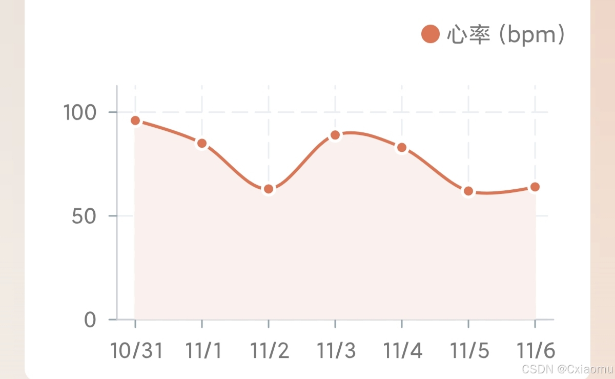
1. WrappedLineChart(折线图组件)
功能特性:
- 支持单条折线显示
- 支持平滑曲线(Bezier 插值)
- 支持数据点显示
- 支持区域填充
- 动态 Y 轴范围计算
适用场景:
- 单一指标的时间序列数据
- 趋势分析图表
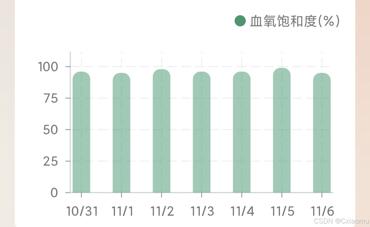
2. WrappedBarChart(柱状图组件)
功能特性:
- 支持柱状图显示
- 自定义柱状图颜色和圆角
- 固定 Y 轴范围(0-100)
适用场景:
- 百分比数据展示
- 分类数据对比
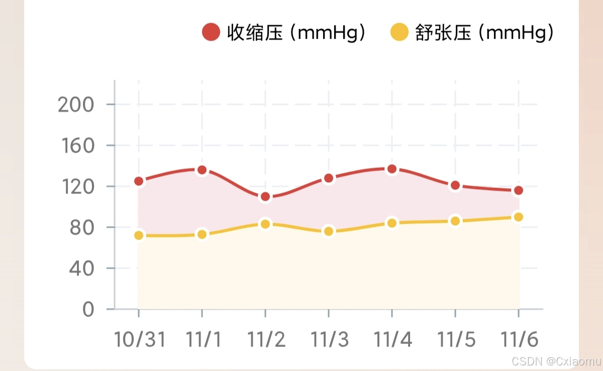
3. WrappedDualLineChart(双折线图组件)
功能特性:
- 同时显示两条折线
- 支持不同颜色区分
- 支持区域填充
适用场景:
- 多指标对比展示
- 双数据系列对比
4. 图表组合使用示例
功能特性:
- 如何组合使用多个图表组件
- 实现 Tooltip 交互
- 实现图例显示
- 图表类型切换逻辑
实现步骤
步骤 1:安装依赖
npm install victory-native react-native-svg
步骤 2:创建基础图表组件
创建 WrappedLineChart、WrappedBarChart 等基础组件。
步骤 3:实现交互功能(可选)
实现 Tooltip、点击交互等功能。
步骤 4:集成到应用
在页面中使用图表组件,根据实际需求传入数据。
核心代码实现
1. Mock 数据生成示例
// 生成时间序列数据的通用函数
const generateTimeSeriesData = (count: number = 7, minValue: number = 0, maxValue: number = 100) => {const data: Array<{ x: string; y: number }> = [];const today = new Date();for (let i = count - 1; i >= 0; i--) {const date = new Date(today);date.setDate(date.getDate() - i);// 格式化日期为字符串const dateStr = `${date.getMonth() + 1}/${date.getDate()}`;// 生成随机数值const value = Math.round(minValue + Math.random() * (maxValue - minValue));data.push({ x: dateStr, y: value });}return data;
};// 生成折线图数据
export const generateLineChartData = (count: number = 7) => {return generateTimeSeriesData(count, 50, 100);
};// 生成柱状图数据
export const generateBarChartData = (count: number = 7) => {return generateTimeSeriesData(count, 0, 100);
};// 生成双折线图数据
export interface DualLineData {x: string;y1: number;y2: number;
}export const generateDualLineChartData = (count: number = 7): DualLineData[] => {const data: DualLineData[] = [];const today = new Date();for (let i = count - 1; i >= 0; i--) {const date = new Date(today);date.setDate(date.getDate() - i);const dateStr = `${date.getMonth() + 1}/${date.getDate()}`;data.push({x: dateStr,y1: Math.round(100 + Math.random() * 50), // 第一条线y2: Math.round(50 + Math.random() * 50),  // 第二条线});}return data;
};
2. 折线图组件(WrappedLineChart.tsx)
import React from 'react';
import { View, Dimensions } from 'react-native';
import {VictoryChart,VictoryLine,VictoryAxis,VictoryTheme,VictoryContainer,VictoryScatter,VictoryArea,
} from 'victory-native';const screenWidth = Dimensions.get('window').width;export interface WrappedLineChartProps {data: {labels: string[];datasets: {data: number[];color?: (opacity?: number) => string;strokeWidth?: number;}[];};width?: number;height?: number;onPress?: (event: any) => void;chartConfig?: {color?: (opacity?: number) => string;strokeWidth?: number;};style?: any;withVerticalLabels?: boolean;withHorizontalLabels?: boolean;withDots?: boolean;fromZero?: boolean;bezier?: boolean;
}const WrappedLineChart: React.FC<WrappedLineChartProps> = ({data,width = screenWidth - 32,height = 220,onPress,chartConfig = {},style = {},withVerticalLabels = true,withHorizontalLabels = true,withDots = true,fromZero = true,bezier = false,
}) => {// 转换数据格式为Victory格式const victoryData = data.labels.map((label, index) => ({x: label,y: data.datasets[0].data[index],}));// 获取颜色const getColor = () => {if (chartConfig.color) {return chartConfig.color(1);}return '#007AFF'; // 默认颜色};// 计算动态Y轴范围const yValues = victoryData.map((p) => p.y).filter((y) => typeof y === 'number' && isFinite(y));const minVal = yValues.length ? Math.min(...yValues) : 0;const maxVal = yValues.length ? Math.max(...yValues) : 0;const padding = Math.max(5, Math.round((maxVal - minVal) * 0.1));const yMin = fromZero ? 0 : Math.max(0, minVal - padding);const yMax = maxVal + padding;// 计算Y轴刻度const range = Math.max(1, yMax - yMin);const roughStep = range / 4;const pow10 = Math.pow(10, Math.floor(Math.log10(roughStep)));const base = roughStep / pow10;const niceBase = base <= 1 ? 1 : base <= 2 ? 2 : base <= 5 ? 5 : 10;const niceStep = niceBase * pow10;const tickValues: number[] = [];let t = Math.ceil(yMin / niceStep) * niceStep;if (fromZero && yMin > 0) tickValues.push(0);while (t <= yMax) {if (!tickValues.includes(t)) tickValues.push(t);t += niceStep;}if (fromZero && !tickValues.includes(0)) tickValues.unshift(0);return (<View style={style}><VictoryChartwidth={width}height={height}theme={VictoryTheme.material}domainPadding={{ x: 20, y: 10 }}containerComponent={<VictoryContainer responsive={false} />}padding={{left: 60,right: 10,top: 10,bottom: 40,}}domain={{ y: [yMin, yMax] }}>{/* Y轴 */}{withVerticalLabels && (<VictoryAxisdependentAxisstyle={{axis: { stroke: '#E5E5E5', strokeWidth: 1 },tickLabels: {fontSize: 12,fill: '#666666',},}}tickValues={tickValues}/>)}{/* X轴 */}{withHorizontalLabels && (<VictoryAxisstyle={{axis: { stroke: '#E5E5E5', strokeWidth: 1 },tickLabels: {fontSize: 12,fill: '#666666',},}}/>)}{/* 区域填充 */}<VictoryAreadata={victoryData}style={{data: {fill: '#FDF1ED',fillOpacity: 1,},}}interpolation={bezier ? 'cardinal' : 'linear'}/>{/* 折线 */}<VictoryLinedata={victoryData}style={{data: {stroke: getColor(),strokeWidth: 2,},}}interpolation={bezier ? 'cardinal' : 'linear'}events={onPress? [{target: 'data',eventHandlers: {onPress: onPress,},},]: undefined}/>{/* 数据点 */}{withDots && (<VictoryScatterdata={victoryData}style={{data: {fill: getColor(),stroke: '#ffffff',strokeWidth: 2,},}}size={4}events={onPress? [{target: 'data',eventHandlers: {onPress: onPress,},},]: undefined}/>)}</VictoryChart></View>);
};export default WrappedLineChart;
3. 柱状图组件(WrappedBarChart.tsx)
import React from 'react';
import { View, Dimensions } from 'react-native';
import {VictoryChart,VictoryBar,VictoryAxis,VictoryTheme,VictoryContainer,
} from 'victory-native';const screenWidth = Dimensions.get('window').width;export interface WrappedBarChartProps {data: {labels: string[];datasets: {data: number[];color?: (opacity?: number) => string;}[];};width?: number;height?: number;onPress?: (event: any) => void;chartConfig?: {color?: (opacity?: number) => string;};style?: any;withVerticalLabels?: boolean;withHorizontalLabels?: boolean;fromZero?: boolean;
}const WrappedBarChart: React.FC<WrappedBarChartProps> = ({data,width = screenWidth - 32,height = 220,onPress,chartConfig = {},style = {},withVerticalLabels = true,withHorizontalLabels = true,fromZero = true,
}) => {// 转换数据格式const victoryData = data.labels.map((label, index) => ({x: label,y: data.datasets[0].data[index],}));// 获取颜色const getBarColor = () => {if (chartConfig.color) {return chartConfig.color(0.5);}return 'rgba(46, 151, 108, 0.50)'; // 默认半透明绿色};return (<View style={style}><VictoryChartwidth={width}height={height}theme={VictoryTheme.material}domainPadding={{ x: 20, y: 10 }}containerComponent={<VictoryContainer responsive={false} />}padding={{left: 60,right: 10,top: 10,bottom: 40,}}domain={{ y: [0, 100] }} // 固定Y轴范围为0-100>{/* Y轴 */}{withVerticalLabels && (<VictoryAxisdependentAxisstyle={{axis: { stroke: '#E5E5E5', strokeWidth: 1 },tickLabels: {fontSize: 12,fill: '#666666',},}}tickValues={[0, 25, 50, 75, 100]}/>)}{/* X轴 */}{withHorizontalLabels && (<VictoryAxisstyle={{axis: { stroke: '#E5E5E5', strokeWidth: 1 },tickLabels: {fontSize: 12,fill: '#666666',},}}/>)}{/* 柱状图 */}<VictoryBardata={victoryData}style={{data: {fill: getBarColor(),fillOpacity: 1,},}}cornerRadius={{ top: 8 }} // 顶部圆角barWidth={19} // 柱子宽度events={onPress? [{target: 'data',eventHandlers: {onPress: onPress,},},]: undefined}/></VictoryChart></View>);
};export default WrappedBarChart;
4. 双折线图组件(WrappedDualLineChart.tsx)
import React from 'react';
import { View, Dimensions } from 'react-native';
import {VictoryChart,VictoryLine,VictoryAxis,VictoryTheme,VictoryContainer,VictoryScatter,VictoryArea,
} from 'victory-native';const screenWidth = Dimensions.get('window').width;export interface WrappedDualLineChartProps {systolicData: {labels: string[];datasets: {data: number[];color?: (opacity?: number) => string;}[];};diastolicData: {labels: string[];datasets: {data: number[];color?: (opacity?: number) => string;}[];};width?: number;height?: number;onPress?: (event: any) => void;withDots?: boolean;bezier?: boolean;
}const WrappedDualLineChart: React.FC<WrappedDualLineChartProps> = ({systolicData,diastolicData,width = screenWidth - 32,height = 220,onPress,withDots = true,bezier = true,
}) => {// 转换数据格式const systolicVictoryData = systolicData.labels.map((label, index) => ({x: label,y: systolicData.datasets[0].data[index],}));const diastolicVictoryData = diastolicData.labels.map((label, index) => ({x: label,y: diastolicData.datasets[0].data[index],}));return (<View><VictoryChartwidth={width}height={height}theme={VictoryTheme.material}domainPadding={{ x: 20, y: 10 }}containerComponent={<VictoryContainer responsive={false} />}padding={{left: 60,right: 10,top: 10,bottom: 40,}}>{/* Y轴 */}<VictoryAxisdependentAxisstyle={{axis: { stroke: '#E5E5E5', strokeWidth: 1 },tickLabels: {fontSize: 12,fill: '#666666',},}}tickValues={[0, 40, 80, 120, 160, 200]}/>{/* X轴 */}<VictoryAxisstyle={{axis: { stroke: '#E5E5E5', strokeWidth: 1 },tickLabels: {fontSize: 12,fill: '#666666',},}}/>{/* 收缩压区域背景 */}<VictoryAreadata={systolicVictoryData}style={{data: {fill: '#FBE7EC',fillOpacity: 1,},}}interpolation={bezier ? 'cardinal' : 'linear'}/>{/* 舒张压区域背景 */}<VictoryAreadata={diastolicVictoryData}style={{data: {fill: '#FFF9EC',fillOpacity: 1,},}}interpolation={bezier ? 'cardinal' : 'linear'}/>{/* 收缩压折线 */}<VictoryLinedata={systolicVictoryData}style={{data: {stroke: '#E53935', // 红色strokeWidth: 2,},}}interpolation={bezier ? 'cardinal' : 'linear'}events={onPress? [{target: 'data',eventHandlers: {onPress: onPress,},},]: undefined}/>{/* 舒张压折线 */}<VictoryLinedata={diastolicVictoryData}style={{data: {stroke: '#FFC107', // 黄色strokeWidth: 2,},}}interpolation={bezier ? 'cardinal' : 'linear'}events={onPress? [{target: 'data',eventHandlers: {onPress: onPress,},},]: undefined}/>{/* 收缩压数据点 */}{withDots && (<VictoryScatterdata={systolicVictoryData}style={{data: {fill: '#E53935',stroke: '#ffffff',strokeWidth: 2,},}}size={4}/>)}{/* 舒张压数据点 */}{withDots && (<VictoryScatterdata={diastolicVictoryData}style={{data: {fill: '#FFC107',stroke: '#ffffff',strokeWidth: 2,},}}size={4}/>)}</VictoryChart></View>);
};export default WrappedDualLineChart;
5. Tooltip 交互实现示例
import React, { useState } from 'react';
import { Dimensions, Text, View } from 'react-native';
import { WrappedLineChart } from './charts';const { width: screenWidth } = Dimensions.get('window');// 图表交互组件示例
const InteractiveChart: React.FC<{ data: any[] }> = ({ data }) => {const [tooltipData, setTooltipData] = useState<any | null>(null);const [tooltipPosition, setTooltipPosition] = useState({ x: 0, y: 0 });// 处理图表点击const handleChartPress = (event: any) => {const { index } = event;if (index >= 0 && index < data.length) {const point = data[index];setTooltipData({x: point.x,y: point.y,label: '数据点',});// 计算tooltip位置const tooltipX = (index + 0.5) * (screenWidth / data.length);setTooltipPosition({ x: tooltipX, y: 100 });}};// 准备图表数据const chartData = {labels: data.map((item) => item.x),datasets: [{data: data.map((item) => item.y),color: (opacity = 1) => '#007AFF',},],};return (<View style={{ position: 'relative' }}><WrappedLineChartdata={chartData}width={screenWidth - 32}height={200}onPress={handleChartPress}chartConfig={{color: (opacity = 1) => '#007AFF',}}withDots={true}bezier={true}/>{/* Tooltip 显示 */}{tooltipData && (<Viewstyle={{position: 'absolute',left: tooltipPosition.x - 60,top: tooltipPosition.y - 100,backgroundColor: '#FFFFFF',borderRadius: 8,padding: 12,shadowColor: '#000',shadowOffset: { width: 0, height: 4 },shadowOpacity: 0.15,shadowRadius: 8,elevation: 5,minWidth: 120,zIndex: 20,borderWidth: 1,borderColor: '#E5E5E5',}}><Text style={{ fontSize: 12, color: '#666666', marginBottom: 4 }}>{tooltipData.x}</Text><View style={{ flexDirection: 'row', alignItems: 'center', marginBottom: 4 }}><Viewstyle={{width: 8,height: 8,backgroundColor: '#007AFF',borderRadius: 4,marginRight: 8,}}/><Text style={{ fontSize: 12, color: '#333333' }}>{tooltipData.label}</Text></View><Text style={{ fontSize: 18, color: '#333333', fontWeight: 'bold', textAlign: 'center' }}>{tooltipData.y}</Text></View>)}</View>);
};export default InteractiveChart;
说明:
- 此示例展示了如何实现图表的交互功能(Tooltip)
- 可以根据实际需求调整业务逻辑
- 核心是图表组件的使用方式
使用示例
示例 1:基础折线图
import React from 'react';
import { View } from 'react-native';
import WrappedLineChart from './components/charts/WrappedLineChart';const LineChartScreen: React.FC = () => {// Mock数据const mockData = {labels: ['1月', '2月', '3月', '4月', '5月', '6月', '7月'],datasets: [{data: [65, 78, 90, 81, 95, 88, 92],color: (opacity = 1) => `rgba(0, 122, 255, ${opacity})`,},],};return (<View style={{ padding: 16 }}><WrappedLineChartdata={mockData}width={350}height={220}chartConfig={{color: (opacity = 1) => `rgba(0, 122, 255, ${opacity})`,}}withDots={true}withVerticalLabels={true}withHorizontalLabels={true}bezier={true}fromZero={true}/></View>);
};export default LineChartScreen;
示例 2:柱状图
import React from 'react';
import { View } from 'react-native';
import WrappedBarChart from './components/charts/WrappedBarChart';const BarChartScreen: React.FC = () => {// Mock数据const mockData = {labels: ['周一', '周二', '周三', '周四', '周五', '周六', '周日'],datasets: [{data: [85, 92, 78, 95, 88, 90, 87],color: (opacity = 1) => `rgba(46, 151, 108, ${opacity})`,},],};return (<View style={{ padding: 16 }}><WrappedBarChartdata={mockData}width={350}height={220}chartConfig={{color: (opacity = 1) => `rgba(46, 151, 108, ${opacity})`,}}withVerticalLabels={true}withHorizontalLabels={true}fromZero={true}/></View>);
};export default BarChartScreen;
示例 3:双折线图
import React from 'react';
import { View } from 'react-native';
import WrappedDualLineChart from './components/charts/WrappedDualLineChart';const DualLineChartScreen: React.FC = () => {// Mock数据 - 第一条线const line1Data = {labels: ['1月', '2月', '3月', '4月', '5月', '6月', '7月'],datasets: [{data: [120, 125, 118, 130, 128, 132, 135],color: (opacity = 1) => `rgba(229, 57, 53, ${opacity})`, // 红色},],};// Mock数据 - 第二条线const line2Data = {labels: ['1月', '2月', '3月', '4月', '5月', '6月', '7月'],datasets: [{data: [80, 85, 78, 90, 88, 92, 95],color: (opacity = 1) => `rgba(255, 193, 7, ${opacity})`, // 黄色},],};return (<View style={{ padding: 16 }}><WrappedDualLineChartsystolicData={line1Data}diastolicData={line2Data}width={350}height={220}withDots={true}bezier={true}/></View>);
};export default DualLineChartScreen;
示例 4:带交互的图表
import React, { useState } from 'react';
import { View, Text } from 'react-native';
import WrappedLineChart from './components/charts/WrappedLineChart';const InteractiveChartScreen: React.FC = () => {const [selectedPoint, setSelectedPoint] = useState<any>(null);const mockData = {labels: ['1月', '2月', '3月', '4月', '5月', '6月', '7月'],datasets: [{data: [65, 78, 90, 81, 95, 88, 92],},],};const handlePress = (event: any) => {const { index } = event;if (index >= 0 && index < mockData.labels.length) {setSelectedPoint({label: mockData.labels[index],value: mockData.datasets[0].data[index],});}};return (<View style={{ padding: 16 }}><WrappedLineChartdata={mockData}width={350}height={220}onPress={handlePress}chartConfig={{color: (opacity = 1) => `rgba(0, 122, 255, ${opacity})`,}}withDots={true}bezier={true}/>{selectedPoint && (<View style={{ marginTop: 16, padding: 12, backgroundColor: '#F0F0F0', borderRadius: 8 }}><Text>选中点: {selectedPoint.label}</Text><Text>数值: {selectedPoint.value}</Text></View>)}</View>);
};export default InteractiveChartScreen;
高级特性
1. 动态Y轴范围计算
折线图组件会根据数据自动计算合适的Y轴范围,确保数据可视化效果最佳:
// 计算动态Y轴范围
const yValues = victoryData.map((p) => p.y).filter((y) => typeof y === 'number' && isFinite(y));
const minVal = yValues.length ? Math.min(...yValues) : 0;
const maxVal = yValues.length ? Math.max(...yValues) : 0;
const padding = Math.max(5, Math.round((maxVal - minVal) * 0.1));
const yMin = fromZero ? 0 : Math.max(0, minVal - padding);
const yMax = maxVal + padding;
2. 智能刻度计算
自动计算合适的Y轴刻度值,使刻度更易读:
// 计算nice刻度
const range = Math.max(1, yMax - yMin);
const roughStep = range / 4;
const pow10 = Math.pow(10, Math.floor(Math.log10(roughStep)));
const base = roughStep / pow10;
const niceBase = base <= 1 ? 1 : base <= 2 ? 2 : base <= 5 ? 5 : 10;
const niceStep = niceBase * pow10;
4. 时间格式化
支持多种时间格式(周、月、季度):
const formatChartTimeLabel = (dateString: string, timeType: 'week' | 'month' | 'quarter') => {const date = new Date(dateString);const month = date.getMonth() + 1;const day = date.getDate();switch (timeType) {case 'week':return `${month}/${day}`;case 'month':return `${month}月`;case 'quarter':return `Q${Math.ceil(month / 3)}`;default:return `${month}/${day}`;}
};
最佳实践
1. 性能优化
- 使用 useMemo:缓存计算密集型操作(如数据转换、刻度计算)
- 使用 memo:避免不必要的组件重新渲染
- 节流更新:对于实时数据,使用节流控制更新频率
// 使用 useMemo 缓存计算结果
const chartData = useMemo(() => {// 数据转换和计算逻辑return processedData;
}, [rawData, width, height]);
2. 数据格式统一
定义统一的数据接口,便于维护和扩展:
export interface ChartDataPoint {x: string;y: number;label?: string;
}export interface BloodPressureData {x: string;systolic: number;diastolic: number;label?: string;
}
3. 样式配置化
将样式配置抽取为独立对象,便于主题切换:
const chartConfig = {backgroundColor: 'transparent',color: (opacity = 1) => `rgba(0, 0, 0, ${opacity * 0.6})`,labelColor: (opacity = 1) => `rgba(0, 0, 0, ${opacity * 0.6})`,// ...
};
4. 错误处理
添加数据验证和错误处理:
// 验证数据有效性
const yValues = victoryData.map((p) => p.y).filter((y) => typeof y === 'number' && isFinite(y));if (yValues.length === 0) {return <EmptyChart />; // 显示空状态
}
5. 响应式设计
根据屏幕尺寸动态调整图表大小:
const screenWidth = Dimensions.get('window').width;
const chartWidth = screenWidth - 32; // 减去左右边距
常见问题
Q1: 图表不显示或显示异常?
A: 检查以下几点:
- 确认数据格式正确(labels 和 datasets 数组长度一致)
- 确认数据值在合理范围内(非 NaN、非 Infinity)
- 检查图表组件的 width 和 height 是否设置正确
Q2: 如何自定义图表颜色?
A: 通过 chartConfig.color 传入颜色函数:
chartConfig={{color: (opacity = 1) => `rgba(255, 0, 0, ${opacity})`, // 红色
}}
Q3: 如何实现平滑曲线?
A: 设置 bezier={true} 并使用 interpolation="cardinal":
<VictoryLinedata={victoryData}interpolation="cardinal" // 平滑曲线
/>
Q4: 如何固定Y轴范围?
A: 使用 domain 属性:
<VictoryChartdomain={{ y: [0, 100] }} // 固定Y轴范围0-100
>
总结
本文详细介绍了一个完整的 React Native 图表绘制方案。该方案具有以下特点:
- 功能完整:支持折线图、柱状图、双折线图等多种图表类型
- 易于使用:提供清晰的组件接口,使用简单直观
- 性能优秀:使用 memo 和 useMemo 优化渲染性能
- 高度可定制:支持颜色、样式、交互等全方位自定义
- 响应式设计:自动适配不同屏幕尺寸
核心优势
- ✅ 模块化设计:组件职责清晰,易于维护
- ✅ 类型安全:使用 TypeScript 提供完整的类型定义
- ✅ 扩展性强:易于添加新的图表类型
适用场景
- 时间序列数据可视化
- 实时数据监控和展示
- 数据统计分析图表
- 多指标对比展示
- 自定义图表需求
后续优化方向
- 动画效果:添加数据加载和更新动画
- 更多图表类型:支持饼图、雷达图等
- 数据导出:支持图表导出为图片
- 手势交互:支持缩放、拖拽等手势操作
- 主题切换:支持深色模式等主题切换