R绘制股票日波动线图 中国海油600938
- 股票数据获取
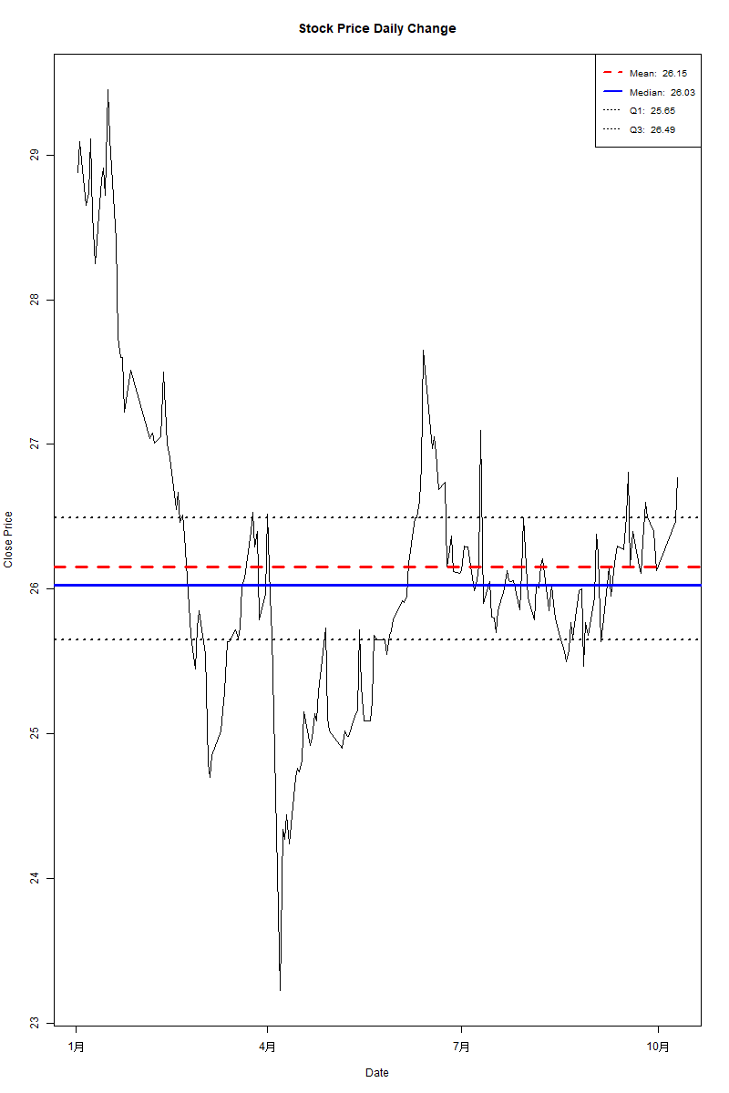
- 图形添加均线,25%,median,75%,四条线–代码:
# Set the working directory
setwd("C:/Users/czliu/Documents/python")# Read the CSV file
df <- read.csv("stock_data_numeric.csv")
colnames(df)# View the first few rows of the data
head(df)# 处理缺失值
# df <- read.csv("data.csv", na.strings = c("NULL", "?"))  # 读取数据
df <- na.omit(df)  # 移除缺失值# 转换日期列(确保列名正确,这里是小写的'date')
df$date <- as.Date(df$date)  # 假设原始日期列名为'date'# 绘制线图
plot(df$close ~ df$date,type = "l",main = "Stock Price Daily Change",xlab = "Date",ylab = "Close Price",ylim = c(min(df$close), max(df$close))
)# 添加多条水平刻度线--Advanced# 1. 平均值 - 红色虚线
mean_price <- mean(df$close)
abline(h = mean_price, col = "red", lwd = 3, lty = 2)# 2. 中位数 - 蓝色实线
median_price <- median(df$close)
abline(h = median_price, col = "blue", lwd = 3, lty = 1)# 3. 上下四分位数 - 黑色点线
q1_price <- quantile(df$close, 0.25)
q3_price <- quantile(df$close, 0.75)
abline(h = q1_price, col = "black", lwd = 2, lty = 3)
abline(h = q3_price, col = "black", lwd = 2, lty = 3)# 添加图例说明
legend("topright", legend = c(paste("Mean: ", round(mean_price, 2)),paste("Median: ", round(median_price, 2)),paste("Q1: ", round(q1_price, 2)),paste("Q3: ", round(q3_price, 2))),col = c("red", "blue", "black", "black"),lwd = c(2, 2, 1, 1),lty = c(2, 1, 3, 3),cex = 0.8)
图形