QML之二导航,通过选项卡的按键切换界面
一、简介
在实际开发过程中,导航界面使用的非常普遍,需要将各个不同的功能进行分类,显示在不同的页面中。可以使用TabBar、TabButton,也可以使用Repeater+StackLayout直接实现。
二、详解
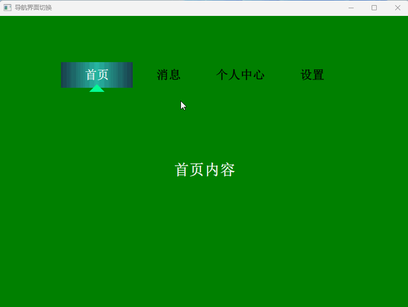
(1)如下是使用Repeater+StackLayout实现灵活的导航布局,将导航切换控件放在这个布局的任意位置,不再局限于顶部位置,在有些情况下特别管用。图片如上图。
import QtQuick 2.15
import QtQuick.Controls 2.15
import QtGraphicalEffects 1.15
import QtQuick.Layouts 1.15ApplicationWindow {visible: truewidth: 800height: 600title: "导航界面切换"Rectangle { //tab topid: tabBarwidth: parent.widthheight: 50anchors.top:tabView.topanchors.topMargin: 90color: "transparent"z:1Row {anchors.centerIn: parentspacing: 0Repeater {model: ["首页", "消息", "个人中心","设置"]Rectangle {id: tabIndexRectwidth: 140height: 50property bool isHovered: falsecolor: "#131f28"gradient: (tabView.currentIndex === index) ? selectedGradient : (isHovered ? hoveredGradient : normalGradient)Gradient {id: selectedGradientorientation: Gradient.HorizontalGradientStop { position: 0.0; color: "#193c4a" } // leftGradientStop { position: 0.5; color: "#27b8a2" } // middleGradientStop { position: 1.0; color: "#193c4a" } // right}Gradient {id: hoveredGradientorientation: Gradient.HorizontalGradientStop { position: 0.0; color: "#12a6b1" } // leftGradientStop { position: 0.5; color: "#1d6267" } // middleGradientStop { position: 1.0; color: "#12a6b1" } // right}Gradient {id: normalGradientGradientStop { position: 0.0; color: "transparent" }GradientStop { position: 1.0; color: "transparent" }}Text {text: modelDataanchors.centerIn: parentfont { pixelSize: 24; family: "Arial"; bold: true}color: tabView.currentIndex === index ? "#FFFFFF" : "black"}Canvas {width: 30height: 15rotation: 180anchors {horizontalCenter: parent.horizontalCenterbottom: parent.bottombottomMargin: -8}visible: tabView.currentIndex === indexonPaint: {var ctx = getContext("2d")ctx.clearRect(0, 0, width, height)ctx.fillStyle = "#03fd95"ctx.beginPath()ctx.moveTo(width/2, height)ctx.lineTo(0, 0)ctx.lineTo(width, 0)ctx.closePath()ctx.fill()}}MouseArea {anchors.fill: parenthoverEnabled: truecursorShape: Qt.PointingHandCursoronEntered: isHovered = trueonExited: isHovered = falseonClicked: tabView.currentIndex = index}}}}}StackLayout {id: tabViewanchors {top: parent.topleft: parent.leftright: parent.rightbottom: parent.bottom}currentIndex: 0Page {Rectangle {anchors.fill: parentcolor: "green"}Label {anchors.centerIn: parenttext: "首页内容"color: "white"font { pixelSize: 30; family: "Arial"; bold: true}}}Page {Rectangle {anchors.fill: parentcolor: "#445ddb"}Label {anchors.centerIn: parenttext: "消息内容"color: "blue"font { pixelSize: 30; family: "Arial"; bold: true}}}Page {Rectangle {anchors.fill: parentcolor: "#c25ace"}Label {anchors.centerIn: parenttext: "个人中心"color: "yellow"font { pixelSize: 30; family: "Arial"; bold: true}}}Page {Rectangle {anchors.fill: parentcolor: "#bdad57"}Label {anchors.centerIn: parenttext: "设置"color: "black"font { pixelSize: 30; family: "Arial"; bold: true}}}}
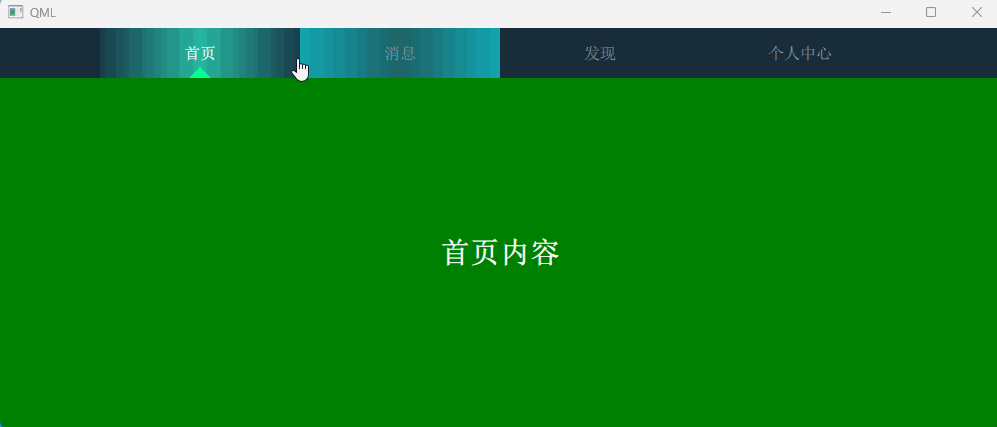
}(2)如下是将导航切换界面,置顶,来实现不同的页面切换,可以对比,选择实际好用的方式。
import QtQuick 2.15
import QtQuick.Controls 2.15
import QtGraphicalEffects 1.15
import QtQuick.Layouts 1.15
ApplicationWindow {width: 1000height: 400visible: true// 主容器Rectangle {anchors.fill: parentcolor: "#f5f5f5"// 标签栏Rectangle {id: tabBarwidth: parent.widthheight: 50color: "#192d3a"Row {spacing: 0anchors.centerIn: parentRepeater {model: ["首页", "消息", "发现", "个人中心"]Rectangle {id: rectDiswidth: 200height: 50property bool isHovered: falsecolor: "#131f28"gradient: (tabView.currentIndex === index) ? selectedGradient : (isHovered ? hoveredGradient : normalGradient)// 非选中状态且未悬停时使用纯色//color: !(tabView.currentIndex === index) && !rectDis.isHovered ? "#f0f0f0" : "transparent"// 定义不同状态的渐变Gradient {id: selectedGradient// GradientStop { position: 0.0; color: "#FF0000" } // 渐变色起始颜色// GradientStop { position: 1.0; color: "#4a9bff" } // 渐变色结束颜色orientation: Gradient.Horizontal  // 关键属性设置水平方向GradientStop { position: 0.0; color: "#193c4a" }  // 左侧红色GradientStop { position: 0.5; color: "#27b8a2" }  // 中间绿色GradientStop { position: 1.0; color: "#193c4a" }  // 右侧蓝色}Gradient {id: hoveredGradient// GradientStop { position: 0.0; color: "#e6f0ff" }// GradientStop { position: 1.0; color: "#cce0ff" }orientation: Gradient.Horizontal  // 关键属性设置水平方向GradientStop { position: 0.0; color: "#12a6b1" }  // 左侧红色GradientStop { position: 0.5; color: "#1d6267" }  // 中间绿色GradientStop { position: 1.0; color: "#12a6b1" }  // 右侧蓝色}Gradient {id: normalGradient// 这里实际上用于选中状态,非选中状态的纯色由上面的 color 属性控制GradientStop { position: 0.0; color: "transparent" }GradientStop { position: 1.0; color: "transparent" }}// 标签文本Text {text: modelDataanchors.centerIn: parentfont { pixelSize: 16; bold: tabView.currentIndex === index }color: tabView.currentIndex === index ? "#FFFFFF" : "#8e9ba7"}// 底部指示三角形Canvas {width: 30height: 15rotation: 180anchors {horizontalCenter: parent.horizontalCenterbottom: parent.bottombottomMargin: -4}visible: tabView.currentIndex === indexonPaint: {var ctx = getContext("2d")ctx.clearRect(0, 0, width, height)ctx.fillStyle = "#03fd95"ctx.beginPath()ctx.moveTo(width/2, height)ctx.lineTo(0, 0)ctx.lineTo(width, 0)ctx.closePath()ctx.fill()}}// 点击区域MouseArea {anchors.fill: parenthoverEnabled: truecursorShape: Qt.PointingHandCursoronEntered: {isHovered = true}onExited: isHovered = falseonClicked: {tabView.currentIndex = index}}}}}}// 内容区域StackLayout {id: tabViewanchors {top: tabBar.bottomleft: parent.leftright: parent.rightbottom: parent.bottom}currentIndex: 0Rectangle {color: "green"Label {anchors.centerIn: parenttext: "首页内容"color: "white"font { pixelSize: 30; family: "Arial"; bold: true}}}Rectangle {color: "#445ddb"Label {anchors.centerIn: parenttext: "消息中心"color: "blue"font { pixelSize: 30; family: "Arial"; bold: true}}}Rectangle {color: "#c25ace"Label {anchors.centerIn: parenttext: "发现频道"color: "yellow"font { pixelSize: 30; family: "Arial"; bold: true}}}Rectangle {color: "#bdad57"Label {anchors.centerIn: parenttext: "个人中心"color: "orange"font { pixelSize: 30; family: "Arial"; bold: true}}}}}
}
三、其他实现
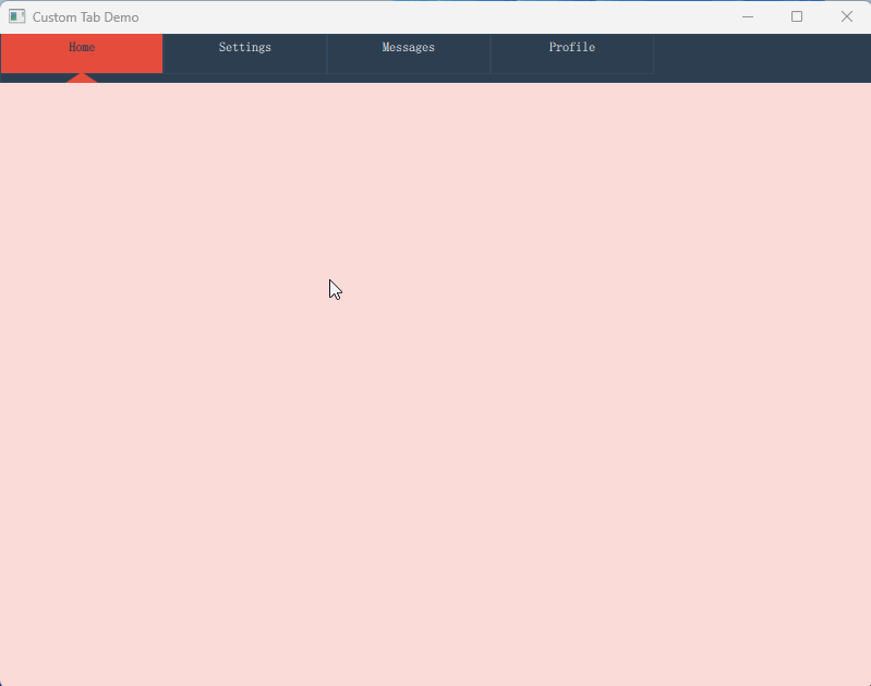
(1)TabBar+TabButton和SwipeView实现切换不同的页面,每个页面显示独立的内容。
import QtQuick 2.15
import QtQuick.Controls 2.15ApplicationWindow {visible: truewidth: 800height: 600title: "Custom Tab Demo"// 自定义TabBarTabBar {id: tabBarwidth: parent.widthheight:45currentIndex: swipeView.currentIndexspacing: 0background: Rectangle {color: "#2c3e50" // Tab栏背景色border.color: "#34495e"}// 四个自定义TabCustomTab {text: "Home"selectedColor: "#e74c3c"indicatorColor: "#e74c3c"}CustomTab {text: "Settings"selectedColor: "#3498db"indicatorColor: "#3498db"}CustomTab {text: "Messages"selectedColor: "#2ecc71"indicatorColor: "#2ecc71"}CustomTab {text: "Profile"selectedColor: "#f39c12"indicatorColor: "#f39c12"}}// 内容区域SwipeView {id: swipeViewanchors.top: tabBar.bottomwidth: parent.widthheight: parent.height - tabBar.heightcurrentIndex: tabBar.currentIndex// 四个对应内容页Page { background: Rectangle { color: "#fadbd8" } }Page { background: Rectangle { color: "#d6eaf8" } }Page { background: Rectangle { color: "#d5f5e0" } }Page { background: Rectangle { color: "#fdebd0" } }}// 自定义Tab组件component CustomTab : TabButton {property color selectedColor: "white"property color indicatorColor: "white"width: 150height: 50background: Rectangle {color: parent.checked ? selectedColor : "transparent"border.color: "#34495e"// 选中状态下的指示器Rectangle {visible: parent.parent.checkedwidth: 30height: 10anchors.horizontalCenter: parent.horizontalCenteranchors.bottom: parent.bottomanchors.bottomMargin: -8rotation: 180clip: truecolor: "transparent"Canvas {anchors.fill: parentonPaint: {var ctx = getContext("2d")ctx.fillStyle = indicatorColorctx.beginPath()ctx.moveTo(0, 0)ctx.lineTo(width, 0)ctx.lineTo(width/2, height)ctx.closePath()ctx.fill()}}}}contentItem: Text {text: parent.textcolor: parent.checked ? "#2c3e50" : "white"font.bold: parent.checkedhorizontalAlignment: Text.AlignHCenterverticalAlignment: Text.AlignVCenter}}
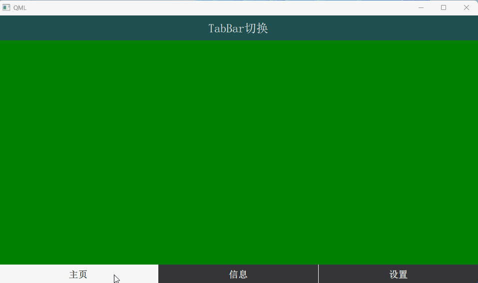
}(2)采用TabBar与StackLayout结合实现底部导航栏,与上述方案有些不同。
import QtQuick 2.15
import QtQuick.Controls 2.15
import QtQuick.Layouts 1.15
import QtQuick.Controls.Material 2.15ApplicationWindow {width: 960height: 540visible: trueRectangle {id: appPlacecolor: "#10021f"anchors.fill: parentRectangle {id: topBarheight: 50color: "#1f504f"anchors.left: parent.leftanchors.right: parent.rightanchors.top: parent.topanchors.rightMargin: 0anchors.leftMargin: 0anchors.topMargin: 0Text {id: text1height: 50text: qsTr("TabBar切换")color: "#ffffff"font.pixelSize: 24anchors.centerIn: parenthorizontalAlignment: Text.AlignHCenterverticalAlignment: Text.AlignVCenter}}}footer: TabBar {id: tabBarcurrentIndex: tabBar.currentIndexMaterial.background:  "#ff0000"width: parent.widthTabButton {font.bold: truefont.pointSize: 14text: qsTr("主页")}TabButton {font.bold: truefont.pointSize: 14text: qsTr("信息")}TabButton {font.bold: truefont.pointSize: 14text: qsTr("设置")}}StackLayout {anchors.fill: parentcurrentIndex: tabBar.currentIndexanchors.top: parent.topanchors.topMargin: 50Item{id: page1Rectangle{id: w1width: 200height: 200anchors.fill: parentcolor: 'green'}}Item {id: page2Rectangle{id: w2width: 200height: 200anchors.fill: parentcolor: 'blue'}}Item {id: page3Rectangle{id: w3width: 200height: 200anchors.fill: parentcolor: 'yellow'}}}
}
四、总结
上述代码提供了提供了完整的代码示例,展示了如何实现标签切换、页面内容更新以及视觉效果的定制,开发者可根据项目需求选择适合的实现方式。