前端实现一个星空特效的效果(实战+讲解)
目录
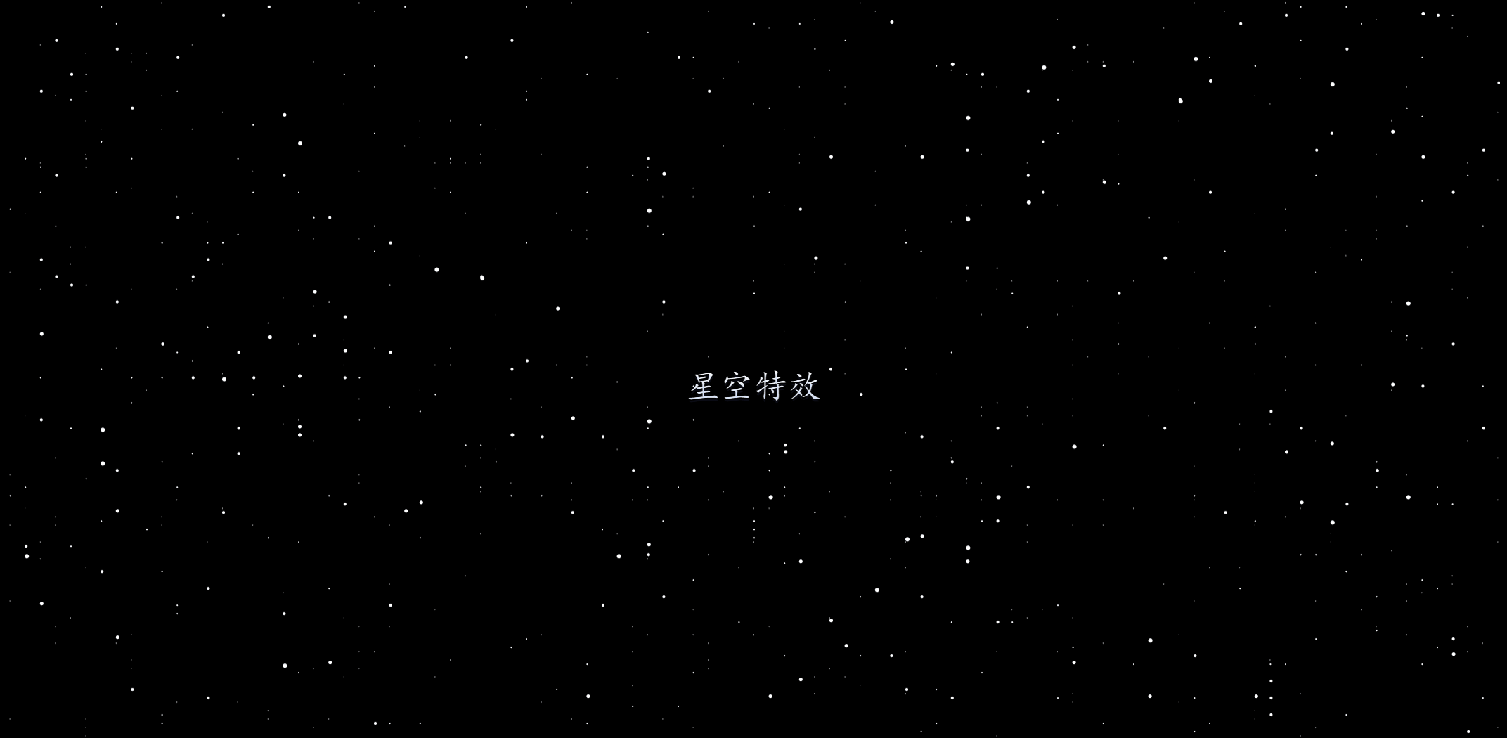
第一章 效果
第二章 实现步骤
第三章 源代码
第一章 效果
第二章 实现步骤
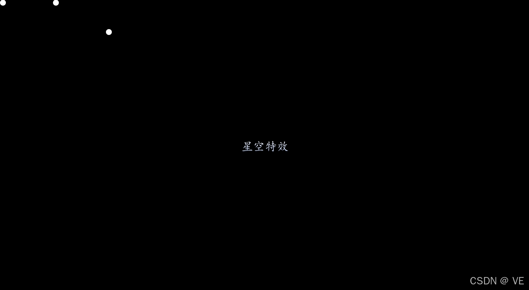
- 首先创建好页面;利用box-shodow的特性我们创建多个星星点
<script setup></script><template><div class="main"><div class="layer_1"></div><div class="layer_2"></div><div class="layer_3"></div><div class="layer_4"></div><div class="layer_5"></div><div class="title">星空特效</div></div>
</template><style scoped lang="scss">
.main {width: 100vw;height: 100vh;display: flex;justify-content: center;align-items: center;background: #000;.title {font-size: 40px;font-family: "楷体";text-shadow: 0px 3px 0px rgba(97, 106, 203, 0.1);background: linear-gradient(0deg, #c9daf7 0%, #ffffff 100%);color: transparent;-webkit-background-clip: text;}.layer_1 {position: fixed;top: 0;left: 0;width: 20px;height: 20px;border-radius: 50%;background-color: #fff;// 我们暂时先用盒子阴影表示星星。注意:盒子阴影是可以有多个的box-shadow: 10vw 0 #fff, 20vw 10vh #fff;}
}
</style>
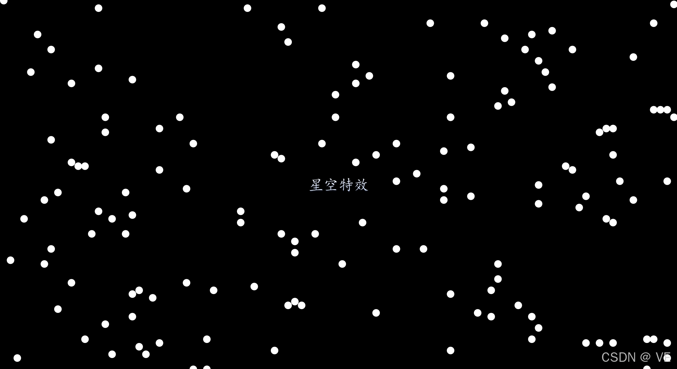
- 由于我们需要很多很多星星,所以我们需要利用sass的特性,写函数实现,而不是一个一个输入
@function star($n) {// 创建第一个阴影$result: "#{random(100)}vw #{random(100)}vh #fff";// for循环,渲染n个阴影@for $i from 2 through $n {$result: "#{$result}, #{random(100)}vw #{random(100)}vh #fff";}@return unquote($result);
}
- 添加动画
@keyframes moveUp {to {transform: translateY(-100vh);}
}
- 解决动画移动到最后留白的问题
// 一个很实用的技巧,在后面再加一个一模一样页面
.layer_1::after {content: "";// inherit: 当前元素继承父元素position: inherit;width: inherit;height: inherit;border-radius: inherit;background-color: inherit;box-shadow: inherit;left: 0;top: 100vh;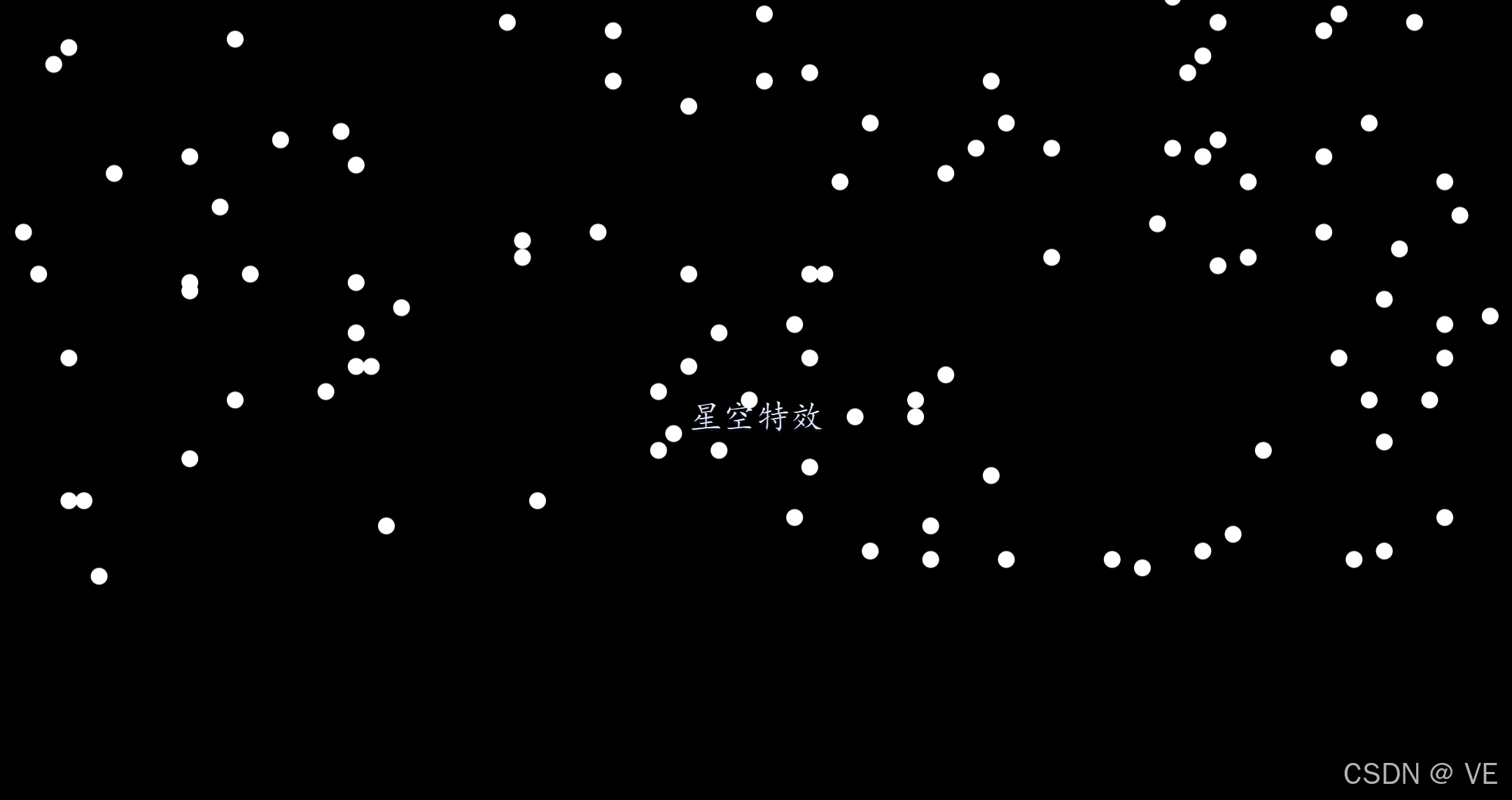
}- 动态渲染5个模板,由近即远的效果,越后面速度越慢,数量越多,用函数写
$n: 5;$duration: 600s;$count: 1000;@for $i from 1 through $n {$duration: floor($duration / 2);$count: floor($count / 2);.layer_#{$i} {position: fixed;top: 0;left: 0;width: #{$i}px;height: #{$i}px;border-radius: 50%;background-color: #fff;// 我们暂时先用盒子阴影表示星星。注意:盒子阴影是可以有多个的box-shadow: star($count);animation: moveUp $duration linear infinite;}// 一个很实用的技巧,在后面再加一个一摸一样页面.layer_#{$i}::after {content: "";// inherit: 当前元素继承父元素position: inherit;width: inherit;height: inherit;border-radius: inherit;background-color: inherit;box-shadow: inherit;left: 0;top: 100vh;}}第三章 源代码
- sass中文文档
https://sass.bootcss.com/documentation.html
- 完整源代码:(复制即可使用)
<script setup></script><template><div class="main"><div class="layer_1"></div><div class="layer_2"></div><div class="layer_3"></div><div class="layer_4"></div><div class="layer_5"></div><div class="title">星空特效</div></div>
</template><style scoped lang="scss">
@function star($n) {// 创建第一个阴影$result: "#{random(100)}vw #{random(100)}vh #fff";// for循环,渲染n个阴影@for $i from 2 through $n {$result: "#{$result}, #{random(100)}vw #{random(100)}vh #fff";}@return unquote($result);
}
.main {width: 100vw;height: 100vh;display: flex;justify-content: center;align-items: center;background: #000;.title {font-size: 40px;font-family: "楷体";text-shadow: 0px 3px 0px rgba(97, 106, 203, 0.1);background: linear-gradient(0deg, #c9daf7 0%, #ffffff 100%);color: transparent;-webkit-background-clip: text;z-index: 1000;}$n: 5;$duration: 600s;$count: 1000;@for $i from 1 through $n {$duration: floor($duration / 2);$count: floor($count / 2);.layer_#{$i} {position: fixed;top: 0;left: 0;width: #{$i}px;height: #{$i}px;border-radius: 50%;background-color: #fff;// 我们暂时先用盒子阴影表示星星。注意:盒子阴影是可以有多个的box-shadow: star($count);animation: moveUp $duration linear infinite;}// 一个很实用的技巧,在后面再加一个一摸一样页面.layer_#{$i}::after {content: "";// inherit: 当前元素继承父元素position: inherit;width: inherit;height: inherit;border-radius: inherit;background-color: inherit;box-shadow: inherit;left: 0;top: 100vh;}}
}@keyframes moveUp {to {transform: translateY(-100vh);}
}
</style>