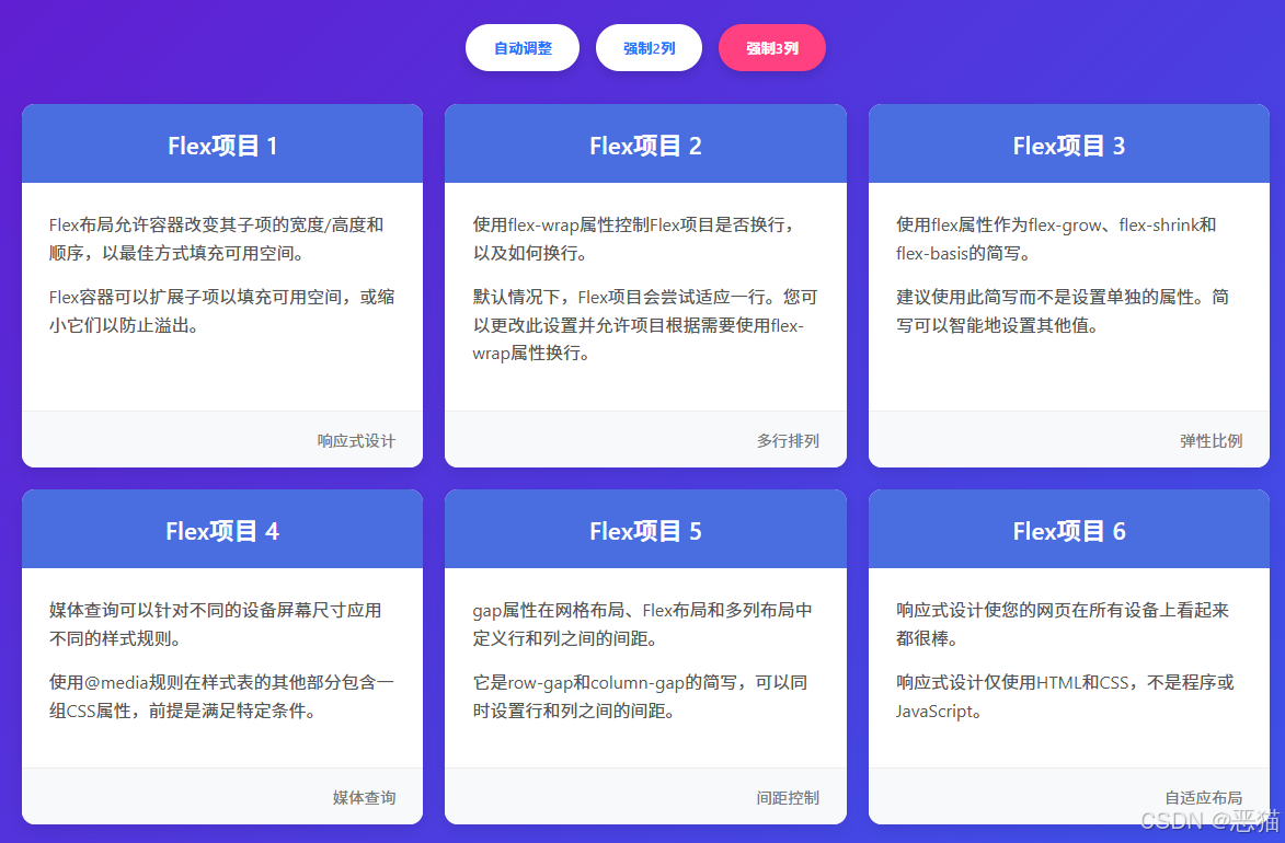
css之Flex响应式多列布局,根据容器宽度自动调整显示2列或3列布局,支持多行排列
display:flex时,要如何设置才可以自适应多列,答案来了,很简单,之前居然看到这个还有人要收费才能看,也真的是有才。
废话不多说,直接上代码。
<!DOCTYPE html>
<html lang="zh-CN">
<head><meta charset="UTF-8"><meta name="viewport" content="width=device-width, initial-scale=1.0"><title>Flex响应式多列布局</title><style>* {margin: 0;padding: 0;box-sizing: border-box;font-family: 'Segoe UI', Tahoma, Geneva, Verdana, sans-serif;}body {background: linear-gradient(135deg, #6a11cb 0%, #2575fc 100%);color: #333;padding: 20px;min-height: 100vh;display: flex;flex-direction: column;align-items: center;}.container {max-width: 1200px;width: 100%;margin: 20px auto;padding: 20px;}header {text-align: center;margin-bottom: 40px;color: white;text-shadow: 0 2px 5px rgba(0, 0, 0, 0.2);}h1 {font-size: 2.8rem;margin-bottom: 15px;}.description {font-size: 1.2rem;max-width: 600px;margin: 0 auto;opacity: 0.9;}.controls {display: flex;justify-content: center;gap: 15px;margin: 30px 0;flex-wrap: wrap;}.btn {padding: 12px 25px;background: white;color: #2575fc;border: none;border-radius: 30px;cursor: pointer;font-weight: 600;transition: all 0.3s;box-shadow: 0 4px 10px rgba(0, 0, 0, 0.15);}.btn:hover {transform: translateY(-3px);box-shadow: 0 6px 15px rgba(0, 0, 0, 0.2);}.btn.active {background: #ff4081;color: white;}/* Flex容器样式 */.flex-container {display: flex;flex-wrap: wrap;gap: 20px;justify-content: center;}/* 默认3列布局 */.flex-item {flex: 1 1 calc(33.333% - 20px);min-width: 280px;background: white;border-radius: 12px;overflow: hidden;box-shadow: 0 5px 15px rgba(0, 0, 0, 0.1);transition: transform 0.3s, box-shadow 0.3s;display: flex;flex-direction: column;}.flex-item:hover {transform: translateY(-5px);box-shadow: 0 10px 25px rgba(0, 0, 0, 0.15);}.item-header {background: #4a6ee0;color: white;padding: 20px;text-align: center;font-size: 1.4rem;font-weight: 600;}.item-content {padding: 25px;flex-grow: 1;}.item-content p {line-height: 1.6;margin-bottom: 15px;color: #555;}.item-footer {background: #f8f9fa;padding: 15px 25px;text-align: right;border-top: 1px solid #eee;color: #777;font-size: 0.9rem;}/* 2列布局 */.layout-2 .flex-item {flex: 1 1 calc(50% - 20px);max-width: calc(50% - 20px);}/* 3列布局 */.layout-3 .flex-item {flex: 1 1 calc(33.333% - 20px);max-width: calc(33.333% - 20px);}/* 响应式设计 */@media (max-width: 900px) {.flex-item {flex: 1 1 calc(50% - 20px);max-width: calc(50% - 20px);}.layout-3 .flex-item {flex: 1 1 calc(50% - 20px);max-width: calc(50% - 20px);}}@media (max-width: 600px) {.flex-item {flex: 1 1 100%;max-width: 100%;}.layout-2 .flex-item,.layout-3 .flex-item {flex: 1 1 100%;max-width: 100%;}h1 {font-size: 2.2rem;}}.code-container {background: #2d2d2d;border-radius: 8px;padding: 20px;margin-top: 40px;color: #f8f8f2;font-family: 'Fira Code', monospace;overflow-x: auto;max-width: 100%;}.code-header {display: flex;justify-content: space-between;align-items: center;margin-bottom: 15px;color: #ffd700;}.code-content {line-height: 1.5;}.comment {color: #969896;}.selector {color: #a6e22e;}.property {color: #66d9ef;}.value {color: #ae81ff;}</style>
</head>
<body><div class="container"><header><h1>Flex响应式多列布局</h1><p class="description">根据容器宽度自动调整显示2列或3列布局,支持多行排列</p></header><div class="controls"><button class="btn active" data-cols="auto">自动调整</button><button class="btn" data-cols="2">强制2列</button><button class="btn" data-cols="3">强制3列</button></div><div class="flex-container layout-3"><div class="flex-item"><div class="item-header">Flex项目 1</div><div class="item-content"><p>Flex布局允许容器改变其子项的宽度/高度和顺序,以最佳方式填充可用空间。</p><p>Flex容器可以扩展子项以填充可用空间,或缩小它们以防止溢出。</p></div><div class="item-footer">响应式设计</div></div><div class="flex-item"><div class="item-header">Flex项目 2</div><div class="item-content"><p>使用flex-wrap属性控制Flex项目是否换行,以及如何换行。</p><p>默认情况下,Flex项目会尝试适应一行。您可以更改此设置并允许项目根据需要使用flex-wrap属性换行。</p></div><div class="item-footer">多行排列</div></div><div class="flex-item"><div class="item-header">Flex项目 3</div><div class="item-content"><p>使用flex属性作为flex-grow、flex-shrink和flex-basis的简写。</p><p>建议使用此简写而不是设置单独的属性。简写可以智能地设置其他值。</p></div><div class="item-footer">弹性比例</div></div><div class="flex-item"><div class="item-header">Flex项目 4</div><div class="item-content"><p>媒体查询可以针对不同的设备屏幕尺寸应用不同的样式规则。</p><p>使用@media规则在样式表的其他部分包含一组CSS属性,前提是满足特定条件。</p></div><div class="item-footer">媒体查询</div></div><div class="flex-item"><div class="item-header">Flex项目 5</div><div class="item-content"><p>gap属性在网格布局、Flex布局和多列布局中定义行和列之间的间距。</p><p>它是row-gap和column-gap的简写,可以同时设置行和列之间的间距。</p></div><div class="item-footer">间距控制</div></div><div class="flex-item"><div class="item-header">Flex项目 6</div><div class="item-content"><p>响应式设计使您的网页在所有设备上看起来都很棒。</p><p>响应式设计仅使用HTML和CSS,不是程序或JavaScript。</p></div><div class="item-footer">自适应布局</div></div></div><div class="code-container"><div class="code-header"><h3>CSS代码示例</h3><span>Flex布局核心代码</span></div><div class="code-content"><span class="comment">/* Flex容器 */</span><br><span class="selector">.flex-container</span> {<br> <span class="property">display</span>: <span class="value">flex</span>;<br> <span class="property">flex-wrap</span>: <span class="value">wrap</span>;<br> <span class="property">gap</span>: <span class="value">20px</span>;<br> <span class="property">justify-content</span>: <span class="value">center</span>;<br>}<br><br><span class="comment">/* 默认3列布局 */</span><br><span class="selector">.flex-item</span> {<br> <span class="property">flex</span>: <span class="value">1 1 calc(33.333% - 20px)</span>;<br> <span class="property">min-width</span>: <span class="value">280px</span>;<br>}<br><br><span class="comment">/* 2列布局 */</span><br><span class="selector">.layout-2 .flex-item</span> {<br> <span class="property">flex</span>: <span class="value">1 1 calc(50% - 20px)</span>;<br> <span class="property">max-width</span>: <span class="value">calc(50% - 20px)</span>;<br>}<br><br><span class="comment">/* 媒体查询 - 中等屏幕 */</span><br>@<span class="value">media</span> (<span class="property">max-width</span>: <span class="value">900px</span>) {<br> <span class="selector">.flex-item</span> {<br> <span class="property">flex</span>: <span class="value">1 1 calc(50% - 20px)</span>;<br> <span class="property">max-width</span>: <span class="value">calc(50% - 20px)</span>;<br> }<br>}<br><br><span class="comment">/* 媒体查询 - 小屏幕 */</span><br>@<span class="value">media</span> (<span class="property">max-width</span>: <span class="value">600px</span>) {<br> <span class="selector">.flex-item</span> {<br> <span class="property">flex</span>: <span class="value">1 1 100%</span>;<br> <span class="property">max-width</span>: <span class="value">100%</span>;<br> }<br>}</div></div></div><script>// 切换布局功能document.querySelectorAll('.btn').forEach(button => {button.addEventListener('click', function() {// 更新按钮状态document.querySelectorAll('.btn').forEach(btn => {btn.classList.remove('active');});this.classList.add('active');// 获取布局类型const cols = this.getAttribute('data-cols');const container = document.querySelector('.flex-container');// 移除现有布局类container.classList.remove('layout-2', 'layout-3');// 添加新布局类if (cols !== 'auto') {container.classList.add('layout-' + cols);}});});</script>
</body>
</html>关键点说明
display: flex - 创建Flex容器
flex-wrap: wrap - 允许项目换行
gap: 20px - 设置项目之间的间距
flex: 1 1 calc(33.333% - 20px) - 设置项目弹性比例和基础宽度
第一个值:flex-grow(扩展比例)
第二个值:flex-shrink(收缩比例)
第三个值:flex-basis(基础宽度)
媒体查询 - 根据屏幕宽度调整布局
这个布局会根据容器宽度自动调整,宽时显示3列,窄时显示2列,非常窄时显示1列。您可以通过顶部的按钮手动切换布局模式。