Vue3+TS 流星夜景
目录
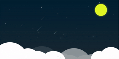
一、效果展示
二、组件分析
三、代码展示
github源码获取
一、效果展示
二、组件分析
1.Mask:黑色、0.5透明度的背景色,作为主背景,渲染出与夜幕相同的颜色。
2.Moon:黄色圆形,添加黄色阴影,作为月亮,渲染出月亮的炫光效果。
3.Sky:利用线性过度,由上到下的逐渐降低透明度,与Mask组件混合出夜色。
4.Stars:随机在添加白色圆点,利用@keyframes和TS代码,制作出闪烁效果。
5.Meteor:与Stars相同,但动画效果由TS代码控制,获取流星的初始位置并计算出终点位置,以长度和随机出的飞行时间,控制步长,制作出流星飞行效果。
6.Could:利用伪元素after和before制作云层效果,再利用vue的props传递不同的位置和透明度,制作出云层重叠效果。
三、代码展示
1.Mask
<template><div id="mask"></div>
</template><script lang="ts">
export default {name:'Mask'
}
</script><style scoped>#mask{position: absolute;left: 0;right: 0;top: 0;bottom: 0;background-color: rgba(0, 0, 0, 0.8);width: 100%;height: 100%;z-index: 999;}
</style>
2.Moon
<template><div id="moon"></div>
</template><script lang="ts">
export default {name:'Moon'
}
</script><style scoped>#moon{position: absolute;top: 50px;right: 150px;width: 150px;height: 150px;border-radius: 50%;background-color: rgba(251, 255, 25, .9);box-shadow: 0 0 20px rgba(251, 255, 25, .5);z-index: 9999;}
</style>
3.Sky
<template><div id="sky"></div>
</template><script lang="ts" name='Sky' setup></script><style scoped>#sky{position: absolute;left: 0;right: 0;top: 0;bottom: 0;width: 100%;height: 100%;background: linear-gradient(rgba(0,150,255,1),rgba(0,150,255,.8),rgba(0,150,255,.5) );}
</style>
4.Stars
<template><div id="stars" ref="stars"></div>
</template><script lang="ts">
export default {name: "Stars",
};
</script><script lang="ts" setup>
import { ref, onMounted, onUnmounted } from "vue";const stars = ref<HTMLDivElement | null>(null);
let timer: number | null = null;function starsCreate() {if (stars.value) {for (let i = 1; i <= 16; i++) {// 每个星星添加随机延迟(0-500ms),避免同时出现const delay = Math.random() * 500;setTimeout(() => {if (!stars.value) return;const star = document.createElement("div");star.className = "star";// 随机位置star.style.left = `${Math.random() * 100}%`;star.style.top = `${Math.random() * 80}%`;// 随机大小 (2-6px)const size = Math.random() * 4 + 2;star.style.width = `${size}px`;star.style.height = `${size}px`;// 随机动画时长 (2-4秒) - 更长的周期让闪烁更舒缓const duration = Math.random() * 2 + 2;star.style.animationDuration = `${duration}s`;// 初始透明度为0(用于渐入)star.style.opacity = "0";// 随机最终亮度const finalOpacity = Math.random() * 0.4 + 0.6;stars.value.appendChild(star);// 触发渐入动画(必须在DOM更新后)setTimeout(() => {star.style.opacity = `${finalOpacity}`;}, 10);// 动画结束后淡出并移除setTimeout(() => {if (star.parentNode) {star.style.opacity = "0";setTimeout(() => star.remove(), 800); // 更长的淡出时间}}, duration * 1000);}, delay);}}
}onMounted(() => {starsCreate();timer = window.setInterval(starsCreate, 2000);
});onUnmounted(() => {if (timer) {clearInterval(timer);}
});
</script><style>
#stars {position: absolute;left: 0;right: 0;top: 0;bottom: 0;overflow: hidden;
}.star {position: absolute;background-color: rgba(255, 255, 255, 0.9);border-radius: 50%;box-shadow: 0 0 15px rgba(255, 255, 255, 0.5);z-index: 9998;/* 延长过渡时间,使透明度变化更平滑 */transition: opacity 0.8s ease-in-out, transform 0.5s ease;animation: twinkle forwards infinite; /* 循环闪烁 */transform: scale(0.5); /* 初始缩小状态 */
}/* 调整闪烁动画节奏,让变化更平缓 */
@keyframes twinkle {0% {box-shadow: 0 0 5px rgba(255, 255, 255, 0.3);transform: scale(0.8);}50% {box-shadow: 0 0 20px rgba(255, 255, 255, 0.8);transform: scale(1);}100% {box-shadow: 0 0 5px rgba(255, 255, 255, 0.3);transform: scale(0.8);}
}
</style>
5.Meteor
<template><div id="meteor-container" ref="meteors"></div>
</template><script lang="ts">
export default {name:"Meteor"
}
</script><script lang="ts" setup>
import { ref, onMounted, onUnmounted } from "vue";const meteors = ref<HTMLDivElement | null>(null);
let timer: number | null = null;function animationMeteor(meteor: HTMLElement) {const startLeft = parseFloat(meteor.style.left);const startTop = parseFloat(meteor.style.top);// 1. 增加移动距离(原20-30% → 改为50-150%)const distance = Math.random() * 10 + 20; // 2. 缩短动画时长(原200-300ms → 改为100-300ms)const duration = Math.random() * 1000 + 2000; const startTime = performance.now();const fadeInDuration = 1000;function updatAnimation(currentTime: number) {// 3. 修复进度计算错误(原代码重复除以duration,导致进度异常)const elapsed = currentTime - startTime; // 正确:已运行的毫秒数const progress = Math.min(elapsed / duration, 1); // 进度 = 已运行时间 / 总时长const opacity = 1 - progress;// 4. 增加X轴移动幅度(让横向速度更快,匹配45度角视觉)meteor.style.left = `${startLeft - distance * progress}%`; meteor.style.top = `${startTop + distance * progress}%`;if(elapsed <= fadeInDuration){meteor.style.animation=`enterMeteor ${fadeInDuration/1000}s`}else{meteor.style.opacity = opacity.toString();}if (progress < 1) {requestAnimationFrame(updatAnimation);} else {meteor.remove();}}requestAnimationFrame(updatAnimation);
}function meteorCreate() {if (meteors.value) {for (let i = 1; i <= 4; i++) {const delay = Math.random() * 1500;const meteor = document.createElement("div");meteor.className = "meteor";// 5. 限制初始位置在顶部/右侧(避免从屏幕中间开始,让移动距离更完整)meteor.style.left = `${20 + Math.random() * 70}%`; // 右侧30%-100%出现meteor.style.top = `${Math.random() * 50}%`; // 顶部0%-40%出现// 随机长度const tailLength = Math.random() * 50 + 50;meteor.style.setProperty("--tail-length", `${tailLength}px`);// 随机亮度const brightness = Math.random() * 0.2 + 0.6;meteor.style.setProperty("--brightness", `${brightness}`);setTimeout(() => {if(meteors.value){meteors.value.appendChild(meteor);animationMeteor(meteor);}}, delay);}}
}onMounted(() => {meteorCreate();//缩短生成间隔(原3000ms → 2000ms,流星更密集,增强速度感)timer = window.setInterval(() => {meteorCreate();}, 2000);
});// 补充:组件卸载时清理定时器,避免内存泄漏
onUnmounted(() => {if (timer) clearInterval(timer);
});
</script><style>
#meteor-container {position: absolute;left: 0;right: 0;top: 0;bottom: 0;overflow: hidden;
}.meteor {position: absolute;opacity: 1;z-index: 10000;--tail-length: 60px;--brightness: 0.8;
}.meteor::after {content: "";display: block;border: solid;border-width: 2px 0 2px var(--tail-length);border-color: transparent transparent transparentrgba(255, 255, 255, var(--brightness));border-radius: 2px 0 0 2px;transform: rotate(-45deg);transform-origin: 0 0 0;box-shadow: 0 0 20px rgba(255, 255, 255, var(--brightness) * 0.5);
}@keyframes enterMeteor{0%{opacity: 0;}50%{opacity: var(--brightness/2);}100%{opacity: var(--brightness);}
}
</style>
6.Could
<template><div id="Cloud-Container" ref="cloudContainer"><div class="cloud cloud-1"></div><div class="cloud cloud-2"></div><div class="cloud cloud-3"></div></div>
</template><script lang="ts">
import { onMounted, ref } from "vue";
export default {name: "Cloud",props: ["op", "posLeft",'posBottom'],setup(props) {const cloudContainer = ref<HTMLDivElement | null>(null);onMounted(() => {if(cloudContainer.value){cloudContainer.value.style.opacity = props.opcloudContainer.value.style.left = `${props.posLeft}px`cloudContainer.value.style.bottom = `${-props.posBottom}px`}});return { cloudContainer };},
};
</script><style scoped>
#Cloud-Container{position: fixed;left: 0;bottom: 0;width: 100%;z-index: 10000;
}
.cloud {position: absolute;background-color: #fff;--opacity: 1;
}.cloud-1 {bottom: 210px;left: -100px;z-index: 1000;opacity: 1;transform: scale(1.5);
}
.cloud-1::after {content: "";position: absolute;bottom: -250px;left: 200px;width: 200px;height: 200px;border-radius: 50%;background: linear-gradient(to bottom,rgba(255, 255, 255, 1) 50%,transparent 10%);
}
.cloud-1::before {content: "";position: absolute;width: 300px;height: 300px;border-radius: 50%;background: linear-gradient(to bottom,rgba(255, 255, 255, 1) 50%,transparent 10%);
}
.cloud-2 {right: 350px;bottom: 100px;z-index: 1000;
}.cloud-2::after {content: "";position: absolute;bottom: -250px;left: 100px;width: 300px;height: 300px;border-radius: 50%;background: linear-gradient(to bottom,rgba(255, 255, 255, 1) 50%,transparent 10%);
}
.cloud-2::before {content: "";position: absolute;width: 200px;height: 200px;border-radius: 50%;background: linear-gradient(to bottom,rgba(255, 255, 255, 1) 50%,transparent 10%);
}.cloud-3 {left: 220px;bottom: 50px;z-index: 999;
}
.cloud-3::after {content: "";position: absolute;bottom: -250px;left: 100px;width: 300px;height: 300px;border-radius: 50%;background: linear-gradient(to bottom,rgba(255, 255, 255, 1) 50%,transparent 10%);
}
.cloud-3::before {content: "";position: absolute;bottom: -200px;left: 300px;width: 300px;height: 250px;border-radius: 50%;background: linear-gradient(to bottom,rgba(255, 255, 255, 1) 50%,transparent 10%);
}
</style>
7.App
<template><Mask/><Moon/><Sky/><Stars/><Meteor/><Cloud :op="1" :posLeft="0"  :posBottom="0"/><Cloud :op="0.5" :posLeft="800" :posBottom="75"/><Cloud :op="0.1" :posLeft="400"  :posBottom="50"/>
</template><script lang="ts">
import Cloud from './components/Cloud.vue';
import Mask from './components/Mask.vue';
import Moon from './components/Moon.vue';
import Sky from './components/Sky.vue';
import Stars from './components/Stars.vue';
import Meteor from './components/Meteor.vue';export default {name: 'App',components: {Mask,Moon,Sky,Stars,Cloud,Meteor}
}
</script><!-- <script setup lang="ts"></script> --><style>*{padding: 0;margin: 0;}html,body{width: 100%;height: 100%;min-width: 1000px;min-height: 400px;overflow: hidden;}
</style>