CSS 3D动画,围绕旋转动画Demo
效果:
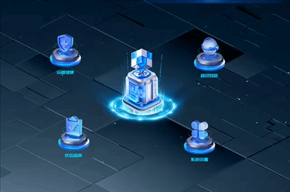
鼠标移入停止旋转移出继续旋转,这种效果有一个问题就是中心的图片层级较高,四周的小图片层级较低,小图片旋转至前面时会被中心的图片覆盖,所以鼠标移入移出时可能会选不中图片,会导致无法停止、继续播放动画需要注意!可以通过调整位置,错位的方式解决或者调整z-index属性层级显示。
<div class="content"><div class="skin_action"><div class="centerIcon"></div><div class="planet"><div class="ball ball1"></div><div class="ball ball2"></div><div class="ball ball3"></div><div class="ball ball4"></div></div></div>
</div>
CSS:
.skin_action{width: 50%;height: 87%;position: relative;left: 10%;top: 5%;
}
.centerIcon{width: 60%;height: 50%;background-image: url('/img/newLogin-centerIcon.png');background-size: 100% 100%;background-repeat: no-repeat;background-position: center;position: relative;z-index: 1;left: 20%;top: 13%;
}
.skin_action .planet {/*border: 2px solid #fff;*/width: 90%;height: 100%;transform-style: preserve-3d;animation: planet-rotate 30s linear infinite;position: relative;z-index: 0;top: -57%;left: 5%;
}
.skin_action .ball1 {width: 25%;height: 30%;left: 0%;top: 0%;cursor: pointer;position: absolute;background-image: url("/img/newLogin-ydhlIcon.png");background-size: 100% 100%;background-repeat: no-repeat;background-position: center;animation: ball1-rotate 30s linear infinite;
}
.skin_action .ball2 {width: 25%;height: 30%;left: 80%;top: 0%;cursor: pointer;position: absolute;background-image: url("/img/newLogin-xtszIcon.png");background-size: 100% 100%;background-repeat: no-repeat;background-position: center;animation: ball1-rotate 30s linear infinite;
}
.skin_action .ball3 {width: 25%;height: 30%;left: 0%;top: 80%;cursor: pointer;position: absolute;background-image: url("/img/newLogin-sbjkIcon.png");background-size: 100% 100%;background-repeat: no-repeat;background-position: center;animation: ball1-rotate 30s linear infinite;
}
.skin_action .ball4 {width: 25%;height: 30%;left: 80%;top: 70%;cursor: pointer;position: absolute;background-image: url("/img/newLogin-ztjcIcon.png");background-size: 100% 100%;background-repeat: no-repeat;background-position: center;animation: ball1-rotate 30s linear infinite;
}@keyframes planet-rotate {0% {transform: rotate(0deg) scaleY(0.5) rotate(0);}100% {transform: rotate(0deg) scaleY(0.5) rotate(360deg);}
}
@keyframes ball1-rotate {0% {transform: rotate(0) scaleY(2) rotate(0deg);}100% {transform: rotate(-360deg) scaleY(2) rotate(0deg);}}
JS:
/*鼠标移入时暂停动画*/$(document).ready(function() {var $planet = $('.planet');var $boxes = $('.ball');// 鼠标移入时暂停动画$('.planet .ball,.planet').on('mouseenter', function() {$planet.css('animation-play-state', 'paused');$boxes.css('animation-play-state', 'paused');});// 鼠标移出时恢复动画$('.planet .ball,.planet').on('mouseleave', function() {$planet.css('animation-play-state', 'running');$boxes.css('animation-play-state', 'running');});});