Antd中使用Table集成 react-resizable实现可伸缩列
需求:需要实现可自定义拖拽宽度的Table列表
官方文档:集成 react-resizable 来实现可伸缩列。
问题
直接安装npm install react-resizable --save
会直接报错
ERROR  Failed to compile with 1 errors                                                                                                                                                 17:25:56error  in ./node_modules/react-draggable/build/cjs/Draggable.jsModule parse failed: Unexpected token (210:22)
You may need an appropriate loader to handle this file type, currently no loaders are configured to process this file. See https://webpack.js.org/concepts#loaders
|   // the underlying DOM node ourselves. See the README for more information.
|   findDOMNode() /*: ?HTMLElement*/{
>     return this.props?.nodeRef?.current ?? _reactDom.default.findDOMNode(this);
|   }
|   render() /*: ReactElement<any>*/{@ ./node_modules/react-draggable/build/cjs/cjs.js 6:4-26@ ./node_modules/react-resizable/build/Resizable.js@ ./node_modules/react-resizable/index.js
在查阅网上内容后 把问题定位在安装的 react-resizable版本兼容上 因为当前公司项目使用的是Antd3.x 偏老的项目
兼容版本
| 依赖库 | 推荐版本 | 说明 |
|---|---|---|
antd | 3.x (如 3.26.20) | Ant Design 3.x 主版本 |
react-resizable | 1.x (如 1.11.1) | 支持 React 16+,与 Antd 3.x 兼容 |
react-draggable | 4.x (如 4.4.5) | react-resizable@1.x 的 peerDependency |
问题解决 | 安装命令
npm install antd@3.x react-resizable@1.11.1 react-draggable@4.4.5
完整步骤
1. 确保 react-resizable 的样式文件被正确引入
react-resizable 需要手动引入其 CSS 样式文件,否则拖拽手柄会不可见。
在代码顶部添加以下引入语句:
import "react-resizable/css/styles.css"; // 必须引入!如果使用 Umi.js,确保样式文件能被 Webpack 正确处理。如果仍然不生效,可以尝试在 global.less 中直接复制样式内容:
/* global.less */
.react-resizable {position: relative;
}
.react-resizable-handle {position: absolute;width: 10px;height: 100%;bottom: 0;right: -5px;cursor: col-resize;background: transparent;z-index: 1;
}
.react-resizable-handle:hover {background: #eee;
}
2. 检查 react-resizable 和 react-draggable 的版本
Antd 3.x 需要配合 react-resizable@1.x 和 react-draggable@4.x,版本过高可能导致兼容性问题。
安装指定版本:
npm install react-resizable@1.11.1 react-draggable@4.4.53. 确认 Umi.js 的配置
如果样式仍未生效,可能是 Umi.js 的 CSS 加载顺序问题。
在 Umi 的配置文件(如 .umirc.ts)中检查以下配置:
export default {// 确保 CSS 相关 loader 配置正确cssLoader: {modules: {localIdentName: '[local]', // 避免样式被哈希化},},// 如果需要,显式注入样式styles: ['https://unpkg.com/react-resizable@1.11.1/css/styles.css'],
};
4. 检查 DOM 结构是否正确
在浏览器开发者工具中检查 <th> 元素是否包含 react-resizable-handle 子元素:
-
如果存在但不可见,说明样式未生效(回到步骤 1)。
-
如果根本不存在,说明
Resizable组件未正确渲染(检查版本或代码逻辑)。
5. 完整代码修正示例
import React from "react";
import { Table } from "antd";
import { Resizable } from "react-resizable";
import "react-resizable/css/styles.css"; // 关键!确保引入样式const ResizableTitle = (props) => {const { onResize, width, ...restProps } = props;return (<Resizablewidth={width}height={0}onResize={onResize}draggableOpts={{ enableUserSelectHack: false }}><th {...restProps} /></Resizable>);
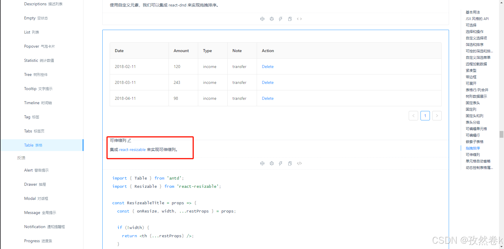
};class Demo extends React.Component {state = {columns: [{ title: "Date", dataIndex: "date", width: 200 },{ title: "Amount", dataIndex: "amount", width: 100 },{ title: "Type", dataIndex: "type", width: 100 },{ title: "Note", dataIndex: "note", width: 100 },{ title: "Action", key: "action", render: () => <a>Delete</a> },],};components = {header: {cell: ResizableTitle,},};handleResize = (index) => (e, { size }) => {this.setState(({ columns }) => {const nextColumns = [...columns];nextColumns[index] = { ...nextColumns[index], width: size.width };return { columns: nextColumns };});};render() {const columns = this.state.columns.map((col, index) => ({...col,onHeaderCell: (column) => ({width: column.width,onResize: this.handleResize(index),}),}));return (<Tableborderedcomponents={this.components}columns={columns}dataSource={this.data}/>);}
}export default Demo;在 global.less 或你的全局样式文件中,添加以下 CSS:
/* 覆盖 react-resizable 默认的斜向拖动手柄 */
.react-resizable-handle {position: absolute;width: 10px !important;       /* 调整手柄宽度 */height: 100% !important;      /* 手柄高度和表头一致 */bottom: 0;right: -5px;                  /* 让手柄稍微超出列边界 */cursor: col-resize !important; /* 列调整光标 */background-color: transparent !important;z-index: 1;
}/* 鼠标悬停时显示手柄 */
.react-resizable-handle:hover {background-color: #f0f0f0 !important;
}/* 确保表头单元格可以触发拖拽 */
.react-resizable {position: relative !important;
}
最终效果