纯flex布局来写瀑布流
项目场景:
提示:这里简述项目相关背景:
这里使用了flex 布局 来形成瀑布流
解决方案:
提示:这里填写该问题的具体解决方案:
1:方法1
<divstyle="max-width: 1500px;min-width: 300px;margin-right: 60px;height: 500px;padding: 10px;border: 1px solid #ccc;"
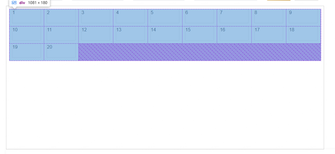
><div style="display: flex; flex-wrap: wrap;width:100%;height:100%">/*flex 根据需要调整列宽和间距 0不放大 1会缩小 设置占据的主轴空间 减去两边margin 内部的margin不用 因为在100% 的宽度里比如 下面的 margin:0 15px; 那么就应该 flex: 0 1 calc(33.333% - 30px)*/<divstyle="flex: 0 1 calc(33.333% - 20px);margin: 0 10px;margin-bottom: 10px; /* 列间距 */box-sizing: border-box;border: 1px solid #ddd;"v-for="i in 20">{{ i }}</div></div>
</div>为20
为10
2:方法2
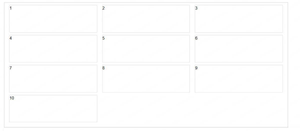
需要设定宽高,不然宽高要靠内容撑起来
<divstyle="max-width: 1500px;min-width: 300px;margin-right: 60px;height: 500px;padding: 10px;border: 1px solid #ccc;"><div style="display: flex; flex-wrap: wrap; align-content: center"><divclass=""style="margin: 0 10px;margin-bottom: 10px; /* 列间距 */box-sizing: border-box;border: 1px solid #ddd;width: 100px;height: 50px;"v-for="i in 20">{{ i }}</div></div>
</div>
布局样式