Android Studio新手开发第二十五天
目录
视图构建过程(一)
视图的构造方法
视图构建过程(一)
Android自带的控件外观有时候不尽人意,常常需要修改某些属性,如按钮有文本颜色、文字大小、字母默认大写等属性需要修改。如果只有一两个按钮还好,但若有许多个按钮,为了统一风格就需要一个一个去修改属性或者改变风格也要一个一个去修改,这样就很麻烦。如果将统一的风格定义在一个地方再引用,这样若要改变风格就只需要修改一个地方。这种方式需要在res/values目录下的styles.xml添加样式代码,若无该文件就新建一个即可,代码示例如下:
<?xml version="1.0" encoding="utf-8"?>
<resources><style name="button_style"><item name="android:text">20</item><item name="android:textColor">@color/red</item><item name="android:textAllCaps">false</item></style>
</resources>//在对应的按钮中添加如下属性
style="@style/button_style"
虽然利用styles.xml自定义样式,不过若忘了添加style属性就不管用了,而且样式只能修改已有的属性,不能添加新的属性以及新方法。若想要灵活的定制控件外观就需要通过自定义控件实现了。
视图的构造方法
自定义控件本身实质上是一个Java类,有其本身的构造方法。以View视图基类为例,它有四个构造方法,说明如下:
View(Context context):带一个参数的构造方法,在Java代码中通过代码动态创建 View 时调用,如new关键字创建视图对象时调用该构造方法。
View(Context context,AttributeSet attrs):带两个参数的构造方法,在xml文件中添加视图节点时会调用该构造方法。
View(Context context,AttributeSet attrs,int defStyleAttr):带三个参数的构造方法,在采取默认的样式属性时会调用该构造方法。若defStyleAttr为0则表示无默认样式。
View(Context context,AttributeSet attrs,int defStyleAttr,int defStyleRes):带四个参数的工构造方法,在采取默认样式资源时会调用该构造方法。若defStyleRes为0则表示无样式资源。
以上四个构造方法,前两个必须实现,否则不能在Java代码中创建视图对象或者不能在xml文件中添加视图节点。后两个则与styles.xml中的样式配置有关。其中的参数defStyleAttr与res/values目录下的attrs.xml中的样式配置有关,若无该文件就先新建一个,然后往里面添加一些配置,如下所示。在里面定义了属性名称为customButtonStyle,属性格式为引用类型reference,也就是说具体的样式在别的地方定义的,而这个地方就是在styles.xml中定义具体的样式配置。那么如何将两者联系起来呢?在AndroidManifest.xml文件中的application节点上有一个属性android:theme,它是app的主题属性,打开它引用的主题所在文件,在里面添加一项customButtonStyle并指定对应的样式,代码如下面所示。
attrs.xml中的代码。
<?xml version="1.0" encoding="utf-8"?>
<resources><declare-styleable name="Button_Custom"><attr name="customButtonStyle" format="reference"/></declare-styleable>
</resources>
styles.xml中的代码。
<?xml version="1.0" encoding="utf-8"?>
<resources><style name="customButtonStyle"><!--文本大小--><item name="android:textSize">20sp</item><!--文本颜色--><item name="android:textColor">@color/black</item><!--字母大小写--><item name="android:textAllCaps">false</item><!--按钮文本--><item name="android:text">自定义按钮</item><!--按钮背景--><item name="android:background">#FFBFBFBF</item><!--内边距--><item name="android:padding">10dp</item></style>
</resources>
APP主题中的代码
<resources xmlns:tools="http://schemas.android.com/tools"><!-- Base application theme. --><style name="Theme.MyApplicationForStudy" parent="Theme.MaterialComponents.DayNight.DarkActionBar"><!-- Primary brand color. --><item name="colorPrimary">@color/purple_500</item><item name="colorPrimaryVariant">@color/purple_700</item><item name="colorOnPrimary">@color/white</item><!-- Secondary brand color. --><item name="colorSecondary">@color/teal_200</item><item name="colorSecondaryVariant">@color/teal_700</item><item name="colorOnSecondary">@color/black</item><!-- Status bar color. --><item name="android:statusBarColor" tools:targetApi="l">?attr/colorPrimaryVariant</item><!-- Customize your theme here. --><!--新添加的内容在这--><item name="customButtonStyle">@style/customButtonStyle</item></style><style name="Theme.MyApplicationForStudy.NoActionBar"><item name="windowActionBar">false</item><item name="windowNoTitle">true</item></style>
</resources>
完成上面的操作后需要新建一个继承于按钮的类并编写代码,部分代码如下所示。重点在于第二个构造方法上,将刚刚新建的样式设置为默认样式。
@SuppressLint("AppCompatCustomView")
public class Button_Custom extends Button {public Button_Custom(Context context) {super(context);}public Button_Custom(Context context, AttributeSet attrs) {this(context, attrs, R.attr.customButtonStyle);}public Button_Custom(Context context, AttributeSet attrs, int defStyleAttr) {super(context, attrs,defStyleAttr);}public Button_Custom(Context context, AttributeSet attrs, int defStyleAttr, int defStyleRes) {super(context, attrs, defStyleAttr, defStyleRes);}
}
最后在页面的布局文件中添加这个新建成的按钮,如下所示。要使用这个按钮需要完整路径。
<?xml version="1.0" encoding="utf-8"?>
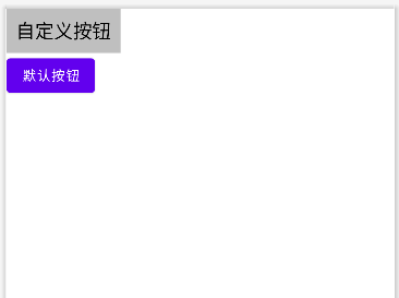
<LinearLayout xmlns:android="http://schemas.android.com/apk/res/android"xmlns:app="http://schemas.android.com/apk/res-auto"xmlns:tools="http://schemas.android.com/tools"android:layout_width="match_parent"android:layout_height="match_parent"android:orientation="vertical"tools:context=".CustomWidget.CustomButtonActivity"><com.example.myapplicationforstudy.Widget.Button_Customandroid:layout_width="wrap_content"android:layout_height="wrap_content" /><Buttonandroid:layout_width="wrap_content"android:layout_height="wrap_content"android:text="默认按钮"/></LinearLayout>效果图如下,可以区分两个按钮的区别。
上面的方法在实现上比较麻烦,需要修改多个地方。若使用第四个构造方法就可以简化这些操作。代码示例如下,在第三个构造方法中调用第四个构造方法设置样式资源,将defStyleAttr设置为0是因为它的优先级要高于defStyleRes,而它又低于style属性。它们的优先级顺序为style属性>defStyleAttr>defStyleRes。
//这个 Lint 检查规则专门针对自定义 View 的 AppCompat 兼容性问题
//当你创建自定义 View 时,如果直接继承自 Android 原生 View(如 TextView, Button 等),而不是 AppCompat 的对应组件,Lint 会发出警告。
@SuppressLint("AppCompatCustomView")
public class Button_Custom extends Button {public Button_Custom(Context context) {super(context);}public Button_Custom(Context context, AttributeSet attrs) {this(context, attrs, R.attr.customButtonStyle);}public Button_Custom(Context context, AttributeSet attrs, int defStyleAttr) {this(context, attrs,0,R.style.customButtonStyle);}
//当你的代码中使用了高于 minSdkVersion 的 API 时,Lint 会发出警告,这个注解可以消除这些警告。@SuppressLint("NewApi")public Button_Custom(Context context, AttributeSet attrs, int defStyleAttr, int defStyleRes) {super(context, attrs, defStyleAttr, defStyleRes);}
}