开源 C++ QT QML 开发(八)自定义控件--圆环
文章的目的为了记录使用QT QML开发学习的经历。开发流程和要点有些记忆模糊,赶紧记录,防止忘记。
相关链接:
开源 C++ QT QML 开发(一)基本介绍
开源 C++ QT QML 开发(二)工程结构
开源 C++ QT QML 开发(三)常用控件
开源 C++ QT QML 开发(四)复杂控件--Listview
开源 C++ QT QML 开发(五)复杂控件--Gridview
开源 C++ QT QML 开发(六)自定义控件--波形图
开源 C++ QT QML 开发(七)自定义控件--仪表盘
开源 C++ QT QML 开发(八)自定义控件--圆环
开源 C++ QT QML 开发(九)文件--文本和二进制
推荐链接:
开源 C# 快速开发(一)基础知识
开源 C# 快速开发(二)基础控件
开源 C# 快速开发(三)复杂控件
开源 C# 快速开发(四)自定义控件--波形图
开源 C# 快速开发(五)自定义控件--仪表盘
开源 C# 快速开发(六)自定义控件--圆环
开源 C# 快速开发(七)通讯--串口
开源 C# 快速开发(八)通讯--Tcp服务器端
开源 C# 快速开发(九)通讯--Tcp客户端
开源 C# 快速开发(十)通讯--http客户端
开源 C# 快速开发(十一)线程
开源 C# 快速开发(十二)进程监控
开源 C# 快速开发(十三)进程--管道通讯
开源 C# 快速开发(十四)进程--内存映射
开源 C# 快速开发(十五)进程--windows消息
开源 C# 快速开发(十六)数据库--sqlserver增删改查
本章节主要内容是:圆环进度控件,参数可设置,数据可实时更新。
1.代码分析
2.所有源码
3.效果演示
一、代码分析1. 主程序文件 (main.qml) 分析
ApplicationWindow 主窗口
ApplicationWindow {id: mainWindowwidth: 400height: 400title: "圆环进度控件示例"visible: trueproperty real currentValue: 0 // 定义当前数值属性,初始为0property real maxValue: 100 // 定义最大值属性,初始为100
功能: 创建应用程序主窗口,定义了两个关键属性用于数据绑定。
columnlayout
ColumnLayout {anchors.centerIn: parent // 布局居中于父元素spacing: 20 // 子元素间距20像素
函数作用: 创建垂直布局,自动管理子元素的位置和大小
戒指
文本
RingProgress {id: ringProgressLayout.preferredWidth: 200    // 设置首选宽度Layout.preferredHeight: 200   // 设置首选高度currentValue: mainWindow.currentValue    // 绑定到主窗口的当前值maxValue: mainWindow.maxValue            // 绑定到主窗口的最大值backgroundColor: "#f0f0f0"               // 设置背景色ringBackgroundColor: "#e0e0e0"           // 设置圆环底色ringColor: "#4CAF50"                     // 设置进度圆环颜色ringWidth: 15                            // 设置圆环宽度
}
属性绑定机制: 这里使用了QML的数据绑定,当`mainWindow.currentValue改变时,会自动更新圆环控件。
按钮控制区域
Button {text: "加10"onClicked: {  // 点击事件处理函数if (mainWindow.currentValue + 10 <= mainWindow.maxValue) {mainWindow.currentValue += 10    // 增加值,不超过最大值} else {mainWindow.currentValue = mainWindow.maxValue  // 达到最大值}}
}
函数逻辑:
onClicked: 按钮点击信号的处理函数
条件判断确保数值在有效范围内
直接修改绑定的属性值,触发界面更新
2. 自定义圆环控件 (RingProgress.qml) 详细分析
属性定义部分
property real currentValue: 0        // 当前进度值
property real maxValue: 100          // 最大值
property color backgroundColor: "#f0f0f0"      // 控件背景色
property color ringBackgroundColor: "#e0e0e0"  // 圆环背景色
property color ringColor: "#4CAF50"            // 进度圆环颜色
property real ringWidth: 15                    // 圆环线条宽度
这些属性提供了控件的可配置接口。
计算属性
property real progress: currentValue / maxValue  // 计算进度比例(0-1)
property real startAngle: -90      // 起始角度(从顶部开始)
property real endAngle: startAngle + (progress * 360)  // 结束角度
计算原理:
progress: 通过数据绑定自动计算当前进度百分比endAngle: 根据进度比例计算对应的圆弧结束角度背景矩形
Rectangle {id: backgroundRectanchors.fill: parent        // 填充整个父元素radius: width / 2          // 圆角半径设为宽度一半,形成圆形color: ringProgress.backgroundColor  // 使用配置的背景色
}
函数作用: 创建圆形背景,anchors.fill确保大小自适应。
圆环底色Canvas
Canvas {id: backgroundCanvasanchors.fill: parentantialiasing: true    // 开启抗锯齿onPaint: {  // 绘制函数,在需要重绘时自动调用var ctx = getContext("2d")  // 获取2D绘图上下文ctx.reset()                 // 重置画布状态var centerX = width / 2     // 计算中心点X坐标var centerY = height / 2    // 计算中心点Y坐标var radius = Math.min(centerX, centerY) - ringWidth / 2  // 计算圆环半径ctx.beginPath()                         // 开始绘制路径ctx.lineWidth = ringWidth              // 设置线条宽度ctx.lineCap = "round"                  // 设置线条端点样式为圆形ctx.strokeStyle = ringBackgroundColor  // 设置线条颜色ctx.arc(centerX, centerY, radius, 0, Math.PI * 2)  // 绘制完整圆形ctx.stroke()                           // 描边绘制}
}
绘制函数详细分析:
getContext("2d"): 获取HTML5 Canvas风格的2D绘图上下文
ctx.arc(x, y, radius, startAngle, endAngle): 绘制圆弧
参数: 中心坐标(x,y), 半径, 起始角度, 结束角度(弧度制)
Math.PI * 2表示360度,绘制完整圆环
进度圆环Canvas
Canvas {id: progressCanvas// ... 类似的属性设置OnPaint : { var ctx =  getContext (“ 2d” ) ctx 。重置()var Centerx =宽度/  2 var Centery =高度/  2 var radius =数学。Min ( Centerx , Centery ) -环宽/  2// 角度转换:QML使用度,Canvas使用弧度var startAngleRad = (startAngle - 90) * Math.PI / 180var endAngleRad = (endAngle - 90) * Math.PI / 180CTX 。BeginPath () CTX 。线宽=环宽CTX 。 linecap =  “圆形” CTX 。 strokestyle = ringcolorctx.arc(centerX, centerY, radius, startAngleRad, endAngleRad)  // 绘制进度圆弧ctx.stroke()}
}
关键算法:
角度转换: (角度 - 90) * π / 180
减90度是因为默认
乘以π/180将角度转换为弧度
只绘制从startAngleRad到的圆弧,显示进度endAngleRad
中心文本
Text {id: centerTextanchors.centerIn: parent  // 在父元素中居中text: Math.round((currentValue / maxValue) * 100) + "%"  // 计算百分比文本font.pixelSize: Math.min(parent.width, parent.height) * 0.25  // 自适应字体大小font.bold: truecolor: "#333333"
}
文本计算:
使用Math.round()四舍五入百分比值
字体大小根据控件尺寸自适应属性变化响应
onCurrentValueChanged: {progressCanvas.requestPaint()  // 请求重绘进度圆环
}onMaxValueChanged: {backgroundCanvas.requestPaint()  // 重绘底色圆环progressCanvas.requestPaint()    // 重绘进度圆环
}
数据绑定机制:
当属性值改变时,自动调用对应的信号处理函数
requestPaint()通知Canvas需要重新绘制
初始化函数组件。
作用: 组件完成创建后立即执行初始绘制。
3. 核心算法总结
圆环绘制算法
半径计算: Math.min(centerX, centerY) - ringWidth / 2
取宽高的最小值确保圆形
减去圆环宽度的一半避免超出边界
角度计算:
起始角度: -
结束角度: -90 + (progress * 360)度
弧度转换: 角度 * π / 180
进度显示:
当progress=0.5(50%)时,绘制从-90度到90度的圆弧,正好是180度
二、所有源码
ringProgress.qml文件源码
import QtQuick 2.12Item {id: ringProgress// 可配置属性property real currentValue: 0property real maxValue: 100property color backgroundColor: "#f0f0f0"property color ringBackgroundColor: "#e0e0e0"property color ringColor: "#4CAF50"property real ringWidth: 15// 计算属性property real progress: currentValue / maxValueproperty real startAngle: -90  // 从顶部开始property real endAngle: startAngle + (progress * 360)width: 200height: 200// 背景Rectangle {id: backgroundRectanchors.fill: parentradius: width / 2color: ringProgress.backgroundColor}// 圆环底色(完整的圆环)Canvas {id: backgroundCanvasanchors.fill: parentantialiasing: trueonPaint: {var ctx = getContext("2d")ctx.reset()var centerX = width / 2var centerY = height / 2var radius = Math.min(centerX, centerY) - ringWidth / 2ctx.beginPath()ctx.lineWidth = ringWidthctx.lineCap = "round"ctx.strokeStyle = ringBackgroundColorctx.arc(centerX, centerY, radius, 0, Math.PI * 2)ctx.stroke()}}// 进度圆环Canvas {id: progressCanvasanchors.fill: parentantialiasing: trueonPaint: {var ctx = getContext("2d")ctx.reset()var centerX = width / 2var centerY = height / 2var radius = Math.min(centerX, centerY) - ringWidth / 2// 转换为弧度var startAngleRad = (startAngle - 90) * Math.PI / 180var endAngleRad = (endAngle - 90) * Math.PI / 180ctx.beginPath()ctx.lineWidth = ringWidthctx.lineCap = "round"ctx.strokeStyle = ringColorctx.arc(centerX, centerY, radius, startAngleRad, endAngleRad)ctx.stroke()}}// 中心文本Text {id: centerTextanchors.centerIn: parenttext: Math.round((currentValue / maxValue) * 100) + "%"font.pixelSize: Math.min(parent.width, parent.height) * 0.25font.bold: truecolor: "#333333"}// 当属性改变时重绘CanvasonCurrentValueChanged: {progressCanvas.requestPaint()}onMaxValueChanged: {backgroundCanvas.requestPaint()progressCanvas.requestPaint()}onRingWidthChanged: {backgroundCanvas.requestPaint()progressCanvas.requestPaint()}onRingBackgroundColorChanged: {backgroundCanvas.requestPaint()}onRingColorChanged: {progressCanvas.requestPaint()}Component.onCompleted: {backgroundCanvas.requestPaint()progressCanvas.requestPaint()}
}
main.qml文件源码
import QtQuick 2.12
import QtQuick.Controls 2.12
import QtQuick.Layouts 1.12ApplicationWindow {id: mainWindowwidth: 400height: 400title: "圆环进度控件示例"visible: trueproperty real currentValue: 0property real maxValue: 100ColumnLayout {anchors.centerIn: parentspacing: 20// 圆环进度控件RingProgress {id: ringProgressLayout.preferredWidth: 200Layout.preferredHeight: 200currentValue: mainWindow.currentValuemaxValue: mainWindow.maxValuebackgroundColor: "#f0f0f0"ringBackgroundColor: "#E6F7FF"    // 非常浅的天蓝色ringColor: "#00BFFF"              // 深天蓝色ringWidth: 15}// 按钮控制区域RowLayout {Layout.alignment: Qt.AlignHCenterspacing: 10Button {text: "加10"onClicked: {if (mainWindow.currentValue + 10 <= mainWindow.maxValue) {mainWindow.currentValue += 10} else {mainWindow.currentValue = mainWindow.maxValue}}}Button {text: "减10"onClicked: {if (mainWindow.currentValue - 10 >= 0) {mainWindow.currentValue -= 10} else {mainWindow.currentValue = 0}}}}// 显示当前数值Text {Layout.alignment: Qt.AlignHCentertext: "当前值: " + mainWindow.currentValuefont.pixelSize: 16}}
}
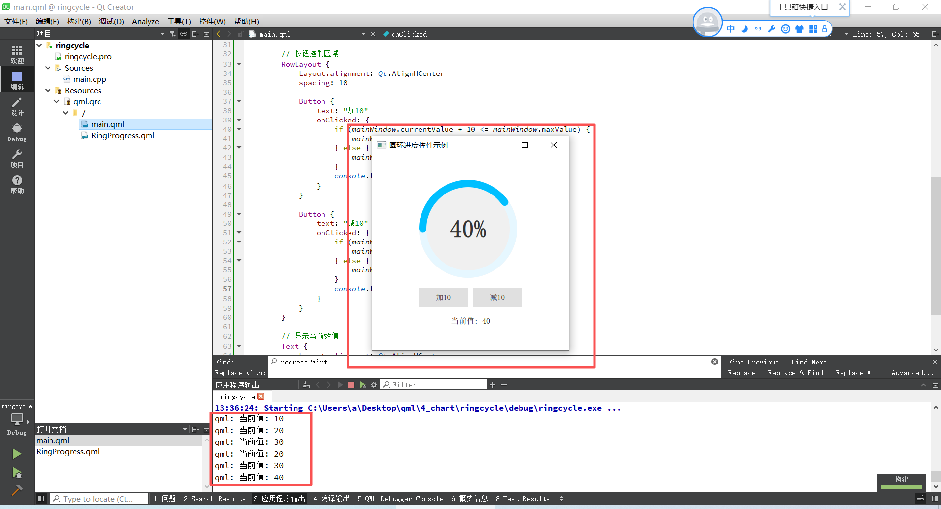
三、效果演示
运行后点击按钮,实时更新圆环值,打印当前圆环值。