国庆回来的css
day2_css
介绍 美化页面
选择器{
样式:样式值;
}
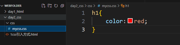
1css引入方式
1.通过style标签 写css代码 (调试代码使用)
<!-- 样式标签 --><style>h1{color:red;}
</style>
2.通过link标签 引入css文件 (调试完毕 上线使用)
<link rel="stylesheet" href="css/mycss.css">
3.直接使用style样式 编辑css代码 (尽量少用 会覆盖其他引入方式)
<h1 style="color:blue;">静夜思--李白</h1>
html文档是从上到下读取和加载 后读取/加载的内容 覆盖先加载的内容
2css常用选择器
基本选择器
1 标签选择器     h1 p   选取范围较大
2 class选择器   .class值 通过class属性的值选取元素     选取精准
3 id选择器      #id值    通过id属性的值选取元素 (id值不要重复 id不能用多值灵活配置)
选择器优先级
id > class > 标签
<!DOCTYPE html>
<html lang="en">
<head><meta charset="UTF-8"><meta name="viewport" content="width=device-width, initial-scale=1.0"><title>Document</title>
<style>#myp{color: green;}
p{color: lightpink;}
.mycls{color: lightblue;}
.mycls2{font-size: larger;}
</style>
</head>
<body><!-- class属性允许多值 --><h1>静夜思--李白</h1><p class="mycls">窗前明月光</p><p class="mycls2">窗前亮月光</p><p class="mycls mycls2">窗前白月光</p><p id="myp" class="mycls">窗前照月光</p>
<h1>静夜思2--李白</h1><p>窗前明月光</p><p>窗前亮月光</p><p>窗前白月光</p><p>窗前照月光</p>
</body>
</html>
高级选择器
4并集选择器  h1,.mycls  一次选取多种选择器的元素  扩大选取范围
5交集选择器  p.mycls    同时满足多个条件        减小选取范围
6后代选择器  .mydiv p   满足层次结构的元素
7子代选择器  .mydiv>div>p   满足层次结构的元素 更严格 只选子代
8属性选择器  [属性] [属性="属性值"] 常用在表单元素上 input[type="button"]
9全局选择器  *          做全局默认设置使用
选择器优先级
id档 class档 标签档
先看高档再看低档 进行覆盖
<!DOCTYPE html>
<html lang="en">
<head><meta charset="UTF-8"><meta name="viewport" content="width=device-width, initial-scale=1.0"><title>Document</title>
<style>/* h1,.mycls{color: red;} */
/* p.mycls{color: red;} */.mydiv>div>p{color: red;}
.mydiv>.myp>p{color: blue;}
input[type="button"]{color: red;}
/* *{color: red;} */
</style>
</head>
<body><!-- class属性允许多值 --><h1>静夜思--李白</h1><div class="mydiv"><p >窗前明月光</p><p >窗前亮月光</p><div class="myp"><p >窗前白月光</p><p >窗前照月光</p></div>
</div>
<h1>静夜思2--李白</h1><div><p>窗前明月光</p><p>窗前亮月光</p><p>窗前白月光</p><p>窗前照月光</p></div>
<hr>
<input type="button" value="按钮">
<input type="text" value="文本框">
<input type="button" value="按钮">
<input type="text" value="文本框">
<input type="button" value="按钮">
<input type="text" value="文本框">
</body>
</html>
3css常用样式
1.文字修饰
文字颜色
color: red;
颜色值: 颜色英文 red blue
使用rgb值 rgb(40, 41, 131) 最小 000 最大 255 255 255
快速记法 #AACC11 缩写为 #AC1
文字大小
font-size: 50px;
单位 : 像素 分辨率 1080p 1920*1080
2k
4k 3840*2160
8k
默认字体相对倍率 1em 2em 1.5em
字体类型
font-family: "隶书"
常用字体 黑体 宋体 隶书 其他特殊字体 需要单独引入字体文件 浏览时 需要下载到本地才能使用
加粗
font-weight: 100;
通过设置可控制粗的程度
文字修饰线
text-decoration: underline;
常用值 : underline 下划线
line-through 删除线
none 没有线
2.对齐和排版
text-align: center;border: 1px solid black;width: 400px;height: 400px;line-height: 400px;
text-align 文字对齐方式(调外部容器)
值 left right center
width 宽 height 高
单位 像素
line-height 行高(行间距)
特殊用法 块中一行文字 行高与块高一直 正好在中间
图片与文字对齐
vertical-align: middle;
vertical-align
上top 中 middle 下bottom
3.背景
background-color: rgb(18, 117, 0);background-image: url(imgs/a.png);background-repeat: repeat-x;
background-color 背景颜色
可以用颜色 英文 rgb值 #xxx
background-image 背景图片
通过路径引入图片
注意 如果背景图片与颜色一起使用 会覆盖颜色
background-repeat 背景图片重复方式
repeat-x 横轴 repeat-y纵轴 no-repeat不重复
list-style: url(imgs/b.gif);
列表标题 可以换图片
常用图片格式 .jpg .png .gif 都支持
<!DOCTYPE html>
<html lang="en">
<head><meta charset="UTF-8"><meta name="viewport" content="width=device-width, initial-scale=1.0"><title>Document</title><style>p{color: #AC1;font-size: 3em;font-family: "隶书";font-weight: 100;text-decoration: line-through;}a{text-decoration:none }.mydiv{text-align: center;border: 1px solid black;width: 400px;height: 400px;line-height: 400px;background-color: rgb(18, 117, 0);background-image: url(imgs/a.png);background-repeat: repeat-x;}img{vertical-align: middle;}.myul{list-style: url(imgs/b.gif);}</style>
</head>
<body><h1>静夜思2--李白</h1><div><p>窗前明月光</p><p>窗前亮月光</p><p>窗前白月光</p><p>窗前照月光</p></div><a href="###">超链接</a><div class="mydiv">测试div</div><hr><img src="imgs/a.png">美女好漂亮<ul class="myul"><li>月饼礼盒设计费1000万?胖东来回应新</li><li>特朗普对俄“态度突变” 原因披露</li><li>净网:2人非法破解无人机系统被查处</li><li>老人去世留8套房 给非亲生女儿最多热</li><li>俞孔坚坠机身亡 学生发声缅怀</li></ul></body>
</html>
4盒子模型
默认文档流
block 从上到下排列
inline 从左到右排列
盒子模型
内容大小 width height
边框 boder
内部填充 padding
外边距 margin
内容大小 通过宽高体现
单位 像素 百分比 vw vh 视窗一版的比例
边框 border
/* border: 100px dashed rgb(199, 35, 35); */border-bottom: 100px dashed rgb(199, 35, 35);border-right: 50px solid rgb(199, 35, 35);border-bottom-right-radius: 20%;
四条边可以整体设置 也可以分开设置
设置粗细 线条 颜色
radius边框圆角 可以设置圆角比例 或者像素
内部填充 padding
/* padding-left: 20px; */padding:10px 20px 30px 40px
可以四个方向一起设置 也可以分开设置 单独计算大小 会让块变大
外边距 margin
/* margin-top: 20px; */margin: 0px auto;
可以四个方向一起设置 也可以分开设置 控制与其他元素间隔的距离 可以取负值 拉进距离
特殊用法 让块在父元素中居中 margin: 0px auto;
盒子模型示例:
<!DOCTYPE html>
<html lang="en">
<head><meta charset="UTF-8"><meta name="viewport" content="width=device-width, initial-scale=1.0"><title>Document</title><style>.mydiv{width: 50vw;height: 50vh;/* 需要父元素高度指定 才能用百分比 */border: 10px solid rgb(199, 35, 35);/* border-bottom: 100px dashed rgb(199, 35, 35);border-right: 50px solid rgb(199, 35, 35);border-bottom-right-radius: 20%; *//* padding-left: 20px; */padding:10px 20px 30px 40px}.marginCls{/* margin-top: 20px; */margin: 0px auto;}</style>
</head>
<body style="height: 200px;"><div class="mydiv">aaa</div><div class="mydiv marginCls">aaa</div>
</body>
</html>
5div+css布局
float 浮动布局
通过浮动 可以让块水平排列
<!DOCTYPE html>
<html lang="en">
<head><meta charset="UTF-8"><meta name="viewport" content="width=device-width, initial-scale=1.0"><title>Document</title><style>.innerDiv{width: 60px;height: 60px;border: 1px solid black;/* float: left; */}</style>
</head>
<body><div style="width: 300px;height: 300px;border:1px solid black;overflow: scroll;"><div class="innerDiv"></div><div class="innerDiv"></div><div class="innerDiv"></div><div class="innerDiv"></div><div class="innerDiv"></div><div class="innerDiv"></div></div></body>
</html>
示例1 小游戏界面
<!DOCTYPE html>
<html lang="en">
<head><meta charset="UTF-8"><meta name="viewport" content="width=device-width, initial-scale=1.0"><title>Document</title><style>.mainPanel{width: 500px;height: 500px;border: 1px solid black;margin: 0px auto;}.innerDiv{width: 60px;height: 60px;border: 1px solid black;float: left;margin: 19px;}.scorePanel{width: 300px;height: 150px;border: 1px solid black;margin: 30px auto;}.mydiv{margin-top: 21px;text-align: center;}</style>
</head>
<body><div class="mainPanel"><div class="innerDiv"></div><div class="innerDiv"></div><div class="innerDiv"></div><div class="innerDiv"></div><div class="innerDiv"></div><div class="innerDiv"></div><div class="innerDiv"></div><div class="innerDiv"></div><div class="innerDiv"></div><div class="innerDiv"></div><div class="innerDiv"></div><div class="innerDiv"></div><div class="innerDiv"></div><div class="innerDiv"></div><div class="innerDiv"></div><div class="innerDiv"></div><div class="innerDiv"></div><div class="innerDiv"></div><div class="innerDiv"></div><div class="innerDiv"></div><div class="innerDiv"></div><div class="innerDiv"></div><div class="innerDiv"></div><div class="innerDiv"></div><div class="innerDiv"></div></div><div class="scorePanel"><div class="mydiv">计时:0秒</div><div class="mydiv">计分:0分</div><div class="mydiv"><button>开始</button><button style="margin-left: 30px;">结束</button></div></div></body>
</html>
示例2 应用界面布局
<!DOCTYPE html>
<html lang="en">
<head><meta charset="UTF-8"><meta name="viewport" content="width=device-width, initial-scale=1.0"><title>Document</title><style>body{margin: 0px;}.mainPanel{width: 100vw;height: 100vh;background-color: lightslategrey;}.top{width: 100%;height: 20%;background-color: lightcoral;}.middle{width: 100%;height: 70%;background-color: lightsalmon;}.bottom{width: 100%;height: 10%;background-color: lightskyblue;}.left{width: 15%;height: 100%;background-color: lightgreen;float: left;}.right{width: 85%;height: 100%;background-color: rgb(95, 45, 189);float: left;}</style></head>
<body><div class="mainPanel"><div class="top"></div><div class="middle"><div class="left"></div><div class="right"></div></div><div class="bottom"></div></div></body>
</html>
6显示属性
display
displayblock 默认占满一行 宽高有效 从上到下排列inline 默认从左到右排列 宽高无效 根据实际内容自动扩展大小inline-block 默认从左到右排列 宽高有效none 隐藏 通常可以用来切换 显示/隐藏
opacity: 0.2; 透明度 1不透 0全透 中间值 半透明rgba a 指透明度
<!DOCTYPE html>
<html lang="en">
<head><meta charset="UTF-8"><meta name="viewport" content="width=device-width, initial-scale=1.0"><title>Document</title><style>/* displayblock    默认占满一行 宽高有效 从上到下排列inline   默认从左到右排列 宽高无效 根据实际内容自动扩展大小inline-block  默认从左到右排列  宽高有效none     隐藏  通常可以用来切换 显示/隐藏opacity: 0.2; 透明度  1不透  0全透  中间值 半透明rgba    a 指透明度*/.mydiv{width: 100px;height: 100px;border: 1px solid rgba(0, 0, 0, 0.685);display: inline;}.myspan{width: 100px;height: 100px;border: 1px solid rgba(0, 0, 0, 0.336);display:block}.myimg{width: 600px;height: 100px;/* display: none; */opacity: 0.2;}</style>
</head>
<body><div class="mydiv"></div><div class="mydiv"></div><div class="mydiv"></div><span class="myspan">你好</span><span class="myspan">啊</span><span class="myspan">span</span><img class="myimg" src="imgs/b.gif">aaaaa
</body>
</html>
7伪类选择器
通过伪类选择器 选择元素状态
:active 点击状态:hover 鼠标悬停手型光标cursor: pointer;
<!DOCTYPE html>
<html lang="en">
<head><meta charset="UTF-8"><meta name="viewport" content="width=device-width, initial-scale=1.0"><title>Document</title><style>.mydiv{width: 100px;height: 100px;border: 1px solid rgba(0, 0, 0, 0.685);}.mydiv:active{background-color: lightcoral;}.mydiv:hover{border: 1px solid rgba(192, 5, 5, 0.685);cursor: pointer;}/* :active  点击状态:hover   鼠标悬停手型光标cursor: pointer;*/</style>
</head>
<body><div class="mydiv"></div>
</body>
</html>
8定位属性
positionstatic 默认文档流relative 相对定位 元素不脱离文档流 以原始位置进行偏移absolute 绝对定位 元素脱离文档流 以页面位置进行偏移fixed 固定定位 元素脱离文档流 以页面位置进行偏移 并固定在此处left 向右 可以使用负值 反方向top 向下z-index 图层顺序 默认图层0 数大的显示在前边
<!DOCTYPE html>
<html lang="en">
<head><meta charset="UTF-8"><meta name="viewport" content="width=device-width, initial-scale=1.0"><title>Document</title><style>/* css 层叠样式表 图层 *//* positionstatic   默认文档流relative 相对定位  元素不脱离文档流 以原始位置进行偏移absolute 绝对定位  元素脱离文档流   以页面位置进行偏移fixed    固定定位  元素脱离文档流   以页面位置进行偏移 并固定在此处left  向右  可以使用负值 反方向top   向下z-index 图层顺序 默认图层0 数大的显示在前边*/.mydiv1{width: 100px;height: 100px;border: 1px solid rgba(0, 0, 0, 0.685);background-color: lightcoral;position: fixed;left: 10px;top: 10px;z-index: 1;}.mydiv2{width: 100px;height: 100px;border: 1px solid rgba(0, 0, 0, 0.685);background-color: lightseagreen;position: fixed;left: 30px;top: 30px;z-index: 2;}.mydiv3{width: 100px;height: 100px;border: 1px solid rgba(0, 0, 0, 0.685);background-color: lightsalmon;position: fixed;left: 50px;top: 50px;z-index: 3;}</style>
</head>
<body><div class="mydiv1"></div><div class="mydiv2"></div><div class="mydiv3"></div><br><br><br><br><br><br><br><br><br><br><br><br><br><br><br><br><br><br><br><br><br><br><br><br><br><br><br><br><br><br><br><br><br><br><br><br><br><br><br><br></body>
</html>
用定位属性做悬浮窗
<!DOCTYPE html>
<html lang="en">
<head><meta charset="UTF-8"><meta name="viewport" content="width=device-width, initial-scale=1.0"><title>Document</title><style>body{margin: 0px;}.mainPanel{width: 100vw;height: 100vh;background-color: lightslategrey;}.top{width: 100%;height: 20%;background-color: lightcoral;}.middle{width: 100%;height: 70%;background-color: lightsalmon;}.bottom{width: 100%;height: 10%;background-color: lightskyblue;}.left{width: 15%;height: 100%;background-color: lightgreen;float: left;}.right{width: 85%;height: 100%;background-color: rgb(95, 45, 189);float: left;}</style></head>
<body><div class="mainPanel"><div class="top"></div><div class="middle"><div class="left"></div><div class="right"></div></div><div class="bottom"></div></div></body>
</html>
4科技
https://qoder.com/
安装 直接下一步
把要写的页面 加入到对话 提要求改