鸿蒙:PickerDialog 日期选择弹窗实现流程
1、前言
本文将以「日期选择弹窗」为例,参考官方文档学习与实践,并动手打造一个练手页面。
2、功能目标
- 页面显示标题、当前选中日期文本
- 点击按钮弹出日期选择弹窗
- 选择日期后,页面文本实时更新,控制台打印选中日期
- 自定义弹窗确认 / 取消按钮的样式(颜色、圆角、背景等)
核心代码
// 8. 显示日期选择器弹窗CalendarPickerDialog.show({selected: this.selectedDate, // 9. 弹窗初始选中的日期,使用已保存的选中日期// 10. 确认按钮样式配置acceptButtonStyle: {fontColor: '#2787d9', // 文字颜色fontSize: '16fp', // 文字大小backgroundColor: '#f7f7f7', // 背景色borderRadius: 10 // 圆角半径},// 11. 取消按钮样式配置cancelButtonStyle: {fontColor: Color.Red, // 文字颜色(使用系统提供的红色)fontSize: '16fp', // 文字大小backgroundColor: '#f7f7f7', // 背景色borderRadius: 10, // 圆角半径,},// 12. 确认选择回调:用户点击确认按钮时触发onAccept: (date: Date) => {// 更新选中日期为用户新选择的日期,确保下次弹窗显示最新选中值this.selectedDate = date;// 打印选中的日期到控制台console.log('选择的日期是', this.formatDate(this.selectedDate))}})3、参考文档
https://developer.huawei.com/consumer/cn/doc/harmonyos-guides/arkts-fixes-style-dialog#%E9%80%89%E6%8B%A9%E5%99%A8%E5%BC%B9%E7%AA%97-pickerdialog https://developer.huawei.com/consumer/cn/doc/harmonyos-guides/arkts-fixes-style-dialog#%E9%80%89%E6%8B%A9%E5%99%A8%E5%BC%B9%E7%AA%97-pickerdialog
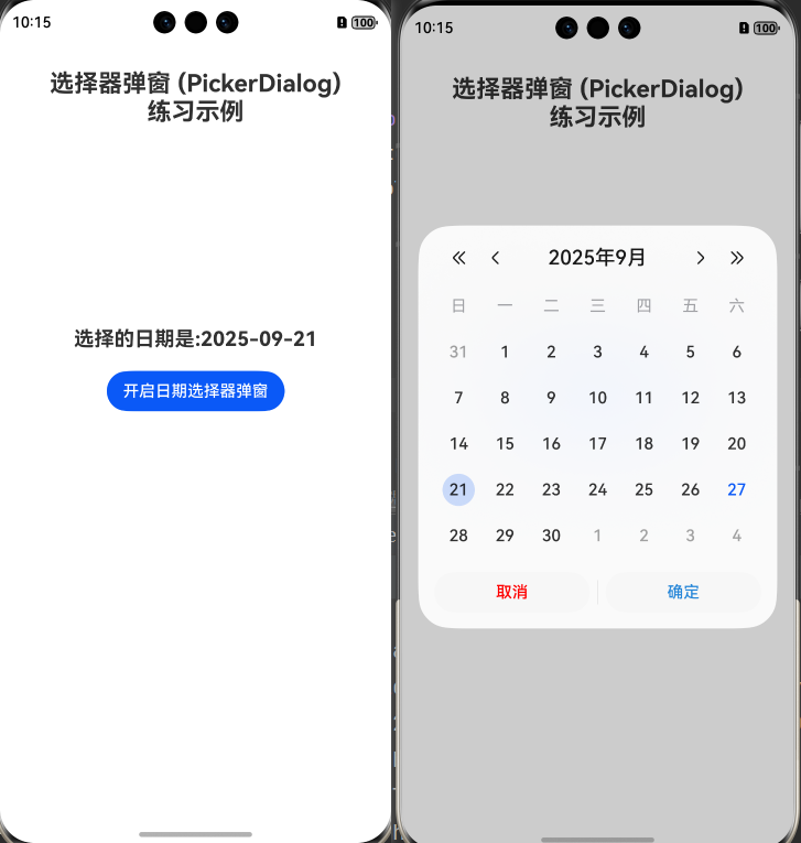
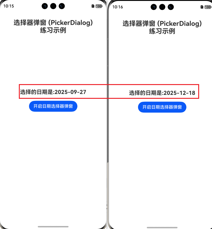
4、运行效果图
5、Index.ets完整代码
// 选择器弹窗 (PickerDialog)练习代码
// 官方文档链接:
// https://developer.huawei.com/consumer/cn/doc/harmonyos-guides/arkts-fixes-style-dialog#%E9%80%89%E6%8B%A9%E5%99%A8%E5%BC%B9%E7%AA%97-pickerdialog// 1. 组件装饰器:@Entry表示该组件为应用入口组件,@Component表示这是一个ArkUI组件
@Entry
@ComponentV2
struct Index {// 2. 成员变量:用于存储用户选中的日期,初始值设为2025-09-27@Local selectedDate: Date = new Date('2025-09-27');// 格式化日期为 'yyyy-MM-dd' 格式的函数formatDate(date: Date): string {const year = date.getFullYear(); // 获取年份(4位数字)const month = date.getMonth() + 1; // 获取月份(0-11),加1转为实际月份(1-12)const day = date.getDate(); // 获取日期(1-31)// 月份和日期不足两位时补0,再拼接成字符串return `${year}-${month.toString().padStart(2, '0')}-${day.toString().padStart(2, '0')}`;}// 3. 构建UI界面的方法,所有UI元素都在该方法中定义build() {// 4.  Column容器:垂直方向排列子组件,宽度占满屏幕Column() {Row().height(30)Text("选择器弹窗 (PickerDialog)\n练习示例").textAlign(TextAlign.Center).fontWeight(FontWeight.Bold).fontSize(24).padding({ bottom: 200 })Column() {Text("选择的日期是:" + this.formatDate(this.selectedDate)).fontSize(20).fontWeight(FontWeight.Bold)// 5. 按钮组件:用于触发日期选择器弹窗的显示Button("开启日期选择器弹窗").margin(20) // 6. 按钮外边距:上下左右各20vp.onClick(() => { // 7. 点击事件:按钮被点击时执行的逻辑// 8. 显示日期选择器弹窗CalendarPickerDialog.show({selected: this.selectedDate, // 9. 弹窗初始选中的日期,使用已保存的选中日期// 10. 确认按钮样式配置acceptButtonStyle: {fontColor: '#2787d9', // 文字颜色fontSize: '16fp', // 文字大小backgroundColor: '#f7f7f7', // 背景色borderRadius: 10 // 圆角半径},// 11. 取消按钮样式配置cancelButtonStyle: {fontColor: Color.Red, // 文字颜色(使用系统提供的红色)fontSize: '16fp', // 文字大小backgroundColor: '#f7f7f7', // 背景色borderRadius: 10, // 圆角半径,},// 12. 确认选择回调:用户点击确认按钮时触发onAccept: (date: Date) => {// 更新选中日期为用户新选择的日期,确保下次弹窗显示最新选中值this.selectedDate = date;// 打印选中的日期到控制台console.log('选择的日期是', this.formatDate(this.selectedDate))}})})}}.width('100%') // 13. 设置Column容器宽度为100%(占满屏幕宽度).height('100%')}
}