微信小程序学习(三)
样式与布局 https://blog.csdn.net/qq_38060125/article/details/149577848
📝 练习任务
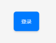
✅1. 登录按钮居中布局:
- 使用 Flex 布局实现水平垂直居中
- 设置按钮样式,包括背景色、边框、圆角等
WXML 文件:
<view class="container"><button class="login-btn">登录</button>
</view>
WXSS 文件
容器的 Flex 布局
.container {display: flex; /* 启用 Flex 布局 */justify-content: center; /* 水平居中 */align-items: center; /* 垂直居中 */height: 100vh; /* 设置容器高度为整个可视窗口高度 */background-color: #f5f5f5; /* 设置背景色,便于观察效果 */
}
登录按钮样式
.login-btn {background-color: #007aff; /* 按钮背景色 */color: #ffffff; /* 按钮文字颜色 */font-size: 16px; /* 按钮文字大小 */padding: 12px 24px; /* 按钮内边距 */border: none; /* 去除默认边框 */border-radius: 8px; /* 设置圆角 */box-shadow: 0 4px 6px rgba(0, 0, 0, 0.1); /* 添加阴影,增加按钮的立体感 */cursor: pointer; /* 鼠标样式(调试环境适用) */text-align: center; /* 文本居中 */
}.login-btn:active {background-color: #005eff; /* 按下时调整按钮背景色 */
}
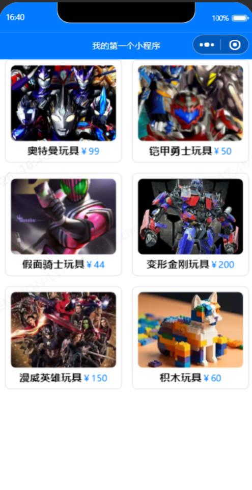
✅2. 商品展示列表:
- 创建两列或多列的商品展示列表
- 使用
flex-wrap实现自动换行 - 添加商品图片、名称、价格等信息
WXML 文件
<view class="container"><view class="product-item" wx:for="{{products}}" wx:key="id"><image class="product-image" src="{{item.image}}" mode="aspectFill"></image><text class="product-name">{{item.name}}</text><text class="product-price">¥{{item.price}}</text></view>
</view>
JS 文件
Page({data: {products: [{ id: 1, name: '奥特曼玩具', price: 99, image: 'https://via.placeholder.com/150' },{ id: 2, name: '铠甲勇士玩具', price: 50, image: 'https://via.placeholder.com/150' },{ id: 3, name: '假面骑士玩具', price: 44, image: 'https://via.placeholder.com/150' },{ id: 4, name: '变形金刚玩具', price: 200, image: 'https://via.placeholder.com/150' },{ id: 5, name: '漫威英雄玩具', price: 150, image: 'https://via.placeholder.com/150' },{ id: 6, name: '积木玩具', price: 60, image: 'https://via.placeholder.com/150' }]}
});
WXSS 文件
.container {display: flex;flex-wrap: wrap; /* 自动换行 */gap: 16px; /* 设置子元素之间的间距 */justify-content: center; /* 横向居中对齐元素 */
}.product-item {flex: 0 1 calc(50% - 16px); /* 每行两列,计算宽度减去间距 */box-sizing: border-box; /* 让宽度包含内边距和边框 */border: 1px solid #ddd; /* 添加边框 */border-radius: 8px; /* 添加圆角 */overflow: hidden; /* 确保内容不会超出边界 */text-align: center; /* 文本居中对齐 */background-color: #fff; /* 设置背景色 */padding: 8px; /* 内容内边距 */
}.product-image {width: 100%; /* 图片宽度占满父容器 */height: 120px; /* 固定图片高度 */object-fit: cover; /* 图片适应容器 */border-radius: 8px; /* 圆角与外框一致 */
}.product-name {font-size: 16px; /* 商品名称字体大小 */font-weight: bold; /* 加粗字体 */margin-top: 8px; /* 与图片和文字之间的间距 */
}.product-price {font-size: 14px; /* 商品价格字体大小 */color: #007aff; /* 设置价格颜色为蓝色 */margin-top: 4px; /* 与名称之间的间距 */
}
✅3. 响应式样式:
- 使用
@media查询实现横竖屏切换 - 设置不同屏幕方向下的布局方案
- 测试在模拟器和真机上的表现.
WXSS 文件
主要添加@media这个。
.product-item {flex: 0 1 calc(50% - 16px); /* 每行两列,计算宽度减去间距 */box-sizing: border-box; /* 让宽度包含内边距和边框 */border: 1px solid #ddd; /* 添加边框 */border-radius: 8px; /* 添加圆角 */overflow: hidden; /* 确保内容不会超出边界 */text-align: center; /* 文本居中对齐 */background-color: #fff; /* 设置背景色 */padding: 8px; /* 内容内边距 */
}
@media screen and (orientation: landscape) {.product-item {flex: 0 1 calc(25% - 16px); /* 每行四列,宽度为 25% 减去间距 */}
}
app.js
添加这个 wx.setPageOrientation ({ orientation: 'landscape', complete: console.log } )
App({onLaunch() {// 展示本地存储能力const logs = wx.getStorageSync('logs') || []logs.unshift(Date.now())wx.setStorageSync('logs', logs)wx.setPageOrientation ({ orientation: 'landscape', complete: console.log } )//设置为横屏模式// 登录wx.login({success: res => {// 发送 res.code 到后台换取 openId, sessionKey, unionId}})},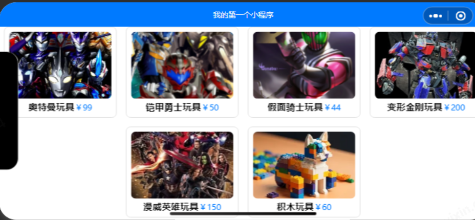
这样就可以看到不同的差别。