vue2头部布局示例
网页头部布局(左Logo,右导航)
布局说明
左侧:网站 Logo(可以是文字或图片)
右侧:导航菜单(如:首页、关于我们、服务、联系)
实现方式:使用 Flex 布局
<template><div class="header"><div class="header-left"><img src="logo.png" alt="Logo" class="logo" /></div><div class="header-right"><ul class="nav"><li><a href="#">首页</a></li><li><a href="#">关于我们</a></li><li><a href="#">服务</a></li><li><a href="#">联系</a></li></ul></div></div>
</template><script>
export default {name: 'HeaderComponent'
}
</script><style scoped>
.header {display: flex;justify-content: space-between;align-items: center;padding: 10px 20px;background-color: #f5f5f5;
}.header-left .logo {height: 40px;
}.header-right .nav {list-style: none;display: flex;gap: 20px;margin: 0;padding: 0;
}.header-right .nav li a {text-decoration: none;color: #333;font-weight: bold;
}
</style>
用户信息栏(左头像,右用户名和操作按钮)
布局说明
左侧:用户头像
右侧:用户名 + 操作按钮(如“退出登录”)
实现方式:使用 Flex 布局
<template><div class="user-bar"><div class="user-left"><img src="avatar.jpg" alt="头像" class="avatar" /></div><div class="user-right"><span class="username">张三</span><button @click="logout">退出登录</button></div></div>
</template><script>
export default {methods: {logout() {alert('已退出登录');}}
}
</script><style scoped>
.user-bar {display: flex;justify-content: space-between;align-items: center;padding: 10px;background: #eee;
}.user-left .avatar {width: 40px;height: 40px;border-radius: 50%;
}.user-right {display: flex;align-items: center;gap: 10px;
}
</style>
商品展示栏(左图,右描述)
布局说明
左侧:商品图片
右侧:商品名称、价格、购买按钮
实现方式:使用 Flex + 固定宽度
<template><div class="product-card"><div class="product-image"><img src="product.jpg" alt="商品图" /></div><div class="product-info"><h3>智能手表</h3><p>价格:¥999</p><button>立即购买</button></div></div>
</template><style scoped>
.product-card {display: flex;border: 1px solid #ccc;padding: 10px;
}.product-image img {width: 120px;height: auto;
}.product-info {margin-left: 20px;
}
</style>
日程安排头部(左日期,右操作)
布局说明
左侧:当前日期
右侧:添加日程、筛选按钮
实现方式:使用 justify-content: space-between
<template><div class="schedule-header"><div class="date">2025年9月3日</div><div class="actions"><button>添加日程</button><button>筛选</button></div></div>
</template><style scoped>
.schedule-header {display: flex;justify-content: space-between;align-items: center;background: #f0f8ff;padding: 10px 20px;
}.actions button {margin-left: 10px;
}
</style>
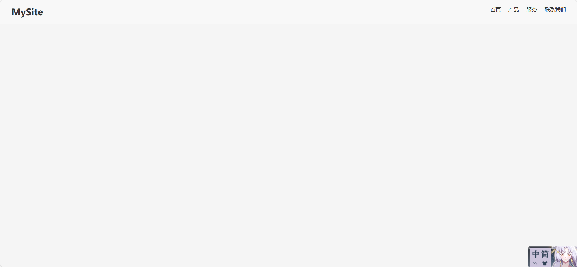
使用 float 实现网页头部左右布局
布局说明
左侧:Logo(浮动到左边)
右侧:导航菜单(浮动到右边)
使用
clearfix清除浮动影响
Vue 2 示例代码(float 方式)
<template><div class="header"><div class="logo">MySite</div><ul class="nav"><li><a href="#">首页</a></li><li><a href="#">产品</a></li><li><a href="#">服务</a></li><li><a href="#">联系我们</a></li></ul></div>
</template><script>
export default {name: 'HeaderFloat'
}
</script><style scoped>
.header {background-color: #f8f8f8;padding: 15px 30px;overflow: hidden; /* 清除浮动 */
}.logo {float: left;font-size: 24px;font-weight: bold;color: #333;
}.nav {float: right;list-style: none;margin: 0;padding: 0;
}.nav li {display: inline-block;margin-left: 20px;
}.nav a {text-decoration: none;color: #333;font-weight: 500;
}
</style>
注意事项
| 问题 | 说明 |
|---|---|
| 清除浮动 | 使用 overflow: hidden 或 clearfix 类来避免父元素高度塌陷 |
| 垂直居中 | float 本身不支持垂直居中,需额外处理(如设置 line-height) |
| 响应式 | float 布局在移动端适配上不如 Flex 灵活 |
| 可维护性 | 多个浮动元素容易造成布局混乱,不推荐用于复杂结构 |
总结
虽然 float 可以实现你要的布局,但现在推荐使用 flex 或 grid,因为它们更现代、更强大、更易维护。
如何实现“左右分开”的关键技巧:
| 技巧 | 说明 |
|---|---|
display: flex | 最常用的方式,设置容器为弹性盒子 |
justify-content: space-between | 左右两边自动拉开距离 |
margin-left 或 gap | 控制左右元素之间的间距 |
固定宽度或 flex-grow | 控制某一侧占据多少空间 |
| 嵌套布局 | 左右部分内部也可以继续用 flex 或 grid 细分 |