react + G2(v4) 应用
记录一下
react中使用G2("@antv/g2": "^4.0.15"),折线图标
完整代码
import React, { Component } from "react";
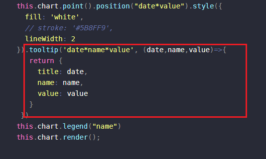
import { Chart } from '@antv/g2'export default class page extends Component {constructor(props) {super(props);this.chartRef = React.createRef();this.chart = null;}// // 组件挂载componentDidMount() {this.createChart()}// 组件卸载时销毁图表componentWillUnmount() {if (this.chart) {this.chart.destroy();}}// 创建表格createChart() {// 图表数据let data = [{"date": "2025-08-14","value": "453","name": "心率"},{"date": "2025-08-14","value": "43","name": "心率"},{"date": "2025-08-14","value": "80","name": "心率"}]// 确保容器存在if (!this.chartRef.current) return;// 销毁已存在的图表if (this.chart) {this.chart.destroy();}const container = this.chartRef.current;this.chart = new Chart({container: this.chartRef.current,width: '100%',height: 500,autoFit: true // 开启自适应});this.chart.data(data);this.chart.axis('value', {label: {textStyle: { fontSize: 12 } // 调整标签字体大小},title: {text: '次'// 轴标题也可包含单位}});this.chart.scale('value', {nice: true,formatter: (val) => `${val} `});this.chart.line().position('date*value').color('name').shape('smooth');this.chart.point().position("date*value").style({fill: 'white',// stroke: '#5B8FF9',lineWidth: 2}).tooltip('date*name*value', (date,name,value)=>{return {title: date,name: name,value: value}})this.chart.legend("name")this.chart.render();}render() {return (<div style={{visibility: currTag==='1'? 'visible':'hidden',width: '100%',height: '500px'}} className="chart" ref={this.chartRef}></div>)}
}
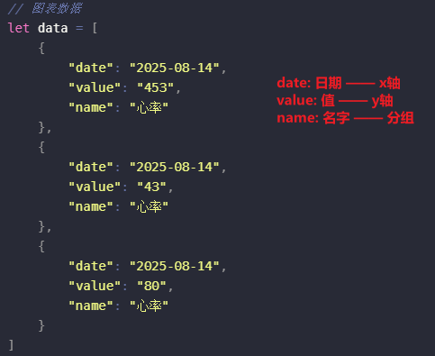
图表数据
name 如果有多种,就会显示多条折线
比如:name的值可以是舒张压、收缩压,则图表会显示两条线。一条是舒张压的,一条是收缩压的
tooltip
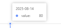
一开始没有写上面那个配置的时候,鼠标悬浮上去的时候,只显示这样。本来是心率的,却显示了value。
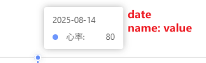
后面加上配置后就显示正常了:
date对应title
图表显示隐藏
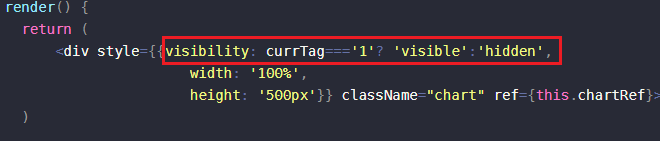
我的需求是切换 tab 的时候,图表要跟着显示隐藏。试了直接用display设置block和none无效,图表会一直显示在那里,然后用visibility就可以