FlutterSwitch(width: 35.0,height: 18.0,toggleSize: 16.0,value: isUnAvailable? false: _settingModel.proResourceStatus == 1,borderRadius: 20.0,padding: 2.0,activeToggleColor: Colors.white,activeColor:  ColorConst.color_FF719CDB,inactiveColor: isUnAvailable? ColorConst.color_ffDEDEDE: ColorConst.color_F64F59,inactiveIcon: Image.asset("image/g36/icon_pro_lock.png",),onToggle: (value) async {if (isUnAvailable) {CommonToast.showAttachedWidget(Translations.text("equity_no_time"));return;}_settingModel.proResourceStatus = value ? 1 : 0;await _settingModel.putUserSetting();await Future.delayed(Duration(milliseconds: 100));ChatModeController.refreshTimeAndLanguage();setState(() {});},
),
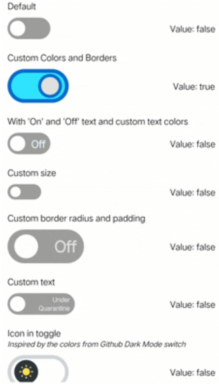 library flutter_switch;import 'package:flutter/material.dart';class FlutterSwitch extends StatefulWidget {/// Creates a material design switch.////// The following arguments are required:////// * [value] determines whether this switch is on or off./// * [onToggle] is called when the user toggles the switch on or off.///const FlutterSwitch({Key? key,required this.value,required this.onToggle,this.activeColor = Colors.blue,this.inactiveColor = Colors.grey,this.activeTextColor = Colors.white70,this.inactiveTextColor = Colors.white70,this.toggleColor = Colors.white,this.activeToggleColor,this.inactiveToggleColor,this.width = 70.0,this.height = 35.0,this.toggleSize = 25.0,this.valueFontSize = 16.0,this.borderRadius = 20.0,this.padding = 4.0,this.showOnOff = false,this.activeText,this.inactiveText,this.activeTextFontWeight,this.inactiveTextFontWeight,this.switchBorder,this.activeSwitchBorder,this.inactiveSwitchBorder,this.toggleBorder,this.activeToggleBorder,this.inactiveToggleBorder,this.activeIcon,this.inactiveIcon,this.duration = const Duration(milliseconds: 200),this.disabled = false,}) : assert((switchBorder == null || activeSwitchBorder == null) &&(switchBorder == null || inactiveSwitchBorder == null),'Cannot provide switchBorder when an activeSwitchBorder or inactiveSwitchBorder was given\n''To give the switch a border, use "activeSwitchBorder: border" or "inactiveSwitchBorder: border".'),assert((toggleBorder == null || activeToggleBorder == null) &&(toggleBorder == null || inactiveToggleBorder == null),'Cannot provide toggleBorder when an activeToggleBorder or inactiveToggleBorder was given\n''To give the toggle a border, use "activeToggleBorder: color" or "inactiveToggleBorder: color".'),super(key: key);/// Determines if the switch is on or off.////// This property is required.final bool value;/// Called when the user toggles the switch.////// This property is required.////// [onToggle] should update the state of the parent [StatefulWidget]/// using the [setState] method, so that the parent gets rebuilt; for example:////// ```dart/// FlutterSwitch(/// value: _status,/// width: 110,/// borderRadius: 30.0,/// onToggle: (val) {/// setState(() {/// _status = val;/// });/// },/// ),/// ```final ValueChanged<bool> onToggle;/// Displays an on or off text.////// Text value can be override by the [activeText] and/// [inactiveText] properties.////// Defaults to 'false' if no value was given.final bool showOnOff;/// The text to display when the switch is on./// This parameter is only necessary when [showOnOff] property is true.////// Defaults to 'On' if no value was given.////// To change value style, the following properties are available////// [activeTextColor] - The color to use on the text value when the switch is on./// [activeTextFontWeight] - The font weight to use on the text value when the switch is on.final String? activeText;/// The text to display when the switch is off./// This parameter is only necessary when [showOnOff] property is true.////// Defaults to 'Off' if no value was given.////// To change value style, the following properties are available////// [inactiveTextColor] - The color to use on the text value when the switch is off./// [inactiveTextFontWeight] - The font weight to use on the text value when the switch is off.final String? inactiveText;/// The color to use on the switch when the switch is on.////// Defaults to [Colors.blue].final Color activeColor;/// The color to use on the switch when the switch is off.////// Defaults to [Colors.grey].final Color inactiveColor;/// The color to use on the text value when the switch is on./// This parameter is only necessary when [showOnOff] property is true.////// Defaults to [Colors.white70].final Color activeTextColor;/// The color to use on the text value when the switch is off./// This parameter is only necessary when [showOnOff] property is true.////// Defaults to [Colors.white70].final Color inactiveTextColor;/// The font weight to use on the text value when the switch is on./// This parameter is only necessary when [showOnOff] property is true.////// Defaults to [FontWeight.w900].final FontWeight? activeTextFontWeight;/// The font weight to use on the text value when the switch is off./// This parameter is only necessary when [showOnOff] property is true.////// Defaults to [FontWeight.w900].final FontWeight? inactiveTextFontWeight;/// The color to use on the toggle of the switch.////// Defaults to [Colors.white].////// If the [activeSwitchBorder] or [inactiveSwitchBorder] is used, this property must be null.final Color toggleColor;/// The color to use on the toggle of the switch when the given value is true.////// If [inactiveToggleColor] is used and this property is null. the value of/// [Colors.white] will be used.final Color? activeToggleColor;/// The color to use on the toggle of the switch when the given value is false.////// If [activeToggleColor] is used and this property is null. the value of/// [Colors.white] will be used.final Color? inactiveToggleColor;/// The given width of the switch.////// Defaults to a width of 70.0.final double width;/// The given height of the switch.////// Defaults to a height of 35.0.final double height;/// The size of the toggle of the switch.////// Defaults to a size of 25.0.final double toggleSize;/// The font size of the values of the switch./// This parameter is only necessary when [showOnOff] property is true.////// Defaults to a size of 16.0.final double valueFontSize;/// The border radius of the switch.////// Defaults to the value of 20.0.final double borderRadius;/// The padding of the switch.////// Defaults to the value of 4.0.final double padding;/// The border of the switch.////// This property will give a uniform border to both states of the toggle////// If the [activeSwitchBorder] or [inactiveSwitchBorder] is used, this property must be null.final BoxBorder? switchBorder;/// The border of the switch when the given value is true.////// This property is optional.final BoxBorder? activeSwitchBorder;/// The border of the switch when the given value is false.////// This property is optional.final BoxBorder? inactiveSwitchBorder;/// The border of the toggle.////// This property will give a uniform border to both states of the toggle////// If the [activeToggleBorder] or [inactiveToggleBorder] is used, this property must be null.final BoxBorder? toggleBorder;/// The border of the toggle when the given value is true.////// This property is optional.final BoxBorder? activeToggleBorder;/// The border of the toggle when the given value is false.////// This property is optional.final BoxBorder? inactiveToggleBorder;/// The icon inside the toggle when the given value is true./// activeIcon can be an Icon Widget, an Image or Fontawesome Icons.////// This property is optional.final Widget? activeIcon;/// The icon inside the toggle when the given value is false./// inactiveIcon can be an Icon Widget, an Image or Fontawesome Icons.////// This property is optional.final Widget? inactiveIcon;/// The duration in milliseconds to change the state of the switch////// Defaults to the value of 200 milliseconds.final Duration duration;/// Determines whether the switch is disabled.////// Defaults to the value of false.final bool disabled;@override_FlutterSwitchState createState() => _FlutterSwitchState();
}class _FlutterSwitchState extends State<FlutterSwitch>with SingleTickerProviderStateMixin {late final Animation _toggleAnimation;late final AnimationController _animationController;@overridevoid initState() {super.initState();_animationController = AnimationController(vsync: this,value: widget.value ? 1.0 : 0.0,duration: widget.duration,);_toggleAnimation = AlignmentTween(begin: Alignment.centerLeft,end: Alignment.centerRight,).animate(CurvedAnimation(parent: _animationController,curve: Curves.linear,),);}@overridevoid dispose() {_animationController.dispose();super.dispose();}@overridevoid didUpdateWidget(FlutterSwitch oldWidget) {super.didUpdateWidget(oldWidget);if (oldWidget.value == widget.value) return;if (widget.value)_animationController.forward();else_animationController.reverse();}@overrideWidget build(BuildContext context) {Color _toggleColor = Colors.white;Color _switchColor = Colors.white;Border? _switchBorder;Border? _toggleBorder;if (widget.value) {_toggleColor = widget.activeToggleColor ?? widget.toggleColor;_switchColor = widget.activeColor;_switchBorder = widget.activeSwitchBorder as Border? ??widget.switchBorder as Border?;_toggleBorder = widget.activeToggleBorder as Border? ??widget.toggleBorder as Border?;} else {_toggleColor = widget.inactiveToggleColor ?? widget.toggleColor;_switchColor = widget.inactiveColor;_switchBorder = widget.inactiveSwitchBorder as Border? ??widget.switchBorder as Border?;_toggleBorder = widget.inactiveToggleBorder as Border? ??widget.toggleBorder as Border?;}double _textSpace = widget.width - widget.toggleSize;return AnimatedBuilder(animation: _animationController,builder: (context, child) {return Container(width: widget.width,child: Align(child: GestureDetector(onTap: () {if (!widget.disabled) {if (widget.value)_animationController.forward();else_animationController.reverse();widget.onToggle(!widget.value);}},child: Opacity(opacity: widget.disabled ? 0.6 : 1,child: Container(width: widget.width,height: widget.height,padding: EdgeInsets.all(widget.padding),decoration: BoxDecoration(borderRadius: BorderRadius.circular(widget.borderRadius),color: _switchColor,border: _switchBorder,),child: Stack(children: <Widget>[AnimatedOpacity(opacity: widget.value ? 1.0 : 0.0,duration: widget.duration,child: Container(width: _textSpace,padding: EdgeInsets.symmetric(horizontal: 4.0),alignment: Alignment.centerLeft,child: _activeText,),),Align(alignment: Alignment.centerRight,child: AnimatedOpacity(opacity: !widget.value ? 1.0 : 0.0,duration: widget.duration,child: Container(width: _textSpace,padding: EdgeInsets.symmetric(horizontal: 4.0),alignment: Alignment.centerRight,child: _inactiveText,),),),Container(child: Align(alignment: _toggleAnimation.value,child: Container(width: widget.toggleSize,height: widget.toggleSize,padding: EdgeInsets.all(3.0),decoration: BoxDecoration(shape: BoxShape.circle,color: _toggleColor,border: _toggleBorder,),child: FittedBox(fit: BoxFit.contain,child: Container(child: Stack(children: [Center(child: AnimatedOpacity(opacity: widget.value ? 1.0 : 0.0,duration: widget.duration,child: widget.activeIcon,),),Center(child: AnimatedOpacity(opacity: !widget.value ? 1.0 : 0.0,duration: widget.duration,child: widget.inactiveIcon,),),],),),),),),),],),),),),),);},);}FontWeight get _activeTextFontWeight =>widget.activeTextFontWeight ?? FontWeight.w900;FontWeight get _inactiveTextFontWeight =>widget.inactiveTextFontWeight ?? FontWeight.w900;Widget get _activeText {if (widget.showOnOff) {return Text(widget.activeText ?? "On",style: TextStyle(color: widget.activeTextColor,fontWeight: _activeTextFontWeight,fontSize: widget.valueFontSize,),);}return Text("");}Widget get _inactiveText {if (widget.showOnOff) {return Text(widget.inactiveText ?? "Off",style: TextStyle(color: widget.inactiveTextColor,fontWeight: _inactiveTextFontWeight,fontSize: widget.valueFontSize,),textAlign: TextAlign.right,);}return Text("");}
}
library flutter_switch;import 'package:flutter/material.dart';class FlutterSwitch extends StatefulWidget {/// Creates a material design switch.////// The following arguments are required:////// * [value] determines whether this switch is on or off./// * [onToggle] is called when the user toggles the switch on or off.///const FlutterSwitch({Key? key,required this.value,required this.onToggle,this.activeColor = Colors.blue,this.inactiveColor = Colors.grey,this.activeTextColor = Colors.white70,this.inactiveTextColor = Colors.white70,this.toggleColor = Colors.white,this.activeToggleColor,this.inactiveToggleColor,this.width = 70.0,this.height = 35.0,this.toggleSize = 25.0,this.valueFontSize = 16.0,this.borderRadius = 20.0,this.padding = 4.0,this.showOnOff = false,this.activeText,this.inactiveText,this.activeTextFontWeight,this.inactiveTextFontWeight,this.switchBorder,this.activeSwitchBorder,this.inactiveSwitchBorder,this.toggleBorder,this.activeToggleBorder,this.inactiveToggleBorder,this.activeIcon,this.inactiveIcon,this.duration = const Duration(milliseconds: 200),this.disabled = false,})  : assert((switchBorder == null || activeSwitchBorder == null) &&(switchBorder == null || inactiveSwitchBorder == null),'Cannot provide switchBorder when an activeSwitchBorder or inactiveSwitchBorder was given\n''To give the switch a border, use "activeSwitchBorder: border" or "inactiveSwitchBorder: border".'),assert((toggleBorder == null || activeToggleBorder == null) &&(toggleBorder == null || inactiveToggleBorder == null),'Cannot provide toggleBorder when an activeToggleBorder or inactiveToggleBorder was given\n''To give the toggle a border, use "activeToggleBorder: color" or "inactiveToggleBorder: color".'),super(key: key);/// Determines if the switch is on or off.////// This property is required.final bool value;/// Called when the user toggles the switch.////// This property is required.////// [onToggle] should update the state of the parent [StatefulWidget]/// using the [setState] method, so that the parent gets rebuilt; for example:////// ```dart/// FlutterSwitch(///   value: _status,///   width: 110,///   borderRadius: 30.0,///   onToggle: (val) {///     setState(() {///        _status = val;///     });///   },/// ),/// ```final ValueChanged<bool> onToggle;/// Displays an on or off text.////// Text value can be override by the [activeText] and/// [inactiveText] properties.////// Defaults to 'false' if no value was given.final bool showOnOff;/// The text to display when the switch is on./// This parameter is only necessary when [showOnOff] property is true.////// Defaults to 'On' if no value was given.////// To change value style, the following properties are available////// [activeTextColor] - The color to use on the text value when the switch is on./// [activeTextFontWeight] - The font weight to use on the text value when the switch is on.final String? activeText;/// The text to display when the switch is off./// This parameter is only necessary when [showOnOff] property is true.////// Defaults to 'Off' if no value was given.////// To change value style, the following properties are available////// [inactiveTextColor] - The color to use on the text value when the switch is off./// [inactiveTextFontWeight] - The font weight to use on the text value when the switch is off.final String? inactiveText;/// The color to use on the switch when the switch is on.////// Defaults to [Colors.blue].final Color activeColor;/// The color to use on the switch when the switch is off.////// Defaults to [Colors.grey].final Color inactiveColor;/// The color to use on the text value when the switch is on./// This parameter is only necessary when [showOnOff] property is true.////// Defaults to [Colors.white70].final Color activeTextColor;/// The color to use on the text value when the switch is off./// This parameter is only necessary when [showOnOff] property is true.////// Defaults to [Colors.white70].final Color inactiveTextColor;/// The font weight to use on the text value when the switch is on./// This parameter is only necessary when [showOnOff] property is true.////// Defaults to [FontWeight.w900].final FontWeight? activeTextFontWeight;/// The font weight to use on the text value when the switch is off./// This parameter is only necessary when [showOnOff] property is true.////// Defaults to [FontWeight.w900].final FontWeight? inactiveTextFontWeight;/// The color to use on the toggle of the switch.////// Defaults to [Colors.white].////// If the [activeSwitchBorder] or [inactiveSwitchBorder] is used, this property must be null.final Color toggleColor;/// The color to use on the toggle of the switch when the given value is true.////// If [inactiveToggleColor] is used and this property is null. the value of/// [Colors.white] will be used.final Color? activeToggleColor;/// The color to use on the toggle of the switch when the given value is false.////// If [activeToggleColor] is used and this property is null. the value of/// [Colors.white] will be used.final Color? inactiveToggleColor;/// The given width of the switch.////// Defaults to a width of 70.0.final double width;/// The given height of the switch.////// Defaults to a height of 35.0.final double height;/// The size of the toggle of the switch.////// Defaults to a size of 25.0.final double toggleSize;/// The font size of the values of the switch./// This parameter is only necessary when [showOnOff] property is true.////// Defaults to a size of 16.0.final double valueFontSize;/// The border radius of the switch.////// Defaults to the value of 20.0.final double borderRadius;/// The padding of the switch.////// Defaults to the value of 4.0.final double padding;/// The border of the switch.////// This property will give a uniform border to both states of the toggle////// If the [activeSwitchBorder] or [inactiveSwitchBorder] is used, this property must be null.final BoxBorder? switchBorder;/// The border of the switch when the given value is true.////// This property is optional.final BoxBorder? activeSwitchBorder;/// The border of the switch when the given value is false.////// This property is optional.final BoxBorder? inactiveSwitchBorder;/// The border of the toggle.////// This property will give a uniform border to both states of the toggle////// If the [activeToggleBorder] or [inactiveToggleBorder] is used, this property must be null.final BoxBorder? toggleBorder;/// The border of the toggle when the given value is true.////// This property is optional.final BoxBorder? activeToggleBorder;/// The border of the toggle when the given value is false.////// This property is optional.final BoxBorder? inactiveToggleBorder;/// The icon inside the toggle when the given value is true./// activeIcon can be an Icon Widget, an Image or Fontawesome Icons.////// This property is optional.final Widget? activeIcon;/// The icon inside the toggle when the given value is false./// inactiveIcon can be an Icon Widget, an Image or Fontawesome Icons.////// This property is optional.final Widget? inactiveIcon;/// The duration in milliseconds to change the state of the switch////// Defaults to the value of 200 milliseconds.final Duration duration;/// Determines whether the switch is disabled.////// Defaults to the value of false.final bool disabled;@override_FlutterSwitchState createState() => _FlutterSwitchState();
}class _FlutterSwitchState extends State<FlutterSwitch>with SingleTickerProviderStateMixin {late final Animation _toggleAnimation;late final AnimationController _animationController;@overridevoid initState() {super.initState();_animationController = AnimationController(vsync: this,value: widget.value ? 1.0 : 0.0,duration: widget.duration,);_toggleAnimation = AlignmentTween(begin: Alignment.centerLeft,end: Alignment.centerRight,).animate(CurvedAnimation(parent: _animationController,curve: Curves.linear,),);}@overridevoid dispose() {_animationController.dispose();super.dispose();}@overridevoid didUpdateWidget(FlutterSwitch oldWidget) {super.didUpdateWidget(oldWidget);if (oldWidget.value == widget.value) return;if (widget.value)_animationController.forward();else_animationController.reverse();}@overrideWidget build(BuildContext context) {Color _toggleColor = Colors.white;Color _switchColor = Colors.white;Border? _switchBorder;Border? _toggleBorder;if (widget.value) {_toggleColor = widget.activeToggleColor ?? widget.toggleColor;_switchColor = widget.activeColor;_switchBorder = widget.activeSwitchBorder as Border? ??widget.switchBorder as Border?;_toggleBorder = widget.activeToggleBorder as Border? ??widget.toggleBorder as Border?;} else {_toggleColor = widget.inactiveToggleColor ?? widget.toggleColor;_switchColor = widget.inactiveColor;_switchBorder = widget.inactiveSwitchBorder as Border? ??widget.switchBorder as Border?;_toggleBorder = widget.inactiveToggleBorder as Border? ??widget.toggleBorder as Border?;}double _textSpace = widget.width - widget.toggleSize;return AnimatedBuilder(animation: _animationController,builder: (context, child) {return Container(width: widget.width,child: Align(child: GestureDetector(onTap: () {if (!widget.disabled) {if (widget.value)_animationController.forward();else_animationController.reverse();widget.onToggle(!widget.value);}},child: Opacity(opacity: widget.disabled ? 0.6 : 1,child: Container(width: widget.width,height: widget.height,padding: EdgeInsets.all(widget.padding),decoration: BoxDecoration(borderRadius: BorderRadius.circular(widget.borderRadius),color: _switchColor,border: _switchBorder,),child: Stack(children: <Widget>[AnimatedOpacity(opacity: widget.value ? 1.0 : 0.0,duration: widget.duration,child: Container(width: _textSpace,padding: EdgeInsets.symmetric(horizontal: 4.0),alignment: Alignment.centerLeft,child: _activeText,),),Align(alignment: Alignment.centerRight,child: AnimatedOpacity(opacity: !widget.value ? 1.0 : 0.0,duration: widget.duration,child: Container(width: _textSpace,padding: EdgeInsets.symmetric(horizontal: 4.0),alignment: Alignment.centerRight,child: _inactiveText,),),),Container(child: Align(alignment: _toggleAnimation.value,child: Container(width: widget.toggleSize,height: widget.toggleSize,padding: EdgeInsets.all(3.0),decoration: BoxDecoration(shape: BoxShape.circle,color: _toggleColor,border: _toggleBorder,),child: FittedBox(fit: BoxFit.contain,child: Container(child: Stack(children: [Center(child: AnimatedOpacity(opacity: widget.value ? 1.0 : 0.0,duration: widget.duration,child: widget.activeIcon,),),Center(child: AnimatedOpacity(opacity: !widget.value ? 1.0 : 0.0,duration: widget.duration,child: widget.inactiveIcon,),),],),),),),),),],),),),),),);},);}FontWeight get _activeTextFontWeight =>widget.activeTextFontWeight ?? FontWeight.w900;FontWeight get _inactiveTextFontWeight =>widget.inactiveTextFontWeight ?? FontWeight.w900;Widget get _activeText {if (widget.showOnOff) {return Text(widget.activeText ?? "On",style: TextStyle(color: widget.activeTextColor,fontWeight: _activeTextFontWeight,fontSize: widget.valueFontSize,),);}return Text("");}Widget get _inactiveText {if (widget.showOnOff) {return Text(widget.inactiveText ?? "Off",style: TextStyle(color: widget.inactiveTextColor,fontWeight: _inactiveTextFontWeight,fontSize: widget.valueFontSize,),textAlign: TextAlign.right,);}return Text("");}
}