浪漫温柔的表白
1. 色彩搭配方案
主色调:柔和的粉色(#ffb6c1, #d16ba5)和淡紫色(#d8bfd8, #b19cd9)
背景:渐变浅粉到淡紫(#ffeff6 → #f6f0ff)
文字:优雅的深紫色(#7a4988)
强调色:玫瑰粉(#ff6b9c)用于按钮和动画
2. 视觉元素设计
花瓣飘落效果:使用CSS创建半透明花瓣并添加飘落动画
浮动爱心:卡片四周添加装饰性爱心,有浮动动画效果
脉冲爱心:点击按钮时产生爱心脉冲动画
渐变装饰条:底部流动的彩色渐变条
3. 动画效果
花瓣动画:花瓣从顶部飘落到底部,同时旋转和水平移动
爱心浮动:装饰爱心上下浮动,增强梦幻感
按钮悬停:按钮有悬停放大和阴影变化效果
脉冲效果:点击按钮时产生爱心扩散动画
4. 布局设计
居中卡片:主内容在柔和背景中居中显示
文字排版:标题有下划线装饰,引用内容有特殊样式
响应式设计:适配不同屏幕尺寸
5. 交互体验
按钮点击效果:点击后按钮文字变化,产生爱心脉冲
色彩变化:接受心意后整体色调变得更温暖
视觉反馈:提供即时的情感反馈
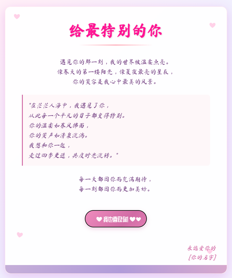
6.截图展示
7.代码重现
<!DOCTYPE html>
<html lang="zh-CN">
<head><meta charset="UTF-8"><meta name="viewport" content="width=device-width, initial-scale=1.0"><title>给特别的你</title><link href="https://fonts.googleapis.com/css2?family=Ma+Shan+Zheng&family=ZCOOL+QingKe+HuangYou&display=swap" rel="stylesheet"><style>/* 全局样式 */* {margin: 0;padding: 0;box-sizing: border-box;}body {font-family: 'Ma Shan Zheng', cursive, 'ZCOOL QingKe HuangYou', sans-serif;background: linear-gradient(135deg, #ffeff6 0%, #fff0f8 25%, #f0f0ff 50%, #f6f0ff 100%);min-height: 100vh;display: flex;justify-content: center;align-items: center;overflow-x: hidden;position: relative;color: #7a4988;line-height: 1.6;}/* 花瓣飘落动画 */.petal {position: absolute;background: rgba(255, 182, 193, 0.6);border-radius: 50% 50% 0 50%;transform: rotate(45deg);animation: fall linear infinite;z-index: 0;}@keyframes fall {0% {top: -10%;opacity: 0.8;transform: rotate(0deg) translateX(0px);}100% {top: 110%;opacity: 0.2;transform: rotate(360deg) translateX(100px);}}/* 主卡片容器 */.love-card {background: rgba(255, 255, 255, 0.85);backdrop-filter: blur(10px);border-radius: 20px;box-shadow: 0 10px 30px rgba(215, 130, 222, 0.2);width: 90%;max-width: 800px;padding: 40px;position: relative;z-index: 10;text-align: center;border: 1px solid rgba(255, 182, 193, 0.3);overflow: hidden;}/* 装饰爱心 */.heart-decoration {position: absolute;font-size: 24px;color: rgba(255, 105, 180, 0.3);animation: float 4s ease-in-out infinite;z-index: -1;}@keyframes float {0%, 100% { transform: translateY(0) rotate(0deg); }50% { transform: translateY(-20px) rotate(10deg); }}/* 标题样式 */.title {font-size: 3.5rem;margin-bottom: 20px;color: #d16ba5;text-shadow: 2px 2px 4px rgba(0, 0, 0, 0.1);position: relative;display: inline-block;}.title::after {content: "";position: absolute;bottom: -10px;left: 50%;transform: translateX(-50%);width: 80%;height: 4px;background: linear-gradient(90deg, transparent, #ffb6c1, transparent);border-radius: 2px;}/* 内容区域 */.content {margin: 30px 0;font-size: 1.4rem;text-align: center;padding: 0 20px;}.quote {font-style: italic;margin: 30px 0;padding: 20px;border-left: 4px solid #d16ba5;background: rgba(255, 182, 193, 0.1);border-radius: 0 10px 10px 0;text-align: left;}/* 爱心按钮 */.heart-btn {background: linear-gradient(135deg, #ff9ecb 0%, #d16ba5 100%);border: none;border-radius: 50px;padding: 15px 40px;font-size: 1.4rem;color: white;cursor: pointer;transition: all 0.3s ease;position: relative;overflow: hidden;margin: 30px 0;box-shadow: 0 5px 15px rgba(209, 107, 165, 0.4);font-family: 'ZCOOL QingKe HuangYou', sans-serif;}.heart-btn:hover {transform: translateY(-5px);box-shadow: 0 8px 20px rgba(209, 107, 165, 0.6);}.heart-btn:active {transform: translateY(0);}.heart-btn::after {content: "❤";position: absolute;top: 50%;right: 20px;transform: translateY(-50%);font-size: 1.2rem;}/* 脉冲爱心动画 */.pulse-heart {position: absolute;font-size: 30px;color: #ff6b9c;animation: pulse 2s infinite;opacity: 0;}@keyframes pulse {0% {transform: scale(0.8);opacity: 0.7;}50% {transform: scale(1.2);opacity: 1;}100% {transform: scale(1.5);opacity: 0;}}/* 响应式设计 */@media (max-width: 768px) {.title {font-size: 2.5rem;}.content {font-size: 1.1rem;}.love-card {padding: 25px;}.heart-btn {padding: 12px 30px;font-size: 1.2rem;}}/* 签名部分 */.signature {margin-top: 30px;text-align: right;font-size: 1.3rem;color: #d16ba5;font-style: italic;}/* 底部装饰 */.footer-decoration {height: 30px;background: linear-gradient(90deg, #ffb6c1, #d8bfd8, #b19cd9, #ffb6c1);background-size: 300% 300%;animation: gradient 8s ease infinite;border-radius: 0 0 20px 20px;position: absolute;bottom: 0;left: 0;width: 100%;}@keyframes gradient {0% { background-position: 0% 50%; }50% { background-position: 100% 50%; }100% { background-position: 0% 50%; }}</style>
</head>
<body><!-- 飘落的花瓣 --><div id="petals-container"></div><!-- 主表白卡片 --><div class="love-card"><!-- 装饰爱心 --><div class="heart-decoration" style="top: 20px; left: 30px; animation-delay: 0.2s;">❤</div><div class="heart-decoration" style="top: 50px; right: 40px; animation-delay: 1.2s;">❤</div><div class="heart-decoration" style="bottom: 100px; left: 40px; animation-delay: 2.5s;">❤</div><div class="heart-decoration" style="bottom: 60px; right: 50px; animation-delay: 0.8s;">❤</div><h1 class="title">给最特别的你</h1><div class="content"><p>遇见你的那一刻,我的世界被温柔点亮。</p><p>像春天的第一缕阳光,像夏夜最亮的星辰,</p><p>你的笑容是我心中最美的风景。</p><div class="quote">"在茫茫人海中,我遇见了你,<br>从此每一个平凡的日子都变得特别。<br>你的温柔如春风拂面,<br>你的笑声如清泉流淌。<br>我想和你一起,<br>走过四季更迭,共度时光流转。"</div><p>每一天都因你而充满期待,</p><p>每一刻都因你而更加美好。</p></div><button class="heart-btn" id="confessBtn">接受我的心意</button><div class="signature"><p>永远爱你的</p><p>[你的名字]</p></div><!-- 底部装饰 --><div class="footer-decoration"></div></div><script>// 创建花瓣飘落效果function createPetals() {const container = document.getElementById('petals-container');const petalCount = 25;for (let i = 0; i < petalCount; i++) {const petal = document.createElement('div');petal.classList.add('petal');// 随机属性const size = Math.random() * 20 + 10;const left = Math.random() * 100;const animationDuration = Math.random() * 10 + 5;const animationDelay = Math.random() * 5;const hue = Math.floor(Math.random() * 20) + 330; // 330-350 粉色范围petal.style.width = `${size}px`;petal.style.height = `${size}px`;petal.style.left = `${left}vw`;petal.style.animationDuration = `${animationDuration}s`;petal.style.animationDelay = `${animationDelay}s`;petal.style.backgroundColor = `hsla(${hue}, 70%, 80%, ${Math.random() * 0.5 + 0.3})`;container.appendChild(petal);}}// 创建脉冲爱心function createPulseHeart(x, y) {const heart = document.createElement('div');heart.classList.add('pulse-heart');heart.innerHTML = '❤';heart.style.left = `${x}px`;heart.style.top = `${y}px`;document.body.appendChild(heart);// 动画结束后移除元素setTimeout(() => {heart.remove();}, 2000);}// 按钮点击事件document.getElementById('confessBtn').addEventListener('click', function() {// 更改按钮文本this.innerHTML = '❤ 我也喜欢你! ❤';// 创建爱心脉冲效果const rect = this.getBoundingClientRect();const x = rect.left + rect.width / 2;const y = rect.top + rect.height / 2;for (let i = 0; i < 5; i++) {setTimeout(() => {createPulseHeart(x + (Math.random() - 0.5) * 100,y + (Math.random() - 0.5) * 100);}, i * 200);}// 添加庆祝效果this.style.background = 'linear-gradient(135deg, #ff9ecb 0%, #d16ba5 50%, #ff9ecb 100%)';this.style.backgroundSize = '200% 200%';this.style.animation = 'gradient 2s ease infinite';// 更改卡片背景色document.querySelector('.love-card').style.background = 'rgba(255, 255, 255, 0.95)';document.querySelector('.love-card').style.boxShadow = '0 10px 40px rgba(215, 130, 222, 0.4)';// 添加标题动画const title = document.querySelector('.title');title.style.color = '#ff1493';title.style.transition = 'color 1s ease';});// 初始化页面window.addEventListener('DOMContentLoaded', () => {createPetals();});</script>
</body>
</html>