vue3组件--无限滚动效果
文章目录
- 引言
- 一、代码展示
- 二、实现逻辑
- 1. 初始化阶段
- 2. 核心响应式数据
- 3. 滚动动画引擎
- 4、动态适配处理
- 5、扩展接口设计
- 6、逻辑示意图
- 三、组件使用
- 1. 基本使用
- 2. 插槽使用
引言
最近在写项目时简单封装了一个文字向上无限滚动的Vue3组件,现在通过分享的方式让自己再加深一次记忆,本人水平有限,如果有错误的地方或者可以优化的地方还请指出来,感谢!
一、代码展示
<script setup>
import { ref, computed, watch, onMounted, onBeforeUnmount, nextTick } from 'vue'const props = defineProps({width: {type: [String, Number],default: '600px'},height: {type: [String, Number],default: '150px'},customStyle: {type: Object,default: () => ({})},items: {type: Array,required: true},speed: {type: Number,default: 600},scrollSpeed: {type: Number,default: 1000},scrollDelay: {type: Number,default: 100}
})// 响应式数据
const currentItems = ref([...props.items])
const currentOffset = ref(0)
const itemHeight = ref(0)
const transitionEnabled = ref(true)
const wrapper = ref(null)
let timeoutId = null// 样式计算
const contentStyle = computed(() => ({transform: `translateY(${currentOffset.value}px)`,transition: transitionEnabled.value ? `transform ${props.scrollSpeed}ms linear` : 'none'
}))const mergedStyle = computed(() => ({width: addUnit(props.width),height: addUnit(props.height),...props.customStyle
}))// 工具方法
function addUnit(val) {return typeof val === 'number' ? `${val}px` : val
}function rotateItems() {// 将第一个元素移动到数组末尾currentItems.value = [...currentItems.value.slice(1), currentItems.value[0]]
}// 滚动逻辑
function startScroll() {if (!props.items.length) return// 启用过渡transitionEnabled.value = true// 滚动一个项目的高度currentOffset.value = -itemHeight.value
}function onTransitionEnd() {if (!props.items.length) return// 禁用过渡准备重置transitionEnabled.value = false// 立即重置位置currentOffset.value = 0// 轮换数组元素rotateItems()nextTick(() => {// 稍后重新开始滚动timeoutId = setTimeout(startScroll, props.scrollDelay)})
}// 生命周期
onMounted(() => {if (props.items.length) {nextTick(() => {const firstItem = wrapper.value.querySelector('.ticker-item')itemHeight.value = firstItem?.offsetHeight || 0timeoutId = setTimeout(startScroll, props.scrollDelay)})}
})onBeforeUnmount(() => {clearTimeout(timeoutId)
})// 监听数据变化
watch(() => props.items, (newVal) => {currentItems.value = [...newVal]currentOffset.value = 0nextTick(() => {const firstItem = wrapper.value?.querySelector('.ticker-item')itemHeight.value = firstItem?.offsetHeight || 0})
}, { deep: true })
</script><template><div :style="mergedStyle" class="ticker"><div class="ticker-wrapper" ref="wrapper"><div class="ticker-content" :style="contentStyle"@transitionend="onTransitionEnd"><divv-for="(item, index) in currentItems":key="index"class="ticker-item"><slot :item="item">{{ item }}</slot></div></div></div></div>
</template><style scoped lang="scss">
.ticker {border: 1px solid #E7DFDF;border-radius: 15px;position: relative;overflow: hidden;background: white;&-wrapper {height: 100%;overflow: hidden;position: relative;}&-content {position: relative;will-change: transform;}&-item {box-sizing: border-box;padding: 8px 15px;font-size: 14px;color: #333;line-height: 1.5;min-height: 100%;border-bottom: 1px solid #eee;background: white;&:last-child {border-bottom: none;}}
}
</style>
二、实现逻辑
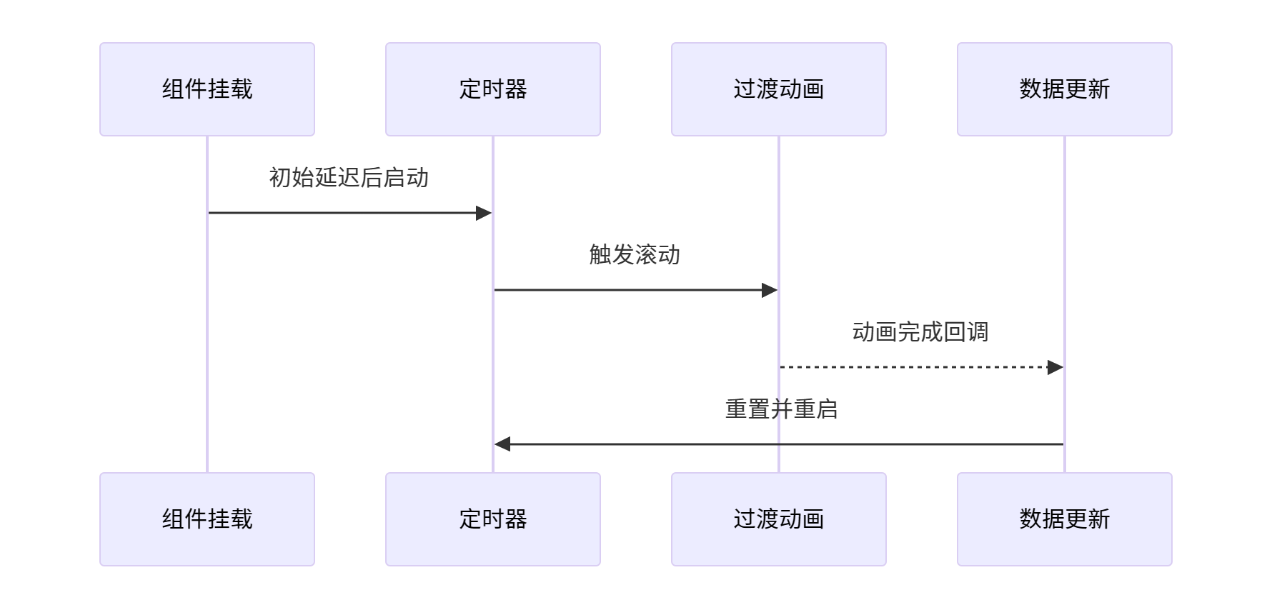
1. 初始化阶段
props配置处理
defineProps({width: { default: '600px' }, // 容器宽度智能处理height: { default: '150px' }, // 容器高度类型转换items: { required: true },    // 核心数据源scrollSpeed: { default: 1000 } // 控制动画流畅度
})
- 支持数字/字符串类型传值,内部统一处理单位
- 数据项强制要求保证业务数据完整性
2. 核心响应式数据
滚动位置控制
const currentOffset = ref(0) // 当前滚动偏移量
const itemHeight = ref(0)    // 动态计算的项目高度
- currentOffset 驱动 CSS transform 变化
- itemHeight 通过 DOM 查询动态获取
数据队列管理
const currentItems = ref([...props.items]) // 数据副本
function rotateItems() {currentItems.value = [...currentItems.value.slice(1), currentItems.value[0]]
}
- 深拷贝原始数据避免污染源
- 数组轮换实现循环展示
3. 滚动动画引擎
动画启动机制
function startScroll() {transitionEnabled.value = truecurrentOffset.value = -itemHeight.value // 触发CSS过渡
}
- 激活过渡效果
- 偏移量设置为单个项目高度
动画周期管理
function onTransitionEnd() {transitionEnabled.value = false // 冻结过渡currentOffset.value = 0        // 瞬时复位rotateItems()                  // 数据轮换nextTick(() => {timeoutId = setTimeout(startScroll, props.scrollDelay)})
}
4、动态适配处理
高度自适应逻辑
onMounted(() => {nextTick(() => {const firstItem = wrapper.value.querySelector('.ticker-item')itemHeight.value = firstItem?.offsetHeight || 0})
})
- 等待DOM渲染完成后获取实际高度
- 支持动态内容变化后的高度重计算
响应式数据监听
watch(() => props.items, (newVal) => {currentItems.value = [...newVal] // 数据同步更新currentOffset.value = 0         // 重置滚动位置
})
- 深度监听保证数据变化及时响应
- 状态充值确保滚动连贯性
5、扩展接口设计
插槽支持
<slot :item="item">{{ item }} <!-- 默认展示方案 -->
</slot>
- 支持自定义内容模板
- 作用域插槽暴露数据项
6、逻辑示意图
三、组件使用
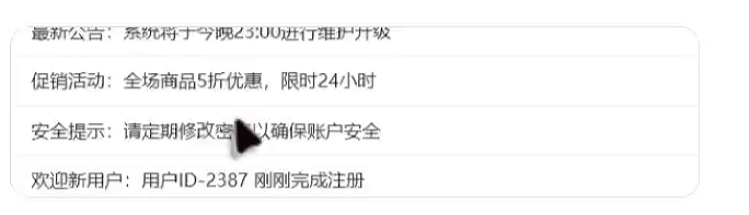
1. 基本使用
使用代码
const newsList = ['最新公告:系统将于今晚23:00进行维护升级','促销活动:全场商品5折优惠,限时24小时','安全提示:请定期修改密码以确保账户安全','欢迎新用户:用户ID-2387 刚刚完成注册','天气预报:明日多云转晴,气温22-28℃'
]<infoTicker :items="newsList" :scrollDelay="0" :width="600"></infoTicker>
效果展示
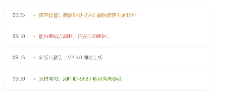
2. 插槽使用
使用代码
const newsList2 = ref([{time: '09:00',type: 'success',content: '支付成功:用户ID-9823 购买高级会员'},{time: '09:05',type: 'warning',content: '库存预警:商品SKU-2387 剩余库存不足10件'},{time: '09:10',type: 'error',content: '服务器响应超时,正在自动重试...'},{time: '09:15',type: 'info',content: '新版本预告:V2.3.0 即将上线'}
])<infoTicker:items="newsList2"speed="3000"scrollSpeed="800"width="600"height="60"
><template #default="{ item }"><div class="ticker-item" :class="item.type"><span class="time">{{ item.time }}</span><span class="dot">•</span><span class="content">{{ item.content }}</span></div></template>
</infoTicker><style lang="scss" scoped>
.ticker-item {display: flex;align-items: center;padding: 12px;font-size: 14px;
}.time {color: #666;min-width: 50px;
}.dot {margin: 0 10px;color: #999;
}.success { color: #67c23a; }
.warning { color: #e6a23c; }
.error { color: #f56c6c; }
.info { color: #909399; }
</style>
效果展示