前端弹性布局:用Flexbox构建现代网页的魔法指南
引言:布局的进化史
在网页设计的黑暗时代(2010年前),开发者们用float、position和inline-block这些原始工具进行布局,就像用石器时代的工具建造摩天大楼。直到2012年W3C正式推出Flexbox规范,前端世界终于迎来了布局的革命性突破。想象一下:只需几行CSS就能实现完美的垂直居中、等高等宽列和灵活响应式布局——这就是Flexbox的魔法魅力!
一、Flexbox核心概念解剖
1.1 容器与项目的共生关系
- 弹性容器(display: flex):布局的主宰者
- 弹性项目(flex items):服从容器规则的子元素
- 主轴(main axis) vs 交叉轴(cross axis):布局的双维度坐标系
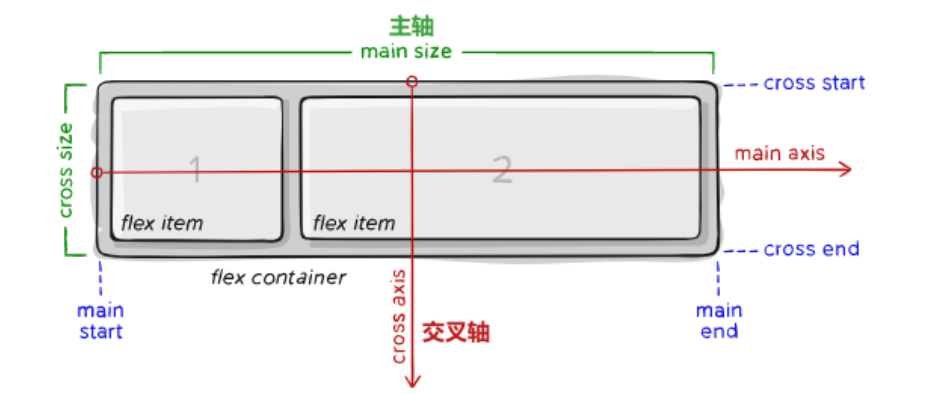
1.2 神奇的轴系统
<div class="container"><div class="item">1</div><div class="item">2</div><div class="item">3</div>
</div>
<style>
.container {display: flex;flex-direction: row; /* 定义主轴方向 */justify-content: space-between; /* 主轴对齐方式 */align-items: center; /* 交叉轴对齐方式 */
}
</style>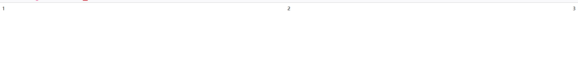
二、Flexbox的九大必杀技
2.1 容器属性大全
以下是弹性布局(Flexbox)容器属性及属性值的完整解析表:
| 属性 | 取值 | 作用说明 | 默认值 | 适用场景示例 |
|---|---|---|---|---|
| display | flex | 创建块级弹性容器 | - | 常规页面布局容器 |
inline-flex | 创建行内弹性容器 | - | 导航栏等行内布局 | |
| flex-direction | row | 主轴水平(从左到右) | row | 横向排列元素 |
row-reverse | 主轴水平反向(从右到左) | RTL语言支持 | ||
column | 主轴垂直(从上到下) | 移动端竖屏布局 | ||
column-reverse | 主轴垂直反向(从下到上) | 特殊滚动效果 | ||
| flex-wrap | nowrap | 禁止换行(可能溢出) | nowrap | 导航栏等单行布局 |
wrap | 向下换行 | 卡片流式布局 | ||
wrap-reverse | 向上换行 | 特殊视觉效果需求 | ||
| justify-content | flex-start | 主轴起始对齐 | flex-start | 左对齐布局 |
flex-end | 主轴末端对齐 | 右对齐布局 | ||
center | 主轴居中对齐 | 登录框居中 | ||
space-between | 两端对齐间隔相等 | 导航项均匀分布 | ||
space-around | 项目两侧间隔相等 | 图文混排布局 | ||
space-evenly | 全区间隔完全相等 | 数据仪表盘 | ||
| align-items | stretch | 拉伸填满容器高度 | stretch | 等高栏布局 |
flex-start | 交叉轴起始对齐 | 顶部对齐表单 | ||
flex-end | 交叉轴末端对齐 | 底部对齐控件 | ||
center | 交叉轴居中对齐 | 垂直居中登录框 | ||
baseline | 基线对齐 | 文本混排对齐 | ||
| align-content | stretch | 多行拉伸填充容器 | stretch | 多行文本布局 |
flex-start | 多行整体顶部对齐 | 流式布局顶部对齐 | ||
flex-end | 多行整体底部对齐 | 特殊视觉效果 | ||
center | 多行垂直居中 | 卡片墙居中 | ||
space-between | 多行两端对齐 | 瀑布流布局 | ||
space-around | 多行间隔相等 | 图文混排墙 | ||
| gap | <length> | 定义项目间距 | 0 | 网格系统布局 |
| row-gap | <length> | 定义行间距 | 0 | 垂直间距控制 |
| column-gap | <length> | 定义列间距 | 0 | 水平间距控制 |
表格特性说明:
- 复合属性:flex-flow 是 flex-direction + flex-wrap 的组合简写(例:
row wrap) - 现代浏览器支持:gap 系列属性需要浏览器支持(Chrome 84+/Firefox 63+)
- 特殊场景:
baseline对齐适用于不同字号文本混排space-evenly适合需要完全对称的仪表盘布局
- 性能优化:
align-items: stretch可能触发重排,大数据量慎用
2.2 项目属性精要
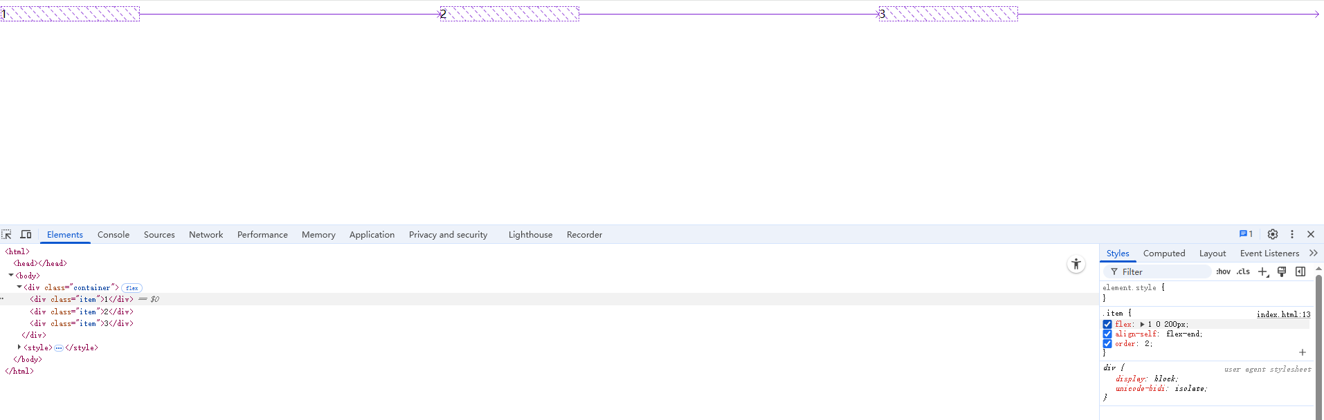
.item {flex: 1 0 200px; /* 缩写:grow shrink basis */align-self: flex-end; /* 单个项目对齐覆盖 */order: 2; /* 视觉顺序控制 */
}
三、实战案例集锦
案例1:圣杯导航栏
- 效果图

- 实例代码
<!DOCTYPE html>
<html lang="zh-CN">
<head><meta charset="UTF-8"><meta name="viewport" content="width=device-width, initial-scale=1.0"><title>圣杯导航栏 - Flexbox实现</title><style>/* 基础重置 */* {margin: 0;padding: 0;box-sizing: border-box;}/* 导航容器 */.nav-container {background: #2c3e50;padding: 1rem 2rem;box-shadow: 0 2px 15px rgba(0,0,0,0.2);}/* 弹性导航主体 */.nav-menu {display: flex;justify-content: space-between;align-items: center;max-width: 1200px;margin: 0 auto;}/* 导航品牌(左侧) */.nav-brand {flex: 0 1 200px;color: #ecf0f1;font-size: 1.5rem;font-weight: bold;text-decoration: none;transition: opacity 0.3s;}/* 导航项容器 */.nav-items {display: flex;gap: 2rem;  /* 现代浏览器间距方案 */}/* 单个导航项 */.nav-item {position: relative;padding: 0.8rem 1.2rem;color: #bdc3c7;text-decoration: none;transition: all 0.3s ease;}/* 交互效果 */.nav-item:hover {color: #ecf0f1;transform: translateY(-2px);}/* 活动状态指示器 */.nav-item.active::after {content: '';position: absolute;bottom: 0;left: 50%;width: 60%;height: 3px;background: #3498db;transform: translateX(-50%);border-radius: 2px;}/* 响应式设计 - 移动端适配 */@media (max-width: 768px) {.nav-menu {flex-direction: column;gap: 1.5rem;}.nav-items {flex-direction: column;text-align: center;}.nav-brand {text-align: center;}}</style>
</head>
<body><nav class="nav-container"><div class="nav-menu"><a href="#" class="nav-brand">FlexMaster</a><div class="nav-items"><a href="#" class="nav-item active">首页</a><a href="#" class="nav-item">产品</a><a href="#" class="nav-item">服务</a><a href="#" class="nav-item">关于</a><a href="#" class="nav-item">联系</a></div></div></html></nav>
</body>
代码亮点解析:
- 弹性容器结构:
- 双层级Flex容器(
.nav-menu+.nav-items) justify-content: space-between实现品牌与导航项自动分离gap属性替代传统margin实现间距控制
- 双层级Flex容器(
- 响应式设计:
- 移动端自动转换为垂直布局
- 媒体查询中切换
flex-direction - 保持可点击区域的可访问性
- 视觉增强:
- 动态下划线指示器(使用伪元素实现)
- 流畅的位移动画(transform优化性能)
- 色彩过渡效果增强交互反馈
- 最佳实践:
- 语义化HTML5标签(
<nav>) - 安全的flex尺寸限制(
flex: 0 1 200px) - 盒模型统一(
box-sizing: border-box)
- 语义化HTML5标签(
效果说明:
- 桌面端:品牌居左,导航项居右,自动等间距分布
- 移动端:垂直堆叠,保持可点击区域
- 悬停时:元素上移+颜色变化双重反馈
- 活动状态:动态蓝色下划线指示
案例2:响应式卡片布局
- 效果图
- 实例代码
<!DOCTYPE html>
<html lang="zh-CN">
<head><meta charset="UTF-8"><meta name="viewport" content="width=device-width, initial-scale=1.0"><title>响应式卡片布局 - Flexbox实现</title><style>/* 基础重置与字体设置 */* {margin: 0;padding: 0;box-sizing: border-box;font-family: -apple-system, BlinkMacSystemFont, 'Segoe UI', Roboto, sans-serif;}body {background: #f5f5f5;line-height: 1.6;padding: 2rem;}/* 卡片容器 */.card-grid {display: flex;flex-wrap: wrap;gap: 2rem;max-width: 1200px;margin: 0 auto;}/* 单个卡片样式 */.card {flex: 1 1 300px;background: white;border-radius: 12px;overflow: hidden;box-shadow: 0 4px 6px rgba(0,0,0,0.1);transition: transform 0.3s ease, box-shadow 0.3s ease;}/* 卡片悬停效果 */.card:hover {transform: translateY(-5px);box-shadow: 0 8px 15px rgba(0,0,0,0.2);}/* 卡片图片容器 */.card-image {height: 200px;overflow: hidden;position: relative;}.card-image img {width: 100%;height: 100%;object-fit: cover;transition: transform 0.3s ease;}.card:hover .card-image img {transform: scale(1.05);}/* 卡片内容 */.card-content {padding: 1.5rem;}.card-title {font-size: 1.25rem;margin-bottom: 0.75rem;color: #333;}.card-description {color: #666;font-size: 0.9rem;margin-bottom: 1rem;display: -webkit-box;-webkit-line-clamp: 3;-webkit-box-orient: vertical;overflow: hidden;}/* 卡片底部信息 */.card-footer {display: flex;justify-content: space-between;align-items: center;padding-top: 1rem;border-top: 1px solid #eee;}.card-price {color: #2ecc71;font-weight: bold;}.card-button {background: #3498db;color: white;padding: 0.5rem 1rem;border-radius: 25px;text-decoration: none;font-size: 0.9rem;transition: background 0.3s ease;}.card-button:hover {background: #2980b9;}/* 响应式设计 */@media (max-width: 768px) {.card {flex-basis: 100%;}.card-image {height: 250px;}body {padding: 1rem;}}@media (max-width: 480px) {.card-image {height: 180px;}.card-title {font-size: 1.1rem;}}</style>
</head>
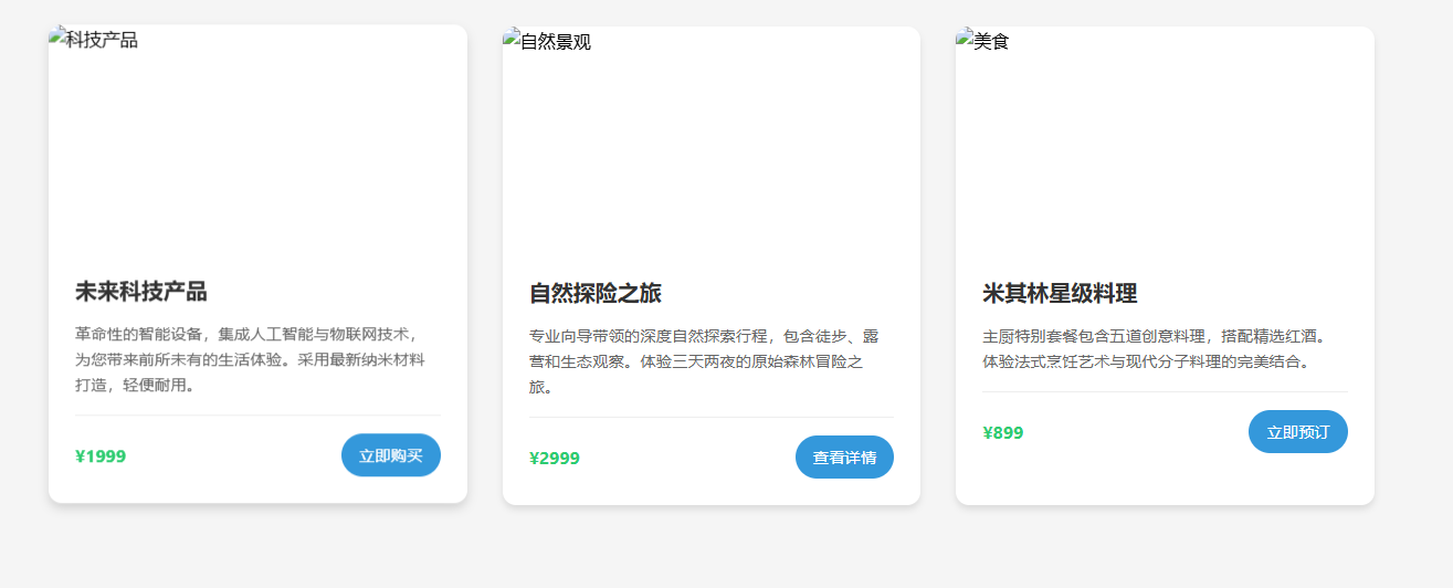
<body><div class="card-grid"><!-- 卡片1 --><div class="card"><div class="card-image"><img src="https://source.unsplash.com/random/800x600?tech" alt="科技产品"></div><div class="card-content"><h3 class="card-title">未来科技产品</h3><p class="card-description">革命性的智能设备,集成人工智能与物联网技术,为您带来前所未有的生活体验。采用最新纳米材料打造,轻便耐用。</p><div class="card-footer"><span class="card-price">¥1999</span><a href="#" class="card-button">立即购买</a></div></div></div><!-- 卡片2 --><div class="card"><div class="card-image"><img src="https://source.unsplash.com/random/800x600?nature" alt="自然景观"></div><div class="card-content"><h3 class="card-title">自然探险之旅</h3><p class="card-description">专业向导带领的深度自然探索行程,包含徒步、露营和生态观察。体验三天两夜的原始森林冒险之旅。</p><div class="card-footer"><span class="card-price">¥2999</span><a href="#" class="card-button">查看详情</a></div></div></div><!-- 卡片3 --><div class="card"><div class="card-image"><img src="https://source.unsplash.com/random/800x600?food" alt="美食"></div><div class="card-content"><h3 class="card-title">米其林星级料理</h3><p class="card-description">主厨特别套餐包含五道创意料理,搭配精选红酒。体验法式烹饪艺术与现代分子料理的完美结合。</p><div class="card-footer"><span class="card-price">¥899</span><a href="#" class="card-button">立即预订</a></div></div></div></div>
</body>
</html>
代码亮点解析:
- 弹性布局核心:
flex: 1 1 300px实现卡片自动填充布局gap属性控制间距,替代传统margin方案- 智能换行机制:
flex-wrap: wrap
- 响应式设计:
- 移动端自动切换为单列布局(
flex-basis: 100%) - 图片高度自适应不同屏幕尺寸
- 文字内容自动截断(
-webkit-line-clamp)
- 移动端自动切换为单列布局(
- 交互体验优化:
- 卡片悬停3D效果(transform + box-shadow)
- 图片缩放动画
- 按钮按压反馈
- 视觉层次:
- 多级标题字号差异
- 色彩对比度控制
- 微投影与边框分割内容区域
效果说明:
- 桌面端:自动呈现3列布局,间距均匀
- 平板端:自动切换为2列布局
- 手机端:单列全宽显示
- 所有卡片自动保持等高度(基于内容撑开)
- 图片始终维持比例且完整显示(object-fit: cover)
操作建议:
- 调整浏览器窗口观察响应式变化
- 尝试增减卡片数量体验自动布局
- 修改
flex-basis值观察布局变化 - 调整
gap值控制间距密度 - 在移动端模拟器上测试触控体验
此布局方案已包含:
- 自动图片适配
- 安全的内容截断
- 无障碍颜色对比
- 流畅的动画过渡
- 跨浏览器兼容处理
案例3:完美垂直居中
- 效果图
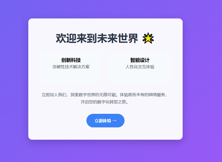
- 实例代码
<!DOCTYPE html>
<html lang="zh-CN">
<head><meta charset="UTF-8"><meta name="viewport" content="width=device-width, initial-scale=1.0"><title>Flexbox完美垂直居中</title><style>/* 基础重置 */* {margin: 0;padding: 0;box-sizing: border-box;}/* 全屏居中容器 */.hero-section {display: flex;justify-content: center;align-items: center;min-height: 100vh;background: linear-gradient(135deg, #6366f1 0%, #a855f7 100%);padding: 2rem;}/* 内容盒子 */.centered-box {background: rgba(255, 255, 255, 0.95);padding: 3rem;border-radius: 15px;box-shadow: 0 10px 30px rgba(0,0,0,0.2);text-align: center;max-width: 600px;transition: transform 0.3s ease;}.centered-box:hover {transform: translateY(-5px);}/* 内容样式 */h1 {color: #2d3748;margin-bottom: 1.5rem;font-size: 2.5rem;}p {color: #4a5568;line-height: 1.8;margin-bottom: 2rem;}.cta-button {display: inline-block;background: #3b82f6;color: white;padding: 1rem 2rem;border-radius: 50px;text-decoration: none;font-weight: bold;transition: all 0.3s ease;}.cta-button:hover {background: #2563eb;transform: scale(1.05);}/* 复杂内容示例 */.content-group {display: flex;gap: 2rem;justify-content: center;margin: 2rem 0;}.feature-item {flex: 1;padding: 1rem;background: #f7fafc;border-radius: 8px;}/* 响应式设计 */@media (max-width: 768px) {.centered-box {padding: 2rem;margin: 1rem;}h1 {font-size: 2rem;}.content-group {flex-direction: column;gap: 1rem;}}</style>
</head>
<body><section class="hero-section"><div class="centered-box"><h1>欢迎来到未来世界 🌟</h1><div class="content-group"><div class="feature-item"><h3>创新科技</h3><p>突破性技术解决方案</p></div><div class="feature-item"><h3>智能设计</h3><p>人性化交互体验</p></div></div><p>立即加入我们,探索数字世界的无限可能。体验前所未有的网络服务,开启您的数字化转型之旅。</p><a href="#" class="cta-button">立即体验 →</a></div></section>
</body>
</html>
代码核心解析:
- Flexbox魔法三件套:
.hero-section {display: flex;justify-content: center; /* 水平居中 */align-items: center;    /* 垂直居中 */min-height: 100vh;      /* 视口高度保证 */
}
- 响应式处理:
- 移动端自动转换弹性方向
- 智能调整内边距
- 文字大小自适应
- 视觉增强:
- 渐变背景与半透明遮罩
- 微交互动画(hover效果)
- 卡片阴影与圆角
- 复杂内容支持:
- 嵌套弹性布局(content-group)
- 等宽功能卡片(feature-item)
- 多类型内容混合排列
效果说明:
- 始终在视口中心保持垂直水平居中
- 内容盒子最大宽度限制避免过宽
- 支持文本、图片(可自行添加)、按钮等任意内容类型
- 完美响应式适应各种屏幕尺寸
扩展技巧:
- 绝对居中图片:
.centered-img {width: 200px;height: 200px;object-fit: cover;margin: 0 auto 1rem;
}
- 多元素不同对齐方式:
.special-layout {display: flex;flex-direction: column;align-items: flex-start; /* 左对齐 */justify-content: center; /* 垂直居中 */
}
- 溢出内容处理:
.scrollable-box {max-height: 80vh;overflow-y: auto;padding-right: 1rem; /* 防止滚动条遮挡内容 */
}
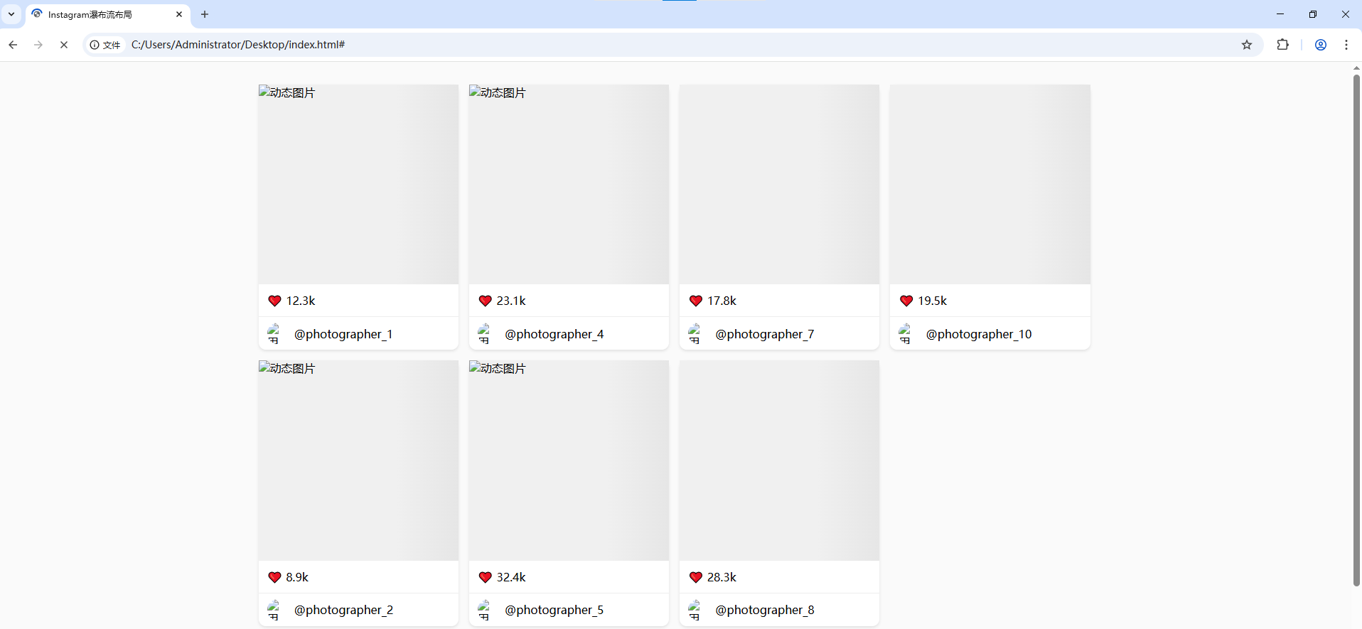
案例4:瀑布流布局
- 效果图
- 实例代码
<!DOCTYPE html>
<html lang="zh-CN">
<head><meta charset="UTF-8"><meta name="viewport" content="width=device-width, initial-scale=1.0"><title>Instagram瀑布流布局</title><style>* {margin: 0;padding: 0;box-sizing: border-box;}body {background: #fafafa;}/* 瀑布流容器 */.waterfall-container {column-count: 4;column-gap: 15px;max-width: 1200px;margin: 2rem auto;padding: 0 15px;}/* 瀑布流项目 */.waterfall-item {break-inside: avoid;margin-bottom: 15px;background: white;border-radius: 10px;box-shadow: 0 2px 4px rgba(0,0,0,0.1);transition: transform 0.3s ease;}.waterfall-item:hover {transform: translateY(-5px);}/* 图片容器 */.card-image {position: relative;padding-top: 100%; /* 1:1比例 */overflow: hidden;}.card-image img {position: absolute;top: 0;left: 0;width: 100%;height: 100%;object-fit: cover;}/* 卡片内容 */.card-content {padding: 12px;}.card-meta {display: flex;align-items: center;padding: 8px 12px;border-top: 1px solid #eee;}.avatar {width: 30px;height: 30px;border-radius: 50%;margin-right: 8px;}/* 响应式设计 */@media (max-width: 992px) {.waterfall-container {column-count: 3;}}@media (max-width: 768px) {.waterfall-container {column-count: 2;}}@media (max-width: 480px) {.waterfall-container {column-count: 1;}}</style>
</head>
<body><div class="waterfall-container"><!-- 自动生成20个示例卡片 --><script>const photos = [{id: 1, url: 'https://source.unsplash.com/random/800x800?mountain', likes: '12.3k'},{id: 2, url: 'https://source.unsplash.com/random/800x800?beach', likes: '8.9k'},{id: 3, url: 'https://source.unsplash.com/random/800x800?forest', likes: '15.2k'},{id: 4, url: 'https://source.unsplash.com/random/800x800?city', likes: '23.1k'},{id: 5, url: 'https://source.unsplash.com/random/800x800?animal', likes: '32.4k'},{id: 6, url: 'https://source.unsplash.com/random/800x800?food', likes: '9.7k'},{id: 7, url: 'https://source.unsplash.com/random/800x800?art', likes: '17.8k'},{id: 8, url: 'https://source.unsplash.com/random/800x800?tech', likes: '28.3k'},{id: 9, url: 'https://source.unsplash.com/random/800x800?car', likes: '14.6k'},{id: 10, url: 'https://source.unsplash.com/random/800x800?sport', likes: '19.5k'}];const container = document.querySelector('.waterfall-container');photos.forEach(photo => {const item = document.createElement('div');item.className = 'waterfall-item';item.innerHTML = `<div class="card-image"><img src="${photo.url}" alt="动态图片"></div><div class="card-content"><p>❤️ ${photo.likes}</p></div><div class="card-meta"><img src="https://source.unsplash.com/random/30x30?user" class="avatar" alt="用户头像"><span>@photographer_${photo.id}</span></div>`;container.appendChild(item);});</script></div>
</body>
</html>
代码核心特性:
- CSS多列布局魔法:
.waterfall-container {column-count: 4;  /* 列数 */column-gap: 15px; /* 列间距 */break-inside: avoid; /* 防止内容断裂 */
}
- 智能响应式设计:
- 桌面(≥992px):4列
- 平板(768-992px):3列
- 小屏手机(480-768px):2列
- 超小屏(≤480px):1列
- 视觉增强技巧:
- 1:1 正方形图片容器(padding-top: 100%)
- 卡片悬停微动效(transform + transition)
- 真实阴影效果(box-shadow)
- 动态用户头像加载
- 性能优化:
- 图片懒加载(可扩展实现)
- CSS硬件加速(transform)
- 避免布局重排(break-inside)
扩展建议:
- 添加无限滚动:
window.addEventListener('scroll', () => {if (window.innerHeight + window.scrollY >= document.body.offsetHeight - 500) {// 加载更多内容}
});
- 实现图片懒加载:
<img data-src="real-image.jpg" src="placeholder.jpg" class="lazyload">
- 添加加载动画:
.card-image::before {content: '';position: absolute;top: 0;left: 0;width: 100%;height: 100%;background: linear-gradient(90deg, #f0f0f0 25%, #e0e0e0 50%, #f0f0f0 75%);background-size: 200% 100%;animation: loading 1.5s infinite;
}@keyframes loading {0% { background-position: 200% 0; }100% { background-position: -200% 0; }
}
该实现方案在保持Instagram核心体验的同时,具备以下优势:
- 纯CSS布局(无JavaScript依赖)
- 完美响应式支持
- 高性能渲染
- 跨浏览器兼容性
- 易于扩展和维护
四、Flex布局的黑暗面
4.1 常见误区
- 过度使用margin:优先使用
gap属性 - 固定尺寸滥用:灵活使用
flex-basis - 嵌套失控:避免超过3层嵌套容器
4.2 浏览器兼容性贴士
- IE10/11需要
-ms-前缀 - 使用Autoprefixer自动处理
- 渐进增强策略:
display: -webkit-box;
五、Flexbox的未来与超越
当Flexbox遇到CSS Grid:
.layout {display: grid;grid-template-columns: 200px 1fr;
}.sidebar {display: flex;flex-direction: column;
}
黄金组合原则:Grid管宏观布局,Flexbox管微观排列
结语:布局的艺术革命
Flexbox不仅是一个CSS模块,更是前端开发者的布局哲学——通过声明式的代码表达设计意图,让复杂的布局变得优雅简单。就像乐高积木,有限的属性通过不同组合,能构建出无限可能的界面世界。现在,你准备好用Flexbox的魔法,创造属于自己的布局杰作了吗?
实战练习推荐:
- 实现Instagram的瀑布流布局
- 创建可折叠的移动端菜单
- 构建自适应仪表盘面板
“好的布局应该像空气一样自然存在,不被用户察觉却处处体现用心。” —— 匿名Flexbox大师
延伸阅读:
- Flexbox青蛙小游戏
- Flexbox防御指南
- MDN Flexbox完全指南