Flutter AppBar 详解
目录
一、引言
二、AppBar 的基本用法
三、主要属性
四、自定义 AppBar
4.1 自定义 leading 图标
4.2 添加 actions 右侧菜单
4.3 自定义 AppBar 样式
五、最佳实践与注意事项
5.1 常见场景处理
5.2 性能优化
5.3 设计规范
六、结论
相关推荐
一、引言
AppBar 是 Flutter 提供的顶栏组件,通常用于应用的导航栏,包含标题、返回按钮、菜单等功能。AppBar 结合 Scaffold 使用,能够增强用户体验,提供一致的导航交互。本文将介绍 AppBar 的基本用法、主要属性及自定义方式。
二、AppBar 的基本用法
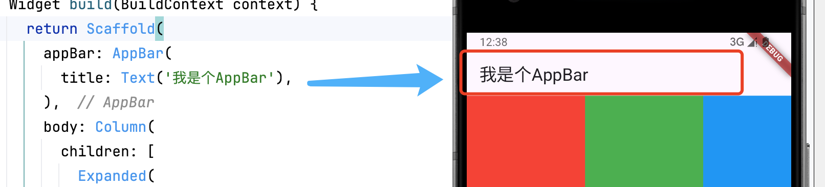
AppBar 主要通过 title 设置标题,并可包含 leading(左侧组件)和 actions(右侧操作按钮)。
Scaffold(appBar: AppBar(title: Text('我是个AppBar'),),body: // 页面内容
)
三、主要属性
| 属性 | 说明 |
|---|---|
title | 标题组件,通常为 Text |
leading | 左侧组件,常用于返回按钮、菜单按钮等 |
actions | 右侧操作按钮,可放置多个 IconButton 或 PopupMenuButton |
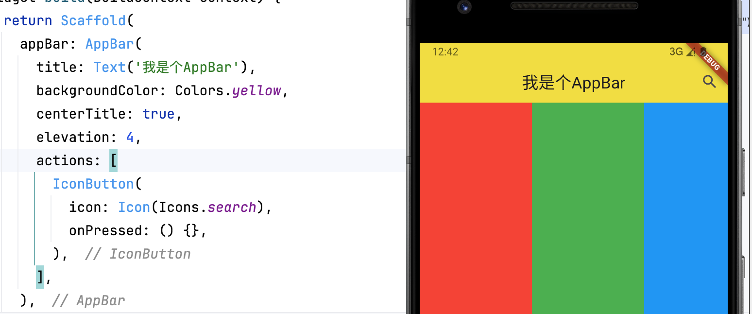
backgroundColor | AppBar 的背景颜色 |
elevation | 阴影高度 |
centerTitle | 是否居中标题(true 居中,false 左对齐) |
示例:
AppBar(title: Text('我是个AppBar'),backgroundColor: Colors.yellow,centerTitle: true,elevation: 4,actions: [IconButton(icon: Icon(Icons.search),onPressed: () {},),],
)
四、自定义 AppBar
4.1 自定义 leading 图标
AppBar(leading: IconButton(icon: Icon(Icons.menu),onPressed: () {},),title: Text('导航栏'),
)
4.2 添加 actions 右侧菜单
AppBar(title: Text('操作栏'),actions: [IconButton(icon: Icon(Icons.notifications), onPressed: () {}),IconButton(icon: Icon(Icons.settings), onPressed: () {}),],
)
4.3 自定义 AppBar 样式
五、最佳实践与注意事项
5.1 常见场景处理
-
隐藏返回按钮:
automaticallyImplyLeading: false -
动态标题:使用状态管理更新 title
-
响应式布局:根据屏幕尺寸调整布局
5.2 性能优化
-
避免在 AppBar 中使用重型组件
-
对需要频繁更新的部分使用 const 构造函数
-
复杂布局考虑使用 SliverAppBar
5.3 设计规范
-
保持操作按钮不超过 3 个(溢出使用 PopupMenu)
-
确保文字与背景的对比度符合可访问性标准
-
在 iOS/Android 上遵循各自平台的设计规范
六、结论
AppBar 是 Flutter 中重要的导航栏组件,结合 leading、actions 可实现丰富的功能。通过自定义 backgroundColor、elevation、shape 等属性,可以打造个性化的 AppBar,提升用户体验。
相关推荐
Flutter Expanded 与 Flexible 详解-CSDN博客文章浏览阅读2.5k次,点赞66次,收藏68次。Expanded 和 Flexible 是 Flutter 中用于控制弹性布局的重要组件。Expanded 强制填充空间,而 Flexible 允许子组件决定是否扩展。理解它们的差异并结合 flex 参数,可以更高效地实现响应式 UI 布局。_flutter expandedhttps://shuaici.blog.csdn.net/article/details/146070160Flutter ListView 详解-CSDN博客文章浏览阅读1.2k次,点赞35次,收藏29次。ListView 是 Flutter 中用于构建滚动列表的核心组件,支持垂直、水平滚动以及复杂的动态布局。本文将深入解析其核心用法、性能优化策略和高级功能实现,助你打造流畅高效的列表界面。_flutter listview
https://shuaici.blog.csdn.net/article/details/147290041