Compose组件转换XML布局1.0
文章目录
- 学习JetPack Compose资源
- 前言:
- 预览界面的实现
- Compose组件的布局管理
- 一、Row和Colum组件(LinearLayout)
- `LinearLayout`(垂直方向 → `Column`)
- `LinearLayout`(水平方向 → `Row`)
- 二、相对布局 `FrameLayout` → Box
- 三、`RelativeLayout` → **`ConstraintLayout`** 或 **`Box`**
- 1. 用 `ConstraintLayout` 实现相对定位
- 2. 用 `Box` 实现简单相对布局
- 五、`GridLayout` → **`LazyVerticalGrid`** 或自定义行/列
- 1. 网格布局
- 六、`TableLayout` → **嵌套 `Row` 和 `Column`**
- 七、`ScrollView` → **`Modifier.verticalScroll`** 或 **`LazyColumn`**
- 1. 简单滚动
- 2. 惰性滚动(大数据集用 `LazyColumn`)
- 八、`Space` → **`Spacer`**
- 九、`include` 标签 → **`@Composable` 函数**
- 1. 定义可复用组件
- 总结对比表
学习JetPack Compose资源
学习资源:JetPack Compose博物馆
前言:
在JetPack Compose博物馆中,对于compose的讲解较为详细,我这篇笔记主要是记录自己不懂和不理解的知识点,可能会重复,也可能有其他的,学习Compose布局一般都是从传统XML布局中进行转换的,接下来开始学习不同布局的Compose组件。
预览界面的实现
1、在传统的XML文件中,都是可以一边填写代码一边查看页面,在Compose如何实现呢?
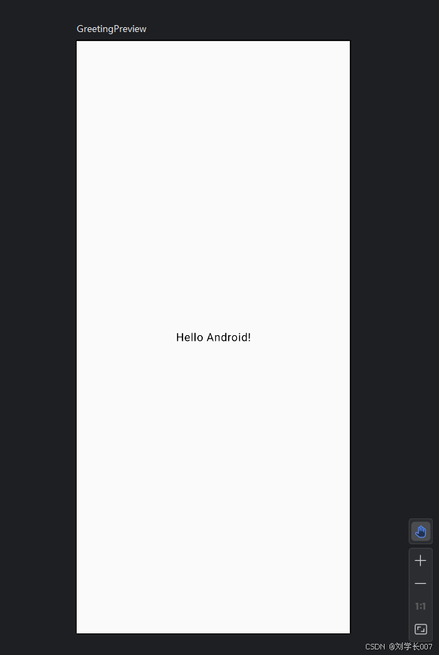
首先,对一个无参的方法添加@Preview和@Composable的注解,如下图所示
@Preview(showBackground = true)
@Composable
fun GreetingPreview() {
    ChainOfCustodyTheme {

            Text(
                text = "Hello Android!",
                modifier = Modifier.fillMaxSize().wrapContentSize(Alignment.Center), // 内容居中
            )

    }
}
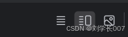
2、上述的图标分别为Code 、Split、Design,选择Split就可以看到分屏显示,默认为左右分屏,再次点击Split图标可以切换为上下分屏。
3、在添加注解的方法中,有个小图标,点击可直接在设备中运行该方法,不需要全部运行了。如下图所示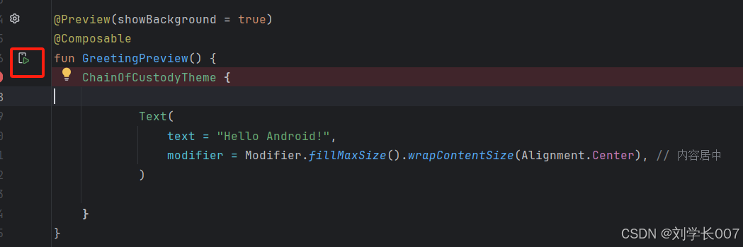
Compose组件的布局管理
一、Row和Colum组件(LinearLayout)
看字面意思可知,Row对应XML布局中LinearLayout的水平布局,Colum对应XML布局中LinearnLayout的垂直布局
LinearLayout(垂直方向 → Column)
基本用法:
@Composable
fun VerticalList() {
    Column(
        modifier = Modifier
            .fillMaxWidth()
            .padding(16.dp),
        verticalArrangement = Arrangement.SpaceEvenly // 垂直分布方式
    ) {
        Text("Item 1")
        Text("Item 2")
        Text("Item 3")
    }
}
等效于:
<LinearLayout
    android:layout_width="match_parent"
    android:layout_height="wrap_content"
    android:orientation="vertical">
    <TextView ... />
    <TextView ... />
    <TextView ... />
</LinearLayout>
LinearLayout(水平方向 → Row)
权重分配
@Composable
fun HorizontalWeight() {
    Row(modifier = Modifier.fillMaxWidth()) {
        Text(
            text = "Left",
            modifier = Modifier
                .weight(1f) // 占剩余空间的1/3
                .background(Color.Gray)
        )
        Text(
            text = "Right",
            modifier = Modifier
                .weight(2f) // 占剩余空间的2/3
                .background(Color.LightGray)
        )
    }
}
等效于
<LinearLayout
    android:layout_width="match_parent"
    android:orientation="horizontal">
    <TextView
        android:layout_width="0dp"
        android:layout_weight="1" .../>
    <TextView
        android:layout_width="0dp"
        android:layout_weight="2" .../>
</LinearLayout>
二、相对布局 FrameLayout → Box
叠加元素
@Composable
fun OverlayElements() {
    Box(modifier = Modifier.fillMaxSize()) {
        Image(
            painter = painterResource(R.drawable.background),
            contentDescription = null,
            modifier = Modifier.matchParentSize()
        )
        Button(
            onClick = { /* ... */ },
            modifier = Modifier.align(Alignment.BottomEnd) // 右下角对齐
        ) {
            Text("Action")
        }
    }
}
等效于
<FrameLayout ...>
    <ImageView ... />
    <Button
        android:layout_gravity="bottom|end" ... />
</FrameLayout>
三、RelativeLayout → ConstraintLayout 或 Box
使用ConstraintLayout需要额外添加依赖,注意需要和传统ConstrainLayout区分开来
依赖添加:
implementation("androidx.constraintlayout:constraintlayout-compose:1.1.0-alpha13")
1. 用 ConstraintLayout 实现相对定位
@Composable
fun RelativePositioning() {
    ConstraintLayout(modifier = Modifier.fillMaxWidth()) {
        val (button, text) = createRefs()

        Button(
            onClick = { /* ... */ },
            modifier = Modifier.constrainAs(button) {
                start.linkTo(parent.start)
                top.linkTo(parent.top)
            }
        ) { Text("Button") }

        Text(
            text = "Next to Button",
            modifier = Modifier.constrainAs(text) {
                start.linkTo(button.end, margin = 16.dp)
                top.linkTo(button.top)
            }
        )
    }
}
2. 用 Box 实现简单相对布局
Box(modifier = Modifier.fillMaxSize()) {
    Text("Center", modifier = Modifier.align(Alignment.Center))
    Text("Top Start", modifier = Modifier.align(Alignment.TopStart))
}
五、GridLayout → LazyVerticalGrid 或自定义行/列
1. 网格布局
直接调用组件LazyVerticalGrid既可以完成实现
LazyVerticalGrid(
    columns = GridCells.Fixed(2), // 2列
    modifier = Modifier.fillMaxWidth()
) {
    items(10) { index ->
        Card(
            modifier = Modifier
                .padding(8.dp)
                .aspectRatio(1f)
        ) {
            Box(modifier = Modifier.background(Color.LightGray)) {
                Text("Item $index", modifier = Modifier.align(Alignment.Center))
            }
        }
    }
}
六、TableLayout → 嵌套 Row 和 Column
@Composable
fun TableExample() {
    Column(modifier = Modifier.padding(16.dp)) {
        // 表头行
        Row(modifier = Modifier.fillMaxWidth()) {
            Text(
                text = "Header 1",
                modifier = Modifier.weight(1f).padding(8.dp)
            )
            Text(
                text = "Header 2",
                modifier = Modifier.weight(2f).padding(8.dp)
            )
        }
        Divider(color = Color.Black, thickness = 1.dp)
        // 数据行
        Row(modifier = Modifier.fillMaxWidth()) {
            Text(
                text = "Data 1",
                modifier = Modifier.weight(1f).padding(8.dp)
            )
            Text(
                text = "Data 2",
                modifier = Modifier.weight(2f).padding(8.dp)
            )
        }
    }
}
七、ScrollView → Modifier.verticalScroll 或 LazyColumn
1. 简单滚动
Column(
    modifier = Modifier
        .fillMaxSize()
        .verticalScroll(rememberScrollState())
) {
    repeat(50) { index ->
        Text("Item $index", modifier = Modifier.padding(8.dp))
    }
}
2. 惰性滚动(大数据集用 LazyColumn)
LazyColumn {
    items(1000) { index ->
        Text("Item $index", modifier = Modifier.padding(8.dp))
    }
}
八、Space → Spacer
Row {
    Text("Left")
    Spacer(modifier = Modifier.weight(1f)) // 占满剩余空间
    Text("Right")
}
九、include 标签 → @Composable 函数
1. 定义可复用组件
@Composable
fun Header(title: String) {
    Text(
        text = title,
        style = MaterialTheme.typography.h4,
        modifier = Modifier.padding(16.dp)
    )
}

// 在父布局中调用
Column {
    Header("Settings")
    // 其他内容...
}
总结对比表
| 传统布局 | Compose 替代方案 | 关键特性 |
|---|---|---|
LinearLayout(垂直) | Column | verticalArrangement 控制垂直间距 |
LinearLayout(水平) | Row | horizontalArrangement 控制水平间距 |
FrameLayout | Box | align 控制子项对齐方式 |
RelativeLayout | ConstraintLayout | 通过 linkTo 定义约束关系 |
GridLayout | LazyVerticalGrid | 固定列数或自适应列宽 |
TableLayout | 嵌套 Row 和 Column | 通过 weight 实现单元格比例 |
ScrollView | Modifier.verticalScroll | 简单滚动内容 |
ListView/RecyclerView | LazyColumn/LazyRow | 惰性加载 + 自动复用 |
Space | Spacer | 空白占位 |
include | @Composable 函数 | 直接调用自定义组件 |