Vue3气泡卡片(Popover)
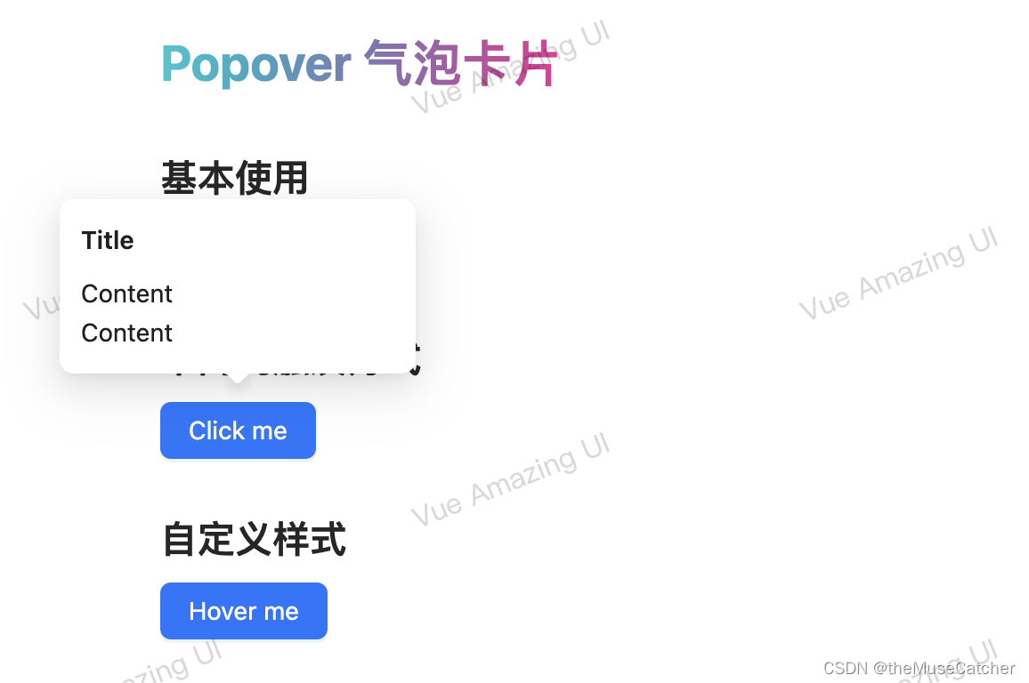
效果如下图:在线预览
APIs
| 参数 | 说明 | 类型 | 默认值 | 必传 |
|---|---|---|---|---|
| title | 卡片标题 | string | slot | ‘’ | false |
| content | 卡片内容 | string | slot | ‘’ | false |
| maxWidth | 卡片内容最大宽度 | string | number | ‘auto’ | false |
| trigger | 卡片触发方式 | ‘hover’ | ‘click’ | ‘hover’ | false |
| overlayStyle | 卡片样式 | CSSProperties | {} | false |
Events
| 事件名称 | 说明 | 参数 |
|---|---|---|
| openChange | 显示隐藏的回调 | (visible: boolean) => void |
注:组件引用方法 import { rafTimeout, cancelRaf } from ‘…/index’ 请参考该博客
创建气泡卡片组件Popover.vue
<script setup lang="ts">
import { ref, computed, useSlots } from 'vue'
import type { Slot, CSSProperties } from 'vue'
import { rafTimeout, cancelRaf } from '../index'
interface Props {
  title?: string|Slot // 卡片标题
  content?: string|Slot // 卡片内容
  maxWidth?: string|number // 卡片内容最大宽度
  trigger?: 'hover'|'click' // 卡片触发方式
  overlayStyle?: CSSProperties // 卡片样式
}
const props = withDefaults(defineProps<Props>(), {
  title: '',
  content: '',
  maxWidth: 'auto',
  trigger: 'hover',
  overlayStyle: () => ({})
})
const popMaxWidth = computed(() => {
  if (typeof props.maxWidth === 'number') {
    return props.maxWidth + 'px'
  }
  return props.maxWidth
})
const visible = ref(false)
const top = ref(0) // 提示框top定位
const left = ref(0) // 提示框left定位
const defaultRef = ref() // 声明一个同名的模板引用
const popRef = ref() // 声明一个同名的模板引用
function getPosition () {
  const defaultWidth = defaultRef.value.offsetWidth // 展示文本宽度
  const popWidth = popRef.value.offsetWidth // 提示文本宽度
  const popHeight = popRef.value.offsetHeight // 提示文本高度
  top.value = popHeight + 4
  left.value = (popWidth - defaultWidth) / 2
}
const emit = defineEmits(['openChange'])
const hideTimer = ref()
function onShow () {
  getPosition()
  cancelRaf(hideTimer.value)
  visible.value = true
  emit('openChange', visible.value)
}
function onHide (): void {
  hideTimer.value = rafTimeout(() => {
    visible.value = false
    emit('openChange', visible.value)
  }, 100)
}
const activeBlur = ref(false) // 是否激活 blur 事件
function onOpen () {
  visible.value = !visible.value
  if (visible.value) {
    getPosition()
  }
  emit('openChange', visible.value)
}
function onEnter () {
  activeBlur.value = false
}
function onLeave () {
  activeBlur.value = true
  popRef.value.focus()
}
function onBlur () {
  visible.value = false
  emit('openChange', false)
}
</script>
<template>
  <div
    class="m-popover"
    @mouseenter="trigger === 'hover' ? onShow() : () => false"
    @mouseleave="trigger === 'hover' ? onHide() : () => false">
    <div
      ref="popRef"
      tabindex="1"
      class="m-pop-content"
      :class="{'show-pop': visible}"
      :style="`max-width: ${popMaxWidth}; top: ${-top}px; left: ${-left}px;`"
      @blur="trigger === 'click' && activeBlur ? onBlur() : () => false"
      @mouseenter="trigger === 'hover' ? onShow() : () => false"
      @mouseleave="trigger === 'hover' ? onHide() : () => false">
      <div class="m-pop" :style="overlayStyle">
        <div class="m-title">
          <slot name="title">{{ title }}</slot>
        </div>
        <div class="m-content">
          <slot name="content">{{ content }}</slot>
        </div>
      </div>
      <div class="m-pop-arrow">
        <span class="u-pop-arrow"></span>
      </div>
    </div>
    <div
      ref="defaultRef"
      @click="trigger === 'click' ? onOpen() : () => false"
      @mouseenter="trigger === 'click' ? onEnter() : () => false"
      @mouseleave="trigger === 'click' ? onLeave() : () => false">
      <slot></slot>
    </div>
  </div>
</template>
<style lang="less" scoped>
.m-popover {
  position: relative;
  display: inline-block;
  .m-pop-content {
    position: absolute;
    z-index: 999;
    width: max-content;
    padding-bottom: 12px;
    outline: none;
    pointer-events: none;
    opacity: 0;
    transform-origin: 50% 75%;
    transform: scale(.8);
    transition: transform .25s, opacity .25s;
    .m-pop {
      min-width: 32px;
      min-height: 32px;
      padding: 12px;
      font-size: 14px;
      color: rgba(0, 0, 0, .88);
      line-height: 1.5714285714285714;
      text-align: start;
      text-decoration: none;
      word-break: break-all;
      cursor: auto;
      user-select: text;
      background-color: #FFF;
      border-radius: 8px;
      box-shadow: 0 6px 16px 0 rgba(0, 0, 0, .08), 0 3px 6px -4px rgba(0, 0, 0, .12), 0 9px 28px 8px rgba(0, 0, 0, .05);
      .m-title {
        min-width: 176px;
        margin-bottom: 8px;
        color: rgba(0, 0, 0, .88);
        font-weight: 600;
      }
      .m-content {
        color: rgba(0, 0, 0, .88);
      }
    }
    .m-pop-arrow {
      position: absolute;
      z-index: 9;
      left: 50%;
      bottom: 12px;
      transform: translateX(-50%) translateY(100%) rotate(180deg);
      display: block;
      pointer-events: none;
      width: 16px;
      height: 16px;
      overflow: hidden;
      &::before {
        position: absolute;
        bottom: 0;
        inset-inline-start: 0;
        width: 16px;
        height: 8px;
        background-color: #FFF;
        clip-path: path('M 0 8 A 4 4 0 0 0 2.82842712474619 6.82842712474619 L 6.585786437626905 3.0710678118654755 A 2 2 0 0 1 9.414213562373096 3.0710678118654755 L 13.17157287525381 6.82842712474619 A 4 4 0 0 0 16 8 Z');
        content: "";
      }
      &::after {
        position: absolute;
        width: 8.970562748477143px;
        height: 8.970562748477143px;
        bottom: 0;
        inset-inline: 0;
        margin: auto;
        border-radius: 0 0 2px 0;
        transform: translateY(50%) rotate(-135deg);
        box-shadow: 3px 3px 7px rgba(0, 0, 0, 0.1);
        z-index: 0;
        background: transparent;
        content: "";
      }
    }
  }
  .show-pop {
    pointer-events: auto;
    opacity: 1;
    transform: scale(1);
  }
}
</style>
在要使用的页面引入
<script setup lang="ts">
function openChange (visible: boolean) {
  console.log('visible:', visible)
}
</script>
<template>
  <div class="ml60">
    <h1>{{ $route.name }} {{ $route.meta.title }}</h1>
    <h2 class="mt30 mb10">基本使用</h2>
    <Popover title="Title" @open-change="openChange">
      <template #content>
        <p>Content</p>
        <p>Content</p>
      </template>
      <Button type="primary">Hover me</Button>
    </Popover>
    <h2 class="mt30 mb10">不同的触发方式</h2>
    <Popover title="Title" trigger="click">
      <template #content>
        <p>Content</p>
        <p>Content</p>
      </template>
      <Button type="primary">Click me</Button>
    </Popover>
    <h2 class="mt30 mb10">自定义样式</h2>
    <Popover
      title="TitleTitleTitleTitleTitleTitleTitleTitleTitle"
      :max-width="240"
      :overlayStyle="{ padding: '12px 18px', borderRadius: '12px' }">
      <template #content>
        <p>Content</p>
        <p>Content</p>
      </template>
      <Button type="primary">Hover me</Button>
    </Popover>
  </div>
</template>