columns实现瀑布流布局
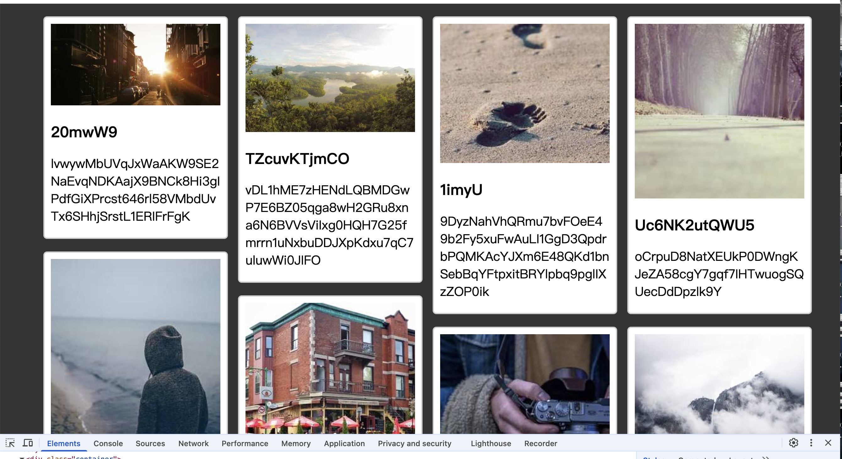
<!DOCTYPE html>
<html lang="en">
<head>
  <meta charset="UTF-8">
  <meta name="viewport" content="width=device-width, initial-scale=1.0">
  <title>瀑布流布局</title>
  <style>
    body {
      background-color: #333;
    }
    .container {
      width: 1200px;
      margin: 20px auto;
      columns: 4;
      column-gap: 40px;
    }
    .item {
      width: 100%;
      margin-bottom: 20px;
      break-inside: avoid;
      background-color: #fff;
      border: 2px solid #ccc;
      padding: 10px;
      overflow: hidden;
      border-radius: 6px;
    }
    .item img {
      width: 100%;
    }
    .item p {
      padding-bottom: 10px;
      font-size: 20px;
      margin: 0;
      word-break: break-all;
    }
    @media screen and (max-width: 1300px) and (min-width: 901px){
      .container {
        width: 900px;
        columns: 3;
      }
    }
    @media screen and (max-width: 900px){
      .container {
        width: 800px;
        columns: 2;
      }
    }
  </style>
</head>
<body>
  <div class="container">

  </div>
  <script>
    const data = [];

    for (let i = 0; i < 30; i++) {
      const width = Math.floor(Math.random() * 300) + 200;
      const height = Math.floor(Math.random() * 300) + 200;
      const img = `https://picsum.photos/${width}/${height}?random=${Math.floor(Math.random() * 1000)}`;
      const title = generateRandomString(Math.floor(Math.random() * 10) + 5);
      const description = generateRandomString(Math.floor(Math.random() * 50) + 50);

      data.push({
        img,
        title,
        description
      });
    }

    function generateRandomString(length) {
      const characters = 'ABCDEFGHIJKLMNOPQRSTUVWXYZabcdefghijklmnopqrstuvwxyz0123456789';
      let result = '';
      for (let i = 0; i < length; i++) {
        result += characters.charAt(Math.floor(Math.random() * characters.length));
      }
      return result;
    }

    const conatiner = document.querySelector('.container');

    data.forEach(item => {
      const div = document.createElement('div');
      div.className = 'item';
      div.innerHTML = `
        <img src="${item.img}" alt="${item.title}">
        <h2>${item.title}</h2>
        <p>${item.description}</p>
      `;
      conatiner.appendChild(div);
    });

  </script>
</body>
</html>
@media调的不是很好 可以自己调合适的