Vue3项目匹配PC端和移动端---两套组件
在 Vue 3 项目中同时适配 PC 和移动端,结合 响应式布局、动态组件加载 和 设备检测 来实现
vite : https://cn.vitejs.dev/guide/#scaffolding-your-first-vite-project
npm create vite@latest my-vue-app --template vue
cd my-vue-app
npm install
npm run dev
device.js
export function isMobile() {
  // 方法 1:通过屏幕宽度判断
  return window.innerWidth <= 768

  // 方法 2:通过用户代理字符串判断
  // const userAgent = navigator.userAgent.toLowerCase()
  // return /iphone|ipod|android|windows phone/.test(userAgent)
}DesktopLayout.vue:PC 端布局
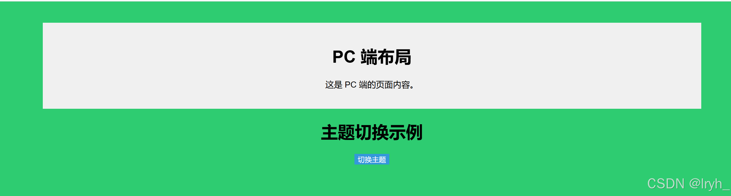
<template>
    <div class="desktop-layout">
      <h1>PC 端布局</h1>
      <p>这是 PC 端的页面内容。</p>
      <!-- <router-view :key="$route.fullPath"/>  -->
    </div>
  </template>

  <script setup>
  // 这里不需要额外的逻辑
  </script>

  <style scoped>
  .desktop-layout {
    width: 1200px;
    margin: 0 auto;
    background-color: #f0f0f0;
    padding: 20px;
  }
  </style>
MobileLayout.vue
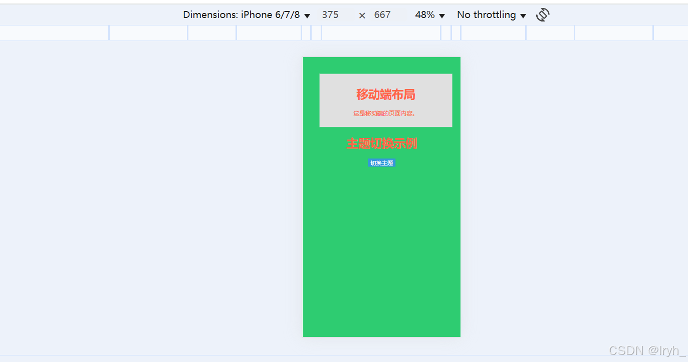
<template>
    <div class="mobile-layout">
      <h1>移动端布局</h1>
      <p>这是移动端的页面内容。</p>
    </div>
  </template>

  <script setup>
  // 这里不需要额外的逻辑
  </script>

  <style scoped>
  .mobile-layout {
    width: 100%;
    padding: 10px;
    background-color: #e0e0e0;
  }
  </style>
在 App.vue 中根据设备类型动态加载组件 DesktopLayout 或 MobileLayout
<template>
  <div id="app">
    <component :is="layout" />

    <h1>主题切换示例</h1>
    <button @click="toggleTheme">切换主题</button>
    <!-- <router-view :key="$route.fullPath"/> -->
  </div>
</template>

<script setup>
import { ref, onMounted, onBeforeUnmount } from 'vue'
import { useThemeStore} from './store/themeStore'
import DesktopLayout from './components/DesktopLayout.vue'
import MobileLayout from './components/MobileLayout.vue'
import { isMobile } from './utils/device'


const themeStore = useThemeStore()

// 初始化时用当前主题
onMounted(() => {
  themeStore.applyTheme(themeStore.currentTheme)
})

const toggleTheme = () => {
  // const newTheme = themeStore.currentTheme === 'light' ? 'blue' : 'light'
  // themeStore.setTheme(newTheme)

  // 多个主题切换
  let themes = ['light', 'blue', 'dark', 'green']
  let currentIndex = themes.indexOf(themeStore.currentTheme)
  let newTheme = themes[(currentIndex + 1) % themes.length]
  themeStore.setTheme(newTheme)
}

// 动态加载布局组件
const layout = ref('DesktopLayout')

// 检测设备类型
const checkDevice = () => {
  layout.value = isMobile() ? MobileLayout : DesktopLayout
}

// 组件挂载时检测设备类型
onMounted(() => {
  checkDevice()
  window.addEventListener('resize', checkDevice)
})

// 组件销毁时移除事件监听
onBeforeUnmount(() => {
  window.removeEventListener('resize', checkDevice)
})
</script>

<style>
#app {
  font-family: Avenir, Helvetica, Arial, sans-serif;
  text-align: center;
  background-color: var(--bg-color);
  /* color: var(--text-color); */
  height: 100vh;
  padding: 20px;
  transition: background-color 0.3s, color 0.3s;
}
button {
  background-color: var(--primary-color);
  color: var(--text-color);
  border: none;
}
</style>
global.css
/* src/assets/global.css */


/* 全局样式 */
body {
  margin: 0;
  font-family: Arial, sans-serif;
}

/* 响应式布局 */
@media (max-width: 768px) {
  body {
    font-size: 14px;
    color: #ff6347;
  }
}


/* :root { */
/* 默认主题 */
/* --bg-color: #ffffff;
  --text-color: #000000;
} */
[data-theme="light"] {
  --bg-color: #ffffff;
  --text-color: #000000;
  --primary-color: #42b983;
}

[data-theme="dark"] {
  /* 暗色主题 */
  --bg-color: #333333;
  --text-color: #ffffff;
  --primary-color: #ff6347;
}

[data-theme="blue"] {
  /* 蓝色主题 */
  --bg-color: #1e90ff;
  --text-color: #ffffff;
  --primary-color: #ffd700;
}

[data-theme="green"] {
  /* 绿色主题 */
  --bg-color: #2ecc71;
  --text-color: #ffffff;
  --primary-color: #3498db;
}
main.js这引入global.css
import './assets/global.css'; // 引入全局样式