【CSS】CSS 面试知多少
1、盒模型的宽度计算
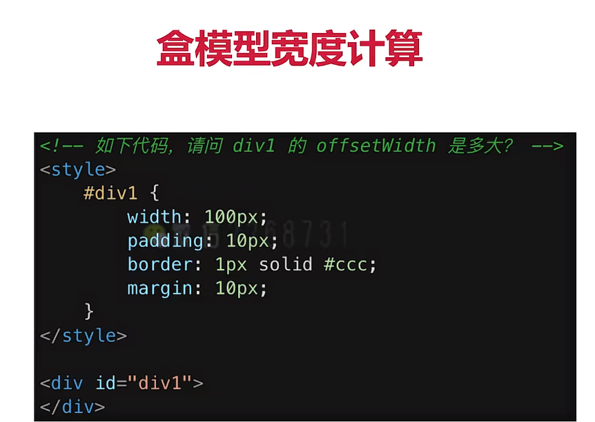
答案:122px。
因为 offsetWidth=(内容宽度+内边距+边框),无外边距
补充:如何让offsetWidth等于100px?
答案:设置 box-sizing: border-box;
2、margin 纵向重叠的问题
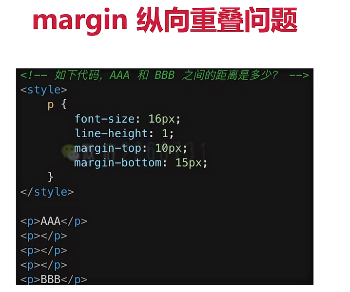
答案:15px。
因为相邻元素的margin-bottom和margin-top会发生重叠。
空白内容标签的margin会被忽略。
3、margin 负值会怎么样

margin-top、margin-left 设置负值,元素会向上、向左移动。
margin-right 设置负值,右侧元素向左移动,自身不受影响。
margin-bottom 设置负值,下方元素上移,自身不受影响。
4、BFC理解与应用
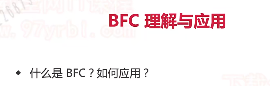
1、定义:Block Format Context 是块级格式化上下文,是一个独立的渲染区域。
2、特性:一块独立渲染区域,内部元素的渲染不会影响边界以外的元素,也不受外部影响。
3、形成 BFC 的常见条件
float 不是 none
position 是 absolute 或 fixed
overflow 不是 visible
display 是 flex inline-block 等
5、考查 float 布局
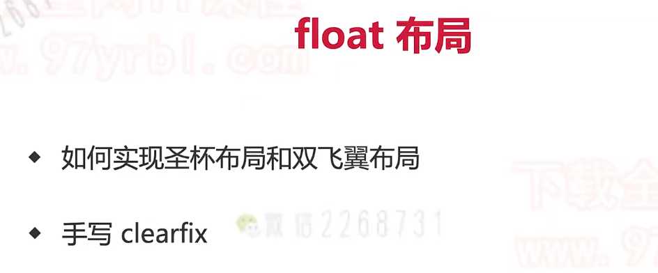
1、圣杯布局和双飞翼布局的目的
(1)三栏布局,中间一栏最先加载和渲染(内容最重要)因为浏览器解析 HTML 是从上到下执行的,中间栏的 HTML 代码被放在了结构最前面,所以会被优先加载和渲染。
(2)两侧内容固定,中间内容随着宽度自适应。
(3)一般用于pc页面。
2、圣杯布局和双飞翼布局的技术总结
(1)使用float布局
(2)两侧使用 margin 负值,以便和中间内容横向重合。
(3)防止中间内容被两侧覆盖,一个用padding一个用margin。
//圣杯布局
<style>.box{padding-left: 200px;padding-right: 300px;}.box-item{float: left;height: 100px;}.center{background: #000;width: 100%;}.left{background: #ccc;width: 200px;margin-left: -100%;position: relative;left: -200px;}.right{background: red;width: 300px;margin-right: -300px;}.footer{height: 100px;background: blue;clear: both;}.banner{height: 100px;background: green;}</style><body><div class="banner"></div><div class="box"><div class="box-item center">1</div><div class="box-item left">2</div><div class="box-item right">3</div></div><div class="footer"></div>
</body>
//双飞翼布局
<style>.container {width: 100%;height: 200px;background-color: lightgray;}.box {float: left;}.main {margin: 0 180px 0 180px;background: orange;height: 200px;}.left-sidebar {width: 180px;height: 200px;background-color: lightblue;margin-left: -100%;}.right-sidebar {width: 180px;height: 200px;background-color: lightgreen;margin-left: -180px;}</style><body><div class="container box"><div class="main"></div></div><div class="left-sidebar box"></div><div class="right-sidebar box"></div>
</body>
6、手写clearfix
.clearfix:after{content: '';dispaly: table;clear: both;
}
.clearfix{*zoom: 1; /*兼容低版本IE*/
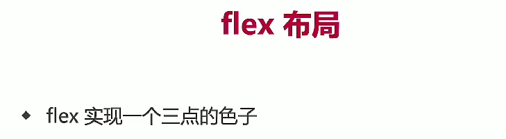
}7、flex 布局