css实现拼图,响应不同屏幕宽度
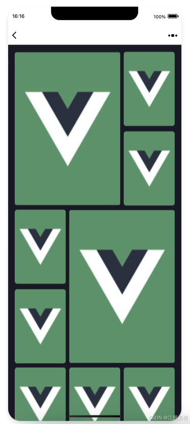
使用是less,可通过@定义变量
<template v-else><template v-if="index==0"><keepImage class="item item-large item-left0 item-top0 item-left" :src="item" fit="contain" :radius="'8'"></keepImage></template><template v-if="index==1"><keepImage class="item item-small item-top0 item-right" :src="item" fit="contain" :radius="'8'"></keepImage></template><template v-if="index==2"><keepImage class="item item-small item-right item-top11" :src="item" fit="contain" :radius="'8'"></keepImage></template><template v-if="index==3"><keepImage class="item item-small item4 item-top0" :src="item" fit="contain" :radius="'8'"></keepImage></template><template v-if="index==4"><template v-if="list.length<6"><keepImage class="item item-small item5left item-top0" :src="item" fit="contain" :radius="'8'"></keepImage></template><template v-else><keepImage class="item item-small item5 item-top0" :src="item" fit="contain" :radius="'8'"></keepImage></template></template><template v-if="index==5"><keepImage class="item item-large item-right" :src="item" fit="contain" :radius="'8'"></keepImage><div class="clearfix"></div> <!-- 清除浮动 --></template><template v-if="index==6 || index==7 || index==8 || index==9 || index==10 || index==11 || index==12 || index==13 || index==14"><template v-if="index==6 || index==9 || index==12"><keepImage class="item item-small item-left0 item-left" :src="item" fit="contain" :radius="'8'"></keepImage></template><template v-else><keepImage class="item item-small item-left" :src="item" fit="contain" :radius="'8'"></keepImage></template></template></template>
@--wh-ratio: 1.46;//宽高比 300*440
@--item-small-width: calc((100vw - 32px - 16px) / 3);
@--item-large-width:calc(100vw - ((100vw - 32px - 16px) / 3) - 40px);
@--item-small-height: calc(@--item-small-width * @--wh-ratio);
@--item-large-height: calc(@--item-small-height * 2 + 11px);
@--item4-top:calc(@--item-large-height + 8px);
@--item5-top:calc(@--item-large-height + @--item-small-height + 19px);
.list{width: calc(100vw - 32px);position: relative; &>div{margin: 0;padding: 0;}.item{width: 100%;}.item-large{width:@--item-large-width;height: @--item-large-height;margin-left: 8px;margin-top: 8px;}.item-small{margin-top: 8px;margin-left: 8px;width:@--item-small-width;height: @--item-small-height;}.item-left{float: left!important;}.item-right{float: right;}.item-top0{margin-top: 0;}.item-top11{margin-top: 11px;}.item-left0{margin-left: 0;}.item4{position: absolute;top: @--item4-top;left: -8px;}.item5{position: absolute;top: @--item5-top;left: -8px;}.item5left{position: absolute;top: @--item4-top;left: @--item-small-width;}.clearfix { clear: both;content: "";display: table; }  &:after{ content: "";  display: block;  clear: both;}}