自适应单行tooltip省略号
当宽度不确定时,是flex:1的情况下适用
引用时
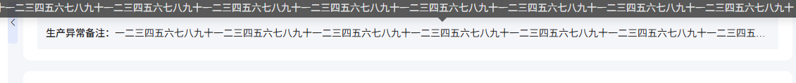
<div class="remark mt-3"><span>生产异常备注:</span><div class="message"><TooltipTextcontent="一二三四五六七八九十一二三四五六七八九十一二三四五六七八"/></div>
</div>.remark {display: flex;width: 100%;> span {flex-shrink: 0;}.message {flex: 1;font-weight: 400;white-space: nowrap;overflow: hidden;text-overflow: ellipsis;}
}
tooltip组件
<template><span class="text-tooltip"><el-tooltipclass="item"effect="dark":disabled="isShowTooltip":content="content"placement="top"><p class="over-flow" :class="className" @mouseover="onMouseOver"><!-- <i class="el-icon-warning margin-left-icon"></i> --><span ref="refName">{{ props.content || '--' }}</span></p></el-tooltip></span>
</template><script setup lang="ts">
const props = defineProps({content: {type: String,default: '',},className: {type: String,default: '',},
});
const isShowTooltip = ref(true);
const refName = ref();function onMouseOver(e: any) {const parentWidth = e.fromElement.offsetWidth - 122;const contentWidth = refName.value.offsetWidth;// 判断是否开启tooltip功能if (contentWidth > parentWidth) {isShowTooltip.value = false;} else {isShowTooltip.value = true;}
}
</script><style lang="scss" scoped>
.over-flow {overflow: hidden;white-space: nowrap;text-overflow: ellipsis;
}
.wid190 {width: 100%;
}
p {margin: 0;
}
.margin-left-icon {margin-right: 3px;
}
</style>