深入理解 CSS 表格布局:table-layout 的秘密与实战详解(附费用报销单案例)
在前端开发中,我们经常用 <table> 来展示结构化数据,比如费用报销单、财务凭证、统计报表等。
但很多开发者在面对“列宽不统一”、“内容溢出”、“表格错位”等问题时,往往无从下手。
其实,这些问题的核心都在一个关键 CSS 属性上—— table-layout。
本文将从原理、代码示例、对比分析到真实案例,带你彻底掌握表格布局控制技巧。
🧩 一、什么是 table-layout?
table-layout 属性定义了浏览器计算表格列宽的方式。
它决定了表格是根据内容动态分配列宽,还是依据结构规则固定分配。
| 属性值 | 含义 | 特点 |
|---|---|---|
auto(默认) | 按内容自动调整列宽 | 灵活但易变形,性能一般 |
fixed | 按固定规则计算列宽 | 稳定高效,适合业务表格 |
📘 简单记忆:
auto→ 内容决定布局。
fixed→ 结构决定布局。
🧱 二、基础对比示例
<section><h1>🧠 使用 table-layout: auto</h1><table><tr><td>If we don’t…</td><td>specify a cell width, they will be assigned one that depends on their contents.</td></tr></table>
</section><section><h1>⚙️ 使用 table-layout: fixed</h1><table style="table-layout: fixed;"><tr><td>If we don’t…</td><td>specify a cell width, they will be assigned one that depends on their contents.</td></tr></table>
</section>
在 auto 模式下,浏览器会扫描所有单元格内容决定列宽;
在 fixed 模式下,只需参考第一行结构即可渲染,速度更快、布局更稳定。
🔍 三、对比总结
| 模式 | 行为特点 | 适用场景 |
|---|---|---|
auto | 根据内容自动计算列宽 | 适合文字多变的表格 |
fixed | 根据第一行或固定宽度分配列宽 | 适合财务表单、工单、报表等结构化数据 |
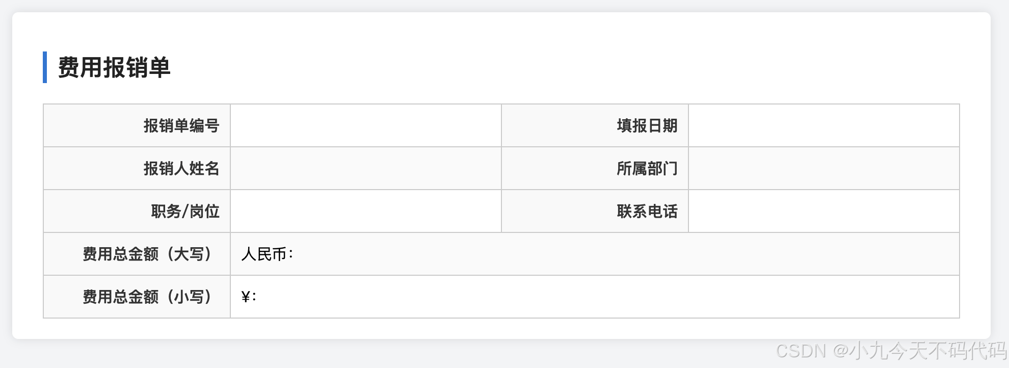
💰 四、实战案例:费用报销单(table-layout: fixed)
下面我们通过一个真实的业务场景来演示如何使用
table-layout: fixed 实现稳定、整齐的“费用报销单”布局。
✅ 完整示例代码
<!DOCTYPE html>
<html lang="zh-CN"><head><meta charset="UTF-8"><meta name="viewport" content="width=device-width, initial-scale=1.0"><title>费用报销单</title><style>body {font-family: "Microsoft YaHei", sans-serif;background-color: #f3f4f6;padding: 40px;}.report-container {width: 900px;margin: 0 auto;background-color: #fff;border-radius: 6px;box-shadow: 0 0 10px rgba(0, 0, 0, 0.1);padding: 20px 30px;}h2 {margin-bottom: 20px;border-left: 4px solid #0078d7;padding-left: 10px;font-size: 1.4em;color: #222;}table {width: 100%;border-collapse: collapse;table-layout: fixed; /* 关键布局模式 */}td {border: 1px solid #ccc;padding: 10px;word-wrap: break-word;vertical-align: middle;font-size: 15px;}tr:nth-child(even) {background-color: #fafafa;}td:nth-child(odd) {width: 20%;background-color: #f9f9f9;font-weight: bold;text-align: right;color: #333;}td:nth-child(even) {width: 30%;}</style>
</head><body><div class="report-container"><h2>费用报销单</h2><table><tr><td>报销单编号</td><td></td><td>填报日期</td><td></td></tr><tr><td>报销人姓名</td><td></td><td>所属部门</td><td></td></tr><tr><td>职务/岗位</td><td></td><td>联系电话</td><td></td></tr><tr><td>费用总金额(大写)</td><td colspan="3"><span>人民币:</span></td></tr><tr><td>费用总金额(小写)</td><td colspan="3"><span>¥:</span></td></tr></table></div>
</body></html>
📖 关键点说明
| 功能 | 技术实现 | 说明 |
|---|---|---|
| 固定列宽布局 | table-layout: fixed | 提升表格稳定性与渲染效率 |
| 标签列右对齐 | td:nth-child(odd) | 清晰区分标签与输入栏 |
| 交替行背景 | tr:nth-child(even) | 提升可读性与层次感 |
| 内容自动换行 | word-wrap: break-word | 防止长内容溢出 |
| 居中与留白 | padding + shadow | 提升整体视觉质感 |
🎯 语法解析
td:nth-child(odd)
意思是:
选择当前表格中每一行(
<tr>)内所有奇数序号的<td>单元格。
其中:
| 语法部分 | 含义 |
|---|---|
td | 目标元素是单元格(table cell) |
:nth-child() | CSS 伪类选择器,用于按顺序选中子元素 |
odd | 表示“奇数序号的元素”,等价于 (2n + 1) |
📘 在表格结构中的作用
例如下面这行表格:
<tr><td>报销人姓名</td><td></td><td>所属部门</td><td></td>
</tr>
在这行 <tr> 中有 4 个 <td>:
| 序号 | 内容 | 属于 |
|---|---|---|
| 1 | 报销人姓名 | 奇数(odd) |
| 2 | (空) | 偶数(even) |
| 3 | 所属部门 | 奇数(odd) |
| 4 | (空) | 偶数(even) |
所以:
td:nth-child(odd)选中第 1、3 个单元格 → 左侧的“标签列”td:nth-child(even)选中第 2、4 个单元格 → 右侧的“数据列”
🎨 样式应用效果
代码中这样定义:
td:nth-child(odd) {width: 20%;background-color: #f9f9f9;font-weight: bold;text-align: right;color: #333;
}
这几行样式的视觉意义如下:
| 属性 | 作用 |
|---|---|
width: 20% | 控制左侧标签列宽度一致 |
background-color: #f9f9f9 | 设置浅灰背景,区分标签与数据区域 |
font-weight: bold | 让标签文字加粗,更醒目 |
text-align: right | 标签右对齐,让冒号或字段名靠近内容 |
color: #333 | 使用深灰字体,更易阅读 |
⚖️ 与 td:nth-child(even) 配合使用
为了让表格结构更整齐,代码同时定义了偶数列样式:
td:nth-child(even) {width: 30%;
}
这就形成了一个典型的 “标签 + 内容” 配对结构:
| 标签列(odd) | 内容列(even) |
|---|---|
| 报销人姓名 | 张三 |
| 所属部门 | 财务部 |
| 联系电话 | 138****8888 |
✨ 一句话总结:
td:nth-child(even)\td:nth-child(odd)是一种“结构化选中”策略,让你无需在 HTML 里写 class,就能自动给表格的标签列添加统一样式。
🧩 五、总结与最佳实践
通过 table-layout: fixed,我们可以在保持表格美观的同时提升渲染性能。
无论是 费用报销单、工单表 还是 数据报表,都推荐使用这一模式。
✅ 推荐配置:
table { table-layout: fixed; word-wrap: break-word;
}
这几行代码,能让你的表格在各种浏览器中都表现一致。