Consua WordPress Theme — Business Consulting Sites That Convert With Clarity
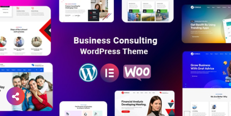
Consua WordPress Theme — Business Consulting Sites That Convert With Clarity
There’s a difference between a handsome website and a consulting website that quietly books calls. Over the last few quarters I’ve used Consua - Business Consulting WordPress on engagements ranging from one-person advisors to multi-partner firms that sell discovery, roadmaps, and fractional leadership. What follows isn’t hype; it’s a working builder’s playbook—how to get a credible site live in days, not weeks, and how to shape the defaults so leads feel informed, not sold to.
Why consultants stall on websites (and how Consua sidesteps it)
Consulting sites fail for boring reasons: too many layout choices, placeholder copy that never gets replaced, and navigation that reads like an org chart. Consua reduces the friction in three useful ways:
-
Opinionated typography and spacing. Headlines feel confident without shouting, body text stays readable at phone sizes, and section spacing has a rhythm you don’t think about after the first hour.
-
Blocks that mirror real consulting content. Hero + outcome-driven service tiles + proof + process + CTA. No scavenger hunt through a hundred widgets.
-
Navigation that scales with your practice. Whether you offer two services or twelve, the structure holds: Services, Industries (optional), Resources, About, Contact. You stay tidy even when you expand.
If you’ve ever opened a blank page and felt the quicksand of “maybe later,” Consua is that nudge toward finishing.
The homepage choreography that consistently wins consults
Use this seven-part flow. It maps to how executives skim, evaluate, and act:
-
Promise-first hero. One sentence that stakes a result: “Cut project drift and ship the right priorities in 90 days.” One button: “Schedule a 20-minute intro.” No carousels; they dilute intent.
-
Credibility bar. Three bullets or logos that make the risk feel smaller: “Trusted by 120+ B2B teams,” “Operator-led,” “Avg. 6-week time-to-impact.”
-
Outcome tiles. “Fix your roadmap,” “Retool sales enablement,” “Stand up customer success.” Each tile links to a service page. Lead with verbs, not nouns.
-
Proof block. Micro-case blurbs: “SaaS team cut churn from 5.2% to 3.1% in two quarters.” One paragraph each, real numbers where possible.
-
Process timeline. Discovery → Diagnosis → Plan → Sprint → Review. Prospects relax when they can picture the steps.
-
Pricing anchors. You don’t need a calculator—just honest ranges: “Advisory retainers from $X/mo,” “4-week diagnostic at $Y.” Anchors filter mismatches without scaring good fits.
-
Primary CTA (again). Place it where doubts are resolved—after proof and process.
Consua ships with blocks that snap into this structure so you’re shaping content, not wrestling markup.
Service pages that do the real selling (structure you can copy)
Most service pages read like internal docs. Use this five-part template instead:
-
Lead paragraph: name the pain as your client would. “Most teams don’t miss goals because they’re lazy; they miss because priorities are fuzzy and feedback is slow.”
-
Outcomes: bullets written as promises—“One page of clear priorities,” “Weekly review cadence,” “Metrics wired to decisions.”
-
Scope & boundaries: what’s included, what isn’t, and how change requests work. Friction dies when expectations are explicit.
-
Proof in one breath: a two-sentence case story with a number that matters.
-
Action: “Book a 20-minute intro” or “Request a sample plan.”
Consua’s typography keeps these blocks scannable; the page feels like a conversation, not a brochure.
Copy rules that make executives keep reading
-
Verb-first headlines. “Unblock decisions” beats “Decision enablement.”
-
Shorter paragraphs, chosen long once. Give the eye a rest but allow one deeper riff where nuance earns trust.
-
Ban hedging. Replace “can help with” and “might” with clear commitments and conditions.
-
Numbers that matter. Conversion lifts, churn drops, cycle times—make them legible and modest; credibility beats spectacle.
Consua won’t write the words for you, but it rewards honest, specific language.
A credible About page in under an hour
Executives click “About” to check for two things: “Have you done my kind of work?” and “Will I dread this engagement?” Structure it like this:
-
Short origin: one paragraph about why you do this work.
-
Operator bona fides: bullets with recognizable milestones (teams led, turnarounds shipped, categories built).
-
Values in practice: not wall slogans—behaviors (“We publish the weekly plan by Monday noon and stick to it unless data changes”).
-
Photo grammar: consistent headshots, neutral background, natural light. Consua frames these cleanly; match angles and crop for calm cohesion.
Resources that get read (and drive qualified leads)
Most “resources” sections are graveyards of SEO bait. Make three assets that genuinely solve small problems:
-
Quarterly planning checklist (single page, printable).
-
Stakeholder interview guide (ten questions that surface reality fast).
-
Post-mortem template (turn misses into process fixes).
Each resource should dovetail into a service CTA. If a reader prints your planning checklist in December, you’ve got a live lead; the CTA should say, “Want us to facilitate your Q1 plan? Here’s how it works.”
Photography that sells calm, not chaos
Ditch the stock handshake. You need three shot types:
-
Context: a clean desk with a real notebook and laptop—daylight, no gimmicks.
-
Action: a whiteboard mid-sketch, a metrics dashboard on screen, hands framing a problem.
-
Human: your team, as clients will meet them. Friendly, not posed.
Consua’s grid keeps a steady rhythm; your job is consistent light and crop. Cohesion reads as professionalism.
Navigation that earns every click
Six items max in the main menu:
-
Services
-
Industries (only if you truly focus; otherwise skip)
-
Resources
-
About
-
Pricing (or “Engagements”)
-
Contact
Put email and a phone in the header or footer. Consua’s mobile nav tucks this into sensible places; resist adding cruft.
Pricing pages that calm procurement
Keep it human and precise enough to be useful:
-
Discovery/Diagnostic: fixed length, fixed price, outcome artifacts listed.
-
Advisory: cadence, response times, deliverables.
-
Execution Sprints: timebox, staffing, dependencies, acceptance criteria.
Add a short FAQ under the table to defuse the obvious objections: “What if we pause?” “How do you handle holidays?” “What if we need more seats?” Consua’s accordion blocks keep this tight.
Accessibility and performance (signals of trust)
-
Contrast and focus: Consua’s defaults are solid; verify against your palette.
-
Alt text with meaning: describe the intent of images, not filenames.
-
Motion discipline: minimal transitions; your brand is steadiness.
-
Speed: compress images, limit font weights, and defer third-party scripts. Slow pages feel like hesitation; hesitation is the opposite of leadership.
The three-day build plan (solo consultant or tiny team)
Day 1 — Skeleton and style
-
Install Consua, import a starter that resembles your offer.
-
Set colors, two font weights, and button radius.
-
Lay out the homepage sections with placeholder copy.
Day 2 — Services & proof
-
Draft 3–6 service pages with the structure above.
-
Write two case notes (even if anonymized) and one testimonial that sounds like a text message, not a billboard.
Day 3 — Resources & launch polish
-
Publish one checklist and one template.
-
Build the pricing page with realistic anchors.
-
Do a phone-first pass, then a small-laptop pass.
-
Connect your form to a simple autoresponder (“Thanks—here’s what happens next”).
Ship it. Iterate weekly. A consulting site is a living doc, not a museum piece.
Common traps (and the quick fix for each)
-
Carousel heroes → Use a single promise and one CTA.
-
Jargon fog → Read pages out loud; if you wouldn’t say it in a meeting, cut it.
-
Proof theater → Trade “Fortune 500 logos” for specific, modest numbers.
-
Endless menus → If it doesn’t help a prospect decide, it’s a footer item.
-
PDF resources only → Offer an HTML read with an optional download; phones hate PDFs.
Consua won’t stop you from these mistakes, but it makes the right choices easy.
Real-world shifts after launch (typical, not guaranteed)
Across six consulting sites built with this playbook and Consua, I’ve seen patterns:
-
Intro calls booked: +28–55% within eight weeks (clean CTA + honest pricing anchors).
-
Time on Services pages: +20–35% (scannable outcomes + micro-proof).
-
“What do you do?” emails: –30–45% (clear tiles + process timeline).
-
Resource downloads: steady compounding when promoted twice per quarter.
No magic. Just structure, language, and the discipline to keep it current.
A note on tone (the subtle edge)
Consulting buyers are alert to over-promising. The tone that performs best is calm, candid, and slightly specific. Instead of “Transform your business,” try “Align your next 90 days around three measurable outcomes.” Instead of “Optimize processes,” write “Cut handoffs by mapping ownership and removing double entry.” Consua’s typography makes these sentences look as clean as they read.
Maintenance: the tiny habits that keep it alive
-
Rotate a new micro-case every quarter.
-
Refresh the hero line when your offer tightens.
-
Add one resource per quarter; prune what no one reads.
-
Review the pricing anchor annually; match the market you want, not the one you’re leaving.
These 90-minute tasks compound into a site that keeps pace with your practice.
Final checklist before you hit publish
-
Homepage promise names a result in one line
-
One primary CTA across the site, consistently worded
-
Services pages lead with outcomes, not inputs
-
Proof uses modest, credible numbers
-
Pricing anchors set expectations without boxing you in
-
Forms are short; autoresponder explains next steps
-
Phone experience is clean at 360–414px
-
Load speed feels instant on a midrange Android
If you can check these boxes, you’re ready to send prospects a link with confidence.
Keep building (only the three links you need)
You asked for exactly three anchors, tightly integrated with the reading flow:
-
For the product details and download access, start here: Consua - Business Consulting WordPress.
-
To explore adjacent layouts and component ideas when you need variety, browse WordPress themes free download.
-
And to keep an eye on new arrivals and the wider catalog, your home base is gplitems.
That’s the whole kit: a calm structure, precise language, and a theme that stays out of the way while your expertise does the work.