【Android】CoordinatorLayout 的基本使用
【Android】CoordinatorLayout 的基本使用
一 、概述
CoordinatorLayout 是 FrameLayout 的子类,是 Android 支持库(现已成为 AndroidX 一部分)中提供的一个 “超级FrameLayout” 。它的核心思想在于协调(Coordination)。
与传统布局(如 LinearLayout 或 RelativeLayout )不同,CoordinatorLayout 通过引入一种名为 Behavior 的机制,允许一个子视图监听另一个子视图的各种事件(如滚动、位置、大小变化等),并据此定义自己的响应动作。可以轻松实现视图间的联动效果(如滚动时工具栏隐藏、Snackbar弹出时按钮上移等)。
二、基本使用
1. 添加依赖
在 app/build.gradle 文件中添加 Material Design 组件库的依赖:
dependencies {implementation 'com.google.android.material:material:1.13.0' ...
}
如果只需要 CoordinatorLayout而不需要其他 Material 组件,可以单独添加:
dependencies {implementation 'androidx.coordinatorlayout:coordinatorlayout:1.3.0'...
}
2. CoordinatorLayout 与 FloatingActionButton
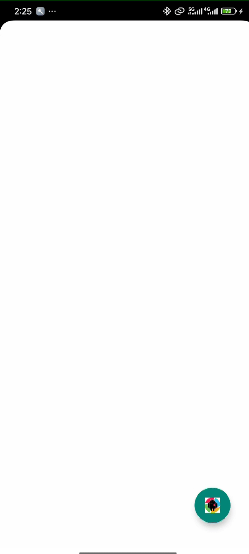
FloatingActionButton (FAB) 是一个圆形的按钮,悬浮在界面内容之上,通常位于屏幕的右下角。它用于执行最重要的、最常用的操作。单独使用,布局如下:
<?xml version="1.0" encoding="utf-8"?>
<androidx.constraintlayout.widget.ConstraintLayoutxmlns:android="http://schemas.android.com/apk/res/android"xmlns:tools="http://schemas.android.com/tools"xmlns:app="http://schemas.android.com/apk/res-auto"android:id="@+id/main"android:layout_width="match_parent"android:layout_height="match_parent"tools:context=".MainActivity"><com.google.android.material.floatingactionbutton.FloatingActionButtonandroid:id="@+id/fab"android:layout_width="wrap_content"android:layout_height="wrap_content"android:layout_margin="40dp"android:src="@drawable/p1"app:layout_constraintBottom_toBottomOf="parent"app:layout_constraintEnd_toEndOf="parent" /></androidx.constraintlayout.widget.ConstraintLayout>
点击FAB,弹出一个 Snackbar:
FloatingActionButton fab = findViewById(R.id.fab);
fab.setOnClickListener(v -> {Snackbar.make(v, "标题", Snackbar.LENGTH_LONG).setAction("点击事件", view -> {// 设置点击事件}).show();
});
效果如下:
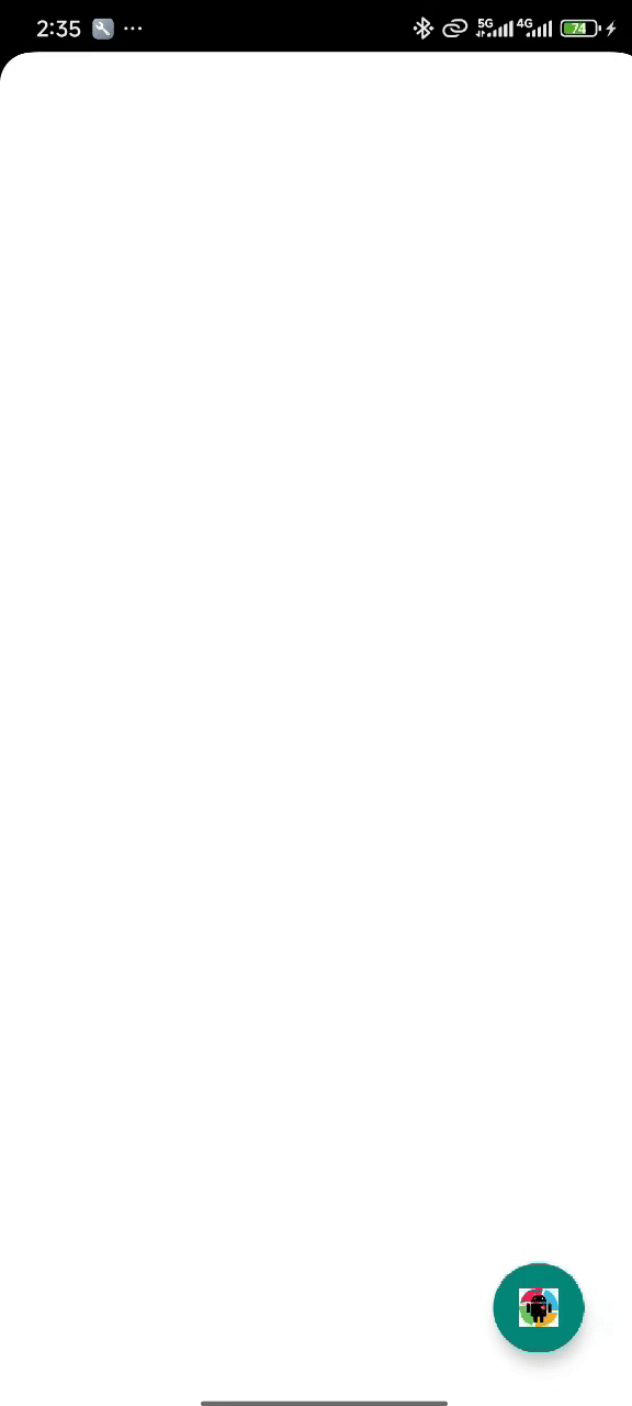
与 CoordinatorLayout 一起使用,布局调整如下:
<?xml version="1.0" encoding="utf-8"?>
<androidx.coordinatorlayout.widget.CoordinatorLayoutxmlns:android="http://schemas.android.com/apk/res/android"xmlns:tools="http://schemas.android.com/tools"xmlns:app="http://schemas.android.com/apk/res-auto"android:id="@+id/main"android:layout_width="match_parent"android:layout_height="match_parent"tools:context=".MainActivity"><com.google.android.material.floatingactionbutton.FloatingActionButtonandroid:id="@+id/fab"android:layout_width="wrap_content"android:layout_height="wrap_content"android:layout_margin="40dp"android:src="@drawable/p1"android:layout_gravity="bottom|end"/></androidx.coordinatorlayout.widget.CoordinatorLayout>
再次运行程序,Snackbar 显示和隐藏的时候,CoordinatorLayout 会动态调整 FAB 的位置,避免被遮挡,这是通过内置Behavior实现的:
3. CoordinatorLayout 与 AppBarLayout 结合使用
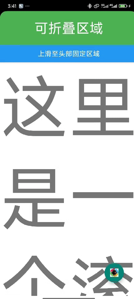
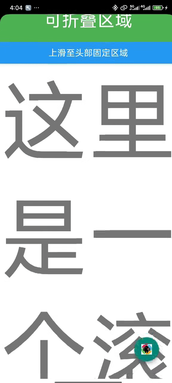
AppBarLayout 是 Material Design 组件库中用于实现可折叠应用栏的核心组件,它继承自 LinearLayout,默认是垂直方向布局。
布局文件如下:
<?xml version="1.0" encoding="utf-8"?>
<androidx.coordinatorlayout.widget.CoordinatorLayoutxmlns:android="http://schemas.android.com/apk/res/android"xmlns:tools="http://schemas.android.com/tools"xmlns:app="http://schemas.android.com/apk/res-auto"android:id="@+id/main"android:layout_width="match_parent"android:layout_height="match_parent"tools:context=".MainActivity"><com.google.android.material.appbar.AppBarLayoutandroid:layout_width="match_parent"android:layout_height="wrap_content"><TextViewandroid:layout_width="match_parent"android:layout_height="100dp"android:background="#4CAF50"android:text="可折叠区域"android:textColor="@color/white"android:textSize="40sp"android:gravity="center"app:layout_scrollFlags="scroll"/><TextViewandroid:layout_width="match_parent"android:layout_height="50dp"android:background="#2196F3"android:text="上滑至头部固定区域"android:textColor="@color/white"android:textSize="20sp"android:gravity="center"/></com.google.android.material.appbar.AppBarLayout><androidx.core.widget.NestedScrollViewandroid:layout_width="match_parent"android:layout_height="wrap_content"app:layout_behavior="com.google.android.material.appbar.AppBarLayout$ScrollingViewBehavior"><TextViewandroid:layout_width="match_parent"android:layout_height="wrap_content"android:text="这里是一个滚动布局"android:textSize="200sp"/></androidx.core.widget.NestedScrollView><com.google.android.material.floatingactionbutton.FloatingActionButtonandroid:id="@+id/fab"android:layout_width="wrap_content"android:layout_height="wrap_content"android:layout_margin="40dp"android:src="@drawable/p1"android:layout_gravity="bottom|end"/></androidx.coordinatorlayout.widget.CoordinatorLayout>
说明:
CoordinatorLayout 须作为顶层父 View,子 View 想要与 CoordinatorLayout 实现"联动性"效果的首要条件是这个 View 必须实现了 NestedScrollingChild 接口(例如:NestedScrollView、RecyclerView等控件)。CoordinatorLayout 子控件如果需要联动,需要设置 app:layout_behavior 属性,上面 FAB 和 AppBarLayout 没有设置是因为它们本身有默认的 app:layout_behavior。这里的 NestedScrollView 设置了app:layout_behavior="com.google.android.material.appbar.AppBarLayout$ScrollingViewBehavior"它建立了 NestedScrollView 和 AppBarLayout 之间的协调关系,当 NestedScrollView 滚动时,它会通知 AppBarLayout,AppBarLayout 再根据子视图的 scrollFlags 来调整它们的状态。
layout_scrollFlags 标志说明
layout_scrollFlags 是 AppBarLayout 子视图最重要的属性,控制视图在滚动时的行为:
| 标志值 | 说明 |
|---|---|
scroll | 视图将随滚动事件一起滚动(必须设置) |
exitUntilCollapsed | 视图会滚动退出直到"折叠"状态 |
enterAlways | 任何向下滚动都会使视图变为可见 |
enterAlwaysCollapsed | 类似于 enterAlways,但会先以折叠高度进入 |
snap | 滚动结束时,视图会自动吸附到最近边缘 |
运行效果如下:
修改 layout_scrollFlags:
app:layout_scrollFlags="scroll|enterAlways|snap"
效果如下:
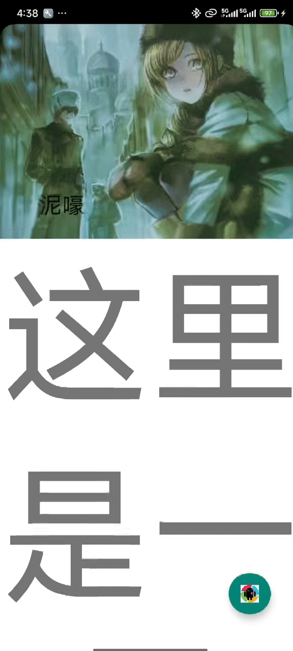
4. 结合 CollapsingToolbarLayout 使用
CollapsingToolbarLayout 是一个专门用于实现高级折叠效果的工具栏包装器,它必须作为 AppBarLayout 的直接子视图使用。
效果图:
布局文件:
<?xml version="1.0" encoding="utf-8"?>
<androidx.coordinatorlayout.widget.CoordinatorLayoutxmlns:android="http://schemas.android.com/apk/res/android"xmlns:tools="http://schemas.android.com/tools"xmlns:app="http://schemas.android.com/apk/res-auto"android:id="@+id/main"android:layout_width="match_parent"android:layout_height="match_parent"tools:context=".MainActivity"><com.google.android.material.appbar.AppBarLayoutandroid:layout_width="match_parent"android:layout_height="wrap_content"><com.google.android.material.appbar.CollapsingToolbarLayoutandroid:layout_width="match_parent"android:layout_height="wrap_content"app:contentScrim="#8BC34A"app:collapsedTitleGravity="center"app:expandedTitleGravity="start|bottom"app:layout_scrollFlags="scroll|exitUntilCollapsed|snap"app:title="泥嚎"><ImageViewandroid:layout_width="match_parent"android:layout_height="wrap_content"android:src="@drawable/p2"android:scaleType="centerCrop"app:layout_collapseMode="parallax"/><androidx.appcompat.widget.Toolbarandroid:layout_width="match_parent"android:layout_height="80dp"app:layout_collapseMode="pin"/></com.google.android.material.appbar.CollapsingToolbarLayout></com.google.android.material.appbar.AppBarLayout><androidx.core.widget.NestedScrollViewandroid:layout_width="match_parent"android:layout_height="wrap_content"app:layout_behavior="com.google.android.material.appbar.AppBarLayout$ScrollingViewBehavior"><TextViewandroid:layout_width="match_parent"android:layout_height="wrap_content"android:text="这里是一个滚动布局"android:textSize="200sp"/></androidx.core.widget.NestedScrollView><com.google.android.material.floatingactionbutton.FloatingActionButtonandroid:id="@+id/fab"android:layout_width="wrap_content"android:layout_height="wrap_content"android:layout_margin="40dp"android:src="@drawable/p1"android:layout_gravity="bottom|end"/></androidx.coordinatorlayout.widget.CoordinatorLayout>
CollapsingToolbarLayout 部分属性:
| 属性名称 | 说明 |
|---|---|
app:contentScrim | 折叠后工具栏的背景色 |
app:statusBarScrim | 折叠后状态栏的背景色 |
app:title | 设置标题文本 |
app:titleEnabled | 是否启用标题显示 |
app:scrimVisibleHeightTrigger | 触发显示contentScrim的折叠高度阈值 |
app:scrimAnimationDuration | contentScrim显示/隐藏的动画持续时间 |
app:expandedTitleTextAppearance | 展开状态标题的文字外观 |
app:collapsedTitleTextAppearance | 折叠状态标题的文字外观 |
app:expandedTitleMargin | 展开状态标题的四周边距 |
app:expandedTitleGravity | 展开状态标题的重力(位置) |
app:collapsedTitleGravity | 折叠状态标题的重力(位置) |
注意:如果同时为
CollapsingToolbarLayout和其内部的Toolbar设置标题,前者的标题会覆盖后者。最佳实践是仅通过CollapsingToolbarLayout的app:title属性或在代码中使用setTitle()方法来设置标题,以确保折叠与展开时的动画效果正常运作。
layout_collapseMode 模式说明
| 模式值 | 说明 |
|---|---|
pin | 视图在折叠时会固定在顶部,不会随滚动消失 |
parallax | 视图以不同于主内容的速度滚动,创造深度感 |
| 无指定 | 视图会正常滚动并最终消失 |
三、关于自定义 Behavior
CoordinatorLayout 的强大功能离不开其核心机制——Behavior,它定义了子视图之间的交互规则与协作方式。本文所展示的滚动折叠、FAB 跟随位移等流畅动效,正是得益于一系列精心设计的内置 Behavior。除了直接使用这些内置行为,CoordinatorLayout 也支持开发者自定义 Behavior,以实现更个性化、更复杂的交互效果。不过自定义 Behavior 涉及的内容较为深入,本文仅作简单介绍,更详细的实现方法将在未来的文章中进一步探讨。