7、Matplotlib、Seaborn、Plotly数据可视化与探索性分析(探索性数据分析(EDA)方法论)
学习目标:掌握数据可视化的原理和工具,培养通过图表洞察数据规律的能力,建立数据驱动的分析思维
数据可视化是数据科学的重要组成部分,它将抽象的数字转化为直观的图形,让我们能够快速识别模式、趋势和异常。从基础的柱状图到复杂的交互式仪表板,可视化技能将帮助我们更有效地探索数据并传达洞察。
tips:可视化建议图表标题、轴标签等用英文,注释用中文,因为即使我们设定了防止中文乱码,一般单个图表是中文,在画布中也容易乱码显示不出中文
7.1 Matplotlib基础:图表创建的底层逻辑
> Matplotlib架构理解
Matplotlib 是Python可视化的基石库,采用分层架构设计。理解其架构有助于创建更专业的图表。
import matplotlib.pyplot as plt
import numpy as np
import pandas as pd
import warnings
warnings.filterwarnings('ignore')# 设置中文字体以防乱码(可选,我们主要用英文标题)
plt.rcParams['font.sans-serif'] = ['Arial', 'DejaVu Sans']
plt.rcParams['axes.unicode_minus'] = False# 创建示例数据
np.random.seed(42)
months = ['Jan', 'Feb', 'Mar', 'Apr', 'May', 'Jun']
sales = [120, 135, 148, 132, 165, 142]
profit = [15, 18, 22, 16, 28, 21]print("=== Matplotlib基础图表类型 ===")# 创建子图布局
fig, axes = plt.subplots(2, 2, figsize=(12, 8))
fig.suptitle('Basic Chart Types in Matplotlib', fontsize=16, fontweight='bold')# 1. 线图 - 展示趋势
axes[0, 0].plot(months, sales, marker='o', linewidth=2, markersize=6)
axes[0, 0].set_title('Line Chart: Sales Trend')
axes[0, 0].set_ylabel('Sales (K)')
axes[0, 0].grid(True, alpha=0.3)# 2. 柱状图 - 展示对比
bars = axes[0, 1].bar(months, profit, color='lightcoral', alpha=0.7)
axes[0, 1].set_title('Bar Chart: Monthly Profit')
axes[0, 1].set_ylabel('Profit (K)')
# 添加数值标签
for bar in bars:height = bar.get_height()axes[0, 1].text(bar.get_x() + bar.get_width()/2., height + 0.5,f'{height}', ha='center', va='bottom')# 3. 散点图 - 展示相关性
axes[1, 0].scatter(sales, profit, s=100, alpha=0.6, c='green')
axes[1, 0].set_title('Scatter Plot: Sales vs Profit')
axes[1, 0].set_xlabel('Sales (K)')
axes[1, 0].set_ylabel('Profit (K)')# 4. 饼图 - 展示构成
categories = ['Product A', 'Product B', 'Product C', 'Others']
values = [30, 25, 20, 25]
colors = ['lightblue', 'lightgreen', 'lightyellow', 'lightpink']
axes[1, 1].pie(values, labels=categories, colors=colors, autopct='%1.1f%%', startangle=90)
axes[1, 1].set_title('Pie Chart: Product Distribution')plt.tight_layout()
plt.show()# 高级样式定制
print("\n=== 高级样式定制 ===")# 创建专业风格的图表
plt.style.use('seaborn-v0_8-darkgrid')  # 使用新版本参数
fig, ax = plt.subplots(figsize=(10, 6))# 多系列数据对比
x = np.arange(len(months))
width = 0.35bars1 = ax.bar(x - width/2, sales, width, label='Sales', color='steelblue', alpha=0.8)
bars2 = ax.bar(x + width/2, [p*5 for p in profit], width, label='Profit x5', color='orange', alpha=0.8)# 样式设置
ax.set_title('Monthly Sales and Profit Comparison', fontsize=14, fontweight='bold', pad=20)
ax.set_xlabel('Month', fontsize=12)
ax.set_ylabel('Amount (K)', fontsize=12)
ax.set_xticks(x)
ax.set_xticklabels(months)
ax.legend(loc='upper left')
ax.grid(True, alpha=0.3, axis='y')# 添加数值标签
for bars in [bars1, bars2]:for bar in bars:height = bar.get_height()ax.text(bar.get_x() + bar.get_width()/2., height + 1,f'{height:.0f}', ha='center', va='bottom', fontsize=10)plt.tight_layout()
plt.show()
> 图表元素精细控制
# 创建复杂的多轴图表
fig, ax1 = plt.subplots(figsize=(10, 6))# 主轴:销售额
color = 'tab:blue'
ax1.set_xlabel('Month', fontsize=12)
ax1.set_ylabel('Sales Revenue (K)', color=color, fontsize=12)
line1 = ax1.plot(months, sales, color=color, marker='o', linewidth=3, markersize=8, label='Sales')
ax1.tick_params(axis='y', labelcolor=color)
ax1.grid(True, alpha=0.3)# 次轴:利润率
ax2 = ax1.twinx()
color = 'tab:red'
ax2.set_ylabel('Profit Margin (%)', color=color, fontsize=12)
profit_margin = [p/s*100 for p, s in zip(profit, sales)]
line2 = ax2.plot(months, profit_margin, color=color, marker='s', linewidth=3, markersize=8, label='Profit Margin')
ax2.tick_params(axis='y', labelcolor=color)# 标题和图例
plt.title('Sales Revenue and Profit Margin Analysis', fontsize=14, fontweight='bold', pad=20)# 合并图例
lines1, labels1 = ax1.get_legend_handles_labels()
lines2, labels2 = ax2.get_legend_handles_labels()
ax1.legend(lines1 + lines2, labels1 + labels2, loc='upper left')plt.tight_layout()
plt.show()print("=== 子图布局控制 ===")# 复杂子图布局
fig = plt.figure(figsize=(15, 10))# 使用GridSpec进行灵活布局
gs = fig.add_gridspec(3, 3, hspace=0.3, wspace=0.3)# 大图占据上半部分
ax_main = fig.add_subplot(gs[0:2, :])
x_data = np.linspace(0, 10, 100)
y1 = np.sin(x_data)
y2 = np.cos(x_data)
y3 = np.sin(x_data) * np.cos(x_data)ax_main.plot(x_data, y1, label='sin(x)', linewidth=2)
ax_main.plot(x_data, y2, label='cos(x)', linewidth=2)
ax_main.plot(x_data, y3, label='sin(x)cos(x)', linewidth=2)
ax_main.set_title('Mathematical Functions Comparison', fontsize=14, fontweight='bold')
ax_main.set_xlabel('X Value')
ax_main.set_ylabel('Y Value')
ax_main.legend()
ax_main.grid(True, alpha=0.3)# 小图1:直方图
ax_hist = fig.add_subplot(gs[2, 0])
data_hist = np.random.normal(100, 15, 1000)
ax_hist.hist(data_hist, bins=30, alpha=0.7, color='skyblue', edgecolor='black')
ax_hist.set_title('Distribution')
ax_hist.set_xlabel('Value')
ax_hist.set_ylabel('Frequency')# 小图2:箱线图
ax_box = fig.add_subplot(gs[2, 1])
data_box = [np.random.normal(0, std, 100) for std in range(1, 4)]
ax_box.boxplot(data_box, labels=['Group 1', 'Group 2', 'Group 3'])
ax_box.set_title('Box Plot')
ax_box.set_ylabel('Value')# 小图3:热力图
ax_heat = fig.add_subplot(gs[2, 2])
heat_data = np.random.random((5, 5))
im = ax_heat.imshow(heat_data, cmap='viridis', aspect='auto')
ax_heat.set_title('Heatmap')
ax_heat.set_xticks(range(5))
ax_heat.set_yticks(range(5))
plt.colorbar(im, ax=ax_heat, shrink=0.8)plt.show()
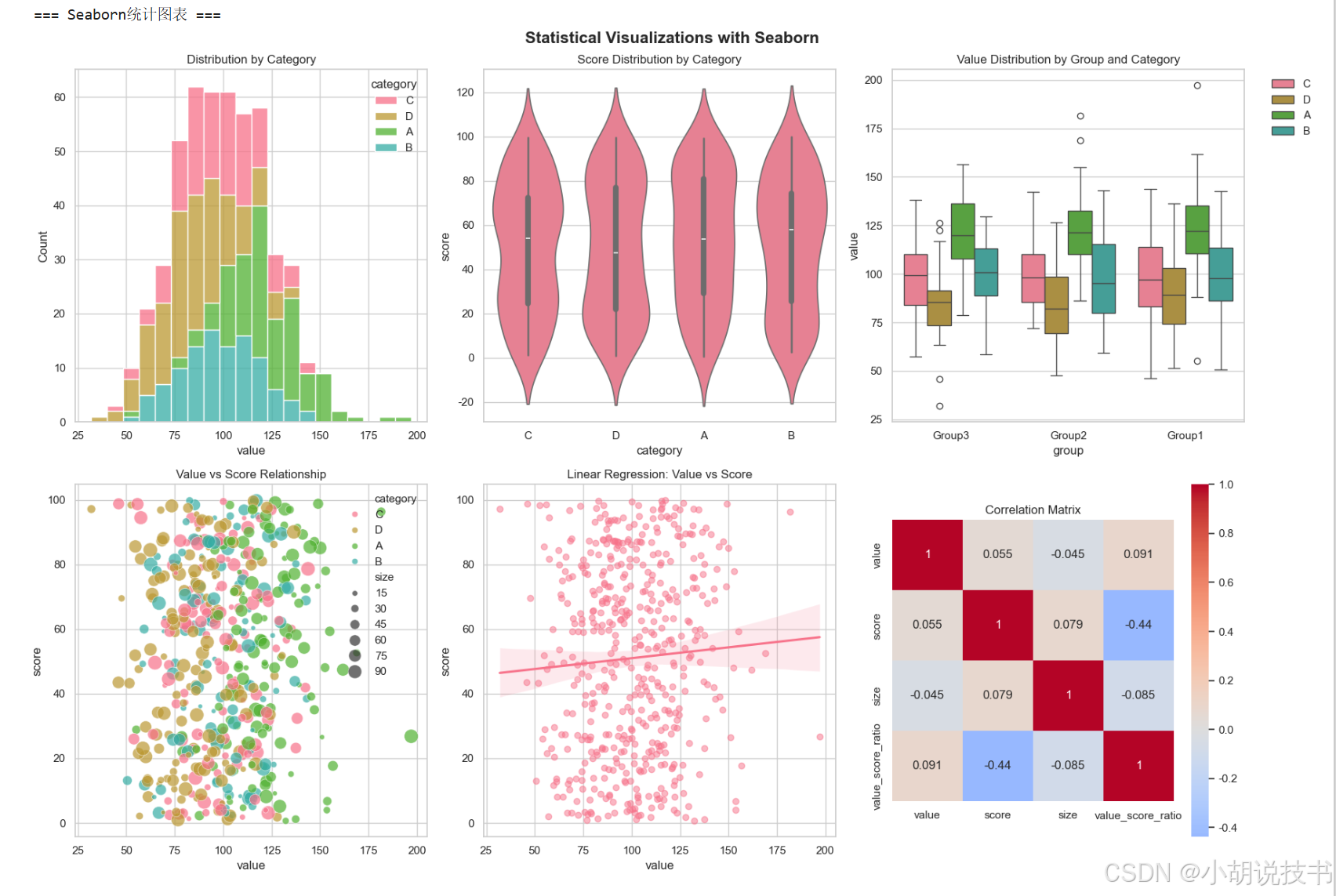
7.2 Seaborn统计可视化:美观与功能并重
> Seaborn核心优势
Seaborn 基于Matplotlib构建,专注于统计可视化,提供更美观的默认样式和强大的统计功能。
import seaborn as sns# 设置Seaborn样式
sns.set_theme(style="whitegrid", palette="husl")# 创建综合数据集
np.random.seed(42)
n_samples = 500dataset = pd.DataFrame({'category': np.random.choice(['A', 'B', 'C', 'D'], n_samples),'value': np.random.normal(100, 20, n_samples),'score': np.random.uniform(0, 100, n_samples),'group': np.random.choice(['Group1', 'Group2', 'Group3'], n_samples),'size': np.random.randint(10, 100, n_samples)
})# 添加一些关联性
dataset.loc[dataset['category'] == 'A', 'value'] += 20
dataset.loc[dataset['category'] == 'D', 'value'] -= 15
dataset['value_score_ratio'] = dataset['value'] / dataset['score']print("=== Seaborn统计图表 ===")# 创建统计图表集合
fig, axes = plt.subplots(2, 3, figsize=(18, 12))
fig.suptitle('Statistical Visualizations with Seaborn', fontsize=16, fontweight='bold')# 1. 分布图 - 显示数据分布
sns.histplot(data=dataset, x='value', hue='category', multiple="stack", ax=axes[0, 0])
axes[0, 0].set_title('Distribution by Category')# 2. 小提琴图 - 显示分布形状
sns.violinplot(data=dataset, x='category', y='score', ax=axes[0, 1])
axes[0, 1].set_title('Score Distribution by Category')# 3. 箱线图 - 显示统计摘要
sns.boxplot(data=dataset, x='group', y='value', hue='category', ax=axes[0, 2])
axes[0, 2].set_title('Value Distribution by Group and Category')
axes[0, 2].legend(bbox_to_anchor=(1.05, 1), loc='upper left')# 4. 散点图 - 显示相关性
sns.scatterplot(data=dataset, x='value', y='score', hue='category', size='size', sizes=(20, 200), alpha=0.7, ax=axes[1, 0])
axes[1, 0].set_title('Value vs Score Relationship')# 5. 回归图 - 显示趋势
sns.regplot(data=dataset, x='value', y='score', ax=axes[1, 1], scatter_kws={'alpha':0.5})
axes[1, 1].set_title('Linear Regression: Value vs Score')# 6. 热力图 - 显示相关性矩阵
numeric_cols = ['value', 'score', 'size', 'value_score_ratio']
corr_matrix = dataset[numeric_cols].corr()
sns.heatmap(corr_matrix, annot=True, cmap='coolwarm', center=0, square=True, ax=axes[1, 2])
axes[1, 2].set_title('Correlation Matrix')plt.tight_layout()
plt.show()# 高级统计图表
print("\n=== 高级统计分析图表 ===")# 创建复杂的多面板图表
fig, axes = plt.subplots(2, 2, figsize=(16, 12))# 1. 成对关系图(简化版)
numeric_data = dataset[['value', 'score', 'size']].sample(100)  # 采样以提高性能
axes[0, 0].scatter(numeric_data['value'], numeric_data['score'], s=numeric_data['size'], alpha=0.6)
axes[0, 0].set_xlabel('Value')
axes[0, 0].set_ylabel('Score')
axes[0, 0].set_title('Pairwise Relationship (Bubble Chart)')# 2. 分面条形图
category_summary = dataset.groupby(['category', 'group'])['value'].mean().reset_index()
category_pivot = category_summary.pivot(index='category', columns='group', values='value')
category_pivot.plot(kind='bar', ax=axes[0, 1], rot=45)
axes[0, 1].set_title('Average Value by Category and Group')
axes[0, 1].legend(title='Group')# 3. 密度图
for cat in dataset['category'].unique():cat_data = dataset[dataset['category'] == cat]['value']axes[1, 0].hist(cat_data, alpha=0.5, label=f'Category {cat}', bins=20, density=True)
axes[1, 0].set_xlabel('Value')
axes[1, 0].set_ylabel('Density')
axes[1, 0].set_title('Value Density by Category')
axes[1, 0].legend()# 4. 分组统计图
group_stats = dataset.groupby('group').agg({'value': ['mean', 'std'],'score': ['mean', 'std']
}).round(2)# 扁平化列名
group_stats.columns = ['_'.join(col).strip() for col in group_stats.columns]
group_stats.plot(kind='bar', ax=axes[1, 1], rot=45)
axes[1, 1].set_title('Group Statistics Comparison')
axes[1, 1].legend(bbox_to_anchor=(1.05, 1), loc='upper left')plt.tight_layout()
plt.show()
> 时间序列可视化
# 创建时间序列数据
dates = pd.date_range('2023-01-01', periods=365, freq='D')
ts_data = pd.DataFrame({'date': dates,'sales': 1000 + np.cumsum(np.random.normal(2, 10, 365)) + 50*np.sin(np.arange(365)*2*np.pi/365),'temperature': 20 + 15*np.sin((np.arange(365)-80)*2*np.pi/365) + np.random.normal(0, 3, 365),'visitors': np.random.poisson(100, 365) + 20*np.sin((np.arange(365)-80)*2*np.pi/365)
})# 添加移动平均
ts_data['sales_ma'] = ts_data['sales'].rolling(window=7).mean()
ts_data['month'] = ts_data['date'].dt.month
ts_data['quarter'] = ts_data['date'].dt.quarterprint("=== 时间序列可视化 ===")fig, axes = plt.subplots(3, 1, figsize=(15, 12))# 1. 基础时间序列
axes[0].plot(ts_data['date'], ts_data['sales'], alpha=0.3, color='blue', label='Daily Sales')
axes[0].plot(ts_data['date'], ts_data['sales_ma'], color='red', linewidth=2, label='7-Day Moving Average')
axes[0].set_title('Sales Time Series with Moving Average')
axes[0].set_ylabel('Sales Amount')
axes[0].legend()
axes[0].grid(True, alpha=0.3)# 2. 多变量时间序列(双轴)
ax2_twin = axes[1].twinx()
line1 = axes[1].plot(ts_data['date'], ts_data['visitors'], color='green', label='Visitors')
axes[1].set_ylabel('Visitors', color='green')
line2 = ax2_twin.plot(ts_data['date'], ts_data['temperature'], color='orange', label='Temperature')
ax2_twin.set_ylabel('Temperature (°C)', color='orange')
axes[1].set_title('Visitors and Temperature Correlation')# 合并图例
lines1, labels1 = axes[1].get_legend_handles_labels()
lines2, labels2 = ax2_twin.get_legend_handles_labels()
axes[1].legend(lines1 + lines2, labels1 + labels2, loc='upper left')# 3. 季节性分析
monthly_avg = ts_data.groupby('month').agg({'sales': 'mean','visitors': 'mean','temperature': 'mean'
}).reset_index()month_names = ['Jan', 'Feb', 'Mar', 'Apr', 'May', 'Jun','Jul', 'Aug', 'Sep', 'Oct', 'Nov', 'Dec']# 标准化数据以便比较
from sklearn.preprocessing import StandardScaler
scaler = StandardScaler()
scaled_data = scaler.fit_transform(monthly_avg[['sales', 'visitors', 'temperature']])
scaled_df = pd.DataFrame(scaled_data, columns=['Sales', 'Visitors', 'Temperature'])
scaled_df['Month'] = month_namesx_pos = np.arange(len(month_names))
width = 0.25axes[2].bar(x_pos - width, scaled_df['Sales'], width, label='Sales (normalized)', alpha=0.8)
axes[2].bar(x_pos, scaled_df['Visitors'], width, label='Visitors (normalized)', alpha=0.8)
axes[2].bar(x_pos + width, scaled_df['Temperature'], width, label='Temperature (normalized)', alpha=0.8)axes[2].set_title('Monthly Seasonal Patterns (Normalized)')
axes[2].set_xlabel('Month')
axes[2].set_ylabel('Normalized Value')
axes[2].set_xticks(x_pos)
axes[2].set_xticklabels(month_names, rotation=45)
axes[2].legend()
axes[2].grid(True, alpha=0.3, axis='y')plt.tight_layout()
plt.show()
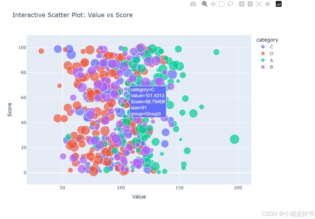
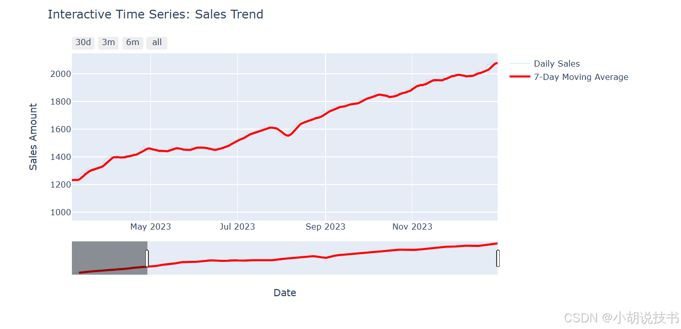
7.3 交互式可视化:Plotly现代图表
> Plotly基础交互
Plotly 提供现代化的交互式图表,特别适合Web展示和仪表板开发。
import plotly.graph_objects as go
import plotly.express as px
from plotly.subplots import make_subplots
import plotly.offline as pyo# 设置离线模式
pyo.init_notebook_mode(connected=True)print("=== Plotly交互式图表 ===")# 创建交互式散点图
fig_scatter = px.scatter(dataset, x='value', y='score', color='category', size='size',hover_data=['group'],title='Interactive Scatter Plot: Value vs Score',labels={'value': 'Value', 'score': 'Score'})fig_scatter.update_layout(width=800, height=600,showlegend=True,hovermode='closest'
)# 显示图表(在Jupyter环境中)
fig_scatter.show()# 创建时间序列交互图表
fig_ts = go.Figure()# 添加原始数据
fig_ts.add_trace(go.Scatter(x=ts_data['date'], y=ts_data['sales'],mode='lines',name='Daily Sales',line=dict(color='lightblue', width=1),opacity=0.6
))# 添加移动平均
fig_ts.add_trace(go.Scatter(x=ts_data['date'], y=ts_data['sales_ma'],mode='lines',name='7-Day Moving Average',line=dict(color='red', width=3)
))fig_ts.update_layout(title='Interactive Time Series: Sales Trend',xaxis_title='Date',yaxis_title='Sales Amount',hovermode='x unified',showlegend=True,width=900, height=500
)# 添加范围选择器
fig_ts.update_layout(xaxis=dict(rangeselector=dict(buttons=list([dict(count=30, label="30d", step="day", stepmode="backward"),dict(count=90, label="3m", step="day", stepmode="backward"),dict(count=180, label="6m", step="day", stepmode="backward"),dict(step="all")])),rangeslider=dict(visible=True),type="date")
)fig_ts.show()# 创建多子图仪表板
print("\n=== 综合仪表板 ===")# 准备仪表板数据
monthly_data = ts_data.groupby(ts_data['date'].dt.to_period('M')).agg({'sales': ['sum', 'mean'],'visitors': 'sum','temperature': 'mean'
}).round(2)monthly_data.columns = ['total_sales', 'avg_sales', 'total_visitors', 'avg_temp']
monthly_data = monthly_data.reset_index()
monthly_data['date'] = monthly_data['date'].astype(str)# 创建子图布局
dashboard = make_subplots(rows=2, cols=2,subplot_titles=('Monthly Sales Trend', 'Sales vs Visitors', 'Temperature Distribution', 'Category Performance'),specs=[[{"secondary_y": False}, {"secondary_y": False}],[{"secondary_y": False}, {"secondary_y": False}]]
)# 子图1:月度销售趋势
dashboard.add_trace(go.Scatter(x=monthly_data['date'], y=monthly_data['total_sales'],mode='lines+markers', name='Total Sales',line=dict(color='blue', width=3)),row=1, col=1
)# 子图2:销售与访客关系
dashboard.add_trace(go.Scatter(x=monthly_data['total_visitors'], y=monthly_data['total_sales'],mode='markers', name='Sales vs Visitors',marker=dict(size=8, color='green')),row=1, col=2
)# 子图3:温度分布
dashboard.add_trace(go.Histogram(x=ts_data['temperature'], name='Temperature Dist',nbinsx=30, marker_color='orange'),row=2, col=1
)# 子图4:类别表现
category_perf = dataset.groupby('category')['value'].agg(['mean', 'count']).reset_index()
dashboard.add_trace(go.Bar(x=category_perf['category'], y=category_perf['mean'],name='Avg Value by Category', marker_color='purple'),row=2, col=2
)# 更新布局
dashboard.update_layout(height=800, width=1200,title_text="Business Intelligence Dashboard",showlegend=False
)dashboard.show()
7.4 探索性数据分析(EDA)方法论
> EDA系统化流程
探索性数据分析 是数据科学项目的关键阶段,通过可视化发现数据中的模式、异常和洞察。
class EDAAnalyzer:"""探索性数据分析工具类"""def __init__(self, data):self.data = data.copy()self.numeric_cols = data.select_dtypes(include=[np.number]).columns.tolist()self.categorical_cols = data.select_dtypes(include=['object', 'category']).columns.tolist()def data_overview(self):"""数据概览"""print("=== 数据基本信息 ===")print(f"数据形状: {self.data.shape}")print(f"数值型列: {len(self.numeric_cols)} 个")print(f"分类型列: {len(self.categorical_cols)} 个")# 缺失值统计missing_info = self.data.isnull().sum()if missing_info.sum() > 0:print(f"\n缺失值情况:")for col in missing_info[missing_info > 0].index:print(f"  {col}: {missing_info[col]} ({missing_info[col]/len(self.data)*100:.1f}%)")else:print("\n无缺失值")return self.data.describe()def distribution_analysis(self):"""分布分析"""if not self.numeric_cols:print("无数值型列可分析")returnn_cols = min(len(self.numeric_cols), 4)fig, axes = plt.subplots(2, n_cols, figsize=(4*n_cols, 8))if n_cols == 1:axes = axes.reshape(2, 1)for i, col in enumerate(self.numeric_cols[:n_cols]):# 直方图axes[0, i].hist(self.data[col], bins=30, alpha=0.7, color='skyblue', edgecolor='black')axes[0, i].set_title(f'Distribution: {col}')axes[0, i].set_xlabel(col)axes[0, i].set_ylabel('Frequency')# 箱线图axes[1, i].boxplot(self.data[col])axes[1, i].set_title(f'Box Plot: {col}')axes[1, i].set_ylabel(col)plt.tight_layout()plt.show()# 统计检验结果print("\n=== 分布统计摘要 ===")for col in self.numeric_cols[:4]:skewness = self.data[col].skew()kurtosis = self.data[col].kurtosis()print(f"{col}: 偏度={skewness:.2f}, 峰度={kurtosis:.2f}")def correlation_analysis(self):"""相关性分析"""if len(self.numeric_cols) < 2:print("数值型列不足,无法进行相关性分析")return# 相关性矩阵corr_matrix = self.data[self.numeric_cols].corr()# 热力图plt.figure(figsize=(10, 8))mask = np.triu(np.ones_like(corr_matrix, dtype=bool))  # 只显示下三角sns.heatmap(corr_matrix, mask=mask, annot=True, cmap='coolwarm', center=0, square=True, vmin=-1, vmax=1)plt.title('Correlation Matrix Heatmap')plt.tight_layout()plt.show()# 强相关性对识别print("\n=== 强相关性对 (|r| > 0.5) ===")strong_corr = []for i in range(len(corr_matrix.columns)):for j in range(i+1, len(corr_matrix.columns)):corr_val = corr_matrix.iloc[i, j]if abs(corr_val) > 0.5:strong_corr.append((corr_matrix.columns[i], corr_matrix.columns[j], corr_val))for col1, col2, corr_val in strong_corr:print(f"{col1} vs {col2}: {corr_val:.3f}")return corr_matrixdef outlier_detection(self):"""异常值检测"""outlier_summary = {}fig, axes = plt.subplots(1, min(len(self.numeric_cols), 4), figsize=(16, 4))if len(self.numeric_cols) == 1:axes = [axes]elif len(self.numeric_cols) < 4:axes = axes[:len(self.numeric_cols)]for i, col in enumerate(self.numeric_cols[:4]):# IQR方法检测异常值Q1 = self.data[col].quantile(0.25)Q3 = self.data[col].quantile(0.75)IQR = Q3 - Q1lower_bound = Q1 - 1.5 * IQRupper_bound = Q3 + 1.5 * IQRoutliers = self.data[(self.data[col] < lower_bound) | (self.data[col] > upper_bound)]outlier_summary[col] = len(outliers)# 可视化异常值axes[i].scatter(range(len(self.data)), self.data[col], alpha=0.6, s=20)axes[i].axhline(y=upper_bound, color='r', linestyle='--', label='Upper Bound')axes[i].axhline(y=lower_bound, color='r', linestyle='--', label='Lower Bound')axes[i].set_title(f'Outliers in {col}')axes[i].set_xlabel('Index')axes[i].set_ylabel(col)if i == 0:axes[i].legend()plt.tight_layout()plt.show()print("\n=== 异常值统计 ===")for col, count in outlier_summary.items():print(f"{col}: {count} 个异常值 ({count/len(self.data)*100:.1f}%)")return outlier_summarydef categorical_analysis(self):"""分类变量分析"""if not self.categorical_cols:print("无分类型列可分析")returnn_cats = min(len(self.categorical_cols), 4)fig, axes = plt.subplots(2, n_cats, figsize=(4*n_cats, 8))if n_cats == 1:axes = axes.reshape(2, 1)for i, col in enumerate(self.categorical_cols[:n_cats]):value_counts = self.data[col].value_counts()# 条形图value_counts.plot(kind='bar', ax=axes[0, i], color='lightgreen')axes[0, i].set_title(f'Value Counts: {col}')axes[0, i].set_xlabel(col)axes[0, i].set_ylabel('Count')axes[0, i].tick_params(axis='x', rotation=45)# 饼图if len(value_counts) <= 8:  # 避免饼图过于复杂axes[1, i].pie(value_counts.values, labels=value_counts.index, autopct='%1.1f%%')axes[1, i].set_title(f'Distribution: {col}')else:# 如果类别太多,显示前8个top_values = value_counts.head(8)axes[1, i].pie(top_values.values, labels=top_values.index, autopct='%1.1f%%')axes[1, i].set_title(f'Top 8 in {col}')plt.tight_layout()plt.show()# 类别统计print("\n=== 分类变量统计 ===")for col in self.categorical_cols:unique_count = self.data[col].nunique()most_common = self.data[col].mode()[0] if len(self.data[col].mode()) > 0 else 'N/A'print(f"{col}: {unique_count} 个唯一值, 最常见: {most_common}")# 使用EDA分析器
print("=== EDA自动化分析演示 ===")# 创建更复杂的测试数据
np.random.seed(42)
eda_data = pd.DataFrame({'age': np.random.normal(35, 10, 1000),'income': np.random.lognormal(10, 0.5, 1000),'education': np.random.choice(['High School', 'Bachelor', 'Master', 'PhD'], 1000, p=[0.3, 0.4, 0.2, 0.1]),'city': np.random.choice(['New York', 'LA', 'Chicago', 'Houston', 'Phoenix'], 1000),'satisfaction': np.random.uniform(1, 10, 1000),'purchase_amount': np.random.exponential(100, 1000)
})# 添加一些关联性和异常值
eda_data.loc[eda_data['education'] == 'PhD', 'income'] *= 1.5
eda_data.loc[eda_data['city'] == 'New York', 'income'] *= 1.2
eda_data.loc[np.random.choice(1000, 20, replace=False), 'purchase_amount'] *= 10  # 添加异常值# 执行EDA分析
analyzer = EDAAnalyzer(eda_data)
desc_stats = analyzer.data_overview()
print("\n描述性统计:")
print(desc_stats)analyzer.distribution_analysis()
corr_matrix = analyzer.correlation_analysis()
outlier_info = analyzer.outlier_detection()
analyzer.categorical_analysis()
7.5 实战项目:业务智能仪表板
现在让我们整合所有可视化技能,创建一个完整的业务智能仪表板。
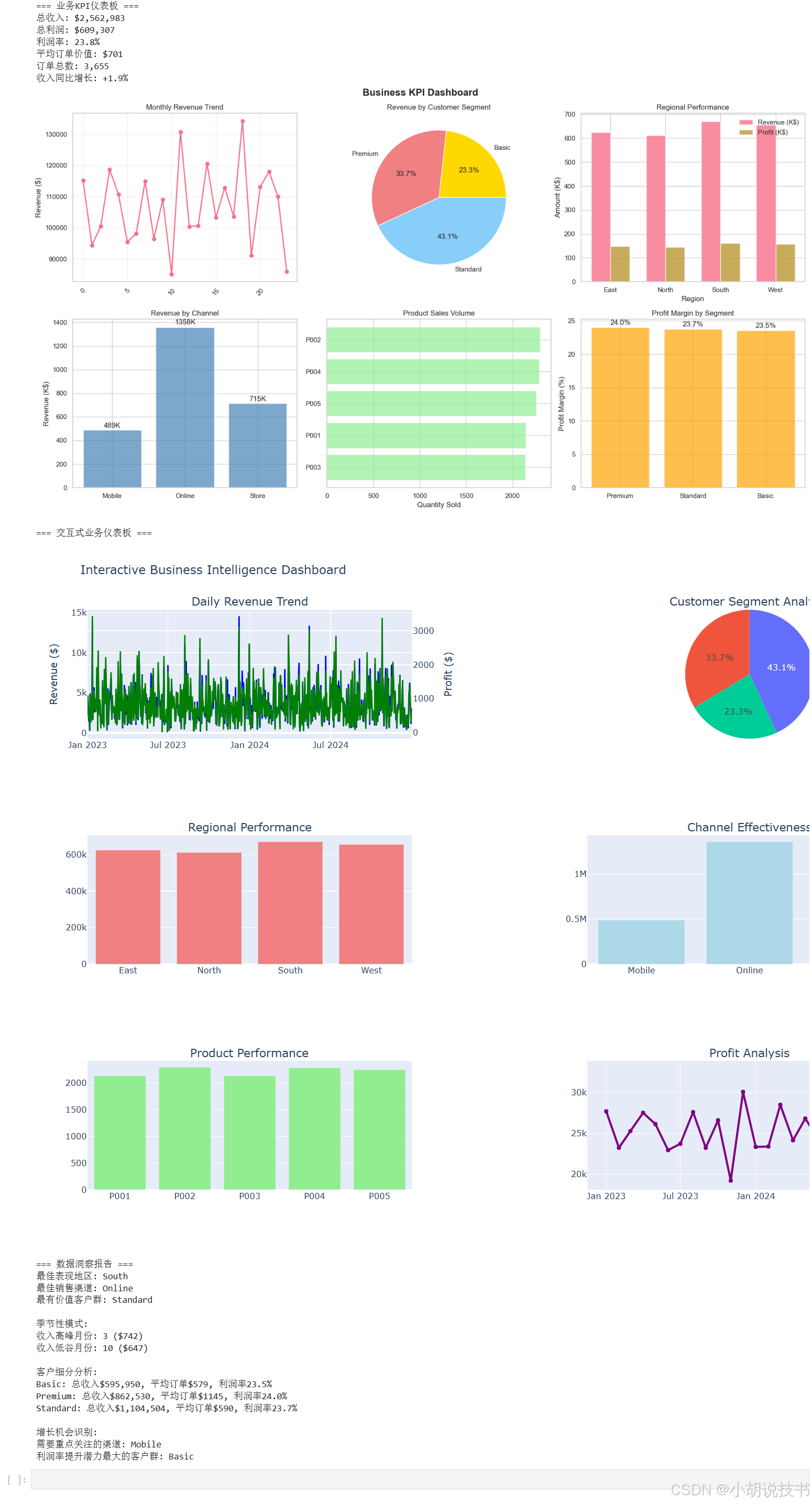
class BusinessDashboard:"""业务智能仪表板"""def __init__(self):self.sales_data = Noneself.customer_data = Noneself.product_data = Nonedef generate_business_data(self):"""生成业务数据"""np.random.seed(42)# 销售数据dates = pd.date_range('2023-01-01', '2024-12-31', freq='D')n_records = len(dates) * 5  # 每天平均5笔交易self.sales_data = pd.DataFrame({'date': np.random.choice(dates, n_records),'product_id': np.random.choice(['P001', 'P002', 'P003', 'P004', 'P005'], n_records),'customer_segment': np.random.choice(['Premium', 'Standard', 'Basic'], n_records, p=[0.2, 0.5, 0.3]),'region': np.random.choice(['North', 'South', 'East', 'West'], n_records),'channel': np.random.choice(['Online', 'Store', 'Mobile'], n_records, p=[0.5, 0.3, 0.2]),'revenue': np.random.lognormal(6, 0.8, n_records),'quantity': np.random.poisson(2, n_records) + 1,'discount': np.random.choice([0, 0.05, 0.1, 0.15, 0.2], n_records, p=[0.4, 0.2, 0.2, 0.1, 0.1])})# 调整数据使其更真实self.sales_data.loc[self.sales_data['customer_segment'] == 'Premium', 'revenue'] *= 2self.sales_data.loc[self.sales_data['channel'] == 'Online', 'revenue'] *= 1.1self.sales_data['profit'] = self.sales_data['revenue'] * (0.3 - self.sales_data['discount'])# 添加时间特征self.sales_data['year'] = self.sales_data['date'].dt.yearself.sales_data['month'] = self.sales_data['date'].dt.monthself.sales_data['quarter'] = self.sales_data['date'].dt.quarterself.sales_data['weekday'] = self.sales_data['date'].dt.day_name()print(f"生成销售数据: {len(self.sales_data)} 条记录")def create_kpi_overview(self):"""创建KPI概览"""# 计算关键指标total_revenue = self.sales_data['revenue'].sum()total_profit = self.sales_data['profit'].sum()avg_order_value = self.sales_data['revenue'].mean()total_orders = len(self.sales_data)profit_margin = total_profit / total_revenue * 100# 同比增长(假设去年数据)current_year = self.sales_data[self.sales_data['year'] == 2024]previous_year = self.sales_data[self.sales_data['year'] == 2023]revenue_growth = (current_year['revenue'].sum() / previous_year['revenue'].sum() - 1) * 100print("=== 业务KPI仪表板 ===")print(f"总收入: ${total_revenue:,.0f}")print(f"总利润: ${total_profit:,.0f}")print(f"利润率: {profit_margin:.1f}%")print(f"平均订单价值: ${avg_order_value:.0f}")print(f"订单总数: {total_orders:,}")print(f"收入同比增长: {revenue_growth:+.1f}%")# 可视化KPIfig, axes = plt.subplots(2, 3, figsize=(18, 10))fig.suptitle('Business KPI Dashboard', fontsize=16, fontweight='bold')# 1. 月度收入趋势monthly_revenue = self.sales_data.groupby(['year', 'month'])['revenue'].sum().reset_index()monthly_revenue['period'] = monthly_revenue['year'].astype(str) + '-' + monthly_revenue['month'].astype(str).str.zfill(2)axes[0, 0].plot(range(len(monthly_revenue)), monthly_revenue['revenue'], marker='o', linewidth=2)axes[0, 0].set_title('Monthly Revenue Trend')axes[0, 0].set_ylabel('Revenue ($)')axes[0, 0].grid(True, alpha=0.3)axes[0, 0].tick_params(axis='x', rotation=45)# 2. 客户细分收入占比segment_revenue = self.sales_data.groupby('customer_segment')['revenue'].sum()colors = ['gold', 'lightcoral', 'lightskyblue']axes[0, 1].pie(segment_revenue.values, labels=segment_revenue.index, autopct='%1.1f%%', colors=colors)axes[0, 1].set_title('Revenue by Customer Segment')# 3. 地区表现对比region_stats = self.sales_data.groupby('region').agg({'revenue': 'sum','profit': 'sum'}).reset_index()x_pos = np.arange(len(region_stats))width = 0.35bars1 = axes[0, 2].bar(x_pos - width/2, region_stats['revenue']/1000, width, label='Revenue (K$)', alpha=0.8)bars2 = axes[0, 2].bar(x_pos + width/2, region_stats['profit']/1000, width, label='Profit (K$)', alpha=0.8)axes[0, 2].set_title('Regional Performance')axes[0, 2].set_xlabel('Region')axes[0, 2].set_ylabel('Amount (K$)')axes[0, 2].set_xticks(x_pos)axes[0, 2].set_xticklabels(region_stats['region'])axes[0, 2].legend()# 4. 渠道表现channel_perf = self.sales_data.groupby('channel').agg({'revenue': ['sum', 'count'],'profit': 'sum'}).round(0)channel_perf.columns = ['total_revenue', 'order_count', 'total_profit']channel_perf = channel_perf.reset_index()axes[1, 0].bar(channel_perf['channel'], channel_perf['total_revenue']/1000, color='steelblue', alpha=0.7)axes[1, 0].set_title('Revenue by Channel')axes[1, 0].set_ylabel('Revenue (K$)')# 添加数值标签for i, v in enumerate(channel_perf['total_revenue']/1000):axes[1, 0].text(i, v + v*0.01, f'{v:.0f}K', ha='center', va='bottom')# 5. 产品销售分布product_sales = self.sales_data.groupby('product_id')['quantity'].sum().sort_values(ascending=True)axes[1, 1].barh(product_sales.index, product_sales.values, color='lightgreen', alpha=0.7)axes[1, 1].set_title('Product Sales Volume')axes[1, 1].set_xlabel('Quantity Sold')# 6. 利润率分析profit_margin_by_segment = self.sales_data.groupby('customer_segment').apply(lambda x: (x['profit'].sum() / x['revenue'].sum()) * 100).sort_values(ascending=False)bars = axes[1, 2].bar(profit_margin_by_segment.index, profit_margin_by_segment.values, color='orange', alpha=0.7)axes[1, 2].set_title('Profit Margin by Segment')axes[1, 2].set_ylabel('Profit Margin (%)')# 添加数值标签for bar in bars:height = bar.get_height()axes[1, 2].text(bar.get_x() + bar.get_width()/2., height + 0.2,f'{height:.1f}%', ha='center', va='bottom')plt.tight_layout()plt.show()def create_interactive_dashboard(self):"""创建交互式仪表板"""print("\n=== 交互式业务仪表板 ===")# 准备数据daily_metrics = self.sales_data.groupby('date').agg({'revenue': 'sum','profit': 'sum','quantity': 'sum'}).reset_index()# 创建交互式多图表仪表板dashboard = make_subplots(rows=3, cols=2,subplot_titles=('Daily Revenue Trend', 'Customer Segment Analysis','Regional Performance', 'Channel Effectiveness','Product Performance', 'Profit Analysis'),specs=[[{"secondary_y": True}, {"type": "domain"}],[{"secondary_y": False}, {"secondary_y": False}],[{"secondary_y": False}, {"secondary_y": False}]])# 1. 日收入趋势(主图表)dashboard.add_trace(go.Scatter(x=daily_metrics['date'], y=daily_metrics['revenue'],mode='lines', name='Daily Revenue',line=dict(color='blue', width=2)),row=1, col=1, secondary_y=False)dashboard.add_trace(go.Scatter(x=daily_metrics['date'], y=daily_metrics['profit'],mode='lines', name='Daily Profit',line=dict(color='green', width=2)),row=1, col=1, secondary_y=True)# 2. 客户细分饼图segment_data = self.sales_data.groupby('customer_segment')['revenue'].sum()dashboard.add_trace(go.Pie(labels=segment_data.index, values=segment_data.values,name="Segment Revenue"),row=1, col=2)# 3. 地区表现region_data = self.sales_data.groupby('region')['revenue'].sum().reset_index()dashboard.add_trace(go.Bar(x=region_data['region'], y=region_data['revenue'],name='Regional Revenue', marker_color='lightcoral'),row=2, col=1)# 4. 渠道效果channel_data = self.sales_data.groupby('channel')['revenue'].sum().reset_index()dashboard.add_trace(go.Bar(x=channel_data['channel'], y=channel_data['revenue'],name='Channel Revenue', marker_color='lightblue'),row=2, col=2)# 5. 产品表现product_data = self.sales_data.groupby('product_id')['quantity'].sum().reset_index()dashboard.add_trace(go.Bar(x=product_data['product_id'], y=product_data['quantity'],name='Product Quantity', marker_color='lightgreen'),row=3, col=1)# 6. 利润分析monthly_profit = self.sales_data.groupby([self.sales_data['date'].dt.to_period('M')])['profit'].sum().reset_index()monthly_profit['date'] = monthly_profit['date'].astype(str)dashboard.add_trace(go.Scatter(x=monthly_profit['date'], y=monthly_profit['profit'],mode='lines+markers', name='Monthly Profit',line=dict(color='purple', width=3)),row=3, col=2)# 更新布局dashboard.update_layout(height=1000, width=1400,title_text="Interactive Business Intelligence Dashboard",showlegend=False)# 设置y轴标题dashboard.update_yaxes(title_text="Revenue ($)", row=1, col=1, secondary_y=False)dashboard.update_yaxes(title_text="Profit ($)", row=1, col=1, secondary_y=True)dashboard.show()def generate_insights(self):"""生成业务洞察"""print("\n=== 数据洞察报告 ===")# 1. 最佳表现分析best_region = self.sales_data.groupby('region')['revenue'].sum().idxmax()best_channel = self.sales_data.groupby('channel')['revenue'].sum().idxmax()best_segment = self.sales_data.groupby('customer_segment')['revenue'].sum().idxmax()print(f"最佳表现地区: {best_region}")print(f"最佳销售渠道: {best_channel}")print(f"最有价值客户群: {best_segment}")# 2. 季节性分析seasonal_pattern = self.sales_data.groupby('month')['revenue'].mean().round(0)peak_month = seasonal_pattern.idxmax()low_month = seasonal_pattern.idxmin()print(f"\n季节性模式:")print(f"收入高峰月份: {peak_month} (${seasonal_pattern[peak_month]:,.0f})")print(f"收入低谷月份: {low_month} (${seasonal_pattern[low_month]:,.0f})")# 3. 客户价值分析segment_analysis = self.sales_data.groupby('customer_segment').agg({'revenue': ['sum', 'mean', 'count'],'profit': 'sum'}).round(2)segment_analysis.columns = ['total_rev', 'avg_rev', 'order_count', 'total_profit']segment_analysis['profit_margin'] = (segment_analysis['total_profit'] / segment_analysis['total_rev'] * 100).round(1)print(f"\n客户细分分析:")for segment in segment_analysis.index:data = segment_analysis.loc[segment]print(f"{segment}: 总收入${data['total_rev']:,.0f}, "f"平均订单${data['avg_rev']:.0f}, "f"利润率{data['profit_margin']:.1f}%")# 4. 增长机会识别print(f"\n增长机会识别:")# 低表现渠道channel_perf = self.sales_data.groupby('channel')['revenue'].sum()underperform_channel = channel_perf.idxmin()print(f"需要重点关注的渠道: {underperform_channel}")# 利润率提升空间low_margin_segment = segment_analysis['profit_margin'].idxmin()print(f"利润率提升潜力最大的客户群: {low_margin_segment}")return {'best_performers': {'region': best_region, 'channel': best_channel, 'segment': best_segment},'seasonal': {'peak': peak_month, 'low': low_month},'opportunities': {'channel': underperform_channel, 'segment': low_margin_segment}}# 运行完整的仪表板演示
def run_dashboard_demo():"""运行仪表板演示"""dashboard = BusinessDashboard()dashboard.generate_business_data()dashboard.create_kpi_overview()dashboard.create_interactive_dashboard()insights = dashboard.generate_insights()return dashboard, insights# 执行演示
dashboard_system, business_insights = run_dashboard_demo()
7.6 学习总结与进阶指导
> 可视化技能矩阵
通过本课学习,我们建立了完整的数据可视化技能体系,从基础图表到交互式仪表板,每个层次都服务于不同的分析需求。
| 工具层次 | 适用场景 | 核心优势 | 学习重点 |
|---|---|---|---|
| Matplotlib | 静态图表、论文发表 | 完全控制、高质量输出 | 图表元素精细调控 |
| Seaborn | 统计分析、探索性分析 | 美观默认样式、统计功能 | 统计图表类型选择 |
| Plotly | 交互展示、Web仪表板 | 现代交互、易于分享 | 交互性设计思维 |
> 数据故事叙述原则
有效的数据可视化不仅仅是技术实现,更重要的是通过图表讲述数据背后的故事:
图表选择逻辑:根据数据类型和分析目的选择最合适的图表类型,避免为了美观而牺牲清晰度。
视觉层次设计:通过颜色、大小、位置等视觉元素引导观众注意力,突出关键洞察。
上下文提供:为图表提供必要的背景信息和解释,帮助观众正确理解数据含义。
> 探索性分析思维
EDA不是简单的图表堆砌,而是系统性的数据探索过程。从数据质量检查到模式发现,从假设验证到洞察提炼,每个步骤都有其特定目的和方法。
> 与后续课程的连接
数据可视化技能将在机器学习课程中发挥重要作用。模型性能评估、特征重要性分析、预测结果展示等都需要有效的可视化支持。同时,可视化也是模型解释性和业务沟通的重要工具。
掌握数据可视化的核心价值在于培养了数据敏感性和洞察能力,这是数据科学家最重要的素养之一。
附录:专业术语表
探索性数据分析(EDA):通过统计和可视化方法系统性地探索数据集,发现模式、趋势和异常的分析过程
数据可视化(Data Visualization):将抽象数据转换为图形表示,以便人类更容易理解和分析的技术
统计图表(Statistical Charts):专门用于展示数据统计特征的图表类型,如箱线图、小提琴图、热力图等
交互式图表(Interactive Charts):允许用户通过点击、悬停、缩放等操作与图表进行交互的动态可视化
仪表板(Dashboard):集成多个图表和指标的综合性展示界面,用于监控业务状态和关键指标
KPI(Key Performance Indicator):关键绩效指标,用于衡量业务目标实现程度的量化指标
相关性矩阵(Correlation Matrix):显示多个变量之间线性相关关系强度的矩阵表示
异常值检测(Outlier Detection):识别数据中显著偏离正常模式的数据点的统计方法
分布分析(Distribution Analysis):研究数据在不同取值范围内的分布特征和模式
时间序列可视化(Time Series Visualization):专门用于展示随时间变化的数据趋势和周期性模式的图表
热力图(Heatmap):使用颜色深浅表示数值大小的矩阵可视化方法
子图布局(Subplot Layout):在单个图形中组织多个图表的空间排列方法
图表元素(Chart Elements):构成图表的基本组件,包括坐标轴、标题、图例、网格线等
颜色映射(Color Mapping):将数据值映射到颜色的可视化编码方法