美图复现|Science:添加显著性的GO富集分析美图
大家好,这里是专注表观组学十余年,领跑多组学科研服务的易基因。
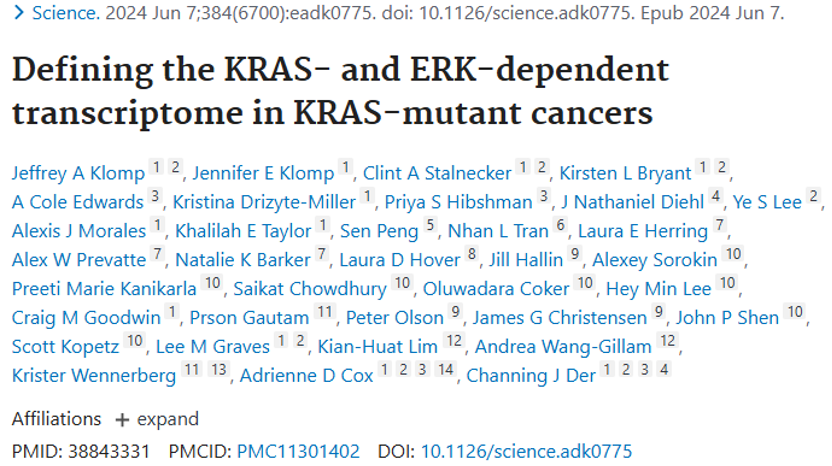
最近,在查阅顶刊Science有关癌症的文献时,发现这篇发表时间为2024年的《Defining the KRAS- and ERK-dependent transcriptome in KRAS-mutant cancers》中的Fig4C的功能富集分析非常精美,堪称美图界的典范,值得进一步学习,成功复现后大家也可以考虑加入自己的文章中增加亮点。
标题:Defining the KRAS- and ERK-dependent transcriptome in KRAS-mutant cancers(揭示KRAS突变癌症中的KRAS和ERK依赖性转录组)
发表时间:2024年6月7日
发表期刊:Science
影响因子:IF45.8/Q1
DOI:10.1126/science.adk0775
文中作者通过功能富集分析加显著性揭示了细胞周期基因编程是PDAC KRAS-ERK 依赖性基因中的一个突出特征。
(C) Overrepresentation analysis for PDAC KRAS-ERK UP essential genes using KEGG, GO, and Reactome. BP, biological process; CC, cellular component.
# 1.数据准备 ------------------------------------------------------------------
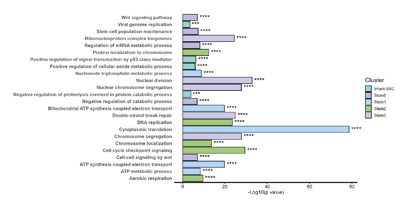
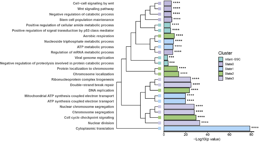
# 这里我们直接获取今年发表在Biochimica et Biophysica Acta (BBA) - Molecular Basis of Disease上的《Deciphering the regulatory networks of human male germline development from embryo to adulthood》中的附表三中GO富集分析的结果进行本次的图表复现
# 当然有兴趣的也可以直接去获取原文的表格,跑通下面的代码,获取属于你数据的美图
# 2.正式分析 ------------------------------------------------------------------
rm(list=ls()) #一键清空,R包需要安装,三种常见的R包安装均可解决
library(ggplot2)
library(clusterProfiler)
library(org.Hs.eg.db)
library(readxl)
library(tidyverse)
# library(GSEABase)
library(ggtree)
library(cowplot)
library(ggplotify)
library(aplot)
# 数据原文提供的列表即为GO富集分析后的结果,直接使用
# options(scipen = 999) # 禁用科学计数法
# options(digits = 6)
sup3 <- read_xlsx("./Supplementary Table 3.xlsx", sheet = "GO") #读取数据,需要确保数据和脚本在一个文件夹
colnames(sup3) =sup3[1,]
sup3 =sup3[-1,]
head(sup3)#查看数据
#去掉数据中重复的path
sup3 =sup3[!duplicated(sup3$Pathnames),]
# 3.开始绘图 ------------------------------------------------------------------
#3.1 表格增加一列星号对应显著性,是我们常规使用的显著性
sup3$`P value` = as.numeric(sup3$`P value`)
sup3$sig <- ""
sup3$sig[sup3$`P value` >= 5e-02 ] <- ""
sup3$sig[sup3$`P value` < 5e-02 ] <- "*"
sup3$sig[sup3$`P value` < 1e-02 ] <- "**"
sup3$sig[sup3$`P value` < 1e-03 ] <- "***"
sup3$sig[sup3$`P value` < 1e-04 ] <- "****"
table(sup3$sig)
colnames(sup3)
#3.2 按照`-Log10(p value)`提取top5的term用于最后绘图(根据需求不同可以改变,如top10)
sup3_plot <-sup3[,c("Pathnames","P value","Pval_adj","-Log10(p value)","Cluster","sig")] %>%
group_by(Cluster) %>%
slice_head(n = 5) %>%
ungroup() %>%
as.data.frame()
sup3_plot
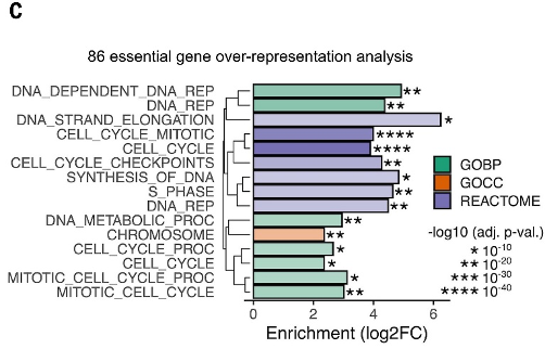
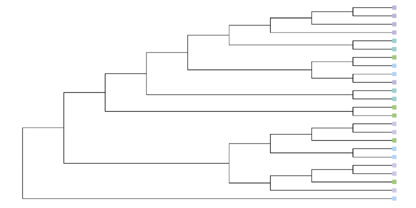
#3.3 绘制左边的通路聚类数(注意这里没有实际用途)
data.1 <- sup3_plot[, c("-Log10(p value)","Pathnames")]
# data.1$num = c(1:25)
rownames(data.1) <- data.1$Pathnames
data.1
path_tree <- hclust(dist(data.1))
path_tree
plot(path_tree, hang=-1)
# 绘图颜色
#修改下面的命名
# '#A0B3DC','#FCDFC7','#99D1D0','#CF66A5','#9F6BBF'
colors <- c("Infant-SSC" ="#99D1D0", State0="#BEB8DC", State1="#b3d5f7", State2="#A4C97C", State3="#CCC9E6")
colors
#3.4 聚类图美化
# class <- c("Infant-SSC", "State0", "State1", "State2", "State3")
# names(class) <- path_tree$labels # 确保顺序匹配
p1 <- ggtree(path_tree, branch.length="none") %<+% sup3_plot +
geom_tippoint(aes(fill=Cluster, color=Cluster),shape=22,size=4) + #21是常见的圆,可以尝试不同的搭配
scale_fill_manual(values = colors) +
scale_color_manual(values = colors) +
theme(legend.position = "none")
p1
结果如下:
#3.5 绘制条形图
head(sup3_plot)
sup3_plot$`-Log10(p value)` = as.numeric(sup3_plot$`-Log10(p value)`)
p2 <- ggplot(data = sup3_plot, aes(x = `-Log10(p value)`,y = Pathnames,fill=Cluster),color="black")+
geom_bar(stat="identity",position="stack",color="black") +
geom_text(aes(label = sig), hjust = -0.2, size = 5) + # 添加星号
labs(x="-Log10(p value)",y=NULL) +
coord_cartesian(clip = 'off') +
scale_fill_manual(values = colors) +
scale_x_continuous(expand = c(0,0)) +
scale_x_continuous(breaks = seq(0, 100, by = 20)) +
theme_classic()
p2
mytheme <- theme(
#axis.title.x=element_blank(),
axis.text.x=element_text(color="black",size=10),
axis.ticks.x=element_line(size = 1 ),
axis.line.x=element_line(size = 1),
axis.ticks.y=element_blank(),
axis.line.y = element_blank(), # 隐藏y轴的线,更美观
axis.text.y=element_text(face = "bold",size = 10),
# legend.title=element_blank(),
legend.title = element_text(size = 13),
legend.spacing.x=unit(0.2,'cm'),
legend.key=element_blank(),
legend.key.width=unit(0.5,'cm'),
legend.key.height=unit(0.5,'cm'),
plot.margin = margin(1,0.5,0.5,1,unit="cm"))
p3<-p2+mytheme
p3
结果如下:
#3.6 拼图
p <- p3 %>%
insert_left(p1,width=.5) %>%
as.grob() %>%
ggdraw()
p
#自由选择需要生成的图片文件格式,建议pdf,其为矢量图,可以后续美化
ggsave(filename = "Fig.4C-egene.pdf", width = 12, height = 6, plot = p)
ggsave(filename = "Fig.4C-egene.png", width = 12, height = 6, plot = p)
结果如下:
参考文献:
Klomp JA, Klomp JE, Stalnecker CA, Bryant KL, Edwards AC, Drizyte-Miller K, Hibshman PS, Diehl JN, Lee YS, Morales AJ, Taylor KE, Peng S, Tran NL, Herring LE, Prevatte AW, Barker NK, Hover LD, Hallin J, Sorokin A, Kanikarla PM, Chowdhury S, Coker O, Lee HM, Goodwin CM, Gautam P, Olson P, Christensen JG, Shen JP, Kopetz S, Graves LM, Lim KH, Wang-Gillam A, Wennerberg K, Cox AD, Der CJ. Defining the KRAS- and ERK-dependent transcriptome in KRAS-mutant cancers. Science. 2024 Jun 7;384(6700):eadk0775. doi: 10.1126/science.adk0775. Epub 2024 Jun 7. Erratum in: Science. 2024 Aug 23;385(6711):eads4435. doi: 10.1126/science.ads4435. PMID: 38843331; PMCID: PMC11301402.