GeoPandas 进行真正的地理空间可视化
我想采用一个简单的状态表并将其转变为:
- 清晰、带注释的分级统计地图
- 散点图(红色和蓝色圆圈)显示值的大小
- 正确的图例,带有缺少数据标签的灰色状态
- 可以放入报告中的内容,无需交互
全部使用GeoPandas、Matplotlib和印度各州的公共 geojson 文件。
流程
- 从 Excel 文件开始
- 清理了一些缺失的值
- 标准化州名(例如,“Odisha”到“Orissa”)以匹配地图文件
sample_dataframe = pd.read_excel('/kaggle/input/map-dataset/Map_Dataset.xlsx', skiprows = 2, usecols = "B:D")
sample_dataframe.columns = ['state', 'Demonstrator', 'Promoter']
sample_dataframe['state'] = sample_dataframe['state'].replace({'Odisha':'Orissa','Jammu & Kashmir':'Jammu and Kashmir'
})
sample_dataframe['Total'] = sample_dataframe['Demonstrator'] + sample_dataframe['Promoter']
sample_dataframe
2. 找到印度的 GeoJSON 地图
- 从开源 GitHub 存储库获取它(经过反复试验!)
- 将其加载到 GeoPandas 并将其与我清理过的数据集合并
gpd_dataframe = gpd.read_file('/kaggle/input/indian-states/state/india_telengana.geojson')
gpd_dataframe
3.绘制等值线地图
fig, ax = plt.subplots(1,2, figsize = (18,12))#Plotting Choropleth maps for Demonstrator counts
merged_dataframe.plot(column = "Demonstrator", cmap = 'Blues', ax = ax[0], legend = True,legend_kwds = {'shrink':0.7}, edgecolor = 'black',missing_kwds = {'color':'lightgrey', 'label':'No data'})
ax[0].set_title('State-wise counts for In-Store Demonstrator')#Plotting Choropleth maps for Promoter counts
merged_dataframe.plot(column = "Promoter", cmap = 'Reds', ax = ax[1], legend = True,legend_kwds = {'shrink':0.7}, edgecolor = 'black',missing_kwds = {'color':'lightgrey', 'label':'No data'})
ax[1].set_title('State-wise counts for In-Store Promoter')#Data Values for Demonstrators
for idx, row in merged_dataframe.iterrows():value = row['Demonstrator']if pd.notna(value):ax[0].text(row['Long'], row['Lat'] - 0.5, int(value), ha = 'center', fontweight = 'bold', fontsize = 12)#Data Values for Promoter
for idx, row in merged_dataframe.iterrows():value = row['Promoter']if pd.notna(value):ax[1].text(row['Long'], row['Lat'] - 0.5, int(value), ha = 'center', fontweight = 'bold', fontsize = 12)
plt.show()- 根据训练好的候选状态进行着色
- 在每个州的质心上添加数据标签
- 没有数据值的灰色状态
5. 使用圆圈使其更好(散点图样式)
#Extracted Centroid and then the X and Y coordinates and saved them in 'Long' and 'Lat' columns
merged_dataframe['Centroid'] = merged_dataframe['geometry'].centroid
merged_dataframe['Long'] = merged_dataframe['Centroid'].x
merged_dataframe['Lat'] = merged_dataframe['Centroid'].yfig, axis = plt.subplots()merged_dataframe.boundary.plot(ax = axis, color = 'black', linewidth = 0.5)#Plotting Promoter and Demonstrator numbers across states using Scatter Plot
axis.scatter(merged_dataframe['Long']-0.5, merged_dataframe['Lat'],s = merged_dataframe['Demonstrator'].fillna(0)* 10,color = 'blue', alpha = 0.3, label = 'Demonstrator'
)axis.scatter(merged_dataframe['Long']+0.3, merged_dataframe['Lat'],s = merged_dataframe['Promoter'].fillna(0)*10,color = 'red', alpha = 0.3, label = 'Promoter'
)plt.legend(loc = 'lower left',ncol = 2, fontsize = 'small', bbox_to_anchor = (0.15,-0.1))- 红色代表宣传者,蓝色代表示威者
- 稍微偏移圆圈,这样它们就不会重叠
- 尺寸按比例缩放以表示值的大小(没有添加数据值,因为它们会相互重叠)
我学到了什么
- 地理空间映射不仅仅是绘图,它还涉及逻辑与地理的融合。
- 可视化真实世界的数据比任何教程项目都更令人满意。
- 地图比我想象的更加灵活和可定制
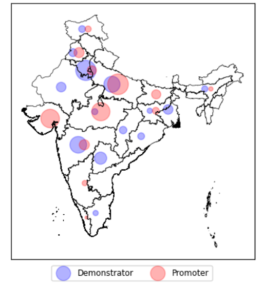
示威者和推动者的散点图
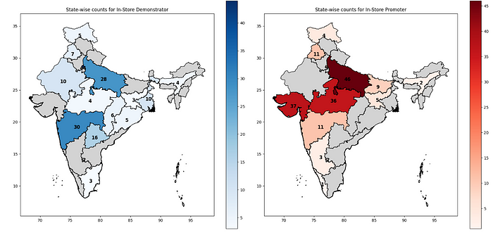
示威者和宣传者的分级统计地图