16、鸿蒙Harmony Next开发:组件扩展
目录
@Styles装饰器:定义组件重用样式
装饰器使用说明
限制条件
使用场景
组件内@Styles和全局@Styles的用法
@Extend装饰器:定义扩展组件样式
装饰器使用说明
语法
使用规则
限制条件
使用场景
stateStyles:多态样式
概述
使用场景
基础场景
@Styles和stateStyles联合使用
在stateStyles里使用常规变量和状态变量
@AnimatableExtend装饰器:定义可动画属性
装饰器使用说明
语法
使用场景
@Require装饰器:校验构造传参
概述
限制条件
使用场景
常见问题
@Reusable装饰器:组件复用
概述
限制条件
使用场景
动态布局更新
列表滚动配合LazyForEach使用
列表滚动-if使用场景
列表滚动-Foreach使用场景
Grid使用场景
WaterFlow使用场景
Swiper使用场景
列表滚动-ListItemGroup使用场景
多种条目类型使用场景
标准型
有限变化型
组合型
@Styles装饰器:定义组件重用样式
@Styles装饰器可以将多条样式设置提炼成一个方法,直接在组件声明的位置调用。通过@Styles装饰器可以快速定义并复用自定义样式。
装饰器使用说明
- 当前@Styles仅支持通用属性和通用事件。
- @Styles可以定义在组件内或全局,在全局定义时需在方法名前面添加function关键字,组件内定义时则不需要添加function关键字。请参考用例组件内styles和全局styles的用法。
- 组件内@Styles的优先级高于全局@Styles。框架优先找当前组件内的@Styles,如果找不到,则会全局查找。
说明
只能在当前文件内使用@Style,不支持export。
若需要实现样式导出,推荐使用AttributeModifier。
定义在组件内的@Styles可以通过this访问组件的常量和状态变量,并可以在@Styles里通过事件来改变状态变量的值,示例如下:
@Entry
@Component
struct FancyUse {@State heightValue: number = 50;@Stylesfancy() {.height(this.heightValue).backgroundColor(Color.Blue).onClick(() => {this.heightValue = 100;})}build() {Column() {Button('change height').fancy()}.height('100%').width('100%')}
}
限制条件
- @Styles方法不能有参数,编译期会报错,表明@Styles方法不支持参数。
// 错误写法: @Styles不支持参数,编译期报错 @Styles function globalFancy (value: number) {.width(value) }// 正确写法 @Styles function globalFancy () {.width(100) } - 不支持在@Styles方法内使用逻辑组件,逻辑组件内的属性不生效。
-
// 错误写法
@Styles
function backgroundColorStyle() {if (true) {.backgroundColor(Color.Red)}
}// 正确写法
@Styles
function backgroundColorStyle() {.backgroundColor(Color.Red)
}
使用场景
组件内@Styles和全局@Styles的用法
// 定义在全局的@Styles封装的样式
@Styles
function globalFancy () {.width(150).height(100).backgroundColor(Color.Pink)
}@Entry
@Component
struct FancyUse {@State heightValue: number = 100;// 定义在组件内的@Styles封装的样式@Styles fancy() {.width(200).height(this.heightValue).backgroundColor(Color.Yellow).onClick(() => {this.heightValue = 200;})}build() {Column({ space: 10 }) {// 使用全局的@Styles封装的样式Text('FancyA').globalFancy().fontSize(30)// 使用组件内的@Styles封装的样式Text('FancyB').fancy().fontSize(30)}}
}
@Extend装饰器:定义扩展组件样式
装饰器使用说明
语法
@Extend(UIComponentName) function functionName { ... }
使用规则
- 和@Styles不同,@Extend支持封装指定组件的私有属性、私有事件和自身定义的全局方法。
// @Extend(Text)可以支持Text的私有属性fontColor
@Extend(Text)
function fancy() {.fontColor(Color.Red)
}// superFancyText可以调用预定义的fancy
@Extend(Text)
function superFancyText(size: number) {.fontSize(size).fancy()
}
- 和@Styles不同,@Extend装饰的方法支持参数,开发者可以在调用时传递参数,调用遵循TS方法传值调用。
// xxx.ets
@Extend(Text)
function fancy(fontSize: number) {.fontColor(Color.Red).fontSize(fontSize)
}@Entry
@Component
struct FancyUse {build() {Row({ space: 10 }) {Text('Fancy').fancy(16)Text('Fancy').fancy(24)}}
}
- @Extend装饰的方法的参数可以为function,作为Event事件的句柄。
@Extend(Text) function makeMeClick(onClick: () => void) {.backgroundColor(Color.Blue).onClick(onClick) }@Entry @Component struct FancyUse {@State label: string = 'Hello World';onClickHandler() {this.label = 'Hello ArkUI';}build() {Row({ space: 10 }) {Text(`${this.label}`).makeMeClick(() => {this.onClickHandler();})}} } - @Extend的参数可以为状态变量,当状态变量改变时,UI可以正常的被刷新渲染。
@Extend(Text)
function fancy(fontSize: number) {.fontColor(Color.Red).fontSize(fontSize)
}@Entry
@Component
struct FancyUse {@State fontSizeValue: number = 20build() {Row({ space: 10 }) {Text('Fancy').fancy(this.fontSizeValue).onClick(() => {this.fontSizeValue = 30})}}
}
限制条件
- 和@Styles不同,@Extend仅支持在全局定义,不支持在组件内部定义。
说明
仅限在当前文件内使用,不支持导出。
如果要实现export功能,推荐使用AttributeModifier。
【反例】
@Entry
@Component
struct FancyUse {// 错误写法,@Extend仅支持在全局定义,不支持在组件内部定义@Extend(Text) function fancy (fontSize: number) {.fontSize(fontSize)}build() {Row({ space: 10 }) {Text('Fancy').fancy(16)}}
}
【正例】
// 正确写法
@Extend(Text)
function fancy(fontSize: number) {.fontSize(fontSize)
}@Entry
@Component
struct FancyUse {build() {Row({ space: 10 }) {Text('Fancy').fancy(16)}}
}
使用场景
以下示例声明了3个Text组件,每个Text组件均设置了fontStyle、fontWeight和backgroundColor样式。
@Entry
@Component
struct FancyUse {@State label: string = 'Hello World';build() {Row({ space: 10 }) {Text(`${this.label}`).fontStyle(FontStyle.Italic).fontWeight(100).backgroundColor(Color.Blue)Text(`${this.label}`).fontStyle(FontStyle.Italic).fontWeight(200).backgroundColor(Color.Pink)Text(`${this.label}`).fontStyle(FontStyle.Italic).fontWeight(300).backgroundColor(Color.Orange)}.margin('20%')}
}
使用@Extend将样式组合复用,示例如下。
@Extend(Text)
function fancyText(weightValue: number, color: Color) {.fontStyle(FontStyle.Italic).fontWeight(weightValue).backgroundColor(color)
}
通过@Extend组合样式后,使得代码更加简洁,增强可读性。
@Entry
@Component
struct FancyUse {@State label: string = 'Hello World';build() {Row({ space: 10 }) {Text(`${this.label}`).fancyText(100, Color.Blue)Text(`${this.label}`).fancyText(200, Color.Pink)Text(`${this.label}`).fancyText(300, Color.Orange)}.margin('20%')}
}
stateStyles:多态样式
@Styles仅仅应用于静态页面的样式复用,stateStyles可以依据组件的内部状态的不同,快速设置不同样式。这就是我们本章要介绍的内容stateStyles(又称为:多态样式)。
概述
stateStyles是属性方法,可以根据UI内部状态来设置样式,类似于css伪类,但语法不同。ArkUI提供以下五种状态:
- focused:获焦态。
- normal:正常态。
- pressed:按压态。
- disabled:不可用态。
- selected:选中态。
说明
获焦态目前仅支持通过外接键盘的Tab键或方向键触发,不支持在嵌套滚动组件场景下通过按键触发。
使用场景
基础场景
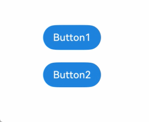
下面的示例展示了stateStyles最基本的使用场景。Button1处于第一个组件,Button2处于第二个组件。按压时显示为pressed态指定的黑色。使用Tab键走焦,先是Button1获焦并显示为focus态指定的粉色。当Button2获焦的时候,Button2显示为focus态指定的粉色,Button1失焦显示normal态指定的蓝色。
@Entry
@Component
struct StateStylesSample {build() {Column() {Button('Button1').stateStyles({focused: {.backgroundColor('#ffffeef0')},pressed: {.backgroundColor('#ff707070')},normal: {.backgroundColor('#ff2787d9')}}).margin(20)Button('Button2').stateStyles({focused: {.backgroundColor('#ffffeef0')},pressed: {.backgroundColor('#ff707070')},normal: {.backgroundColor('#ff2787d9')}})}.margin('30%')}
}
图1 获焦态和按压态
@Styles和stateStyles联合使用
以下示例通过@Styles指定stateStyles的不同状态。
@Entry
@Component
struct MyComponent {@Styles normalStyle() {.backgroundColor(Color.Gray)}@Styles pressedStyle() {.backgroundColor(Color.Red)}build() {Column() {Text('Text1').fontSize(50).fontColor(Color.White).stateStyles({normal: this.normalStyle,pressed: this.pressedStyle,})}}
}
图2 正常态和按压态

在stateStyles里使用常规变量和状态变量
stateStyles可以通过this绑定组件内的常规变量和状态变量。
@Entry
@Component
struct CompWithInlineStateStyles {@State focusedColor: Color = Color.Red;normalColor: Color = Color.Green;build() {Column() {Button('clickMe').height(100).width(100).stateStyles({normal: {.backgroundColor(this.normalColor)},focused: {.backgroundColor(this.focusedColor)}}).onClick(() => {this.focusedColor = Color.Pink;}).margin('30%')}}
}
Button默认normal态显示绿色,第一次按下Tab键让Button获焦显示为focus态的红色,点击事件触发后,再次按下Tab键让Button获焦,focus态变为粉色。
图3 点击改变获焦态样式

@AnimatableExtend装饰器:定义可动画属性
@AnimatableExtend装饰器用于自定义可动画的属性方法,在这个属性方法中修改组件不可动画的属性。在动画执行过程中,通过逐帧回调函数修改不可动画属性值,让不可动画属性也能实现动画效果。也可通过逐帧回调函数修改可动画属性的值,实现逐帧布局的效果。
- 可动画属性:如果一个属性方法在animation属性前调用,改变这个属性的值可以使animation属性的动画效果生效,这个属性称为可动画属性。比如height、width、backgroundColor、translate属性,和Text组件的fontSize属性等。
- 不可动画属性:如果一个属性方法在animation属性前调用,改变这个属性的值不能使animation属性的动画效果生效,这个属性称为不可动画属性。比如Polyline组件的points属性等。
说明
该装饰器从API version 10开始支持。后续版本如有新增内容,则采用上角标单独标记该内容的起始版本。
从API version 11开始,该装饰器支持在元服务中使用。
装饰器使用说明
语法
@AnimatableExtend(UIComponentName) function functionName(value: typeName) { .propertyName(value)
}
- @AnimatableExtend仅支持定义在全局,不支持在组件内部定义。
- @AnimatableExtend定义的函数参数类型必须为number类型或者实现 AnimatableArithmetic<T>接口的自定义类型。
- @AnimatableExtend定义的函数体内只能调用@AnimatableExtend括号内组件的属性方法。
AnimatableArithmetic<T>接口说明
该接口定义非number数据类型的动画运算规则。对非number类型的数据(如数组、结构体、颜色等)做动画,需要实现AnimatableArithmetic<T>接口中加法、减法、乘法和判断相等函数,
使得该数据能参与动画的插值运算和识别该数据是否发生改变。即定义它们为实现了AnimatableArithmetic<T>接口的类型。
| 名称 | 入参类型 | 返回值类型 | 说明 |
|---|---|---|---|
| plus | AnimatableArithmetic<T> | AnimatableArithmetic<T> | 定义该数据类型的加法运算规则 |
| subtract | AnimatableArithmetic<T> | AnimatableArithmetic<T> | 定义该数据类型的减法运算规则 |
| multiply | number | AnimatableArithmetic<T> | 定义该数据类型的乘法运算规则 |
| equals | AnimatableArithmetic<T> | boolean | 定义该数据类型的相等判断规则 |
使用场景
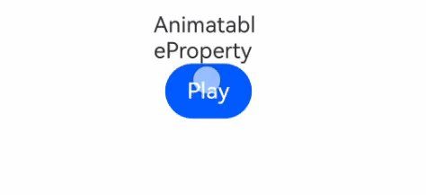
以下示例通过改变Text组件宽度实现逐帧布局的效果。
@AnimatableExtend(Text)
function animatableWidth(width: number) {.width(width)
}@Entry
@Component
struct AnimatablePropertyExample {@State textWidth: number = 80;build() {Column() {Text("AnimatableProperty").animatableWidth(this.textWidth).animation({ duration: 2000, curve: Curve.Ease })Button("Play").onClick(() => {this.textWidth = this.textWidth == 80 ? 160 : 80;})}.width("100%").padding(10)}
}
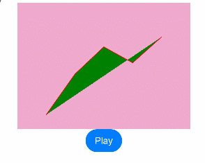
以下示例实现折线的动画效果。
class Point {x: numbery: numberconstructor(x: number, y: number) {this.x = xthis.y = y}plus(rhs: Point): Point {return new Point(this.x + rhs.x, this.y + rhs.y);}subtract(rhs: Point): Point {return new Point(this.x - rhs.x, this.y - rhs.y);}multiply(scale: number): Point {return new Point(this.x * scale, this.y * scale);}equals(rhs: Point): boolean {return this.x === rhs.x && this.y === rhs.y;}
}// PointVector实现了AnimatableArithmetic<T>接口
class PointVector extends Array<Point> implements AnimatableArithmetic<PointVector> {constructor(value: Array<Point>) {super();value.forEach(p => this.push(p));}plus(rhs: PointVector): PointVector {let result = new PointVector([]);const len = Math.min(this.length, rhs.length);for (let i = 0; i < len; i++) {result.push((this as Array<Point>)[i].plus((rhs as Array<Point>)[i]));}return result;}subtract(rhs: PointVector): PointVector {let result = new PointVector([]);const len = Math.min(this.length, rhs.length);for (let i = 0; i < len; i++) {result.push((this as Array<Point>)[i].subtract((rhs as Array<Point>)[i]));}return result;}multiply(scale: number): PointVector {let result = new PointVector([]);for (let i = 0; i < this.length; i++) {result.push((this as Array<Point>)[i].multiply(scale));}return result;}equals(rhs: PointVector): boolean {if (this.length != rhs.length) {return false;}for (let i = 0; i < this.length; i++) {if (!(this as Array<Point>)[i].equals((rhs as Array<Point>)[i])) {return false;}}return true;}get(): Array<Object[]> {let result: Array<Object[]> = [];this.forEach(p => result.push([p.x, p.y]));return result;}
}@AnimatableExtend(Polyline)
function animatablePoints(points: PointVector) {.points(points.get())
}@Entry
@Component
struct AnimatablePropertyExample {@State points: PointVector = new PointVector([new Point(50, Math.random() * 200),new Point(100, Math.random() * 200),new Point(150, Math.random() * 200),new Point(200, Math.random() * 200),new Point(250, Math.random() * 200),])build() {Column() {Polyline().animatablePoints(this.points).animation({ duration: 1000, curve: Curve.Ease })// 设置动画参数.size({ height: 220, width: 300 }).fill(Color.Green).stroke(Color.Red).backgroundColor('#eeaacc')Button("Play").onClick(() => {// points是实现了可动画协议的数据类型,points在动画过程中可按照定义的运算规则、动画参数从之前的PointVector变为新的PointVector数据,产生每一帧的PointVector数据,进而产生动画this.points = new PointVector([new Point(50, Math.random() * 200),new Point(100, Math.random() * 200),new Point(150, Math.random() * 200),new Point(200, Math.random() * 200),new Point(250, Math.random() * 200),]);})}.width("100%").padding(10)}
}
@Require装饰器:校验构造传参
@Require是校验@Prop、@State、@Provide、@BuilderParam、@Param和普通变量(无状态装饰器修饰的变量)是否需要构造传参的一个装饰器。
说明
- 从API version 11开始对@Prop/@BuilderParam进行校验。
- 从API version 11开始,该装饰器支持在元服务中使用。
- 从API version 12开始对@State/@Provide/@Param/普通变量(无状态装饰器修饰的变量)进行校验。
概述
当@Require装饰器和@Prop、@State、@Provide、@Param、@BuilderParam、普通变量(无状态装饰器修饰的变量)结合使用时,在构造该自定义组件时,@Prop、@State、@Provide、@Param、@BuilderParam和普通变量(无状态装饰器修饰的变量)必须在构造时传参。
限制条件
@Require装饰器仅用于装饰struct内的@Prop、@State、@Provide、@BuilderParam、@Param和普通变量(无状态装饰器修饰的变量)。
预览器的限制场景请参考PreviewChecker检测规则。
使用场景
当Child组件内使用@Require装饰器和@Prop、@State、@Provide、@BuilderParam、@Param和普通变量(无状态装饰器修饰的变量)结合使用时,父组件Index在构造Child时必须传参,否则编译不通过。
@Entry
@Component
struct Index {@State message: string = 'Hello World';@BuilderbuildTest() {Row() {Text('Hello, world').fontSize(30)}}build() {Row() {// 构造Child时需传入所有@Require对应参数,否则编译失败。Child({regular_value: this.message,state_value: this.message,provide_value: this.message,initMessage: this.message,message: this.message,buildTest: this.buildTest,initBuildTest: this.buildTest})}}
}@Component
struct Child {@BuilderbuildFunction() {Column() {Text('initBuilderParam').fontSize(30)}}@Require regular_value: string = 'Hello';@Require @State state_value: string = "Hello";@Require @Provide provide_value: string = "Hello";@Require @BuilderParam buildTest: () => void;@Require @BuilderParam initBuildTest: () => void = this.buildFunction;@Require @Prop initMessage: string = 'Hello';@Require @Prop message: string;build() {Column() {Text(this.initMessage).fontSize(30)Text(this.message).fontSize(30)this.initBuildTest();this.buildTest();}.width('100%').height('100%')}
}
使用@ComponentV2修饰的自定义组件ChildPage通过父组件ParentPage进行初始化,因为有@Require装饰@Param,所以父组件必须进行构造赋值。
@ObservedV2
class Info {@Trace name: string = '';@Trace age: number = 0;
}@ComponentV2
struct ChildPage {@Require @Param childInfo: Info = new Info();@Require @Param state_value: string = "Hello";build() {Column() {Text(`ChildPage childInfo name :${this.childInfo.name}`).fontSize(20).fontWeight(FontWeight.Bold)Text(`ChildPage childInfo age :${this.childInfo.age}`).fontSize(20).fontWeight(FontWeight.Bold)Text(`ChildPage state_value age :${this.state_value}`).fontSize(20).fontWeight(FontWeight.Bold)}}
}@Entry
@ComponentV2
struct ParentPage {info1: Info = { name: "Tom", age: 25 };label1: string = "Hello World";@Local info2: Info = { name: "Tom", age: 25 };@Local label2: string = "Hello World";build() {Column() {Text(`info1: ${this.info1.name}  ${this.info1.age}`) // Text1.fontSize(30).fontWeight(FontWeight.Bold)// 父组件ParentPage构造子组件ChildPage时进行了构造赋值。// 为ChildPage中被@Require @Param装饰的childInfo和state_value属性传入了值。ChildPage({ childInfo: this.info1, state_value: this.label1 }) // 创建自定义组件。Line().width('100%').height(5).backgroundColor('#000000').margin(10)Text(`info2: ${this.info2.name}  ${this.info2.age}`) // Text2。.fontSize(30).fontWeight(FontWeight.Bold)// 同上,在父组件创建子组件的过程中进行构造赋值。ChildPage({ childInfo: this.info2, state_value: this.label2 }) // 创建自定义组件。Line().width('100%').height(5).backgroundColor('#000000').margin(10)Button("change info1&info2").onClick(() => {this.info1 = { name: "Cat", age: 18 }; // Text1不会刷新,原因是info1没有装饰器装饰,监听不到值的改变。this.info2 = { name: "Cat", age: 18 }; // Text2会刷新,原因是info2有装饰器装饰,能够监听到值的改变。this.label1 = "Luck"; // 不会刷新,原因是label1没有装饰器装饰,监听不到值的改变。this.label2 = "Luck"; // 会刷新,原因是label2有装饰器装饰,可以监听到值的改变。})}}
}
从API version 18开始,使用@Require装饰@State、@Prop、@Provide装饰的状态变量,可以在无本地初始值的情况下直接在组件内使用,不会编译报错。
@Entry
@Component
struct Index {message: string = 'Hello World';build() {Column() {Child({ message: this.message })}}
}@Component
struct Child {@Require @State message: string;build() {Column() {Text(this.message) // 从API version 18开始,可以编译通过。}}
}
常见问题
当Child组件内将@Require装饰器与@Prop、@State、@Provide、@BuilderParam、@Param和普通变量(无状态装饰器修饰的变量)结合使用时,若父组件Index在构造Child时未传递参数,则会导致编译失败。
@Entry
@Component
struct Index {@State message: string = 'Hello World';@BuilderbuildTest() {Row() {Text('Hello, world').fontSize(30)}}build() {Row() {//构造Child、ChildV2组件时没有传参,会导致编译不通过。Child()ChildV2()}}
}@Component
struct Child {@BuilderbuildFunction() {Column() {Text('initBuilderParam').fontSize(30)}}// 使用@Require必须构造时传参。@Require regular_value: string = 'Hello';@Require @State state_value: string = "Hello";@Require @Provide provide_value: string = "Hello";@Require @BuilderParam initBuildTest: () => void = this.buildFunction;@Require @Prop initMessage: string = 'Hello';build() {Column() {Text(this.initMessage).fontSize(30)this.initBuildTest();}}
}@ComponentV2
struct ChildV2 {// 使用@Require必须构造时传参。@Require @Param message: string;build() {Column() {Text(this.message)}}
}
@Reusable装饰器:组件复用
@Reusable装饰器标记的自定义组件支持视图节点、组件实例和状态上下文的复用,避免重复创建和销毁,提升性能。
概述
使用@Reusable装饰器时,表示该自定义组件可以复用。与@Component结合使用,标记为@Reusable的自定义组件在从组件树中移除时,组件及其对应的JS对象将被放入复用缓存中。后续创建新自定义组件节点时,将复用缓存中的节点,从而节约组件重新创建的时间。
说明
- API version 10开始支持@Reusable,支持在ArkTS中使用。
- 关于组件复用的原理与使用、优化方法、适用场景,请参考最佳实践组件复用最佳实践。
- @Reusable标识之后,在组件上下树时ArkUI框架会调用该组件的aboutToReuse方法和aboutToRecycle方法,因此,开发者在实现复用时,大部分代码都集中在这两个生命周期方法中。
- 如果一个组件里可复用的组件不止一个,可以使用reuseId来区分不同结构的复用组件。
限制条件
- @Reusable装饰器仅用于自定义组件。
import { ComponentContent } from "@kit.ArkUI";// @Builder加上@Reusable编译报错,不适用于builder。
// @Reusable
@Builder
function buildCreativeLoadingDialog(closedClick: () => void) {Crash()
}@Component
export struct Crash {build() {Column() {Text("Crash").fontSize(12).lineHeight(18).fontColor(Color.Blue).margin({left: 6})}.width('100%').height('100%').justifyContent(FlexAlign.Center)}
}@Entry
@Component
struct Index {@State message: string = 'Hello World';private uiContext = this.getUIContext();build() {RelativeContainer() {Text(this.message).id('Index').fontSize(50).fontWeight(FontWeight.Bold).alignRules({center: { anchor: '__container__', align: VerticalAlign.Center },middle: { anchor: '__container__', align: HorizontalAlign.Center }}).onClick(() => {let contentNode = new ComponentContent(this.uiContext, wrapBuilder(buildCreativeLoadingDialog), () => {});this.uiContext.getPromptAction().openCustomDialog(contentNode);})}.height('100%').width('100%')}
}
- 被@Reusable装饰的自定义组件在复用时,会递归调用该自定义组件及其所有子组件的aboutToReuse回调函数。若在子组件的aboutToReuse函数中修改了父组件的状态变量,此次修改将不会生效,请避免此类用法。若需设置父组件的状态变量,可使用setTimeout设置延迟执行,将任务抛出组件复用的作用范围,使修改生效。
【反例】
在子组件的aboutToReuse中,直接修改父组件的状态变量。
class BasicDataSource implements IDataSource {private listener: DataChangeListener | undefined = undefined;public dataArray: number[] = [];totalCount(): number {return this.dataArray.length;}getData(index: number): number {return this.dataArray[index];}registerDataChangeListener(listener: DataChangeListener): void {this.listener = listener;}unregisterDataChangeListener(listener: DataChangeListener): void {this.listener = undefined;}
}@Entry
@Component
struct Index {private data: BasicDataSource = new BasicDataSource();aboutToAppear(): void {for (let index = 1; index < 20; index++) {this.data.dataArray.push(index);}}build() {List() {LazyForEach(this.data, (item: number, index: number) => {ListItem() {ReuseComponent({ num: item })}}, (item: number, index: number) => index.toString())}.cachedCount(0)}
}@Reusable
@Component
struct ReuseComponent {@State num: number = 0;aboutToReuse(params: ESObject): void {this.num = params.num;}build() {Column() {Text('ReuseComponent num:' + this.num.toString())ReuseComponentChild({ num: this.num })Button('plus').onClick(() => {this.num += 10;})}.height(200)}
}@Component
struct ReuseComponentChild {@Link num: number;aboutToReuse(params: ESObject): void {this.num = -1 * params.num;}build() {Text('ReuseComponentChild num:' + this.num.toString())}
}
【正例】
在子组件的aboutToReuse中,使用setTimeout,将修改抛出组件复用的作用范围。
class BasicDataSource implements IDataSource {private listener: DataChangeListener | undefined = undefined;public dataArray: number[] = [];totalCount(): number {return this.dataArray.length;}getData(index: number): number {return this.dataArray[index];}registerDataChangeListener(listener: DataChangeListener): void {this.listener = listener;}unregisterDataChangeListener(listener: DataChangeListener): void {this.listener = undefined;}
}@Entry
@Component
struct Index {private data: BasicDataSource = new BasicDataSource();aboutToAppear(): void {for (let index = 1; index < 20; index++) {this.data.dataArray.push(index);}}build() {List() {LazyForEach(this.data, (item: number, index: number) => {ListItem() {ReuseComponent({ num: item })}}, (item: number, index: number) => index.toString())}.cachedCount(0)}
}@Reusable
@Component
struct ReuseComponent {@State num: number = 0;aboutToReuse(params: ESObject): void {this.num = params.num;}build() {Column() {Text('ReuseComponent num:' + this.num.toString())ReuseComponentChild({ num: this.num })Button('plus').onClick(() => {this.num += 10;})}.height(200)}
}@Component
struct ReuseComponentChild {@Link num: number;aboutToReuse(params: ESObject): void {setTimeout(() => {this.num = -1 * params.num;}, 1)}build() {Text('ReuseComponentChild num:' + this.num.toString())}
}
- ComponentContent不支持传入@Reusable装饰器装饰的自定义组件。
import { ComponentContent } from "@kit.ArkUI";@Builder
function buildCreativeLoadingDialog(closedClick: () => void) {Crash()
}// 如果注释掉就可以正常弹出弹窗,如果加上@Reusable就直接crash。
@Reusable
@Component
export struct Crash {build() {Column() {Text("Crash").fontSize(12).lineHeight(18).fontColor(Color.Blue).margin({left: 6})}.width('100%').height('100%').justifyContent(FlexAlign.Center)}
}@Entry
@Component
struct Index {@State message: string = 'Hello World';private uiContext = this.getUIContext();build() {RelativeContainer() {Text(this.message).id('Index').fontSize(50).fontWeight(FontWeight.Bold).alignRules({center: { anchor: '__container__', align: VerticalAlign.Center },middle: { anchor: '__container__', align: HorizontalAlign.Center }}).onClick(() => {// ComponentContent底层是BuilderNode,BuilderNode不支持传入@Reusable注解的自定义组件。let contentNode = new ComponentContent(this.uiContext, wrapBuilder(buildCreativeLoadingDialog), () => {});this.uiContext.getPromptAction().openCustomDialog(contentNode);})}.height('100%').width('100%')}
}
- @Reusable装饰器不建议嵌套使用,会增加内存,降低复用效率,加大维护难度。嵌套使用会导致额外缓存池的生成,各缓存池拥有相同树状结构,复用效率低下。此外,嵌套使用会使生命周期管理复杂,资源和变量共享困难。
使用场景
动态布局更新
重复创建与移除视图可能引起频繁的布局计算,从而影响帧率。采用组件复用可以避免不必要的视图创建与布局计算,提升性能。
以下示例中,将Child自定义组件标记为复用组件,通过Button点击更新Child,触发复用。
// xxx.ets
export class Message {value: string | undefined;constructor(value: string) {this.value = value;}
}@Entry
@Component
struct Index {@State switch: boolean = true;build() {Column() {Button('Hello').fontSize(30).fontWeight(FontWeight.Bold).onClick(() => {this.switch = !this.switch;})if (this.switch) {// 如果只有一个复用的组件,可以不用设置reuseId。Child({ message: new Message('Child') }).reuseId('Child')}}.height("100%").width('100%')}
}@Reusable
@Component
struct Child {@State message: Message = new Message('AboutToReuse');aboutToReuse(params: Record<string, ESObject>) {console.info("Recycle====Child==");this.message = params.message as Message;}build() {Column() {Text(this.message.value).fontSize(30)}.borderWidth(1).height(100)}
}
列表滚动配合LazyForEach使用
- 当应用展示大量数据的列表并进行滚动操作时,频繁创建和销毁列表项视图可能导致卡顿和性能问题。使用列表组件的组件复用机制可以重用已创建的列表项视图,提高滚动流畅度。
- 以下示例代码将CardView自定义组件标记为复用组件,List上下滑动,触发CardView复用。
class MyDataSource implements IDataSource {private dataArray: string[] = [];private listener: DataChangeListener | undefined;public totalCount(): number {return this.dataArray.length;}public getData(index: number): string {return this.dataArray[index];}public pushData(data: string): void {this.dataArray.push(data);}public reloadListener(): void {this.listener?.onDataReloaded();}public registerDataChangeListener(listener: DataChangeListener): void {this.listener = listener;}public unregisterDataChangeListener(listener: DataChangeListener): void {this.listener = undefined;}
}@Entry
@Component
struct ReuseDemo {private data: MyDataSource = new MyDataSource();aboutToAppear() {for (let i = 1; i < 1000; i++) {this.data.pushData(i + "");}}// ...build() {Column() {List() {LazyForEach(this.data, (item: string) => {ListItem() {CardView({ item: item })}}, (item: string) => item)}}}
}// 复用组件
@Reusable
@Component
export struct CardView {// 被\@State修饰的变量item才能更新,未被\@State修饰的变量不会更新。@State item: string = '';aboutToReuse(params: Record<string, Object>): void {this.item = params.item as string;}build() {Column() {Text(this.item).fontSize(30)}.borderWidth(1).height(100)}
}
列表滚动-if使用场景
以下示例代码将OneMoment自定义组件标记为复用组件。当List上下滑动时,会触发OneMoment的复用。设置reuseId可为复用组件分配复用组,相同reuseId的组件将在同一复用组中复用。单个复用组件无需设置reuseId。使用reuseId标识复用组件,可避免重复执行if语句的删除和重新创建逻辑,提高复用效率和性能。
@Entry
@Component
struct Index {private dataSource = new MyDataSource<FriendMoment>();aboutToAppear(): void {for (let i = 0; i < 20; i++) {let title = i + 1 + "test_if";this.dataSource.pushData(new FriendMoment(i.toString(), title, 'app.media.app_icon'));}for (let i = 0; i < 50; i++) {let title = i + 1 + "test_if";this.dataSource.pushData(new FriendMoment(i.toString(), title, ''));}}build() {Column() {// TopBar()List({ space: 3 }) {LazyForEach(this.dataSource, (moment: FriendMoment) => {ListItem() {// 使用reuseId进行组件复用的控制。OneMoment({ moment: moment }).reuseId((moment.image !== '') ? 'withImage' : 'noImage')}}, (moment: FriendMoment) => moment.id)}.cachedCount(0)}}
}class FriendMoment {id: string = '';text: string = '';title: string = '';image: string = '';answers: Array<ResourceStr> = [];constructor(id: string, title: string, image: string) {this.text = id;this.title = title;this.image = image;}
}@Reusable
@Component
export struct OneMoment {@Prop moment: FriendMoment;// 复用id相同的组件才能触发复用。aboutToReuse(params: ESObject): void {console.log("=====aboutToReuse====OneMoment==复用了==" + this.moment.text);}build() {Column() {Text(this.moment.text)// if分支判断。if (this.moment.image !== '') {Flex({ wrap: FlexWrap.Wrap }) {Image($r(this.moment.image)).height(50).width(50)Image($r(this.moment.image)).height(50).width(50)Image($r(this.moment.image)).height(50).width(50)Image($r(this.moment.image)).height(50).width(50)}}}}
}class BasicDataSource<T> implements IDataSource {private listeners: DataChangeListener[] = [];private originDataArray: T[] = [];public totalCount(): number {return 0;}public getData(index: number): T {return this.originDataArray[index];}registerDataChangeListener(listener: DataChangeListener): void {if (this.listeners.indexOf(listener) < 0) {this.listeners.push(listener);}}unregisterDataChangeListener(listener: DataChangeListener): void {const pos = this.listeners.indexOf(listener);if (pos >= 0) {this.listeners.splice(pos, 1);}}notifyDataAdd(index: number): void {this.listeners.forEach(listener => {listener.onDataAdd(index);});}
}export class MyDataSource<T> extends BasicDataSource<T> {private dataArray: T[] = [];public totalCount(): number {return this.dataArray.length;}public getData(index: number): T {return this.dataArray[index];}public pushData(data: T): void {this.dataArray.push(data);this.notifyDataAdd(this.dataArray.length - 1);}
}
列表滚动-Foreach使用场景
使用Foreach创建可复用的自定义组件,由于Foreach渲染控制语法的全展开属性,导致复用组件无法复用。示例中点击update,数据刷新成功,但滑动列表时,ListItemView无法复用。点击clear,再次点击update,ListItemView复用成功,因为一帧内重复创建多个已被销毁的自定义组件。
// xxx.ets
class MyDataSource implements IDataSource {private dataArray: string[] = [];public totalCount(): number {return this.dataArray.length;}public getData(index: number): string {return this.dataArray[index];}public pushData(data: string): void {this.dataArray.push(data);}public registerDataChangeListener(listener: DataChangeListener): void {}public unregisterDataChangeListener(listener: DataChangeListener): void {}
}@Entry
@Component
struct Index {private data: MyDataSource = new MyDataSource();private data02: MyDataSource = new MyDataSource();@State isShow: boolean = true;@State dataSource: ListItemObject[] = [];aboutToAppear() {for (let i = 0; i < 100; i++) {this.data.pushData(i.toString());}for (let i = 30; i < 80; i++) {this.data02.pushData(i.toString());}}build() {Column() {Row() {Button('clear').onClick(() => {for (let i = 1; i < 50; i++) {this.dataSource.pop();}}).height(40)Button('update').onClick(() => {for (let i = 1; i < 50; i++) {let obj = new ListItemObject();obj.id = i;obj.uuid = Math.random().toString();obj.isExpand = false;this.dataSource.push(obj);}}).height(40)}List({ space: 10 }) {ForEach(this.dataSource, (item: ListItemObject) => {ListItem() {ListItemView({obj: item})}}, (item: ListItemObject) => {return item.uuid.toString();})}.cachedCount(0).width('100%').height('100%')}}
}@Reusable
@Component
struct ListItemView {@ObjectLink obj: ListItemObject;@State item: string = '';aboutToAppear(): void {// 点击 update,首次进入,上下滑动,由于Foreach折叠展开属性,无法复用。console.log("=====aboutToAppear=====ListItemView==创建了==" + this.item);}aboutToReuse(params: ESObject) {this.item = params.item;// 点击clear,再次update,复用成功。// 符合一帧内重复创建多个已被销毁的自定义组件。console.log("=====aboutToReuse====ListItemView==复用了==" + this.item);}build() {Column({ space: 10 }) {Text(`${this.obj.id}.标题`).fontSize(16).fontColor('#000000').padding({top: 20,bottom: 20,})if (this.obj.isExpand) {Text('').fontSize(14).fontColor('#999999')}}.width('100%').borderRadius(10).backgroundColor(Color.White).padding(15).onClick(() => {this.obj.isExpand = !this.obj.isExpand;})}
}@Observed
class ListItemObject {uuid: string = "";id: number = 0;isExpand: boolean = false;
}
Grid使用场景
示例中使用@Reusable装饰器修饰GridItem中的自定义组件ReusableChildComponent,即表示其具备组件复用的能力。
使用aboutToReuse可以在 Grid 滑动时,从复用缓存中加入到组件树之前触发,从而更新组件状态变量,展示正确内容。
需要注意的是无需在aboutToReuse中对@Link、@StorageLink、@ObjectLink、@Consume等自动更新值的状态变量进行更新,可能触发不必要的组件刷新。
// MyDataSource类实现IDataSource接口。
class MyDataSource implements IDataSource {private dataArray: number[] = [];public pushData(data: number): void {this.dataArray.push(data);}// 数据源的数据总量。public totalCount(): number {return this.dataArray.length;}// 返回指定索引位置的数据。public getData(index: number): number {return this.dataArray[index];}registerDataChangeListener(listener: DataChangeListener): void {}unregisterDataChangeListener(listener: DataChangeListener): void {}
}@Entry
@Component
struct MyComponent {// 数据源。private data: MyDataSource = new MyDataSource();aboutToAppear() {for (let i = 1; i < 1000; i++) {this.data.pushData(i);}}build() {Column({ space: 5 }) {Grid() {LazyForEach(this.data, (item: number) => {GridItem() {// 使用可复用自定义组件。ReusableChildComponent({ item: item })}}, (item: string) => item)}.cachedCount(2) // 设置GridItem的缓存数量。.columnsTemplate('1fr 1fr 1fr').columnsGap(10).rowsGap(10).margin(10).height(500).backgroundColor(0xFAEEE0)}}
}@Reusable
@Component
struct ReusableChildComponent {@State item: number = 0;// aboutToReuse从复用缓存中加入到组件树之前调用,可在此处更新组件的状态变量以展示正确的内容。// aboutToReuse参数类型已不支持any,这里使用Record指定明确的数据类型。Record用于构造一个对象类型,其属性键为Keys,属性值为Type。aboutToReuse(params: Record<string, number>) {this.item = params.item;}build() {Column() {// 请开发者自行在src/main/resources/base/media路径下添加app.media.app_icon图片,否则运行时会因资源缺失而报错。Image($r('app.media.app_icon')).objectFit(ImageFit.Fill).layoutWeight(1)Text(`图片${this.item}`).fontSize(16).textAlign(TextAlign.Center)}.width('100%').height(120).backgroundColor(0xF9CF93)}
}
WaterFlow使用场景
- 在WaterFlow滑动场景中,FlowItem及其子组件频繁创建和销毁。可以将FlowItem中的组件封装成自定义组件,并使用@Reusable装饰器修饰,实现组件复用。
class WaterFlowDataSource implements IDataSource {private dataArray: number[] = [];private listeners: DataChangeListener[] = [];constructor() {for (let i = 0; i <= 60; i++) {this.dataArray.push(i);}}// 获取索引对应的数据。public getData(index: number): number {return this.dataArray[index];}// 通知控制器增加数据。notifyDataAdd(index: number): void {this.listeners.forEach(listener => {listener.onDataAdd(index);});}// 获取数据总数。public totalCount(): number {return this.dataArray.length;}// 注册改变数据的控制器。registerDataChangeListener(listener: DataChangeListener): void {if (this.listeners.indexOf(listener) < 0) {this.listeners.push(listener);}}// 注销改变数据的控制器。unregisterDataChangeListener(listener: DataChangeListener): void {const pos = this.listeners.indexOf(listener);if (pos >= 0) {this.listeners.splice(pos, 1);}}// 在数据尾部增加一个元素。public addLastItem(): void {this.dataArray.splice(this.dataArray.length, 0, this.dataArray.length);this.notifyDataAdd(this.dataArray.length - 1);}
}@Reusable
@Component
struct ReusableFlowItem {@State item: number = 0;// 从复用缓存中加入到组件树之前调用,可在此处更新组件的状态变量以展示正确的内容。aboutToReuse(params: ESObject) {this.item = params.item;console.log("=====aboutToReuse====FlowItem==复用了==" + this.item);}aboutToRecycle(): void {console.log("=====aboutToRecycle====FlowItem==回收了==" + this.item);}build() {// 请开发者自行在src/main/resources/base/media路径下添加app.media.app_icon图片,否则运行时会因资源缺失而报错。Column() {Text("N" + this.item).fontSize(24).height('26').margin(10)Image($r('app.media.app_icon')).objectFit(ImageFit.Cover).width(50).height(50)}}
}@Entry
@Component
struct Index {@State minSize: number = 50;@State maxSize: number = 80;@State fontSize: number = 24;@State colors: number[] = [0xFFC0CB, 0xDA70D6, 0x6B8E23, 0x6A5ACD, 0x00FFFF, 0x00FF7F];scroller: Scroller = new Scroller();dataSource: WaterFlowDataSource = new WaterFlowDataSource();private itemWidthArray: number[] = [];private itemHeightArray: number[] = [];// 计算flow item宽/高。getSize() {let ret = Math.floor(Math.random() * this.maxSize);return (ret > this.minSize ? ret : this.minSize);}// 保存flow item宽/高。getItemSizeArray() {for (let i = 0; i < 100; i++) {this.itemWidthArray.push(this.getSize());this.itemHeightArray.push(this.getSize());}}aboutToAppear() {this.getItemSizeArray();}build() {Stack({ alignContent: Alignment.TopStart }) {Column({ space: 2 }) {Button('back top').height('5%').onClick(() => { // 点击后回到顶部。this.scroller.scrollEdge(Edge.Top);})WaterFlow({ scroller: this.scroller }) {LazyForEach(this.dataSource, (item: number) => {FlowItem() {ReusableFlowItem({ item: item })}.onAppear(() => {if (item + 20 == this.dataSource.totalCount()) {for (let i = 0; i < 50; i++) {this.dataSource.addLastItem();}}})})}}}}
}
Swiper使用场景
- 在Swiper滑动场景中,条目中的子组件频繁创建和销毁。可以将这些子组件封装成自定义组件,并使用@Reusable装饰器修饰,以实现组件复用。
@Entry
@Component
struct Index {private dataSource = new MyDataSource<Question>();aboutToAppear(): void {for (let i = 0; i < 1000; i++) {let title = i + 1 + "test_swiper";let answers = ["test1", "test2", "test3","test4"];// 请开发者自行在src/main/resources/base/media路径下添加app.media.app_icon图片,否则运行时会因资源缺失而报错。this.dataSource.pushData(new Question(i.toString(), title, $r('app.media.app_icon'), answers));}}build() {Column({ space: 5 }) {Swiper() {LazyForEach(this.dataSource, (item: Question) => {QuestionSwiperItem({ itemData: item })}, (item: Question) => item.id)}}.width('100%').margin({ top: 5 })}
}class Question {id: string = '';title: ResourceStr = '';image: ResourceStr = '';answers: Array<ResourceStr> = [];constructor(id: string, title: ResourceStr, image: ResourceStr, answers: Array<ResourceStr>) {this.id = id;this.title = title;this.image = image;this.answers = answers;}
}@Reusable
@Component
struct QuestionSwiperItem {@State itemData: Question | null = null;aboutToReuse(params: Record<string, Object>): void {this.itemData = params.itemData as Question;console.info("===aboutToReuse====QuestionSwiperItem==");}build() {Column() {Text(this.itemData?.title).fontSize(18).fontColor($r('sys.color.ohos_id_color_primary')).alignSelf(ItemAlign.Start).margin({top: 10,bottom: 16})Image(this.itemData?.image).width('100%').borderRadius(12).objectFit(ImageFit.Contain).margin({bottom: 16}).height(80).width(80)Column({ space: 16 }) {ForEach(this.itemData?.answers, (item: Resource) => {Text(item).fontSize(16).fontColor($r('sys.color.ohos_id_color_primary'))}, (item: ResourceStr) => JSON.stringify(item))}.width('100%').alignItems(HorizontalAlign.Start)}.width('100%').padding({left: 16,right: 16})}
}class BasicDataSource<T> implements IDataSource {private listeners: DataChangeListener[] = [];private originDataArray: T[] = [];public totalCount(): number {return 0;}public getData(index: number): T {return this.originDataArray[index];}registerDataChangeListener(listener: DataChangeListener): void {if (this.listeners.indexOf(listener) < 0) {this.listeners.push(listener);}}unregisterDataChangeListener(listener: DataChangeListener): void {const pos = this.listeners.indexOf(listener);if (pos >= 0) {this.listeners.splice(pos, 1);}}notifyDataAdd(index: number): void {this.listeners.forEach(listener => {listener.onDataAdd(index);});}
}export class MyDataSource<T> extends BasicDataSource<T> {private dataArray: T[] = [];public totalCount(): number {return this.dataArray.length;}public getData(index: number): T {return this.dataArray[index];}public pushData(data: T): void {this.dataArray.push(data);this.notifyDataAdd(this.dataArray.length - 1);}
}
列表滚动-ListItemGroup使用场景
- 可以视作特殊List滑动场景,将ListItem需要移除重建的子组件封装成自定义组件,并使用@Reusable装饰器修饰,使其具备组件复用能力。
@Entry
@Component
struct ListItemGroupAndReusable {data: DataSrc2 = new DataSrc2();@BuilderitemHead(text: string) {Text(text).fontSize(20).backgroundColor(0xAABBCC).width('100%').padding(10)}aboutToAppear() {for (let i = 0; i < 10000; i++) {let data_1 = new DataSrc1();for (let j = 0; j < 12; j++) {data_1.Data.push(`测试条目数据: ${i} - ${j}`);}this.data.Data.push(data_1);}}build() {Stack() {List() {LazyForEach(this.data, (item: DataSrc1, index: number) => {ListItemGroup({ header: this.itemHead(index.toString()) }) {LazyForEach(item, (ii: string, index: number) => {ListItem() {Inner({ str: ii })}})}.width('100%').height('60vp')})}}.width('100%').height('100%')}
}@Reusable
@Component
struct Inner {@State str: string = '';aboutToReuse(param: ESObject) {this.str = param.str;}build() {Text(this.str)}
}class DataSrc1 implements IDataSource {listeners: DataChangeListener[] = [];Data: string[] = [];public totalCount(): number {return this.Data.length;}public getData(index: number): string {return this.Data[index];}// 该方法为框架侧调用,为LazyForEach组件向其数据源处添加listener监听。registerDataChangeListener(listener: DataChangeListener): void {if (this.listeners.indexOf(listener) < 0) {this.listeners.push(listener);}}// 该方法为框架侧调用,为对应的LazyForEach组件在数据源处去除listener监听。unregisterDataChangeListener(listener: DataChangeListener): void {const pos = this.listeners.indexOf(listener);if (pos >= 0) {this.listeners.splice(pos, 1);}}// 通知LazyForEach组件需要重载所有子组件。notifyDataReload(): void {this.listeners.forEach(listener => {listener.onDataReloaded();});}// 通知LazyForEach组件需要在index对应索引处添加子组件。notifyDataAdd(index: number): void {this.listeners.forEach(listener => {listener.onDataAdd(index);});}// 通知LazyForEach组件在index对应索引处数据有变化,需要重建该子组件。notifyDataChange(index: number): void {this.listeners.forEach(listener => {listener.onDataChange(index);});}// 通知LazyForEach组件需要在index对应索引处删除该子组件。notifyDataDelete(index: number): void {this.listeners.forEach(listener => {listener.onDataDelete(index);});}// 通知LazyForEach组件将from索引和to索引处的子组件进行交换。notifyDataMove(from: number, to: number): void {this.listeners.forEach(listener => {listener.onDataMove(from, to);});}
}class DataSrc2 implements IDataSource {listeners: DataChangeListener[] = [];Data: DataSrc1[] = [];public totalCount(): number {return this.Data.length;}public getData(index: number): DataSrc1 {return this.Data[index];}// 该方法为框架侧调用,为LazyForEach组件向其数据源处添加listener监听。registerDataChangeListener(listener: DataChangeListener): void {if (this.listeners.indexOf(listener) < 0) {this.listeners.push(listener);}}// 该方法为框架侧调用,为对应的LazyForEach组件在数据源处去除listener监听。unregisterDataChangeListener(listener: DataChangeListener): void {const pos = this.listeners.indexOf(listener);if (pos >= 0) {this.listeners.splice(pos, 1);}}// 通知LazyForEach组件需要重载所有子组件。notifyDataReload(): void {this.listeners.forEach(listener => {listener.onDataReloaded();});}// 通知LazyForEach组件需要在index对应索引处添加子组件。notifyDataAdd(index: number): void {this.listeners.forEach(listener => {listener.onDataAdd(index);});}// 通知LazyForEach组件在index对应索引处数据有变化,需要重建该子组件。notifyDataChange(index: number): void {this.listeners.forEach(listener => {listener.onDataChange(index);});}// 通知LazyForEach组件需要在index对应索引处删除该子组件。notifyDataDelete(index: number): void {this.listeners.forEach(listener => {listener.onDataDelete(index);});}// 通知LazyForEach组件将from索引和to索引处的子组件进行交换。notifyDataMove(from: number, to: number): void {this.listeners.forEach(listener => {listener.onDataMove(from, to);});}
}
多种条目类型使用场景
标准型
复用组件的布局相同,示例参见本文列表滚动部分的描述。
有限变化型
复用组件间存在差异,但类型有限。例如,可以通过显式设置两个reuseId或使用两个自定义组件来实现复用。
class MyDataSource implements IDataSource {private dataArray: string[] = [];private listener: DataChangeListener | undefined;public totalCount(): number {return this.dataArray.length;}public getData(index: number): string {return this.dataArray[index];}public pushData(data: string): void {this.dataArray.push(data);}public reloadListener(): void {this.listener?.onDataReloaded();}public registerDataChangeListener(listener: DataChangeListener): void {this.listener = listener;}public unregisterDataChangeListener(listener: DataChangeListener): void {this.listener = undefined;}
}@Entry
@Component
struct Index {private data: MyDataSource = new MyDataSource();aboutToAppear() {for (let i = 0; i < 1000; i++) {this.data.pushData(i + "");}}build() {Column() {List({ space: 10 }) {LazyForEach(this.data, (item: number) => {ListItem() {ReusableComponent({ item: item })// 设置两种有限变化的reuseId.reuseId(item % 2 === 0 ? 'ReusableComponentOne' : 'ReusableComponentTwo')}.backgroundColor(Color.Orange).width('100%')}, (item: number) => item.toString())}.cachedCount(2)}}
}@Reusable
@Component
struct ReusableComponent {@State item: number = 0;aboutToReuse(params: ESObject) {this.item = params.item;}build() {Column() {// 组件内部根据类型差异渲染if (this.item % 2 === 0) {Text(`Item ${this.item} ReusableComponentOne`).fontSize(20).margin({ left: 10 })} else {Text(`Item ${this.item} ReusableComponentTwo`).fontSize(20).margin({ left: 10 })}}.margin({ left: 10, right: 10 })}
}
组合型
复用组件间存在多种差异,但通常具备共同的子组件。将三种复用组件以组合型方式转换为Builder函数后,内部的共享子组件将统一置于父组件MyComponent之下。复用这些子组件时,缓存池在父组件层面实现共享,减少组件创建过程中的资源消耗。