打造苹果级视差滚动动画:现代网页滚动动画技术详解
目录
实现原理分析
完整实现方案
编辑
核心技术解析
1. 视差滚动效果
2. 滚动触发动画
3. 3D透视效果
4. 性能优化技巧
进阶实现方案
设计原则
苹果、华为等顶尖科技公司的官网以其流畅的滚动动画效果著称,这种随着页面滚动而播放的动画能显著提升用户体验。本文将详细介绍实现这类效果的技术方案。
实现原理分析
苹果官网的滚动动画主要基于以下核心技术:
-
视差滚动(Parallax Scrolling):不同层级的元素以不同速度滚动
-
滚动触发动画(Scroll-triggered Animations):当元素进入视口时触发动画
-
CSS变换与过渡:实现平滑的视觉变化效果
-
Canvas动画集成:复杂场景使用Canvas渲染
完整实现方案
<!DOCTYPE html>
<html lang="zh-CN">
<head><meta charset="UTF-8"><meta name="viewport" content="width=device-width, initial-scale=1.0"><title>苹果级视差滚动动画</title><style>* {margin: 0;padding: 0;box-sizing: border-box;}body {font-family: 'SF Pro Display', -apple-system, BlinkMacSystemFont, sans-serif;background: #000;color: #fff;overflow-x: hidden;}.hero {height: 100vh;display: flex;flex-direction: column;justify-content: center;align-items: center;text-align: center;position: relative;overflow: hidden;}.parallax-container {position: absolute;top: 0;left: 0;width: 100%;height: 100%;}.parallax-layer {position: absolute;width: 100%;height: 100%;background-size: cover;background-position: center;}.layer-1 {background-image: linear-gradient(120deg, #0f0c29, #302b63, #24243e);z-index: 1;}.layer-2 {background-image: url('data:image/svg+xml;utf8,<svg xmlns="http://www.w3.org/2000/svg" width="100" height="100" viewBox="0 0 100 100"><circle cx="50" cy="50" r="2" fill="white" opacity="0.6"/></svg>');background-size: 200px 200px;z-index: 2;opacity: 0.4;}.hero-content {position: relative;z-index: 10;max-width: 900px;padding: 0 20px;}h1 {font-size: 5rem;font-weight: 700;margin-bottom: 1rem;opacity: 0;transform: translateY(50px);transition: all 1s cubic-bezier(0.16, 1, 0.3, 1);}.subtitle {font-size: 1.5rem;opacity: 0;transform: translateY(30px);transition: all 1s cubic-bezier(0.16, 1, 0.3, 1) 0.1s;}.scroll-down {position: absolute;bottom: 30px;left: 50%;transform: translateX(-50%);display: flex;flex-direction: column;align-items: center;z-index: 20;opacity: 0.7;animation: bounce 2s infinite;}@keyframes bounce {0%, 20%, 50%, 80%, 100% {transform: translateY(0) translateX(-50%);}40% {transform: translateY(-20px) translateX(-50%);}60% {transform: translateY(-10px) translateX(-50%);}}.feature-section {min-height: 150vh;padding: 100px 0;position: relative;}.feature-content {position: sticky;top: 0;height: 100vh;display: flex;flex-direction: column;justify-content: center;align-items: center;overflow: hidden;}.feature-title {font-size: 3.5rem;margin-bottom: 2rem;text-align: center;max-width: 800px;}.feature-description {font-size: 1.3rem;max-width: 600px;text-align: center;margin-bottom: 3rem;opacity: 0.8;}.device-container {position: relative;width: 100%;max-width: 800px;margin: 0 auto;}.device {position: relative;width: 100%;padding-top: 56.25%; /* 16:9 Aspect Ratio */border-radius: 30px;overflow: hidden;background: #111;box-shadow: 0 30px 60px rgba(0,0,0,0.3);transform-style: preserve-3d;}.device-screen {position: absolute;top: 5%;left: 5%;width: 90%;height: 90%;background: #000;overflow: hidden;border-radius: 5px;}.screen-content {position: absolute;top: 0;left: 0;width: 100%;height: 100%;display: flex;justify-content: center;align-items: center;font-size: 5rem;color: rgba(255,255,255,0.1);transition: transform 0.5s ease-out;}.scroll-progress {position: fixed;top: 0;left: 0;height: 5px;background: linear-gradient(90deg, #ff2d75, #5c5cff);z-index: 1000;width: 0%;}.animated-element {width: 200px;height: 200px;background: linear-gradient(135deg, #00c6ff, #0072ff);border-radius: 30px;margin: 100px auto;opacity: 0;transform: scale(0.8) rotate(-10deg);transition: all 1s cubic-bezier(0.16, 1, 0.3, 1);}.reveal-section {min-height: 100vh;display: flex;flex-direction: column;justify-content: center;align-items: center;padding: 100px 20px;text-align: center;}.reveal-content {max-width: 800px;}.features-grid {display: grid;grid-template-columns: repeat(auto-fit, minmax(300px, 1fr));gap: 40px;margin-top: 80px;}.feature-card {background: rgba(255,255,255,0.05);padding: 40px 30px;border-radius: 20px;transform: translateY(50px);opacity: 0;transition: all 0.8s cubic-bezier(0.16, 1, 0.3, 1);}.feature-card:nth-child(2) { transition-delay: 0.1s; }.feature-card:nth-child(3) { transition-delay: 0.2s; }.feature-card h3 {font-size: 1.8rem;margin-bottom: 20px;}.footer {padding: 100px 20px;text-align: center;background: #0a0a0a;}@media (max-width: 768px) {h1 { font-size: 3rem; }.feature-title { font-size: 2.5rem; }.features-grid { grid-template-columns: 1fr; }}</style>
</head>
<body><div class="scroll-progress"></div><section class="hero"><div class="parallax-container"><div class="parallax-layer layer-1"></div><div class="parallax-layer layer-2"></div></div><div class="hero-content"><h1>视差滚动动画</h1><p class="subtitle">打造苹果级用户体验的现代网页技术</p></div><div class="scroll-down"><span>向下滚动</span><svg width="24" height="24" viewBox="0 0 24 24" fill="none" stroke="currentColor" stroke-width="2"><path d="M12 5v14M19 12l-7 7-7-7"></path></svg></div></section><section class="feature-section"><div class="feature-content"><h2 class="feature-title">滚动驱动的视觉叙事</h2><p class="feature-description">随着用户滚动页面,元素以精心设计的节奏进入视图</p><div class="device-container"><div class="device"><div class="device-screen"><div class="screen-content">滚动动画</div></div></div></div></div></section><section class="reveal-section"><div class="reveal-content"><h2 class="feature-title">优雅的内容呈现</h2><p class="feature-description">当元素进入视口时,触发平滑的过渡效果</p><div class="animated-element"></div></div></section><section class="reveal-section"><div class="reveal-content"><h2 class="feature-title">核心技术特性</h2><p class="feature-description">实现高级滚动动画的关键技术</p><div class="features-grid"><div class="feature-card"><h3>CSS Scroll API</h3><p>使用最新的CSS Scroll API实现高性能的滚动绑定动画,无需JavaScript</p></div><div class="feature-card"><h3>Intersection Observer</h3><p>高效检测元素进入视口,触发复杂的动画序列</p></div><div class="feature-card"><h3>3D变换与透视</h3><p>利用CSS 3D变换创造深度感和空间感</p></div></div></div></section><footer class="footer"><p>© 2023 现代网页动画技术展示 | 使用纯CSS和JavaScript实现</p></footer><script>// 滚动进度指示器window.addEventListener('scroll', () => {const scrollProgress = document.querySelector('.scroll-progress');const scrollPosition = window.scrollY;const documentHeight = document.documentElement.scrollHeight - window.innerHeight;const scrollPercent = (scrollPosition / documentHeight) * 100;scrollProgress.style.width = `${scrollPercent}%`;});// Intersection Observer 用于动画触发const observer = new IntersectionObserver((entries) => {entries.forEach(entry => {if (entry.isIntersecting) {entry.target.classList.add('visible');// 设备屏幕内容动画if(entry.target.classList.contains('device-screen')) {const screenContent = entry.target.querySelector('.screen-content');animateScreenContent(screenContent);}// 移除观察器避免重复触发observer.unobserve(entry.target);}});}, {threshold: 0.2});// 动画元素列表const elementsToAnimate = document.querySelectorAll('h1, .subtitle, .animated-element, .feature-card');elementsToAnimate.forEach(element => {observer.observe(element);});// 视差效果window.addEventListener('scroll', () => {const scrollY = window.scrollY;const parallaxLayers = document.querySelectorAll('.parallax-layer');parallaxLayers.forEach((layer, index) => {// 不同层级以不同速度移动const speed = 0.2 * (index + 1);const offset = -scrollY * speed;layer.style.transform = `translate3d(0, ${offset}px, 0)`;});// 设备3D旋转效果const device = document.querySelector('.device');if (device) {const deviceRect = device.getBoundingClientRect();const deviceCenter = deviceRect.top + deviceRect.height / 2;const viewportCenter = window.innerHeight / 2;const rotation = (deviceCenter - viewportCenter) / 30;device.style.transform = `perspective(1000px) rotateX(${rotation}deg)`;}});// 设备屏幕内容动画function animateScreenContent(element) {let counter = 0;const effects = [{ transform: 'scale(0.9)', opacity: 0 },{ transform: 'scale(1)', opacity: 1 }];const animate = () => {if (counter >= 5) return;element.animate(effects, {duration: 800,easing: 'cubic-bezier(0.22, 1, 0.36, 1)'});counter++;setTimeout(animate, 1500);};animate();}// 初始加载后触发标题动画setTimeout(() => {document.querySelector('h1').classList.add('visible');document.querySelector('.subtitle').classList.add('visible');}, 500);// 添加可见类时的样式变化const styleSheet = document.styleSheets[0];styleSheet.insertRule(`h1.visible,.subtitle.visible,.feature-card.visible {opacity: 1 !important;transform: translateY(0) !important;}`, styleSheet.cssRules.length);styleSheet.insertRule(`.animated-element.visible {opacity: 1 !important;transform: scale(1) rotate(0) !important;}`, styleSheet.cssRules.length);</script>
</body>
</html>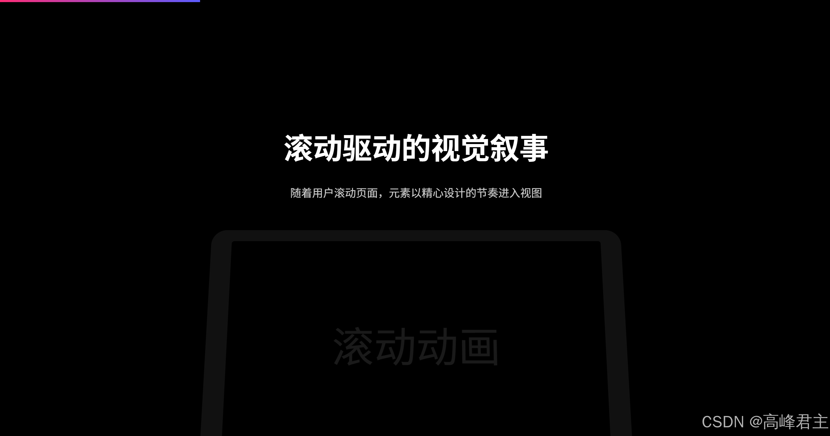
核心技术解析
1. 视差滚动效果
// 视差层以不同速度移动
window.addEventListener('scroll', () => {const scrollY = window.scrollY;parallaxLayers.forEach((layer, index) => {const speed = 0.2 * (index + 1);const offset = -scrollY * speed;layer.style.transform = `translate3d(0, ${offset}px, 0)`;});
});
2. 滚动触发动画
使用Intersection Observer API检测元素进入视口:
const observer = new IntersectionObserver((entries) => {entries.forEach(entry => {if (entry.isIntersecting) {entry.target.classList.add('visible');observer.unobserve(entry.target);}});
}, { threshold: 0.2 });
3. 3D透视效果
// 设备3D旋转效果
window.addEventListener('scroll', () => {const deviceRect = device.getBoundingClientRect();const deviceCenter = deviceRect.top + deviceRect.height / 2;const rotation = (deviceCenter - viewportCenter) / 30;device.style.transform = `perspective(1000px) rotateX(${rotation}deg)`;
});
4. 性能优化技巧
-
使用
transform和opacity属性进行动画(避免布局重排) -
使用
will-change: transform提示浏览器元素将发生变化 -
对复杂动画使用
requestAnimationFrame -
限制滚动事件处理函数的执行频率
进阶实现方案
对于更复杂的项目,可以考虑以下方案:
-
专业动画库:
-
GSAP + ScrollTrigger:提供最强大的时间轴控制和滚动绑定
-
AOS (Animate On Scroll):轻量级库,简单易用
-
Framer Motion:适合React应用的动画库
-
-
CSS滚动API:
@keyframes fade-in {from { opacity: 0; transform: translateY(50px); }to { opacity: 1; transform: translateY(0); }
}.element {animation: fade-in linear;animation-timeline: view();animation-range: entry 20% cover 30%;
}-
Canvas动画集成:
-
使用Three.js创建3D滚动场景
-
复杂粒子效果和物理模拟
-
设计原则
-
适度使用:动画应增强内容而非分散注意力
-
性能优先:确保60fps流畅体验
-
渐进增强:在低性能设备上优雅降级
-
无障碍访问:提供减少动画的选项
-
统一风格:动画应与品牌风格保持一致
通过合理运用这些技术,您可以创建出媲美苹果官网的滚动动画体验,显著提升用户参与度和品牌形象。