前端项目2-01:个人简介页面
目录
一.代码显示
二.效果图
三.代码分析
1. 文档声明和 HTML 基本结构
2. CSS 样式部分
全局样式
body 样式
页面主要容器 box 样式
左侧区域 l 样式
右侧区域 r 样式
左侧区域中头像容器 to 样式
头像图片样式及悬停效果
左侧区域中个人信息容器 tit 样式
个人信息中姓名和签名样式
联系方式容器 lianxi 样式
联系方式标题 h3 样式
联系方式中加粗文本 span 样式
每个联系方式项 item 样式
联系方式项中图片 img 样式
右侧区域中每个信息块 item 通用样式
右侧区域中信息块标题 title 样式
右侧区域中段落 p 样式
专业技能容器 jingneng 样式
专业技能名称 span 样式
技能进度条背景 bg 样式
技能进度条内部填充 div 样式
爱好列表容器 list 样式
每个爱好项 item 样式
爱好项中图片容器 div 样式
爱好项中图片 img 样式及悬停效果
爱好项中爱好名称 p 样式
3. HTML 内容部分
页面主要容器
左侧区域内容
右侧区域内容
使用工具:webstorm
编程语言:html5+css3
一.代码显示
<!DOCTYPE html>
<html><head><meta charset="utf-8"><title></title><style>* {text-decoration: none;font-family: '微软雅黑';letter-spacing: 1px;margin: 0;}body {display: flex;justify-content: center;align-items: center;height: 100vh;background: linear-gradient(to bottom right, #efcfec, #c2cde7);background-size: 100% 100%;}.box{width: 1000px;height: 700px;display: flex;border: 15px solid rgba(255,255,255,.5);}.box>.l{width: 30%;height: 100%;background-color: #daa4d7;}.box>.r{width: 70%;height: 100%;background-color: #fff;box-sizing: border-box;padding: 20px;}.box>.l>.to{width: 160px;height: 160px;border-radius: 100%;overflow: hidden;margin: auto;margin-top: 50px;}.box>.l>.to>img{width: 100%;height: 100%;object-fit: cover;transition: .5s;}.box>.l>.to:hover>img{transform: scale(1.4);}.box>.l>.tit{text-align: center;line-height: 1.6;color: #fff;margin-top: 20px;}.box>.l>.tit>.name{font-size: 24px;}.box>.l>.tit>.text{font-size: 18px;}.lianxi>h3{margin-bottom: 20px;}.lianxi{padding: 0 20px;margin-top: 70px;color: #fff;}.lianxi>span{margin-bottom: 20px;font-weight: bold;}.lianxi>.item{display: flex;align-items: center;margin-bottom: 20px;}.lianxi>.item>img{width: 35px;margin-right: 10px;}.r>.item{margin-bottom: 30px;}.r>.item>.title{color: #daa4d7;font-size: 22px;font-weight: bold;margin-bottom: 20px;}.r>.item>p{text-align: justify;letter-spacing: 0;line-height: 1.8;}.jingneng{display: flex;align-items: center;margin-bottom: 25px;}.jingneng>span{font-size: 18px;width: 100px;}.jingneng>.bg{width: 80%;height: 30px;background-color: #e4ceea;}.jingneng>.bg>div{height: 100%;background-color: #daa4d7;}.list{display: flex;justify-content: space-between;}.list>.item{width: 22%;}.list>.item>div{overflow: hidden;border-radius: 100%;}.list>.item>div img{width: 100%;display: block;height: 140px;object-fit: cover;transition: .5s;}.list>.item>div:hover>img{transform: scale(1.3);}.list>.item>p{text-align: center;font-weight: bold;line-height: 1.6;}</style></head><body><div class="box"><div class="l"><div class="to"><img src="img/to.jpg" alt="" /></div><div class="tit"><div class="name">Name</div><div class="text">signature</div></div><div class="lianxi"><h3>联系方式</h3><div class="item"><img src="img/item1.png" alt="" />1225105775</div><div class="item"><img src="img/item2.png" alt="" />1225105775qq.com</div><div class="item"><img src="img/item3.png" alt="" />www.xxxx.com</div><div class="item"><img src="img/item4.png" alt="" />辽宁省,沈阳市,沈河区</div></div></div><div class="r"><div class="item"><div class="title">自我介绍</div><p>I am a technology enthusiast specializing in web front-end development, proficient in coretechnologies such as HTML5, CSS3, and JavaScript, and possess solid abilities in page layout andinteraction design. Passionate about pursuing user experience, proficient in modern front-endframeworks such as React and Vue, and emphasizing code readability and maintainability.</p></div><div class="item"><div class="title">专业技能</div><div class="jingneng"><span>HTML</span><div class="bg"><div style="width: 80%;"></div></div></div><div class="jingneng"><span>CSS</span><div class="bg"><div style="width: 70%;"></div></div></div><div class="jingneng"><span>Vue</span><div class="bg"><div style="width: 60%;"></div></div></div></div><div class="item"><div class="title">我的爱好</div><div class="list"><div class="item"><div><img src="img/list1.jpg" alt="" /></div><p>篮球</p></div><div class="item"><div><img src="img/list2.jpg" alt="" /></div><p>跳舞</p></div><div class="item"><div><img src="img/list3.jpg" alt="" /></div><p>唱歌</p></div><div class="item"><div><img src="img/list4.jpg" alt="" /></div><p>演讲</p></div></div></div></div></div></body>
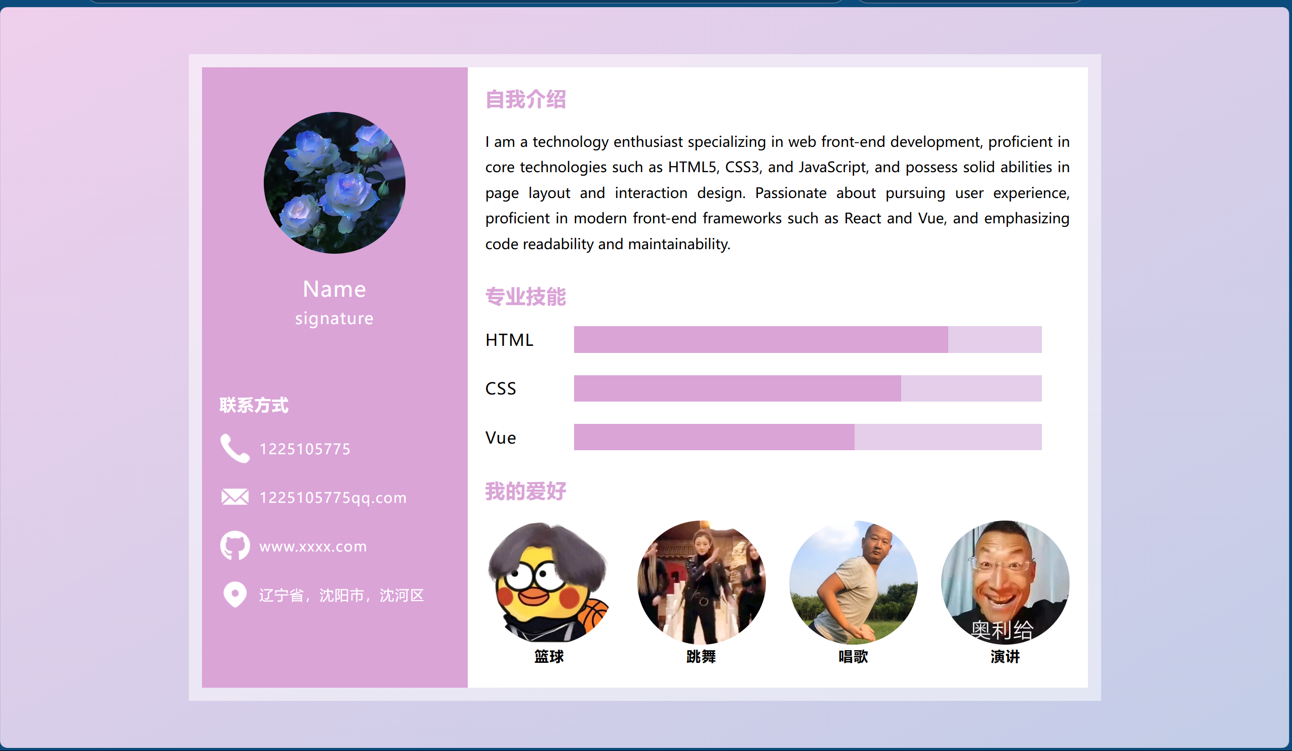
</html>二.效果图
三.代码分析
1. 文档声明和 HTML 基本结构
<!DOCTYPE html>
<html>
<head><meta charset="utf-8"><title></title><style><!-- 此处为 CSS 样式代码,下面会详细解释 --></style>
</head>
<body><div class="box"><!-- 页面主要内容区域,包含左侧和右侧部分 --></div>
</body>
</html>- <!DOCTYPE html>:声明这是一个 HTML5 文档,告知浏览器按照 HTML5 的规范来解析页面。
- <html>:整个 HTML 文档的根元素,所有其他 HTML 元素都包含在这个元素内。
- <head>:包含了文档的元数据,如字符编码、页面标题等,这些信息不会直接显示在页面上,但对页面的显示和功能有重要作用。
- <meta charset="utf-8">:设置页面的字符编码为 UTF-8,确保页面能够正确显示各种字符,包括中文、英文以及其他特殊字符。
- <title></title>:定义页面的标题,显示在浏览器的标题栏或标签页上,当前代码中标题为空,实际应用中应填写合适的标题。
- <style>:内部包含 CSS 样式代码,用于控制页面元素的外观和布局。
- <body>:网页的主体部分,包含了页面上实际显示的内容,用户能看到的所有可视化元素都在这个元素内。
2. CSS 样式部分
全局样式
* {text-decoration: none;font-family: '微软雅黑';letter-spacing: 1px;margin: 0;
}-
*是通配选择器,表示应用到页面上的所有元素。 -
text-decoration: none;:移除所有元素默认的文本装饰,比如链接的下划线。 -
font-family: '微软雅黑';:设置所有元素的默认字体为 “微软雅黑”,使页面文本呈现统一的字体风格。 -
letter-spacing: 1px;:设置字符之间的间距为 1 像素,调整文本的视觉效果。 -
margin: 0;:将所有元素的外边距设置为 0,去除元素与元素之间默认的外边距,使页面布局更加紧凑。
body 样式
body {display: flex;justify-content: center;align-items: center;height: 100vh;background: linear-gradient(to bottom right, #efcfec, #c2cde7);background-size: 100% 100%;
}-
display: flex;:将body元素设置为弹性容器,使用弹性盒模型来布局内部元素。 -
justify-content: center;:使弹性容器内的元素在水平方向上居中对齐,即页面内容水平居中显示。 -
align-items: center;:使弹性容器内的元素在垂直方向上居中对齐,即页面内容垂直居中显示。 -
height: 100vh;:设置body的高度为视口高度的 100%,确保页面内容能够完全覆盖整个浏览器窗口的高度。 -
background: linear-gradient(to bottom right, #efcfec, #c2cde7);:设置body的背景为从左上角到右下角的线性渐变,起始颜色为#efcfec,结束颜色为#c2cde7。 -
background-size: 100% 100%;:设置背景图像的大小为占满整个body,使渐变背景完全覆盖页面。
页面主要容器 box 样式
.box {width: 1000px;height: 700px;display: flex;border: 15px solid rgba(255, 255, 255,.5);
}-
.box是一个类选择器,用于选择页面中类名为box的元素。 -
width: 1000px;:设置容器的宽度为 1000 像素。 -
height: 700px;:设置容器的高度为 700 像素。 -
display: flex;:将容器设置为弹性容器,方便对其内部的子元素(左侧和右侧区域)进行布局。 -
border: 15px solid rgba(255, 255, 255,.5);:设置容器的边框宽度为 15 像素,边框颜色为半透明的白色(rgba(255, 255, 255,.5)表示白色且透明度为 0.5)。
左侧区域 l 样式
.box>.l {width: 30%;height: 100%;background-color: #daa4d7;
}-
.box>.l是后代选择器,表示选择box元素下的类名为l的直接子元素。 -
width: 30%;:设置左侧区域的宽度为父元素(box)宽度的 30%。 -
height: 100%;:设置左侧区域的高度为父元素(box)高度的 100%,即占满整个box的高度。 -
background-color: #daa4d7;:设置左侧区域的背景颜色为#daa4d7,为该区域添加一个深粉色的背景。
右侧区域 r 样式
.box>.r {width: 70%;height: 100%;background-color: #fff;box-sizing: border-box;padding: 20px;
}-
.box>.r是后代选择器,表示选择box元素下的类名为r的直接子元素。 -
width: 70%;:设置右侧区域的宽度为父元素(box)宽度的 70%。 -
height: 100%;:设置右侧区域的高度为父元素(box)高度的 100%,即占满整个box的高度。 -
background-color: #fff;:设置右侧区域的背景颜色为白色(#fff是白色的十六进制表示)。 -
box-sizing: border-box;:使元素的内边距和边框包含在元素的宽度和高度内,这样设置内边距和边框不会影响元素的实际宽度和高度。 -
padding: 20px;:为右侧区域设置内边距为 20 像素,使内部内容与边框之间有一定的间隔。
左侧区域中头像容器 to 样式
.box>.l>.to {width: 160px;height: 160px;border-radius: 100%;overflow: hidden;margin: auto;margin-top: 50px;
}-
.box>.l>.to是后代选择器,表示选择box元素下l元素下的类名为to的子元素。 -
width: 160px;:设置头像容器的宽度为 160 像素。 -
height: 160px;:设置头像容器的高度为 160 像素。 -
border-radius: 100%;:将容器的边框半径设置为 100%,使其成为一个圆形。 -
overflow: hidden;:隐藏超出容器边界的内容,确保圆形头像图片不会超出圆形容器。 -
margin: auto;:使容器在水平方向上居中对齐。 -
margin-top: 50px;:设置容器的上边距为 50 像素,调整头像在左侧区域的垂直位置。
头像图片样式及悬停效果
.box>.l>.to>img {width: 100%;height: 100%;object-fit: cover;transition: .5s;
}.box>.l>.to:hover>img {transform: scale(1.4);
}-
.box>.l>.to>img:选择to容器内的img元素。-
width: 100%;:使图片的宽度占满to容器的宽度。 -
height: 100%;:使图片的高度占满to容器的高度。 -
object-fit: cover;:使图片在容器内完全覆盖,保持图片的纵横比并填满容器。 -
transition: .5s;:设置过渡效果,持续时间为 0.5 秒,为悬停效果做准备。
-
-
.box>.l>.to:hover>img:当鼠标悬停在to容器上时,选择其中的img元素。-
transform: scale(1.4);:使图片在鼠标悬停时放大到原来的 1.4 倍,增加交互效果。
-
左侧区域中个人信息容器 tit 样式
.box>.l>.tit {text-align: center;line-height: 1.6;color: #fff;margin-top: 20px;
}-
.box>.l>.tit是后代选择器,表示选择box元素下l元素下的类名为tit的子元素。 -
text-align: center;:使容器内的文本水平居中对齐。 -
line-height: 1.6;:设置文本的行高为 1.6,调整文本行与行之间的垂直间距。 -
color: #fff;:设置文本颜色为白色。 -
margin-top: 20px;:设置容器的上边距为 20 像素,调整个人信息在左侧区域的垂直位置。
个人信息中姓名和签名样式
.box>.l>.tit>.name {font-size: 24px;
}.box>.l>.tit>.text {font-size: 18px;
}-
.box>.l>.tit>.name:选择tit容器内的类名为name的子元素,设置其字体大小为 24 像素,用于显示姓名。 -
.box>.l>.tit>.text:选择tit容器内的类名为text的子元素,设置其字体大小为 18 像素,用于显示签名。
联系方式容器 lianxi 样式
.lianxi {padding: 0 20px;margin-top: 70px;color: #fff;
}-
.lianxi是类选择器,选择页面中类名为lianxi的元素。 -
padding: 0 20px;:设置容器的左右内边距为 20 像素,使内部内容与边框有一定间隔。 -
margin-top: 70px;:设置容器的上边距为 70 像素,调整联系方式区域在左侧区域的垂直位置。 -
color: #fff;:设置容器内文本的颜色为白色。
联系方式标题 h3 样式
.lianxi>h3 {margin-bottom: 20px;
}-
.lianxi>h3是后代选择器,表示选择lianxi元素下的h3元素。 -
margin-bottom: 20px;:设置h3元素的下边距为 20 像素,使标题与下方的联系方式项有一定间隔。
联系方式中加粗文本 span 样式
.lianxi>span {margin-bottom: 20px;font-weight: bold;
}-
.lianxi>span是后代选择器,表示选择lianxi元素下的span元素。 -
margin-bottom: 20px;:设置span元素的下边距为 20 像素,使每个联系方式项之间有一定间隔。 -
font-weight: bold;:使span元素内的文本字体加粗。
每个联系方式项 item 样式
.lianxi>.item {display: flex;align-items: center;margin-bottom: 20px;
}-
.lianxi>.item是后代选择器,表示选择lianxi元素下的类名为item的子元素。 -
display: flex;:将每个联系方式项设置为弹性容器,方便对内部的图标和文本进行布局。 -
align-items: center;:使弹性容器内的元素垂直居中对齐,确保图标和文本在垂直方向上居中显示。 -
margin-bottom: 20px;:设置每个联系方式项的下边距为 20 像素,使各个联系方式项之间有一定间隔。
联系方式项中图片 img 样式
.lianxi>.item>img {width: 35px;margin-right: 10px;
}-
.lianxi>.item>img是后代选择器,表示选择item元素下的img元素。 -
width: 35px;:设置图片的宽度为 35 像素。 -
margin-right: 10px;:设置图片的右边距为 10 像素,使图片与右侧的文本有一定间隔。
右侧区域中每个信息块 item 通用样式
.r>.item {margin-bottom: 30px;
}-
.r>.item是后代选择器,表示选择r元素下的类名为item的子元素。 -
margin-bottom: 30px;:设置每个信息块的下边距为 30 像素,使各个信息块之间有一定间隔。
右侧区域中信息块标题 title 样式
.r>.item>.title {color: #daa4d7;font-size: 22px;font-weight: bold;margin-bottom: 20px;
}-
.r>.item>.title是后代选择器,表示选择item元素下的类名为title的子元素。 -
color: #daa4d7;:设置标题的颜色为#daa4d7,与左侧区域背景颜色相呼应。 -
font-size: 22px;:设置标题的字体大小为 22 像素。 -
font-weight: bold;:使标题字体加粗。 -
margin-bottom: 20px;:设置标题的下边距为 20 像素,使标题与下方的内容有一定间隔。
右侧区域中段落 p 样式
.r>.item>p {text-align: justify;letter-spacing: 0;line-height: 1.8;
}-
.r>.item>p是后代选择器,表示选择item元素下的p元素。 -
text-align: justify;:使段落文本两端对齐,使文本排版更加整齐。 -
letter-spacing: 0;:设置字符间距为 0,恢复默认的字符间距。 -
line-height: 1.8;:设置段落文本的行高为 1.8,调整行与行之间的垂直间距。
专业技能容器 jingneng 样式
.jingneng {display: flex;align-items: center;margin-bottom: 25px;
}-
.jingneng是类选择器,选择页面中类名为jingneng的元素。 -
display: flex;:将专业技能容器设置为弹性容器,方便对技能名称和进度条进行布局。 -
align-items: center;:使弹性容器内的元素垂直居中对齐,确保技能名称和进度条在垂直方向上居中显示。 -
margin-bottom: 25px;:设置容器的下边距为 25 像素,使每个技能项之间有一定间隔。
专业技能名称 span 样式
.jingneng>span {font-size: 18px;width: 100px;
}-
.jingneng>span是后代选择器,表示选择jingneng元素下的span元素。 -
font-size: 18px;:设置技能名称的字体大小为 18 像素。 -
width: 100px;:设置span元素的宽度为 100 像素,为技能名称预留一定的宽度空间。
技能进度条背景 bg 样式
.jingneng>.bg {width: 80%;height: 30px;background-color: #e4ceea;
}-
.jingneng>.bg是后代选择器,表示选择jingneng元素下的类名为bg的子元素。 -
width: 80%;:设置进度条背景的宽度为父元素(.jingneng)宽度的 80%。 -
height: 30px;:设置进度条背景的高度为 30 像素。 -
background-color: #e4ceea;:设置进度条背景的颜色为淡紫色,作为技能进度的底层背景。
技能进度条内部填充 div 样式
.jingneng>.bg>div {height: 100%;background-color: #daa4d7;
}-
.jingneng>.bg>div:选择进度条背景(.bg)内部的div元素,用于显示具体的技能进度。 -
height: 100%;:设置填充元素的高度为父元素(.bg)高度的 100%,即完全填充进度条背景的高度。 -
background-color: #daa4d7;:设置填充元素的颜色为深粉色,与左侧区域背景颜色一致,形成视觉呼应。 -
进度值通过 HTML 内联样式(如
style="width: 80%;")动态设置,控制填充元素的宽度,从而显示不同的技能掌握程度。
爱好列表容器 list 样式
.list {display: flex;justify-content: space-between;
}-
.list是类选择器,选择页面中类名为list的元素,用于容纳爱好项。 -
display: flex;:将爱好列表容器设置为弹性容器,使内部的爱好项可以灵活布局。 -
justify-content: space-between;:使弹性容器内的爱好项在水平方向上均匀分布,两端对齐,中间间距相等。
每个爱好项 item 样式
.list>.item {width: 22%;
}-
.list>.item:选择爱好列表(.list)中的每个爱好项。 -
width: 22%;:设置每个爱好项的宽度为父元素(.list)宽度的 22%,确保四个爱好项能够合理分布在容器内,同时留出一定的间距。
爱好项中图片容器 div 样式
.list>.item>div {overflow: hidden;border-radius: 100%;
}-
.list>.item>div:选择每个爱好项中的图片容器。 -
overflow: hidden;:隐藏超出容器边界的内容,确保图片不会溢出圆形区域。 -
border-radius: 100%;:将容器的边框半径设置为 100%,使容器成为圆形,用于展示圆形的爱好图片。
爱好项中图片 img 样式及悬停效果
.list>.item>div img {width: 100%;display: block;height: 140px;object-fit: cover;transition: .5s;
}.list>.item>div:hover>img {transform: scale(1.3);
}-
.list>.item>div img:选择爱好项图片容器内的图片元素。-
width: 100%;:设置图片宽度为父元素(图片容器)宽度的 100%,确保图片填满容器。 -
display: block;:将图片显示为块级元素,消除图片底部的默认间距。 -
height: 140px;:设置图片高度为 140 像素,统一所有爱好图片的高度。 -
object-fit: cover;:使图片在保持纵横比的情况下覆盖整个容器,可能会裁剪部分图片,但能确保图片填满容器。 -
transition: .5s;:设置过渡效果,持续时间为 0.5 秒,使悬停效果更加平滑。
-
-
.list>.item>div:hover>img:当鼠标悬停在爱好项图片容器上时,选择其中的图片元素。-
transform: scale(1.3);:使图片在鼠标悬停时放大到原来的 1.3 倍,增强交互体验,提供视觉反馈。
-
爱好项中爱好名称 p 样式
.list>.item>p {text-align: center;font-weight: bold;line-height: 1.6;
}-
.list>.item>p:选择每个爱好项下方的爱好名称文本元素。 -
text-align: center;:使爱好名称文本在水平方向上居中对齐,与上方的圆形图片居中对齐。 -
font-weight: bold;:使爱好名称文本字体加粗,增强视觉效果,使其更加突出。 -
line-height: 1.6;:设置文本的行高为 1.6,调整文本行与行之间的垂直间距,提高可读性。
3. HTML 内容部分
页面主要容器
<div class="box"><!-- 左侧区域 --><div class="l"><!-- 头像、个人信息、联系方式 --></div><!-- 右侧区域 --><div class="r"><!-- 自我介绍、专业技能、爱好 --></div>
</div>-
<div class="box">:整个页面的主要容器,使用弹性布局包含左右两个区域。 -
左侧区域(
.l):宽度占 30%,用于展示个人基本信息。 -
右侧区域(
.r):宽度占 70%,用于展示详细信息。
左侧区域内容
<div class="l"><!-- 头像部分 --><div class="to"><img src="img/to.jpg" alt="" /></div><!-- 个人信息部分 --><div class="tit"><div class="name">Name</div><div class="text">signature</div></div><!-- 联系方式部分 --><div class="lianxi"><h3>联系方式</h3><div class="item"><img src="img/item1.png" alt="" />1225105775</div><div class="item"><img src="img/item2.png" alt="" />1225105775qq.com</div><div class="item"><img src="img/item3.png" alt="" />www.xxxx.com</div><div class="item"><img src="img/item4.png" alt="" />辽宁省,沈阳市,沈河区</div></div>
</div>-
头像部分:
-
<div class="to">:圆形容器,用于展示个人头像。 -
<img src="img/to.jpg" alt="" />:头像图片,路径为img/to.jpg,实际使用时需替换为真实图片。
-
-
个人信息部分:
-
<div class="tit">:个人信息容器。 -
<div class="name">Name</div>:显示姓名,实际使用时需替换为真实姓名。 -
<div class="text">signature</div>:显示个人签名,实际使用时需替换为真实签名。
-
-
联系方式部分:
-
<div class="lianxi">:联系方式容器。 -
<h3>联系方式</h3>:联系方式标题。 -
四个
.item元素:分别包含图标和对应信息(QQ、邮箱、网站、地址),实际使用时需替换为真实联系方式。
-
右侧区域内容
<div class="r"><!-- 自我介绍部分 --><div class="item"><div class="title">自我介绍</div><p>I am a technology enthusiast specializing in web front-end development, proficient in coretechnologies such as HTML5, CSS3, and JavaScript, and possess solid abilities in page layout andinteraction design. Passionate about pursuing user experience, proficient in modern front-endframeworks such as React and Vue, and emphasizing code readability and maintainability.</p></div><!-- 专业技能部分 --><div class="item"><div class="title">专业技能</div><div class="jingneng"><span>HTML</span><div class="bg"><div style="width: 80%;"></div></div></div><div class="jingneng"><span>CSS</span><div class="bg"><div style="width: 70%;"></div></div></div><div class="jingneng"><span>Vue</span><div class="bg"><div style="width: 60%;"></div></div></div></div><!-- 我的爱好部分 --><div class="item"><div class="title">我的爱好</div><div class="list"><div class="item"><div><img src="img/list1.jpg" alt="" /></div><p>篮球</p></div><div class="item"><div><img src="img/list2.jpg" alt="" /></div><p>跳舞</p></div><div class="item"><div><img src="img/list3.jpg" alt="" /></div><p>唱歌</p></div><div class="item"><div><img src="img/list4.jpg" alt="" /></div><p>演讲</p></div></div></div>
</div>-
自我介绍部分:
-
<div class="title">自我介绍</div>:标题。 -
<p>:包含自我介绍的文本内容,实际使用时可替换为个人真实介绍。
-
-
专业技能部分:
-
<div class="title">专业技能</div>:标题。 -
三个
.jingneng元素:分别展示 HTML、CSS、Vue 的技能进度。 -
每个技能项包含技能名称(
<span>)和进度条(.bg内部的<div>),通过style="width: XX%;"设置进度百分比。
-
-
我的爱好部分:
-
<div class="title">我的爱好</div>:标题。 -
<div class="list">:爱好列表容器,使用弹性布局。 -
四个
.item元素:每个包含一个圆形图片容器和爱好名称文本,实际使用时需替换为真实图片和爱好。
-