基于随机森林的糖尿病预测模型研究应用(python)
基于随机森林的糖尿病预测模型研究应用
1、导入糖尿病数据集
In [14]:
import pandas as pd
import seaborn as sns
import numpy as np
import matplotlib.pyplot as plt
data=pd.read_csv('./糖尿病数据集.csv',encoding="gbk")
data.head()#查看前五行数据
Out[14]:
| Pregnancies | Glucose | BloodPressure | SkinThickness | Insulin | BMI | DiabetesPedigreeFunction | Age | Outcome | |
|---|---|---|---|---|---|---|---|---|---|
| 0 | 6 | 148 | 72 | 35 | 0 | 33.6 | 0.627 | 50 | 1 |
| 1 | 1 | 85 | 66 | 29 | 0 | 26.6 | 0.351 | 31 | 0 |
| 2 | 8 | 183 | 64 | 0 | 0 | 23.3 | 0.672 | 32 | 1 |
| 3 | 1 | 89 | 66 | 23 | 94 | 28.1 | 0.167 | 21 | 0 |
| 4 | 0 | 137 | 40 | 35 | 168 | 43.1 | 2.288 | 33 | 1 |
In [2]:
data.tail()
Out[2]:
| Pregnancies | Glucose | BloodPressure | SkinThickness | Insulin | BMI | DiabetesPedigreeFunction | Age | Outcome | |
|---|---|---|---|---|---|---|---|---|---|
| 763 | 10 | 101 | 76 | 48 | 180 | 32.9 | 0.171 | 63 | 0 |
| 764 | 2 | 122 | 70 | 27 | 0 | 36.8 | 0.340 | 27 | 0 |
| 765 | 5 | 121 | 72 | 23 | 112 | 26.2 | 0.245 | 30 | 0 |
| 766 | 1 | 126 | 60 | 0 | 0 | 30.1 | 0.349 | 47 | 1 |
| 767 | 1 | 93 | 70 | 31 | 0 | 30.4 | 0.315 | 23 | 0 |
2、糖尿病样本统计分析
- 提取进行样本分析的特征
In [2]:
##写一个类方法做一个数据转换操作,将1转换成糖尿病患者,0转换成正常人
data2=data.copy()
def tn_ftn(Outcome):if Outcome==1:return '糖尿病患者'else:return '正常人'
data2['result']=data2['Outcome'].apply(tn_ftn)##目标变量
y1=data2['result']
data2['age_groups'] = pd.cut(data2['Age'], bins=[0, 20, 40, 60,80,100],right=False)##分箱操作
In [3]:
age_felie=data2.groupby(['age_groups','Outcome'])['result'].count().reset_index()
age_felie['age_groups']=['(0,20]正常人','(0,20]糖尿病患者','(20,40]正常人','(20,40]糖尿病患者','(40,60]正常人','(40,60]糖尿病患者','(60,80]正常人','(60,80]糖尿病患者','(80,100]正常人','(80,100]糖尿病患者']
age_felie
Out[3]:
| age_groups | Outcome | result | |
|---|---|---|---|
| 0 | (0,20]正常人 | 0 | 0 |
| 1 | (0,20]糖尿病患者 | 1 | 0 |
| 2 | (20,40]正常人 | 0 | 401 |
| 3 | (20,40]糖尿病患者 | 1 | 160 |
| 4 | (40,60]正常人 | 0 | 76 |
| 5 | (40,60]糖尿病患者 | 1 | 99 |
| 6 | (60,80]正常人 | 0 | 22 |
| 7 | (60,80]糖尿病患者 | 1 | 9 |
| 8 | (80,100]正常人 | 0 | 1 |
| 9 | (80,100]糖尿病患者 | 1 | 0 |
In [4]:
fl=data2.groupby(['age_groups'])['Age'].count()
fl
Out[4]:
age_groups
[0, 20)        0
[20, 40)     561
[40, 60)     175
[60, 80)      31
[80, 100)      1
Name: Age, dtype: int64
In [5]:
age_felie['age_groups']
Out[5]:
0        (0,20]正常人
1      (0,20]糖尿病患者
2       (20,40]正常人
3     (20,40]糖尿病患者
4       (40,60]正常人
5     (40,60]糖尿病患者
6       (60,80]正常人
7     (60,80]糖尿病患者
8      (80,100]正常人
9    (80,100]糖尿病患者
Name: age_groups, dtype: object
- 一、糖尿病患者在各年龄阶段的年龄占比
In [14]:
from pyecharts.charts import Pie
from pyecharts import options as opts
# 绘制饼图
pie = Pie()
pie.add("", [list(z) for z in zip(age_felie['age_groups'].values.tolist(), list(age_felie['result']))],radius=[20,200])
pie.set_global_opts(legend_opts=opts.LegendOpts(orient="vertical", pos_bottom="50%", pos_left="75%"))
pie.set_series_opts(label_opts=opts.LabelOpts(formatter="{b}:{c} \n ({d}%)"))
pie.render('各年龄阶段糖尿病患者人数.html')
# pie.render_notebook()
Out[14]:
- 二、各年龄阶段人数
In [13]:
from pyecharts import options as opts
from pyecharts.charts import Bar# 假设age_felie已经定义并包含'age_groups'和'result'列
y_data = age_felie['result'].values
x_data = age_felie['age_groups'].values# 初始化图表配置
init_opts = opts.InitOpts(width='1200px', height='800px')# 创建柱状图
bar = (Bar(init_opts).add_xaxis(x_data.tolist()).add_yaxis('糖尿病患者/正常人', y_data.tolist(), label_opts=opts.LabelOpts(position='insideTop')).set_global_opts(title_opts=opts.TitleOpts(title='各年龄阶段人数'),xaxis_opts=opts.AxisOpts(axislabel_opts=opts.LabelOpts(font_size=20, color='skyblue')),yaxis_opts=opts.AxisOpts(axislabel_opts=opts.LabelOpts(font_size=20, color='skyblue')))
)# 渲染到HTML文件
bar.render('各年龄阶段人数.html')
# bar.render_notebook()
Out[13]:
3、查看数据的描述性信息及相关性
- 数据的形状
In [15]:
data.shape
Out[15]:
(768, 9)
- 数据的标签
In [16]:
# 查看标签分布
print("数据集一共多少条:",data.shape[0])
print("\n")
print("糖尿病数据标签的分布:\n")
print(data.Outcome.value_counts()) ##0代表正常人,1代表患者人数
数据集一共多少条: 768糖尿病数据标签的分布:0    500
1    268
Name: Outcome, dtype: int64
- 描述信息
In [17]:
data.describe().round(2)##保留两位小数
Out[17]:
| Pregnancies | Glucose | BloodPressure | SkinThickness | Insulin | BMI | DiabetesPedigreeFunction | Age | Outcome | |
|---|---|---|---|---|---|---|---|---|---|
| count | 768.00 | 768.00 | 768.00 | 768.00 | 768.00 | 768.00 | 768.00 | 768.00 | 768.00 |
| mean | 3.85 | 120.89 | 69.11 | 20.54 | 79.80 | 31.99 | 0.47 | 33.24 | 0.35 |
| std | 3.37 | 31.97 | 19.36 | 15.95 | 115.24 | 7.88 | 0.33 | 11.76 | 0.48 |
| min | 0.00 | 0.00 | 0.00 | 0.00 | 0.00 | 0.00 | 0.08 | 21.00 | 0.00 |
| 25% | 1.00 | 99.00 | 62.00 | 0.00 | 0.00 | 27.30 | 0.24 | 24.00 | 0.00 |
| 50% | 3.00 | 117.00 | 72.00 | 23.00 | 30.50 | 32.00 | 0.37 | 29.00 | 0.00 |
| 75% | 6.00 | 140.25 | 80.00 | 32.00 | 127.25 | 36.60 | 0.63 | 41.00 | 1.00 |
| max | 17.00 | 199.00 | 122.00 | 99.00 | 846.00 | 67.10 | 2.42 | 81.00 | 1.00 |
In [18]:
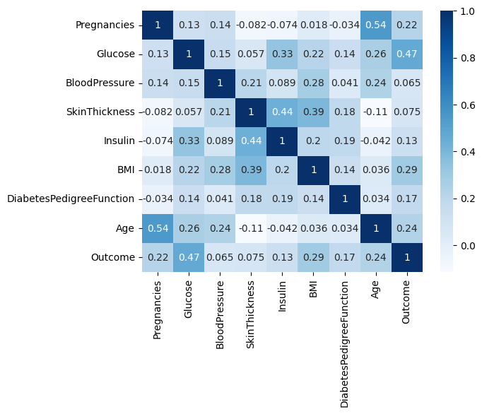
#相关性
data.corr().round(2)
Out[18]:
| Pregnancies | Glucose | BloodPressure | SkinThickness | Insulin | BMI | DiabetesPedigreeFunction | Age | Outcome | |
|---|---|---|---|---|---|---|---|---|---|
| Pregnancies | 1.00 | 0.13 | 0.14 | -0.08 | -0.07 | 0.02 | -0.03 | 0.54 | 0.22 |
| Glucose | 0.13 | 1.00 | 0.15 | 0.06 | 0.33 | 0.22 | 0.14 | 0.26 | 0.47 |
| BloodPressure | 0.14 | 0.15 | 1.00 | 0.21 | 0.09 | 0.28 | 0.04 | 0.24 | 0.07 |
| SkinThickness | -0.08 | 0.06 | 0.21 | 1.00 | 0.44 | 0.39 | 0.18 | -0.11 | 0.07 |
| Insulin | -0.07 | 0.33 | 0.09 | 0.44 | 1.00 | 0.20 | 0.19 | -0.04 | 0.13 |
| BMI | 0.02 | 0.22 | 0.28 | 0.39 | 0.20 | 1.00 | 0.14 | 0.04 | 0.29 |
| DiabetesPedigreeFunction | -0.03 | 0.14 | 0.04 | 0.18 | 0.19 | 0.14 | 1.00 | 0.03 | 0.17 |
| Age | 0.54 | 0.26 | 0.24 | -0.11 | -0.04 | 0.04 | 0.03 | 1.00 | 0.24 |
| Outcome | 0.22 | 0.47 | 0.07 | 0.07 | 0.13 | 0.29 | 0.17 | 0.24 | 1.00 |
In [19]:
#相关性热力图
#忽略警告
import warnings
warnings.filterwarnings('ignore')
import seaborn as sns
import matplotlib.pyplot as plt
sns.heatmap(data.corr(),cmap="Blues",annot=True)
Out[19]:
<Axes: >
4、数据预处理
- 一、缺失值——均值填充
In [20]:
#使用seaborn库绘图
import seaborn as sns
sns.set_style('whitegrid',{'font.sans-serif':['simhei','Arial']})
plt.figure(figsize=(30, 30))
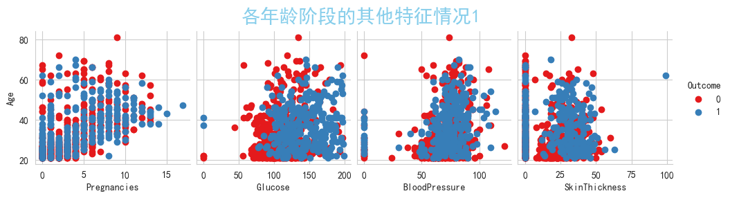
g = sns.pairplot(data,x_vars=['Pregnancies','Glucose','BloodPressure','SkinThickness'],y_vars=['Age'],palette='Set1',hue='Outcome')
g = g.map_offdiag(plt.scatter)
plt.suptitle('各年龄阶段的其他特征情况1', verticalalignment='bottom' , y=1,color="skyblue",size=20)
plt.show()#0为正常人,1为患有糖尿病
<Figure size 3000x3000 with 0 Axes>
In [21]:
#使用seaborn库绘图
sns.set_style('whitegrid',{'font.sans-serif':['simhei','Arial']})
plt.figure(figsize=(30, 30))
g = sns.pairplot(data,x_vars=['Insulin','BMI','DiabetesPedigreeFunction'],y_vars=['Age'],palette='Set1',hue='Outcome')
g = g.map_offdiag(plt.scatter)
plt.suptitle('各年龄阶段的其他特征情况2', verticalalignment='bottom' , y=1,color="skyblue",size=20)
plt.show()#0为正常人,1为患有糖尿病
<Figure size 3000x3000 with 0 Axes>
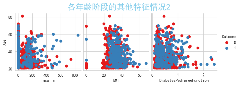
可以观察到'Pregnancies','Glucose','BloodPressure','SkinThickness','Insulin','BMI'上都含有0值,
从现实的实际情况来说,'Pregnancies'列含有0值是正常的,那么我们将其他列含有的0值视为缺失值,现在进行转换,
将'Glucose','BloodPressure','SkinThickness','Insulin','BMI'上所有列含有的0值填充为NaN值,进行查看空缺值
步骤:
1、缺失值检查
2、填充缺失值
1、缺失值检查
第一步:将Glucose、BloodPressure、SkinThickness、Insulin、BMI中的0替换成NaN值
第二步:使用data.info()检查缺失值
第一步:将Glucose、BloodPressure、SkinThickness、Insulin、BMI中的0替换成NaN值
In [15]:
column = ['Glucose', 'BloodPressure', 'SkinThickness', 'Insulin', 'BMI']
data[column] = data[column].replace(0,np.nan)
第二步:使用data.info()检查缺失值
In [23]:
data.info()
<class 'pandas.core.frame.DataFrame'>
RangeIndex: 768 entries, 0 to 767
Data columns (total 9 columns):#   Column                    Non-Null Count  Dtype
---  ------                    --------------  -----  0   Pregnancies               768 non-null    int64  1   Glucose                   763 non-null    float642   BloodPressure             733 non-null    float643   SkinThickness             541 non-null    float644   Insulin                   394 non-null    float645   BMI                       757 non-null    float646   DiabetesPedigreeFunction  768 non-null    float647   Age                       768 non-null    int64  8   Outcome                   768 non-null    int64
dtypes: float64(6), int64(3)
memory usage: 54.1 KB
可以很清楚的观察到糖尿病数据集中Glucose含有5条缺失值,BloodPressure含有35条缺失值,
SkinThickness含有227条缺失值,Insulin含有374条缺失值,BMI含有11条缺失值
即缺失值数据条数从多到少排序为:Insulin、SkinThickness、BloodPressure、BMI、Glucose
2、填充缺失值
填充原因:由上述的糖尿病数据相关性可知,目标变量与特征变量之间都存在一定的相关性,
故如果删除缺失值的话,会可能导致统计效力下降,模型的准确性和泛化能力也会受到影响
In [16]:
data['Glucose'].fillna(data.Glucose.mean().round(0),inplace=True)
data['BloodPressure'].fillna(data.BloodPressure.mean().round(0),inplace=True)
data['SkinThickness'].fillna(data.SkinThickness.mean().round(0),inplace=True)
data['Insulin'].fillna(data.Insulin.mean().round(0),inplace=True)
data['BMI'].fillna(data.BMI.mean().round(1),inplace=True)
In [25]:
data.head()##查看填充成功
Out[25]:
| Pregnancies | Glucose | BloodPressure | SkinThickness | Insulin | BMI | DiabetesPedigreeFunction | Age | Outcome | |
|---|---|---|---|---|---|---|---|---|---|
| 0 | 6 | 148.0 | 72.0 | 35.0 | 156.0 | 33.6 | 0.627 | 50 | 1 |
| 1 | 1 | 85.0 | 66.0 | 29.0 | 156.0 | 26.6 | 0.351 | 31 | 0 |
| 2 | 8 | 183.0 | 64.0 | 29.0 | 156.0 | 23.3 | 0.672 | 32 | 1 |
| 3 | 1 | 89.0 | 66.0 | 23.0 | 94.0 | 28.1 | 0.167 | 21 | 0 |
| 4 | 0 | 137.0 | 40.0 | 35.0 | 168.0 | 43.1 | 2.288 | 33 | 1 |
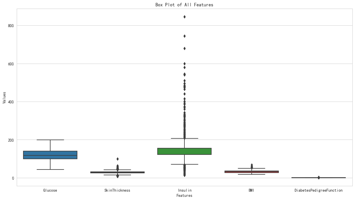
- 二、异常值处理——中位数填充
由上述的描述信息可以看出Pregnancies、BloodPressure、Age这些值在实际生活中是正常的, 那么现在需要进行对Glucose、SkinThickness、Insulin、BMI、DiabetesPedigreeFunction进行异常排查
第一步:画出需要分析列的箱线图,即画出糖尿病数据集中经过缺失值填充后Glucose、SkinThickness、Insulin、BMI、DiabetesPedigreeFunction列的箱线图
第二步:利用z-score的方法找出异常值所在的行
第三步:采用中位数对异常进行填充
In [26]:
import pandas as pd
import matplotlib.pyplot as plt
import seaborn as sns# 删除指定的列
df = data.drop(['Pregnancies','BloodPressure','Age','Outcome'], axis=1)# 查看转换后的DataFrame的数据类型
# print(df.dtypes)# 生成箱型图
plt.figure(figsize=(15, 8))
sns.boxplot(data=df,orient= 'vertica')
plt.title('Box Plot of All Features')
plt.xlabel('Features')
plt.ylabel('Values')
#保存图片
plt.savefig('糖尿病数据集缺失值处理后的箱线图.png')
plt.show()
①对Glucose列
In [17]:
##对异常值进行足一排查
import pandas as pd
# 选择要分析的列,Glucose——葡萄糖
column_to_analyze = 'Glucose'
# 计算该列的平均值和标准差
mean = data[column_to_analyze].mean()
std = data[column_to_analyze].std()
# 计算每个样本的Z-score
data['z_score'] = (data[column_to_analyze] - mean) / std
# 设定一个阈值,通常选择3作为标准,表示3个标准差之外的值为异常值
threshold = 3
# 识别异常值,即Z-score的绝对值大于阈值的样本
data['is_outlier'] = abs(data['z_score']) > threshold
# 打印出异常值的行
print("Glucose异常值所在行:")
print(data[data['is_outlier']])
Glucose异常值所在行:
Empty DataFrame
Columns: [Pregnancies, Glucose, BloodPressure, SkinThickness, Insulin, BMI, DiabetesPedigreeFunction, Age, Outcome, z_score, is_outlier]
Index: []
可以看出Glucose无异常值
②对SkinThickness列
In [18]:
##第一步:利用Z-Score进行异常值排查
import pandas as pd
import math
# 选择要分析的列,SkinThickness——皮脂厚度
column_to_analyze = 'SkinThickness'
# 计算该列的平均值和标准差
mean = data[column_to_analyze].mean()
std = data[column_to_analyze].std()
# 计算每个样本的Z-score
data['z_score'] = (data[column_to_analyze] - mean) / std
# 设定一个阈值,通常选择3作为标准,表示3个标准差之外的值为异常值
threshold = 3
# 识别异常值,即Z-score的绝对值大于阈值的样本
data['is_outlier'] = abs(data['z_score']) > threshold
# 打印出异常值的行
print("SkinThickness异常值所在行:")
print(data[data['is_outlier']])
# 第二步:利用中位数填充异常值
## 使用中位数替换异常值
# 计算列的中位数
median_value = data[column_to_analyze].median()
# 使用中位数替换异常值
data.loc[data['is_outlier'], column_to_analyze] = median_value
SkinThickness异常值所在行:Pregnancies  Glucose  BloodPressure  SkinThickness  Insulin   BMI  \
57             0    100.0           88.0           60.0    110.0  46.8
120            0    162.0           76.0           56.0    100.0  53.2
445            0    180.0           78.0           63.0     14.0  59.4
579            2    197.0           70.0           99.0    156.0  34.7   DiabetesPedigreeFunction  Age  Outcome   z_score  is_outlier
57                      0.962   31        0  3.513952        True
120                     0.759   25        1  3.058952        True
445                     2.420   25        1  3.855201        True
579                     0.575   62        1  7.950196        True
③对Insulin列
In [19]:
import pandas as pd
# 选择要分析的列,BloodPressure——血压
column_to_analyze = 'Insulin'
# 计算该列的平均值和标准差
mean = data[column_to_analyze].mean()
std = data[column_to_analyze].std()
# # 使用math.floor()将均值向下取整为最接近的整数
# mean_value_int = math.floor(mean)
# 计算每个样本的Z-score
data['z_score'] = (data[column_to_analyze] - mean) / std
# 设定一个阈值,通常选择3作为标准,表示3个标准差之外的值为异常值
threshold = 3
# 识别异常值,即Z-score的绝对值大于阈值的样本
data['is_outlier'] = abs(data['z_score']) > threshold# 打印出异常值的行
print("Insulin异常值所在行:")
print(data[data['is_outlier']])
# 计算列的中位数
median_value = data[column_to_analyze].median()
# 使用中位数替换异常值
data.loc[data['is_outlier'], column_to_analyze] = median_value
Insulin异常值所在行:Pregnancies  Glucose  BloodPressure  SkinThickness  Insulin   BMI  \
8              2    197.0           70.0           45.0    543.0  30.5
13             1    189.0           60.0           23.0    846.0  30.1
111            8    155.0           62.0           26.0    495.0  34.0
153            1    153.0           82.0           42.0    485.0  40.6
186            8    181.0           68.0           36.0    495.0  30.1
220            0    177.0           60.0           29.0    478.0  34.6
228            4    197.0           70.0           39.0    744.0  36.7
247            0    165.0           90.0           33.0    680.0  52.3
286            5    155.0           84.0           44.0    545.0  38.7
370            3    173.0           82.0           48.0    465.0  38.4
392            1    131.0           64.0           14.0    415.0  23.7
409            1    172.0           68.0           49.0    579.0  42.4
415            3    173.0           84.0           33.0    474.0  35.7
486            1    139.0           62.0           41.0    480.0  40.7
584            8    124.0           76.0           24.0    600.0  28.7
645            2    157.0           74.0           35.0    440.0  39.4
655            2    155.0           52.0           27.0    540.0  38.7
695            7    142.0           90.0           24.0    480.0  30.4
753            0    181.0           88.0           44.0    510.0  43.3   DiabetesPedigreeFunction  Age  Outcome   z_score  is_outlier
8                       0.158   53        1  4.554521        True
13                      0.398   59        1  8.118329        True
111                     0.543   46        1  3.989957        True
153                     0.687   23        0  3.872340        True
186                     0.615   60        1  3.989957        True
220                     1.072   21        1  3.790007        True
228                     2.329   31        0  6.918631        True
247                     0.427   23        0  6.165880        True
286                     0.619   34        0  4.578044        True
370                     2.137   25        1  3.637105        True
392                     0.389   21        0  3.049018        True
409                     0.702   28        1  4.977944        True
415                     0.258   22        1  3.742960        True
486                     0.536   21        0  3.813531        True
584                     0.687   52        1  5.224940        True
645                     0.134   30        0  3.343061        True
655                     0.240   25        1  4.519236        True
695                     0.128   43        1  3.813531        True
753                     0.222   26        1  4.166383        True
④对BMI列
In [20]:
import pandas as pd
import math
# 选择要分析的列
column_to_analyze = 'BMI'
# 计算该列的平均值和标准差
mean = data[column_to_analyze].mean()
std = data[column_to_analyze].std()
# # 使用math.floor()将均值向下取整为最接近的整数
# mean_value_int = math.floor(mean)
# 计算每个样本的Z-score
data['z_score'] = (data[column_to_analyze] - mean) / std
# 设定一个阈值,通常选择3作为标准,表示3个标准差之外的值为异常值
threshold = 3
# 识别异常值,即Z-score的绝对值大于阈值的样本
data['is_outlier'] = abs(data['z_score']) > threshold
# 打印出异常值的行
print("BMI异常值所在行:")
print(data[data['is_outlier']])
# 计算列的中位数
median_value = data[column_to_analyze].median()
# 使用中位数替换异常值
data.loc[data['is_outlier'], column_to_analyze] = median_value
BMI异常值所在行:Pregnancies  Glucose  BloodPressure  SkinThickness  Insulin   BMI  \
120            0    162.0           76.0           29.0    100.0  53.2
125            1     88.0           30.0           42.0     99.0  55.0
177            0    129.0          110.0           46.0    130.0  67.1
445            0    180.0           78.0           29.0     14.0  59.4
673            3    123.0          100.0           35.0    240.0  57.3   DiabetesPedigreeFunction  Age  Outcome   z_score  is_outlier
120                     0.759   25        1  3.016940        True
125                     0.496   26        1  3.278753        True
177                     0.319   26        1  5.038713        True
445                     2.420   25        1  3.918738        True
673                     0.880   22        0  3.613291        True
⑤对DiabetesPedigreeFunction列
In [21]:
import pandas as pd
# 选择要分析的列,DiabetesPedigreeFunction——糖尿病遗传函数
column_to_analyze = 'DiabetesPedigreeFunction'
# 计算该列的平均值和标准差
mean = data[column_to_analyze].mean()
std = data[column_to_analyze].std()
# # 使用math.floor()将均值向下取整为最接近的整数
# mean_value_int = math.floor(mean)
# 计算每个样本的Z-score
data['z_score'] = (data[column_to_analyze] - mean) / std
# 设定一个阈值,通常选择3作为标准,表示3个标准差之外的值为异常值
threshold = 3
# 识别异常值,即Z-score的绝对值大于阈值的样本
data['is_outlier'] = abs(data['z_score']) > threshold
# 打印出异常值的行
print("DiabetesPedigreeFunction异常值所在行:")
print(data[data['is_outlier']])
# 计算列的中位数
median_value = data[column_to_analyze].median()
# 使用中位数替换异常值
data.loc[data['is_outlier'], column_to_analyze] = median_value
DiabetesPedigreeFunction异常值所在行:Pregnancies  Glucose  BloodPressure  SkinThickness  Insulin   BMI  \
4              0    137.0           40.0           35.0    168.0  43.1
45             0    180.0           66.0           39.0    156.0  42.0
58             0    146.0           82.0           29.0    156.0  40.5
228            4    197.0           70.0           39.0    156.0  36.7
330            8    118.0           72.0           19.0    156.0  23.1
370            3    173.0           82.0           48.0    156.0  38.4
371            0    118.0           64.0           23.0     89.0  32.5
395            2    127.0           58.0           24.0    275.0  27.7
445            0    180.0           78.0           29.0     14.0  32.4
593            2     82.0           52.0           22.0    115.0  28.5
621            2     92.0           76.0           20.0    156.0  24.2   DiabetesPedigreeFunction  Age  Outcome   z_score  is_outlier
4                       2.288   33        1  5.481337        True
45                      1.893   25        1  4.289167        True
58                      1.781   44        0  3.951134        True
228                     2.329   31        0  5.605081        True
330                     1.476   46        0  3.030598        True
370                     2.137   25        1  5.025596        True
371                     1.731   21        0  3.800226        True
395                     1.600   25        0  3.404849        True
445                     2.420   25        1  5.879733        True
593                     1.699   25        0  3.703646        True
621                     1.698   28        0  3.700627        True
- 数据预处理之后的描述信息
In [34]:
data.drop(columns=['z_score']).describe().round(2)
Out[34]:
| Pregnancies | Glucose | BloodPressure | SkinThickness | Insulin | BMI | DiabetesPedigreeFunction | Age | Outcome | |
|---|---|---|---|---|---|---|---|---|---|
| count | 768.00 | 768.00 | 768.00 | 768.0 | 768.00 | 768.00 | 768.00 | 768.00 | 768.00 |
| mean | 3.85 | 121.69 | 72.39 | 28.9 | 146.22 | 32.29 | 0.45 | 33.24 | 0.35 |
| std | 3.37 | 30.44 | 12.10 | 8.2 | 56.27 | 6.53 | 0.28 | 11.76 | 0.48 |
| min | 0.00 | 44.00 | 24.00 | 7.0 | 14.00 | 18.20 | 0.08 | 21.00 | 0.00 |
| 25% | 1.00 | 99.75 | 64.00 | 25.0 | 121.50 | 27.50 | 0.24 | 24.00 | 0.00 |
| 50% | 3.00 | 117.00 | 72.00 | 29.0 | 156.00 | 32.40 | 0.37 | 29.00 | 0.00 |
| 75% | 6.00 | 140.25 | 80.00 | 32.0 | 156.00 | 36.42 | 0.60 | 41.00 | 1.00 |
| max | 17.00 | 199.00 | 122.00 | 54.0 | 402.00 | 52.90 | 1.46 | 81.00 | 1.00 |
In [35]:
data.head(10)
Out[35]:
| Pregnancies | Glucose | BloodPressure | SkinThickness | Insulin | BMI | DiabetesPedigreeFunction | Age | Outcome | z_score | is_outlier | |
|---|---|---|---|---|---|---|---|---|---|---|---|
| 0 | 6 | 148.0 | 72.0 | 35.0 | 156.0 | 33.6 | 0.6270 | 50 | 1 | 0.468187 | False |
| 1 | 1 | 85.0 | 66.0 | 29.0 | 156.0 | 26.6 | 0.3510 | 31 | 0 | -0.364823 | False |
| 2 | 8 | 183.0 | 64.0 | 29.0 | 156.0 | 23.3 | 0.6720 | 32 | 1 | 0.604004 | False |
| 3 | 1 | 89.0 | 66.0 | 23.0 | 94.0 | 28.1 | 0.1670 | 21 | 0 | -0.920163 | False |
| 4 | 0 | 137.0 | 40.0 | 35.0 | 168.0 | 43.1 | 0.3725 | 33 | 1 | 5.481337 | True |
| 5 | 5 | 116.0 | 74.0 | 29.0 | 156.0 | 25.6 | 0.2010 | 30 | 0 | -0.817546 | False |
| 6 | 3 | 78.0 | 50.0 | 32.0 | 88.0 | 31.0 | 0.2480 | 26 | 1 | -0.675693 | False |
| 7 | 10 | 115.0 | 72.0 | 29.0 | 156.0 | 35.3 | 0.1340 | 29 | 0 | -1.019762 | False |
| 8 | 2 | 197.0 | 70.0 | 45.0 | 156.0 | 30.5 | 0.1580 | 53 | 1 | -0.947326 | False |
| 9 | 8 | 125.0 | 96.0 | 29.0 | 156.0 | 32.5 | 0.2320 | 54 | 1 | -0.723983 | False |
三、确定糖尿病数据集中的目标值与特征变量
- 确定实验二的目标变量与特征变量
In [22]:
X=data.drop(columns=['Outcome','z_score','is_outlier'])##特征变量(删除目标变量,其余的数据为特征变量)
y=data['Outcome']##目标变量 ----0为正常人,1为患有糖尿病
In [23]:
X##特征变量
Out[23]:
| Pregnancies | Glucose | BloodPressure | SkinThickness | Insulin | BMI | DiabetesPedigreeFunction | Age | |
|---|---|---|---|---|---|---|---|---|
| 0 | 6 | 148.0 | 72.0 | 35.0 | 156.0 | 33.6 | 0.6270 | 50 |
| 1 | 1 | 85.0 | 66.0 | 29.0 | 156.0 | 26.6 | 0.3510 | 31 |
| 2 | 8 | 183.0 | 64.0 | 29.0 | 156.0 | 23.3 | 0.6720 | 32 |
| 3 | 1 | 89.0 | 66.0 | 23.0 | 94.0 | 28.1 | 0.1670 | 21 |
| 4 | 0 | 137.0 | 40.0 | 35.0 | 168.0 | 43.1 | 0.3725 | 33 |
| ... | ... | ... | ... | ... | ... | ... | ... | ... |
| 763 | 10 | 101.0 | 76.0 | 48.0 | 180.0 | 32.9 | 0.1710 | 63 |
| 764 | 2 | 122.0 | 70.0 | 27.0 | 156.0 | 36.8 | 0.3400 | 27 |
| 765 | 5 | 121.0 | 72.0 | 23.0 | 112.0 | 26.2 | 0.2450 | 30 |
| 766 | 1 | 126.0 | 60.0 | 29.0 | 156.0 | 30.1 | 0.3490 | 47 |
| 767 | 1 | 93.0 | 70.0 | 31.0 | 156.0 | 30.4 | 0.3150 | 23 |
768 rows × 8 columns
- 确定实验一的目标变量与特征变量
In [24]:
##写一个类方法做一个数据转换操作,将1转换成糖尿病患者,0转换成正常人
data1=data
def tn_ftn(Outcome):if Outcome==1:return '糖尿病患者'else:return '正常人'
data1['result']=data1['Outcome'].apply(tn_ftn)##目标变量
y1=data1['result']
In [25]:
X#特征变量
Out[25]:
| Pregnancies | Glucose | BloodPressure | SkinThickness | Insulin | BMI | DiabetesPedigreeFunction | Age | |
|---|---|---|---|---|---|---|---|---|
| 0 | 6 | 148.0 | 72.0 | 35.0 | 156.0 | 33.6 | 0.6270 | 50 |
| 1 | 1 | 85.0 | 66.0 | 29.0 | 156.0 | 26.6 | 0.3510 | 31 |
| 2 | 8 | 183.0 | 64.0 | 29.0 | 156.0 | 23.3 | 0.6720 | 32 |
| 3 | 1 | 89.0 | 66.0 | 23.0 | 94.0 | 28.1 | 0.1670 | 21 |
| 4 | 0 | 137.0 | 40.0 | 35.0 | 168.0 | 43.1 | 0.3725 | 33 |
| ... | ... | ... | ... | ... | ... | ... | ... | ... |
| 763 | 10 | 101.0 | 76.0 | 48.0 | 180.0 | 32.9 | 0.1710 | 63 |
| 764 | 2 | 122.0 | 70.0 | 27.0 | 156.0 | 36.8 | 0.3400 | 27 |
| 765 | 5 | 121.0 | 72.0 | 23.0 | 112.0 | 26.2 | 0.2450 | 30 |
| 766 | 1 | 126.0 | 60.0 | 29.0 | 156.0 | 30.1 | 0.3490 | 47 |
| 767 | 1 | 93.0 | 70.0 | 31.0 | 156.0 | 30.4 | 0.3150 | 23 |
768 rows × 8 columns
4、糖尿病数据预测模型
实验一:
- 测试数据
In [40]:
##测试数据
data1.iloc[20:40,:].drop(columns=['Outcome','z_score','is_outlier'])
Out[40]:
| Pregnancies | Glucose | BloodPressure | SkinThickness | Insulin | BMI | DiabetesPedigreeFunction | Age | result | |
|---|---|---|---|---|---|---|---|---|---|
| 20 | 3 | 126.0 | 88.0 | 41.0 | 235.0 | 39.3 | 0.704 | 27 | 正常人 |
| 21 | 8 | 99.0 | 84.0 | 29.0 | 156.0 | 35.4 | 0.388 | 50 | 正常人 |
| 22 | 7 | 196.0 | 90.0 | 29.0 | 156.0 | 39.8 | 0.451 | 41 | 糖尿病患者 |
| 23 | 9 | 119.0 | 80.0 | 35.0 | 156.0 | 29.0 | 0.263 | 29 | 糖尿病患者 |
| 24 | 11 | 143.0 | 94.0 | 33.0 | 146.0 | 36.6 | 0.254 | 51 | 糖尿病患者 |
| 25 | 10 | 125.0 | 70.0 | 26.0 | 115.0 | 31.1 | 0.205 | 41 | 糖尿病患者 |
| 26 | 7 | 147.0 | 76.0 | 29.0 | 156.0 | 39.4 | 0.257 | 43 | 糖尿病患者 |
| 27 | 1 | 97.0 | 66.0 | 15.0 | 140.0 | 23.2 | 0.487 | 22 | 正常人 |
| 28 | 13 | 145.0 | 82.0 | 19.0 | 110.0 | 22.2 | 0.245 | 57 | 正常人 |
| 29 | 5 | 117.0 | 92.0 | 29.0 | 156.0 | 34.1 | 0.337 | 38 | 正常人 |
| 30 | 5 | 109.0 | 75.0 | 26.0 | 156.0 | 36.0 | 0.546 | 60 | 正常人 |
| 31 | 3 | 158.0 | 76.0 | 36.0 | 245.0 | 31.6 | 0.851 | 28 | 糖尿病患者 |
| 32 | 3 | 88.0 | 58.0 | 11.0 | 54.0 | 24.8 | 0.267 | 22 | 正常人 |
| 33 | 6 | 92.0 | 92.0 | 29.0 | 156.0 | 19.9 | 0.188 | 28 | 正常人 |
| 34 | 10 | 122.0 | 78.0 | 31.0 | 156.0 | 27.6 | 0.512 | 45 | 正常人 |
| 35 | 4 | 103.0 | 60.0 | 33.0 | 192.0 | 24.0 | 0.966 | 33 | 正常人 |
| 36 | 11 | 138.0 | 76.0 | 29.0 | 156.0 | 33.2 | 0.420 | 35 | 正常人 |
| 37 | 9 | 102.0 | 76.0 | 37.0 | 156.0 | 32.9 | 0.665 | 46 | 糖尿病患者 |
| 38 | 2 | 90.0 | 68.0 | 42.0 | 156.0 | 38.2 | 0.503 | 27 | 糖尿病患者 |
| 39 | 4 | 111.0 | 72.0 | 47.0 | 207.0 | 37.1 | 1.390 | 56 | 糖尿病患者 |
- 预测诊断结果
In [15]:
import pandas as pd
##忽略警告
import warnings
warnings.filterwarnings('ignore')
from sklearn.model_selection import train_test_split
from sklearn.linear_model import LogisticRegression
from sklearn.tree import DecisionTreeClassifier
from sklearn.ensemble import RandomForestClassifier
from sklearn.preprocessing import StandardScaler
from sklearn.metrics import classification_report,confusion_matrix,accuracy_score
import numpy as npdef lg_hgui():X_train,X_test,y_train,y_test=train_test_split(X,y1,test_size=0.3,random_state=25)lg=LogisticRegression(penalty='l2',max_iter=5)lg.fit(X_train,y_train)X_test1=data.iloc[20:40,:8]print("逻辑回归预测结果:",lg.predict(X_test1))def jue_cs():X_train,X_test,y_train,y_test=train_test_split(X,y1,test_size=0.3,random_state=25)jcs=DecisionTreeClassifier(criterion='gini',max_depth=3,splitter='best')jcs.fit(X_train,y_train)X_test1=data.iloc[20:40,:8]print("决策树预测结果:",jcs.predict(X_test1))def sj_sl():X_train,X_test,y_train,y_test=train_test_split(X,y1,test_size=0.3,random_state=25)sj=RandomForestClassifier(n_estimators=19,max_leaf_nodes=7,max_depth=4)sj.fit(X_train,y_train)X_test1=data.iloc[20:40,:8]print("随机森林预测结果:",sj.predict(X_test1))def in_out():print("预测结果结束!")print("真实数据:",data.iloc[20:40,9:]['result'].values)
print("\n")
while True:model=input("请输入选择的模型!- - - - - - - - - - - - - - - - - - -")if model == '逻辑回归':lg_hgui()print("\n")elif model == '决策树':jue_cs()print("\n")elif model=='随机森林':sj_sl()else:print("\n")in_out()break
真实数据: ['正常人' '正常人' '糖尿病患者' '糖尿病患者' '糖尿病患者' '糖尿病患者' '糖尿病患者' '正常人' '正常人' '正常人''正常人' '糖尿病患者' '正常人' '正常人' '正常人' '正常人' '正常人' '糖尿病患者' '糖尿病患者' '糖尿病患者']
逻辑回归预测结果: ['正常人' '正常人' '糖尿病患者' '正常人' '正常人' '正常人' '糖尿病患者' '正常人' '糖尿病患者' '正常人' '正常人''糖尿病患者' '正常人' '正常人' '正常人' '正常人' '正常人' '正常人' '正常人' '正常人']
决策树预测结果: ['糖尿病患者' '正常人' '糖尿病患者' '正常人' '糖尿病患者' '糖尿病患者' '糖尿病患者' '正常人' '正常人' '正常人''正常人' '糖尿病患者' '正常人' '正常人' '正常人' '正常人' '糖尿病患者' '正常人' '正常人' '正常人']
随机森林预测结果: ['正常人' '正常人' '糖尿病患者' '正常人' '糖尿病患者' '正常人' '糖尿病患者' '正常人' '正常人' '正常人' '正常人''糖尿病患者' '正常人' '正常人' '正常人' '正常人' '糖尿病患者' '糖尿病患者' '正常人' '正常人']
预测结果结束!
实验二:
混淆矩阵、模型评估报告、准确率
- 基于逻辑回归模型糖尿病的预测模型
In [1288]:
%%time
import pandas as pd
from sklearn import metrics
##忽略警告
import warnings
warnings.filterwarnings('ignore')
from sklearn.model_selection import train_test_split
from sklearn.linear_model import LogisticRegression
from sklearn.tree import DecisionTreeClassifier
from sklearn.preprocessing import StandardScaler
from sklearn.metrics import classification_report,confusion_matrix,accuracy_score
from sklearn.model_selection import cross_val_score
import numpy as np
def lg_re():X_train,X_test,y_train,y_test=train_test_split(X,y,test_size=0.3,random_state=25)sc = StandardScaler()X_train = sc.fit_transform(X_train)X_test = sc.transform(X_test)lg=LogisticRegression(penalty='l2',max_iter=5)lg.fit(X_train,y_train)y_predict=lg.predict(X_test)print('逻辑回归混淆矩阵:')confusion_matrix=metrics.confusion_matrix(y_test,y_predict)plt.figure(figsize=(3, 3))# 设置x轴和y轴的刻度标签heatmap = plt.imshow(confusion_matrix, cmap=plt.cm.Reds)# # 去掉网格线plt.grid(False)for i in range(confusion_matrix.shape[0]):for j in range(confusion_matrix.shape[1]):plt.text(j, i, format(confusion_matrix[i, j], 'd'), ha="center", va="center")plt.colorbar(heatmap)plt.xticks([0,1])plt.yticks([1,0])plt.xlabel('Predicted labels')plt.ylabel('True labels')plt.show()print("\n")print("逻辑回归模型评估报告:")print(classification_report(y_test,y_predict))#模型评估报告print("\n")# print("逻辑回归准确率:")print("逻辑回归准确率:",accuracy_score(y_test,y_predict).round(2))#准确率score_tr=lg.score(X_train,y_train)score_te=lg.score(X_test,y_test)print("逻辑回归模型训练集准确率:",score_tr.round(2))print("逻辑回归模型测试集准确率:",score_te.round(2))score_tc= cross_val_score(lg,X,y,cv=10,scoring = 'accuracy')#使用交叉验证print("逻辑回归十次交叉验证准确率:",score_tc.round(2))
lg_re()##逻辑回归模型的准确率约为0.82
逻辑回归混淆矩阵:
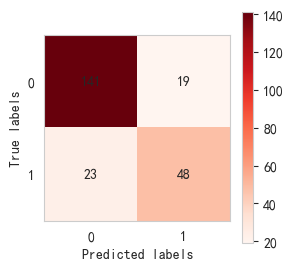
逻辑回归模型评估报告:precision    recall  f1-score   support0       0.86      0.88      0.87       1601       0.72      0.68      0.70        71accuracy                           0.82       231macro avg       0.79      0.78      0.78       231
weighted avg       0.82      0.82      0.82       231逻辑回归准确率: 0.82
逻辑回归模型训练集准确率: 0.76
逻辑回归模型测试集准确率: 0.82
逻辑回归十次交叉验证准确率: [0.69 0.69 0.68 0.62 0.69 0.77 0.7  0.73 0.71 0.66]
CPU times: total: 734 ms
Wall time: 720 ms
- 基于决策树模型糖尿病的预测模型
In [818]:
%%time
from sklearn.tree import DecisionTreeClassifier
sc = StandardScaler()
X= sc.fit_transform(X)
def j_cs():X_train,X_test,y_train,y_test=train_test_split(X,y,test_size=0.3,random_state=30)sc = StandardScaler()X_train = sc.fit_transform(X_train)X_test = sc.transform(X_test)clf=DecisionTreeClassifier(criterion='gini',max_depth=3,splitter='best')clf.fit(X_train,y_train)y_predict=clf.predict(X_test)print('决策树混淆矩阵:')confusion_matrix=metrics.confusion_matrix(y_test,y_predict)plt.figure(figsize=(3, 3))# 设置x轴和y轴的刻度标签heatmap = plt.imshow(confusion_matrix, cmap=plt.cm.Reds)for i in range(confusion_matrix.shape[0]):for j in range(confusion_matrix.shape[1]):plt.text(j, i, format(confusion_matrix[i, j], 'd'), ha="center", va="center")plt.colorbar(heatmap)# # 去掉网格线plt.grid(False)plt.xticks([0,1])plt.yticks([1,0])plt.xlabel('Predicted labels')plt.ylabel('True labels')plt.show()print("\n")print('决策树模型评估报告:')print(classification_report(y_test,y_predict))print('\n')print('决策树准确率:',accuracy_score(y_test,y_predict).round(2))print("决策树模型训练集准确率:",clf.score(X_train,y_train).round(2))print("决策树模型测试集准确率:",clf.score(X_test,y_test).round(2))score_tc= cross_val_score(clf,X,y,cv=10,scoring = 'accuracy')#使用交叉验证print("决策树十次交叉验证准确率:",score_tc.round(2))
j_cs()##决策树模型的准确率约为0.78
决策树混淆矩阵:
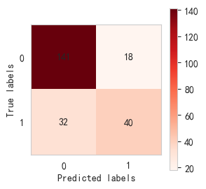
决策树模型评估报告:precision    recall  f1-score   support0       0.82      0.89      0.85       1591       0.69      0.56      0.62        72accuracy                           0.78       231macro avg       0.75      0.72      0.73       231
weighted avg       0.78      0.78      0.78       231决策树准确率: 0.78
决策树模型训练集准确率: 0.78
决策树模型测试集准确率: 0.78
决策树十次交叉验证准确率: [0.73 0.73 0.74 0.68 0.71 0.75 0.71 0.81 0.71 0.78]
CPU times: total: 844 ms
Wall time: 839 ms
- 基于随机森林模型糖尿病的预测模型
In [1280]:
%%time
from sklearn.ensemble import RandomForestClassifier
from sklearn.model_selection import train_test_split
from sklearn.preprocessing import StandardScaler
from sklearn.metrics import classification_report,confusion_matrix,accuracy_score
from sklearn.model_selection import cross_val_score
def sj_sl():X_train,X_test,y_train,y_test=train_test_split(X,y,test_size=0.3,random_state=25)sc = StandardScaler()X_train = sc.fit_transform(X_train)X_test = sc.transform(X_test)rfc=RandomForestClassifier(n_estimators=19,max_leaf_nodes=7,max_depth=4)rfc.fit(X_train,y_train)y_predict=rfc.predict(X_test)print('随机森林混淆矩阵:')confusion_matrix=metrics.confusion_matrix(y_test,y_predict)plt.figure(figsize=(3, 3))# 设置x轴和y轴的刻度标签heatmap = plt.imshow(confusion_matrix, cmap=plt.cm.Reds)for i in range(confusion_matrix.shape[0]):for j in range(confusion_matrix.shape[1]):plt.text(j, i, format(confusion_matrix[i, j], 'd'), ha="center", va="center")# # 去掉网格线plt.grid(False)plt.colorbar(heatmap)plt.xticks([0,1])plt.yticks([1,0])plt.xlabel('Predicted labels')plt.ylabel('True labels')plt.show()print('\n')print('随机森林模型评估报告:')print(classification_report(y_test,y_predict))print('\n')print('随机森林准确率:',accuracy_score(y_test,y_predict).round(2))print("随机森林模型训练集准确率:",rfc.score(X_train,y_train).round(2))print("随机森林模型测试集准确率:",rfc.score(X_test,y_test).round(2))score_tc= cross_val_score(rfc,X,y,cv=10,scoring = 'accuracy')#使用交叉验证print("随机森林十次交叉验证准确率:",score_tc.round(2))
sj_sl()##随机森林模型的准确率约为0.84
随机森林混淆矩阵:
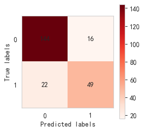
随机森林模型评估报告:precision    recall  f1-score   support0       0.87      0.90      0.88       1601       0.75      0.69      0.72        71accuracy                           0.84       231macro avg       0.81      0.80      0.80       231
weighted avg       0.83      0.84      0.83       231随机森林准确率: 0.84
随机森林模型训练集准确率: 0.79
随机森林模型测试集准确率: 0.84
随机森林十次交叉验证准确率: [0.73 0.73 0.75 0.64 0.73 0.78 0.78 0.78 0.7  0.82]
CPU times: total: 1.89 s
Wall time: 1.87 s
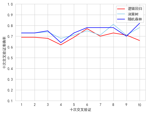
- 逻辑回归、决策树、随机森林十次验证准确率
In [191]:
##导包
import matplotlib.pyplot as plt
import numpy as np
plt.rcParams['font.family'] = ['SimHei']   #设置字体为黑体
plt.rcParams['axes.unicode_minus'] = False #解决保存图像时负号“-”显示为方块的问题
#由上述分别得到逻辑回归、决策树、随机森林的十次交叉验证准确率
##逻辑回归十次交叉验证准确率0.69 0.69 0.68 0.62 0.69 0.77 0.7  0.73 0.71 0.66
y1_Logistic=np.array([0.69,0.69,0.68,0.62,0.69,0.77,0.7,0.73,0.71,0.66]).tolist()
##决策树十次交叉验证准确率0.73 0.73 0.74 0.68 0.71 0.75 0.71 0.81 0.71 0.78
y2_Decision=np.array([0.73,0.73,0.74,0.68,0.71,0.75,0.71,0.81,0.71,0.78]).tolist()
##随机森林十次交叉验证准确率0.73,0.73,0.75,0.64,0.73,0.78,0.78,0.78,0.7,0.82
y3_Random=np.array([0.73,0.73,0.75,0.64,0.73,0.78,0.78,0.78,0.7,0.82]).tolist()
##因为是十次所以现在设置x轴时,要确定x轴的范围是1~10
x_data=[1,2,3,4,5,6,7,8,9,10]
plt.plot(x_data,y1_Logistic,color="red" ,label="逻辑回归")
plt.plot(x_data,y2_Decision,color="skyblue" ,label="决策树")
plt.plot(x_data,y3_Random,color="blue" ,label="随机森林")
plt.xticks(range(1,11))
plt.yticks([0.10,0.20,0.30,0.40,0.50,0.60,0.70,0.80,0.90,1.00])
plt.legend()
plt.xlabel("十次交叉验证")
plt.ylabel("十次交叉验证准确率")
plt.show()
- 逻辑回归准确率、决策树准确率、随机森林准确率柱形图
In [196]:
import seaborn as sns
import matplotlib.pyplot as plt
import warnings
warnings.filterwarnings("ignore")
plt.rcParams['font.sans-serif']='SimHei'# 用来正常显示中文标签
plt.rcParams['axes.unicode_minus']=False  # 用来正常显示负号
import pandas as pd# 假设我们有一些数据
data = {'Model': ['逻辑回归', '决策树', '随机森林'],'Value': [0.82, 0.78, 0.84]
}# 将数据转换为Pandas DataFrame
df = pd.DataFrame(data)# 使用Seaborn的 barplot函数绘制柱形图
# 在这里,我们不需要hue参数,因为我们只有一个分类变量
plt.figure(figsize=(8, 8))
sns.barplot(x='Model', y='Value', data=df)
# # 去掉网格线
plt.grid(False)
# 添加标题和轴标签
plt.title('三种算法模型的准确率比较',fontsize=20,color="blue")
plt.xlabel('模型',fontsize=15,color="purple")
plt.ylabel('准确率',fontsize=15,color="purple")# 在每个柱子上方添加准确率数值
for i, v in enumerate(df['Value']):plt.text(i, v + 0.01, f"{v:.2f}", ha='center', va='bottom',bbox=dict(facecolor='skyblue', alpha=0.5))# 显示图表
plt.show()
In [194]:
import seaborn as sns
import matplotlib.pyplot as plt
import warnings
warnings.filterwarnings("ignore")
plt.rcParams['font.sans-serif']='SimHei'# 用来正常显示中文标签
plt.rcParams['axes.unicode_minus']=False # 用来正常显示负号
import pandas as pd# 假设我们有一些数据
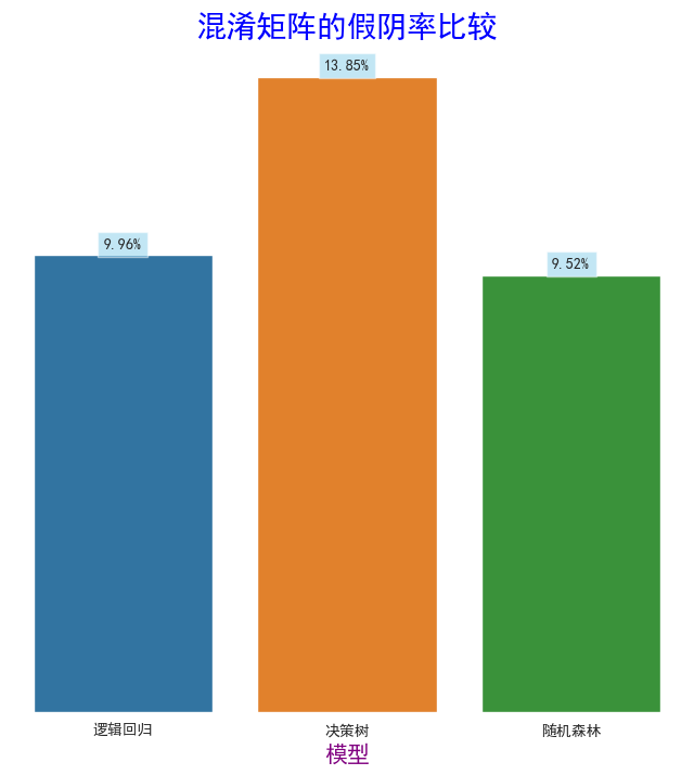
data = {'Model': ['逻辑回归', '决策树', '随机森林'],'Value': [0.0996, 0.1385, 0.0952]
}# 将数据转换为Pandas DataFrame
df = pd.DataFrame(data)# 使用Seaborn的 barplot函数绘制柱形图
# 在这里,我们不需要hue参数,因为我们只有一个分类变量
plt.figure(figsize=(8, 8))
sns.barplot(x='Model', y='Value', data=df)
# # 去掉网格线
plt.grid(False)
# 添加标题和轴标签
plt.title('混淆矩阵的假阴率比较',fontsize=20,color="blue")
plt.xlabel('模型',fontsize=15,color="purple")
# 在每个柱子上方添加准确率数值(百分比形式)
for i, v in enumerate(df['Value']):plt.text(i, v + 0.001, f"{v*100:.2f}%", ha='center', va='bottom',bbox=dict(facecolor='skyblue', alpha=0.5)) # 将浮点数转换为百分比并保留一位小数
ax=plt.gca()
frame=plt.gca()
# y 轴不可见
frame.axes.get_yaxis().set_visible(False)
##去除x轴横线
for spine in ax.spines.values():spine.set_visible(False)
plt.show()
数据集:该数据集最初来自美国国立糖尿病与消化与肾脏疾病研究所。在天池阿里云找到该数据集:https://tianchi.aliyun.com/dataset/88343。