vue3.2 + element-plus 实现跟随input输入框的弹框,弹框里可以分组或tab形式显示选项
效果
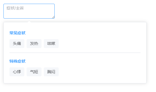
基础用法(分组选项)
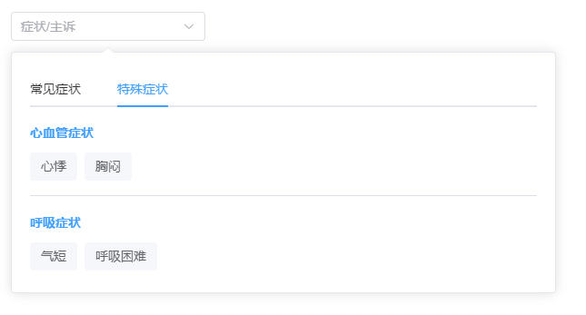
高级用法(带Tab栏)
<!-- 弹窗跟随通用组件  SmartSelector.vue -->
<template><div class="smart-selector-container"><el-popover :visible="visible" :width="width" :placement="placement" trigger="manual" :popper-class="popperClass"@show="$emit('open')" @hide="$emit('close')"><template #reference><el-input ref="inputRef" v-model="selectedText" :placeholder="placeholder":type="multiline ? 'textarea' : 'text'" :autosize="autosize" :readonly="readonly" @click="togglePopup"><template #suffix><el-icon><arrow-down /></el-icon></template></el-input></template><div class="smart-selector-content"><!-- Tab栏 --><el-tabs v-if="hasTabs" v-model="activeTab" @tab-click="handleTabChange"><el-tab-pane v-for="tab in tabs" :key="tab.name" :label="tab.label" :name="tab.name" /></el-tabs><el-scrollbar :max-height="maxHeight"><!-- 分组选项 --><template v-for="(group, index) in currentGroups" :key="index"><div v-if="group.title" class="group-title">{{ group.title }}</div><div class="options-grid"><div v-for="(item, itemIndex) in group.options" :key="itemIndex" class="option-item"@click="handleSelect(item)">{{ item.label || item.name }}</div></div><el-divider v-if="index < currentGroups.length - 1" /></template></el-scrollbar></div></el-popover></div>
</template><script setup lang="ts">
import { ref, computed, watch, onMounted, onUnmounted } from 'vue'
import { ArrowDown } from '@element-plus/icons-vue'const props = defineProps({modelValue: { type: [String, Array], default: '' },options: { type: Array, default: () => [] },groups: { type: Array, default: () => [] }, // 分组格式: [{title: '分组1', options: [...]}]tabs: { type: Array, default: () => [] }, // Tab格式: [{name: 'tab1', label: 'Tab1', options: [...]}]placeholder: { type: String, default: '请选择' },width: { type: String, default: '500px' },maxHeight: { type: String, default: '300px' },separator: { type: String, default: ',' },multiline: Boolean,autosize: { type: [Object, Boolean], default: () => ({ minRows: 2, maxRows: 4 }) },placement: { type: String, default: 'bottom-start' },readonly: { type: Boolean, default: false },popperClass: String
})const emit = defineEmits(['update:modelValue', 'select', 'open', 'close', 'tab-change'])const inputRef = ref<HTMLElement | null>(null)
const popoverRef = ref<HTMLElement | null>(null)
const visible = ref(false)
const activeTab: any = ref('')const tabs: any = props.tabs || []const hasTabs = computed(() => tabs.length > 0)
const currentGroups = computed(() => {if (hasTabs.value) {const tab = tabs.find((t: any) => t.name === activeTab.value)// 修改这里:优先返回 groups,如果没有 groups 再返回 options 包装的数组if (tab?.groups) {return tab.groups} else if (tab?.options) {return [{ options: tab.options }]}return []}return props.groups.length > 0 ? props.groups : [{ options: props.options }]
})const selectedText = computed({get: () => Array.isArray(props.modelValue)? props.modelValue.join(props.separator): props.modelValue,set: (val) => emit('update:modelValue', val)
})// 初始化第一个Tab
if (hasTabs.value) {activeTab.value = tabs[0].name
}const togglePopup = () => {visible.value = !visible.value
}const handleSelect = (item: any) => {const currentValue = props.modelValue || ''if (currentValue.includes(item.value || item.label)) {return}const newValue = Array.isArray(props.modelValue)? [...props.modelValue, item.value || item.label]: currentValue? `${currentValue}${props.separator}${item.value || item.label}`: item.value || item.labelemit('update:modelValue', newValue)emit('select', item)// visible.value = false
}const handleTabChange = (tab: any) => {emit('tab-change', tab.props.name)
}// 处理键盘事件
const handleKeydown = (e: any) => {if (e.key === 'Escape') {visible.value = false}
}onMounted(() => {document.addEventListener('keydown', handleKeydown)
})onUnmounted(() => {document.removeEventListener('keydown', handleKeydown)
})
</script><style scoped lang="scss">
.smart-selector-container {position: relative;display: inline-block;
}.smart-selector-content {padding: 8px;:deep(.el-tabs__header) {margin: 0 0 12px 0;}
}.group-title {padding: 8px 0;font-weight: bold;color: var(--el-color-primary);
}.options-grid {display: flex;flex-wrap: wrap;gap: 8px;padding: 4px 0;
}.option-item {padding: 6px 12px;background: #f5f7fa;border-radius: 4px;cursor: pointer;transition: all 0.2s;white-space: nowrap;font-size: 14px;&:hover {background: var(--el-color-primary);color: white;transform: translateY(-1px);}
}:deep(.el-divider--horizontal) {margin: 12px 0;
}/**使用示例基础用法(分组选项):<template><SmartSelectorv-model="form.symptom":groups="symptomGroups"placeholder="症状/主诉"separator=","multiline:autosize="{ minRows: 2, maxRows: 6 }"@select="handleSelect"/></template><script setup>import { ref } from 'vue'import SmartSelector from '@/components/popup/SmartSelector.vue'const form = ref({symptom: ''})const symptomGroups = ref([{title: '常见症状',options: [{ label: '头痛', value: '头痛' },{ label: '发热', value: '发热' },{ label: '咳嗽', value: '咳嗽' }]},{title: '特殊症状',options: [{ label: '心悸', value: '心悸' },{ label: '气短', value: '气短' },{ label: '胸闷', value: '胸闷' }]}])const handleSelect = (item) => {console.log('选中:', item)}</script>高级用法(带Tab栏):<template><SmartSelectorv-model="form.symptom":tabs="symptomTabs"placeholder="症状/主诉"separator=","width="600px"@select="handleSelect"@tab-change="handleTabChange"/></template><script setup>import { ref } from 'vue'import SmartSelector from '@/components/popup/SmartSelector.vue'const form = ref({symptom: ''})const symptomTabs = ref([{name: 'common',label: '常见症状',options: [{ label: '头痛', value: '头痛' },{ label: '发热', value: '发热' },{ label: '咳嗽', value: '咳嗽' }]},{name: 'special',label: '特殊症状',groups: [{title: '心血管症状',options: [{ label: '心悸', value: '心悸' },{ label: '胸闷', value: '胸闷' }]},{title: '呼吸症状',options: [{ label: '气短', value: '气短' },{ label: '呼吸困难', value: '呼吸困难' }]}]}])const handleSelect = (item) => {console.log('选中:', item)}const handleTabChange = (tabName) => {console.log('切换到Tab:', tabName)}</script>*/
</style>