m-card卡片组件
实现
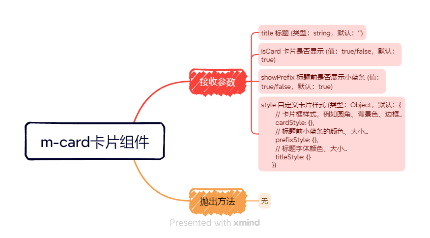
自定义卡片标题、兼容其他组件进行二次嵌套、默认标题前展示小红条、自定义卡片其他样式
一、组件源码
1、typescript 部分
<script lang="ts">
export default {name: 'm-card'
};
</script><script setup lang="ts">
import { reactive } from "vue";const props = defineProps({// 标题title: {type: String,default: ''},// 嵌套组件是否开启卡片模式isCard: {type: Boolean,default: true},// 标题前是否展示小红条showPrefix: {type: Boolean,default: true},// 自定义样式style: {type: Object,default: () => {return {// 卡片框样式,例如圆角、背景色、边框...cardStyle: {},// 标题前小红条的颜色、大小...prefixStyle: {},// 标题字体颜色、大小...titleStyle: {}}}}
});const state = reactive({cardStyle: {borderRadius: '0',...props.style.cardStyle},prefixStyle: {backgroundColor: '#FF6650',...props.style.prefixStyle},titleStyle: {fontSize: '16px',fontWeight: 'bolder',...props.style.titleStyle,}
})
</script>
2、html 部分
<template><div class="m-card"><el-card class="mcard-container" v-if="isCard" :style="state.cardStyle"><template #header v-if="props.title !== ''"><div class="mcard-header"><span class="title-prefix" :style="state.prefixStyle" v-if="props.showPrefix"></span><span class="title-text" :style="state.titleStyle">{{ props.title }}</span></div></template><slot></slot></el-card><div v-if="!isCard"><slot /></div></div>
</template>
3、scss 部分
<style lang="scss" scoped>
::v-deep .mcard-container{.el-card__header{padding: 24px 0px 16px 0px;}.el-card__body{padding: 16px 0;}
}
.mcard-container{padding: 0 24px;border: none;box-shadow: none;background-color: var(--bgColor);
}
.mcard-header {display: flex;line-height: 1;.title-prefix {width: 4px;height: inherit;margin-right: 12px;border-radius: 92px;}.title-text{color:var(--card-title-color)}
}
</style>
二、组件的使用
# 卡片属性
| 属性值 | 说明 | 类型 | 默认值 |
|---|---|---|---|
| title | 标题 | string | '' |
| isCard | 卡片是否显示 | boolean | true |
| showPrefix | 标题前是否展示小红条 | boolean | true |
| style | 自定义卡片样式 | Object | { cardStyle: {}, // 卡片样式,eg: 圆角、背景色、边框... prefixStyle: {}, // 小红条颜色、大小... titleStyle: {}, // 标题字体颜色、大小... } |
1、自定义标题
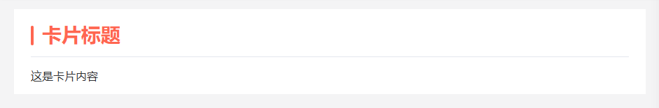
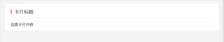
<template><div class="app-container"><m-card title="卡片标题">这是卡片内容</m-card></div>
</template>
2、自定义卡片样式
(1)卡片框样式
<script lang="ts" setup>
const cardStyle:object = {cardStyle: {borderLeft:'7px solid #165DFF',borderRadius: '6px',marginBottom: '20px',}
}
</script><template><div class="app-container"><m-card title="卡片标题":showPrefix="false":style="cardStyle">这是卡片内容</m-card></div>
</template>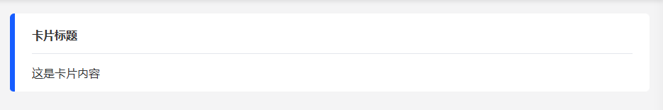
(2)标题前小红条
<script lang="ts" setup>
const prefixStyle:object = {prefixStyle: {width: '16px',height: '16px',backgroundColor: "#165DFF",borderRadius: "50%",}
}
</script><template><div class="app-container"><m-card title="卡片标题":style="prefixStyle">这是卡片内容</m-card></div>
</template>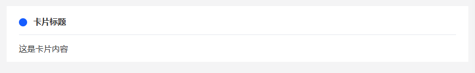
(3)标题字体
<script lang="ts" setup>
const titleStyle:object = {titleStyle: {color: "#FF6650",fontSize: "28px",}
}
</script><template><div class="app-container"><m-card title="卡片标题":style="titleStyle">这是卡片内容</m-card></div>
</template>