中后台管理系统导航布局切换的技术原理解析
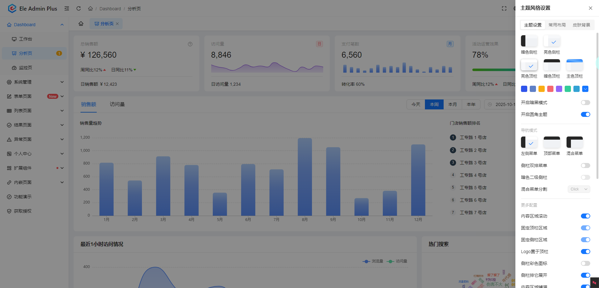
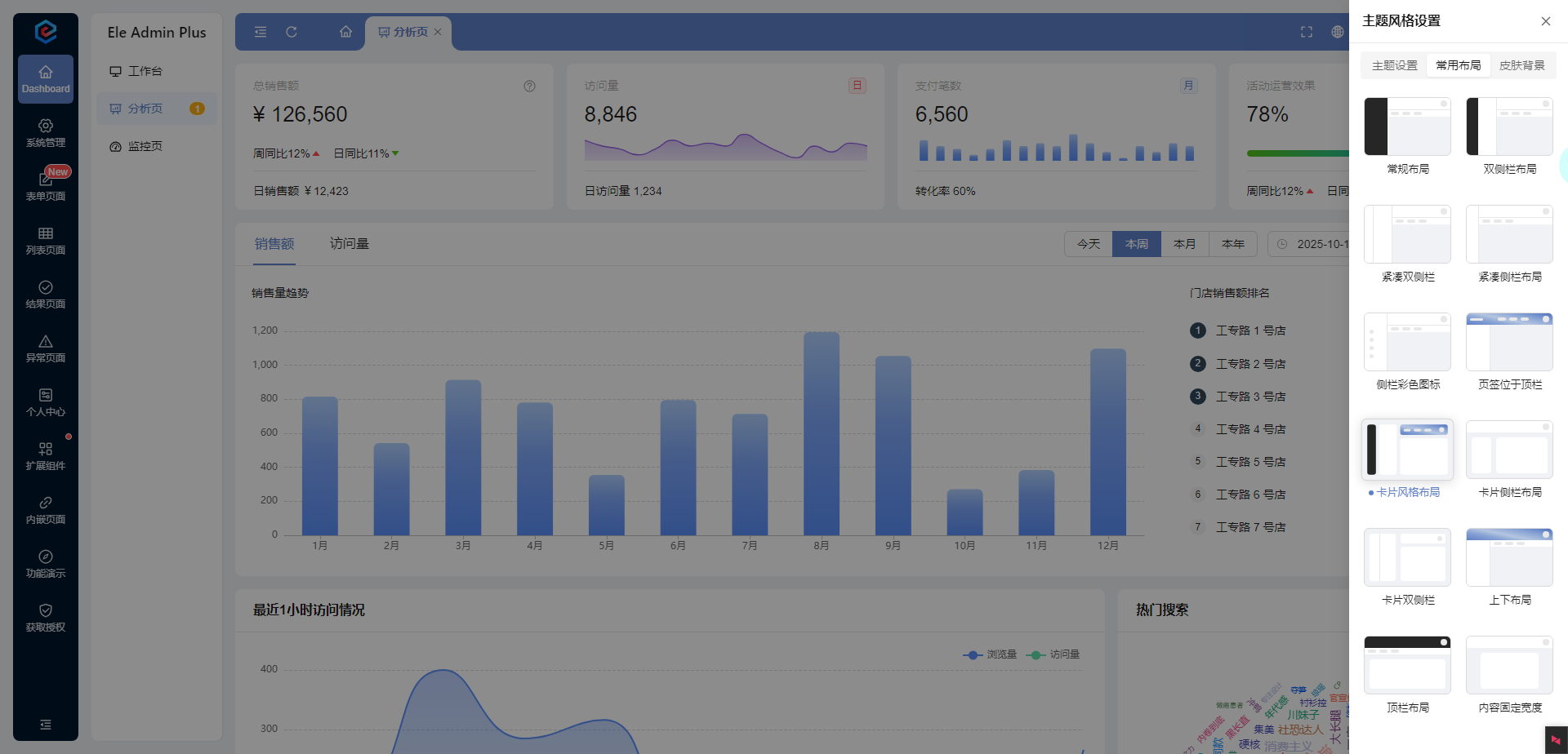
本文详细说一下管理系统切换布局的原理,特别是导航在不同位置(上、左、右)的实现。
布局切换比换肤更复杂,因为它涉及到HTML结构、CSS布局方式和JavaScript动态控制的协同工作。
核心原理
通过JavaScript动态改变CSS布局规则和HTML结构,实现不同布局方案的切换。
主要技术方案
方案一:CSS类名切换 + 不同布局样式(推荐)
这是最常用且维护性最好的方案。
1. HTML结构设计
首先需要设计一个灵活、可重排的HTML结构:
<div class="layout-container layout-left"> <!-- 默认左侧布局 --><div class="header">顶部公共头部</div><div class="main-container"><nav class="sidebar">导航菜单</nav><main class="content">主要内容区域</main></div></div>
2. CSS布局实现
为每种布局编写对应的CSS类:
/* 公共基础样式 */
.layout-container {min-height: 100vh;display: flex;flex-direction: column;
}.main-container {flex: 1;display: flex;
}.sidebar {width: 200px;background: #f5f5f5;transition: all 0.3s ease;
}.content {flex: 1;padding: 20px;transition: all 0.3s ease;
}/* 左侧导航布局 (默认) */
.layout-left .main-container {flex-direction: row;
}.layout-left .sidebar {order: 1;
}.layout-left .content {order: 2;
}/* 顶部导航布局 */
.layout-top .main-container {flex-direction: column;
}.layout-top .sidebar {width: 100%;height: 50px;order: 1;display: flex;/* 顶部导航可能需要水平排列菜单项 */
}.layout-top .content {order: 2;
}/* 右侧导航布局 */
.layout-right .main-container {flex-direction: row;
}.layout-right .sidebar {order: 2;
}.layout-right .content {order: 1;
}
3. JavaScript切换逻辑
通过切换容器元素的类名来改变布局:
class LayoutManager {constructor() {this.container = document.querySelector('.layout-container');this.currentLayout = localStorage.getItem('layout') || 'layout-left';this.init();}init() {// 应用保存的布局this.switchLayout(this.currentLayout);// 绑定布局切换事件document.getElementById('layout-left-btn').addEventListener('click', () => {this.switchLayout('layout-left');});document.getElementById('layout-top-btn').addEventListener('click', () => {this.switchLayout('layout-top');});document.getElementById('layout-right-btn').addEventListener('click', () => {this.switchLayout('layout-right');});}switchLayout(layoutName) {// 移除所有布局类this.container.classList.remove('layout-left', 'layout-top', 'layout-right');// 添加新的布局类this.container.classList.add(layoutName);// 保存到本地存储localStorage.setItem('layout', layoutName);this.currentLayout = layoutName;// 触发自定义事件,通知其他组件布局已改变window.dispatchEvent(new CustomEvent('layoutChange', { detail: layoutName }));}
}// 初始化布局管理器
new LayoutManager();
方案二:CSS Grid 布局 + 区域模板切换
对于更复杂的布局,CSS Grid 提供了更强的控制能力。
1. HTML结构
<div class="grid-layout"><header class="header">顶部头部</header><nav class="sidebar">导航菜单</nav><main class="content">主要内容</main><footer class="footer">底部信息</footer></div>
2. CSS Grid 布局
.grid-layout {display: grid;min-height: 100vh;transition: all 0.3s ease;
}.header { grid-area: header; }
.sidebar { grid-area: sidebar; }
.content { grid-area: content; }
.footer { grid-area: footer; }/* 左侧导航布局 */
.layout-left {grid-template-areas:"header header""sidebar content""footer footer";grid-template-columns: 200px 1fr;grid-template-rows: auto 1fr auto;
}/* 顶部导航布局 */
.layout-top {grid-template-areas:"header header""sidebar sidebar""content content""footer footer";grid-template-columns: 1fr;grid-template-rows: auto auto 1fr auto;
}/* 右侧导航布局 */
.layout-right {grid-template-areas:"header header""content sidebar""footer footer";grid-template-columns: 1fr 200px;grid-template-rows: auto 1fr auto;
}
方案三:CSS变量动态控制
结合CSS变量,可以更灵活地控制布局:
:root {--sidebar-position: left; /* left, top, right */--sidebar-width: 200px;--sidebar-height: auto;
}.layout-container {display: flex;flex-direction: column;min-height: 100vh;
}.main-container {flex: 1;display: flex;flex-direction: var(--layout-direction, row);
}.sidebar {width: var(--sidebar-width);height: var(--sidebar-height);order: var(--sidebar-order, 1);
}.content {flex: 1;order: var(--content-order, 2);
}/* 通过JavaScript修改变量值来实现布局切换 */
function switchLayout(layout) {const root = document.documentElement;switch(layout) {case 'left':root.style.setProperty('--layout-direction', 'row');root.style.setProperty('--sidebar-width', '200px');root.style.setProperty('--sidebar-height', 'auto');root.style.setProperty('--sidebar-order', '1');root.style.setProperty('--content-order', '2');break;case 'top':root.style.setProperty('--layout-direction', 'column');root.style.setProperty('--sidebar-width', '100%');root.style.setProperty('--sidebar-height', '50px');root.style.setProperty('--sidebar-order', '1');root.style.setProperty('--content-order', '2');break;case 'right':root.style.setProperty('--layout-direction', 'row');root.style.setProperty('--sidebar-width', '200px');root.style.setProperty('--sidebar-height', 'auto');root.style.setProperty('--sidebar-order', '2');root.style.setProperty('--content-order', '1');break;}
}
方案四:组件化框架中的实现(Vue/React)
在现代前端框架中,布局切换通常通过条件渲染或动态组件实现:
Vue 示例
<template><div class="app" :class="`layout-${currentLayout}`"><header class="header">顶部头部</header><div class="main-container"><!-- 左侧导航 --><nav v-if="currentLayout === 'left'" class="sidebar"><LeftNavigation /></nav><!-- 主要内容 --><main class="content"><router-view /></main><!-- 右侧导航 --><nav v-if="currentLayout === 'right'" class="sidebar"><RightNavigation /></nav></div><!-- 顶部导航(单独处理) --><nav v-if="currentLayout === 'top'" class="top-nav"><TopNavigation /></nav></div></template><script>
export default {data() {return {currentLayout: localStorage.getItem('layout') || 'left'}},methods: {switchLayout(layout) {this.currentLayout = layout;localStorage.setItem('layout', layout);}}
}
</script>
关键考虑因素
1. 状态持久化
- 使用
localStorage或sessionStorage保存用户布局偏好
- 服务器端保存(如果用户登录)
2. 响应式适配
布局切换需要考虑不同屏幕尺寸:
/* 移动端强制顶部布局 */
@media (max-width: 768px) {.layout-container {flex-direction: column !important;}.sidebar {width: 100% !important;height: auto !important;order: 1 !important;}.content {order: 2 !important;}
}
3. 动画过渡
为布局切换添加平滑动画:
.layout-container * {transition: all 0.3s cubic-bezier(0.4, 0, 0.2, 1);
}
4. 组件通信
布局变化可能需要通知其他组件:
// 发布布局变化事件
const layoutEvent = new CustomEvent('layoutChanged', {detail: { layout: newLayout }
});
window.dispatchEvent(layoutEvent);// 其他组件监听
window.addEventListener('layoutChanged', (event) => {console.log('布局已改变:', event.detail.layout);// 调整组件行为
});
总结
| 方案 | 适用场景 | 优点 | 缺点 |
| 类名切换 | 大多数场景 | 简单直观,维护性好 | 需要预先定义所有布局 |
| CSS Grid | 复杂网格布局 | 布局能力强,代码简洁 | 兼容性要求较高 |
| CSS变量 | 需要动态调整 | 高度灵活,可配置性强 | 实现相对复杂 |
| 框架组件 | Vue/React项目 | 与框架深度集成 | 框架绑定 |
最佳实践推荐:
对于大多数管理系统,方案一(CSS类名切换) 是最实用和可维护的选择。它结合了清晰的HTML结构、灵活的CSS布局和简单的JavaScript控制,能够很好地满足导航位置切换的需求。