病理切片可解释性分析-细胞类型、核形态与细胞间相互作用
病理切片可解释性分析-细胞类型、核形态与细胞间相互作用
本文以 Yang, Zijian, Changyuan Guo, Jiayi Li, Yalun Li, Lei Zhong, Pengming Pu, Tongxuan Shang et al. “An Explainable Multimodal Artificial Intelligence Model Integrating Histopathological Microenvironment and EHR Phenotypes for Germline Genetic Testing in Breast Cancer.” Advanced Science (2025): e02833. 文献为参考进行介绍。
文章github地址:https://github.com/ZhoulabCPH/MAIGGT/tree/master
病理切片的可解释性从细胞类型分布,核形态学特征以及细胞间相互作用三个层面出发:
进行分析的前序基础是病理全扫图片上细胞的分割与识别,以在Pannuke数据集上训练的Hovernet模型预训练模型为基础,每张病理切片通过hovernet模型生成对应的四个文件(overlay(标注细胞类别的图片),mat,qupath和json)。Hovernet的具体介绍可参考过往文章https://blog.csdn.net/qq_44505899/article/details/145936423?spm=1001.2014.3001.5501。
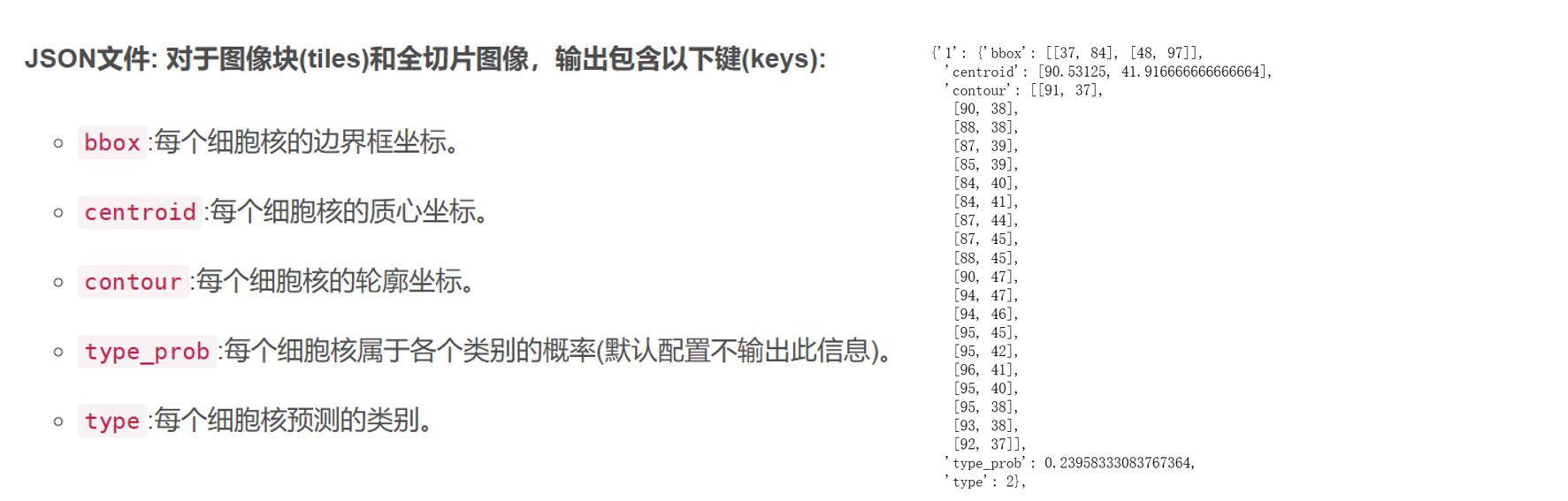
下述分析主要基于JSON文件,包含得到每个核的坐标数据,包括核轮廓坐标等。
数据展示如下:
一. 可解释性分析-细胞类别
直接统计每张图片上各种细胞的数据占比即可。文章相关出图如下:
相关教程可参考:https://blog.csdn.net/qq_44505899/article/details/145936423?spm=1001.2014.3001.5501
二. 可解释性分析-细胞形态学
(1)文章方法学部分描述
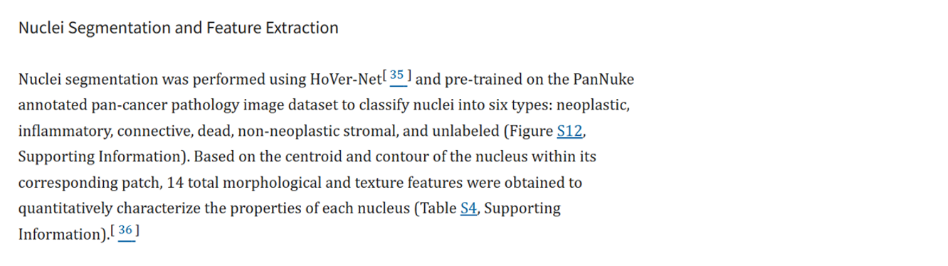
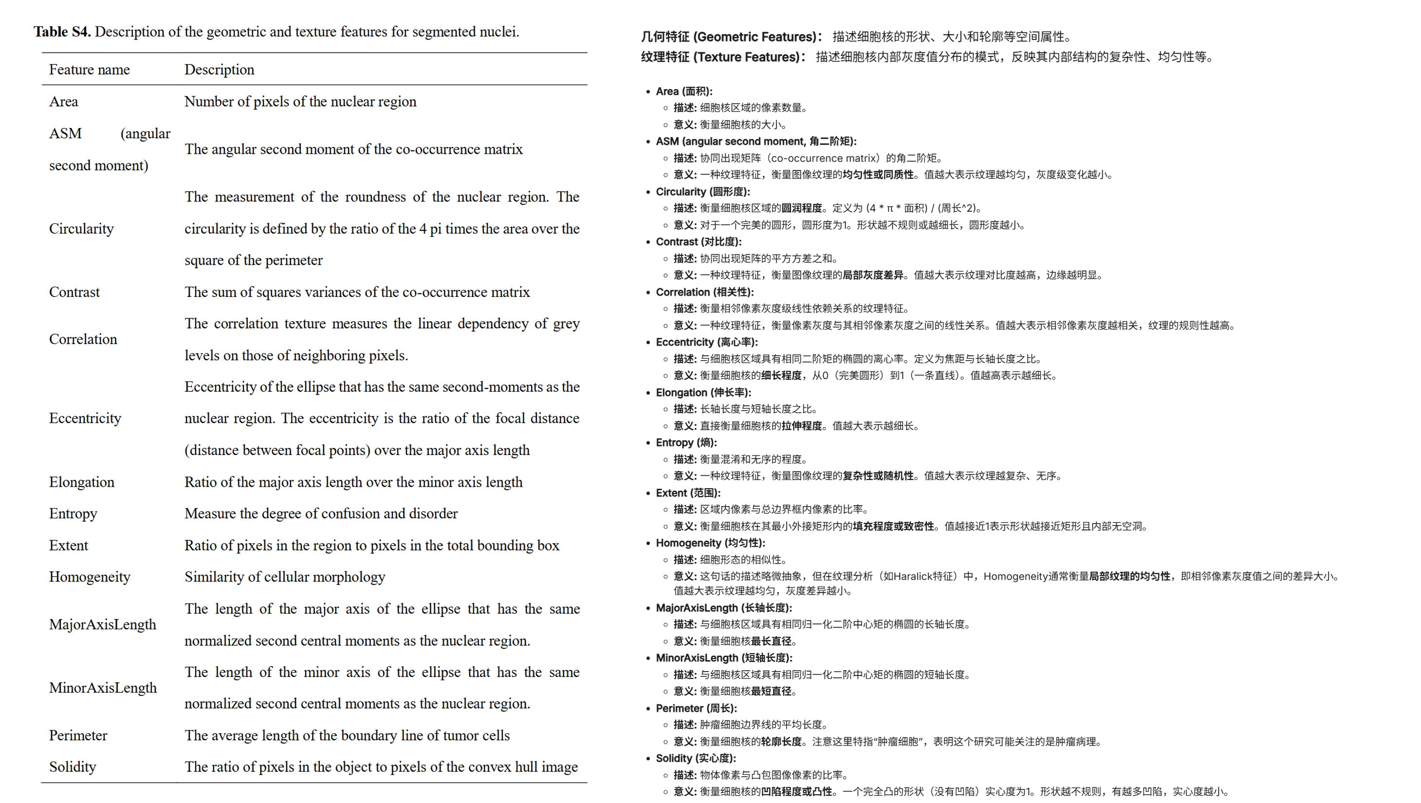
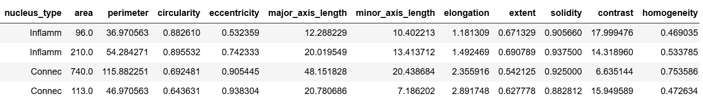
方法学部分不详细,但Table S4中展示了具体提取的14个形态纹理特征。由此推测特征基于python语言的skimage包进行提取。
(2)结果展示
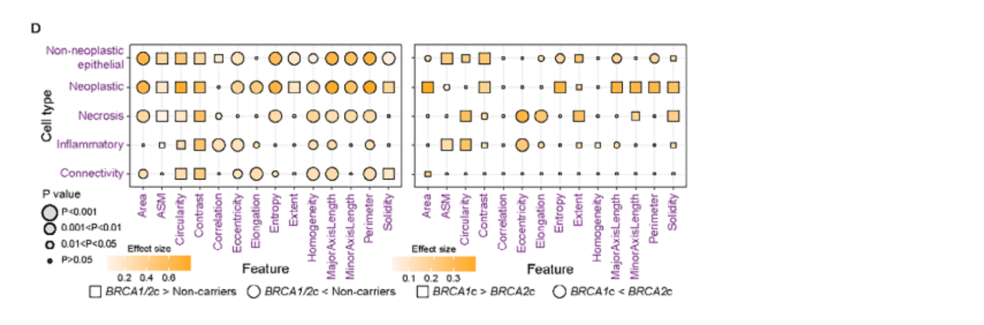
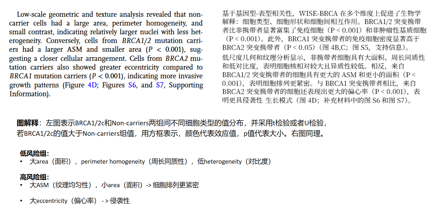
(3)形态学特征具体描述
(4)核形态特征提取代码实现
输入数据:patch原图与hovernet模型分析结果。
import json
import numpy as np
import cv2 # 用于处理轮廓和绘制掩膜
from skimage import io, color, measure, feature
import pandas as pd
import matplotlib.pyplot as plt
import ostype_id_to_name = {1: 'Neop',2: 'Inflamm',3: 'Connec',4: 'Dead',5: 'Non-Neo Epi'
}pngfile = "baiyahui_16064_36032_0.png"infile = os.path.join("../input_dataset_tiles/",pngfile)
original_rgb_image = io.imread(infile)
image_height, image_width = original_rgb_image.shape[0], original_rgb_image.shape[1]infile= os.path.join("../output_tiles_Pannuke/overlay/",pngfile)
seg_rgb_image = io.imread(infile)infile = os.path.join("../output_tiles_Pannuke/json",pngfile.replace(".png",".json"))
json_data = json.load(open(infile, "r"))
nuc_data = json_data["nuc"]  # ---  准备 `gray_image` (原始的灰度图像) ---
gray_image = color.rgb2gray(original_rgb_image)
gray_image_uint8 = (gray_image * 255).astype(np.uint8)# ---  构建 `label_image` 和 `hovernet_nucleus_id_to_type` ---
label_image = np.zeros((image_height, image_width), dtype=np.uint16)
hovernet_nucleus_id_to_type = {}for nuc_id_str, nuc_info in nuc_data.items():nuc_id = int(nuc_id_str) # JSON中的键是字符串,需要转换为整数IDcontour_coords = np.array(nuc_info["contour"], dtype=np.int32)#     contour_coords = contour_coords[:, [1, 0]] # 交换列,将[y,x]转为[x,y]cv2.fillPoly(label_image, [contour_coords], color=nuc_id) # color=nuc_id,将核ID作为像素值填充# 存储细胞核类型predicted_type_id = nuc_info["type"]hovernet_nucleus_id_to_type[nuc_id] = type_id_to_name.get(predicted_type_id, f'未知类型_{predicted_type_id}')# ---创建 `binary_nucleus_image` ---
binary_nucleus_image = (label_image > 0).astype(bool)# --- 提取几何和纹理特征 ---
nucleus_features = []
properties = measure.regionprops(label_image)for prop in properties:current_nucleus_id = prop.label# 从HoVer-Net的分类结果中获取类型nucleus_type = hovernet_nucleus_id_to_type.get(current_nucleus_id, '未标记')# 过滤掉太小或太大的噪音区域(如果需要)if prop.area < 5 or prop.area > 5000:continue# 几何特征area = prop.areaperimeter = prop.perimetercircularity = (4 * np.pi * area) / (perimeter**2) if perimeter > 0 else 0eccentricity = prop.eccentricitymajor_axis_length = prop.major_axis_lengthminor_axis_length = prop.minor_axis_lengthelongation = major_axis_length / minor_axis_length if minor_axis_length > 0 else 0extent = prop.extentsolidity = prop.solidity# 纹理特征 (GLCM)minr, minc, maxr, maxc = prop.bboxnucleus_intensity_image_bbox = gray_image_uint8[minr:maxr, minc:maxc]nucleus_mask_bbox = (prop.image > 0) # prop.image 是一个二值mask,形状与bbox相同masked_nucleus_data = nucleus_intensity_image_bbox * nucleus_mask_bboxunique_pixels = masked_nucleus_data[masked_nucleus_data > 0]if len(unique_pixels) > 0:min_val, max_val = np.min(unique_pixels), np.max(unique_pixels)if max_val > min_val:quantized_masked_nucleus_data = np.zeros_like(masked_nucleus_data, dtype=np.uint8)quantized_masked_nucleus_data[masked_nucleus_data > 0] = \np.uint8( (masked_nucleus_data[masked_nucleus_data > 0] - min_val) / (max_val - min_val) * 15 + 1)else: # 区域内所有有效像素值都相同quantized_masked_nucleus_data = (masked_nucleus_data > 0).astype(np.uint8) * 1 # 所有有效像素值都设为1else:quantized_masked_nucleus_data = np.zeros_like(masked_nucleus_data, dtype=np.uint8)distances = [1]angles = [0, np.pi/4, np.pi/2, 3*np.pi/4]contrast, homogeneity, asm, correlation, entropy_val = 0, 0, 0, 0, 0 # 默认值if np.sum(quantized_masked_nucleus_data > 0) > 10: # 至少有10个有效像素glcm = feature.graycomatrix(quantized_masked_nucleus_data, distances=distances, angles=angles, levels=17, symmetric=True, normed=True)contrast = feature.graycoprops(glcm, 'contrast').mean()homogeneity = feature.graycoprops(glcm, 'homogeneity').mean()asm = feature.graycoprops(glcm, 'ASM').mean()correlation = feature.graycoprops(glcm, 'correlation').mean()glcm_non_zero = glcm[glcm > 0]entropy_val = -np.sum(glcm_non_zero * np.log2(glcm_non_zero + 1e-10))nucleus_features.append({'label_id': current_nucleus_id,'nucleus_type': nucleus_type,'area': area,'perimeter': perimeter,'circularity': circularity,'eccentricity': eccentricity,'major_axis_length': major_axis_length,'minor_axis_length': minor_axis_length,'elongation': elongation,'extent': extent,'solidity': solidity,'contrast': contrast,'homogeneity': homogeneity,'asm': asm,'correlation': correlation,'entropy': entropy_val})df_features = pd.DataFrame(nucleus_features)
df_features["patch_id"]=pngfile
print("提取到的细胞核特征示例:")
print(df_features.head())# 可视化部分结果
fig, axes = plt.subplots(2, 3, figsize=(9, 6))
axes[0,0].imshow(original_rgb_image)
axes[0,0].set_title("Original RGB Image")
axes[0,0].axis('off')axes[0,1].imshow(gray_image_uint8, cmap='gray')
axes[0,1].set_title("Grayscale Image")
axes[0,1].axis('off')axes[0,2].imshow(seg_rgb_image)
axes[0,2].set_title("Hovenet Seg RGB Image")
axes[0,2].axis('off')axes[1,0].imshow(label_image, cmap='nipy_spectral')
axes[1,0].set_title("Label Image from JSON Contours")
axes[1,0].axis('off')axes[1,1].imshow(binary_nucleus_image,cmap='gray')
axes[1,1].set_title("Binary Nucleus Image (All Nuclei)")
axes[1,1].axis('off')axes[1,2].axis('off')
plt.tight_layout()
plt.show()
提取特征展示如下
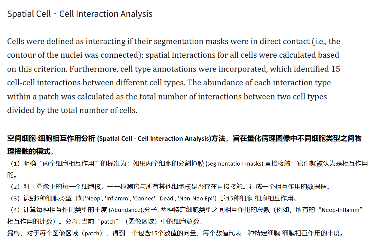
三. 可解释性分析 - 细胞相互作用
(1)文章方法学部分描述
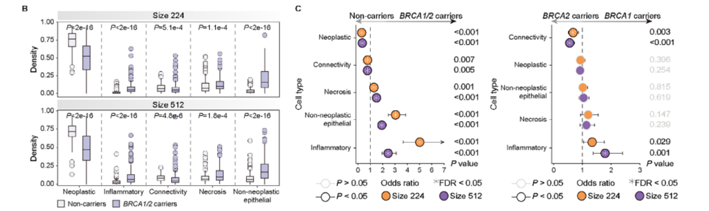
(2)文章结果展示
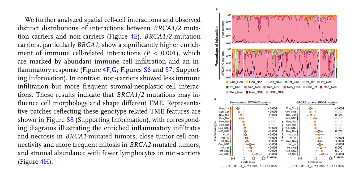
上述结果主要表明了BRCA1/2 突变对肿瘤微环境 (TME) 中细胞间空间相互作用和免疫浸润模式的影响。BRCA1/2 突变与细胞间相互作用的独特分布有关:BRCA1/2 突变携带者(特别是BRCA1突变) 表现出显著更高比例的免疫细胞相互作用 (P < 0.001)。这与丰富的免疫细胞浸润和炎症反应密切相关。非携带者则显示出较少的免疫浸润,但更频繁的基质-肿瘤细胞相互作用。
(3)代码实现-数据生成
import json
import numpy as np
import cv2
from skimage import io, color, measure, feature
import pandas as pd
import matplotlib.pyplot as plt
import os
from itertools import combinations_with_replacement type_id_to_name = {1: 'Neo', #Neoplastic2: 'Inf',3: 'Con',4: 'Nec',# dead5: 'NNE'# 非肿瘤上皮细胞
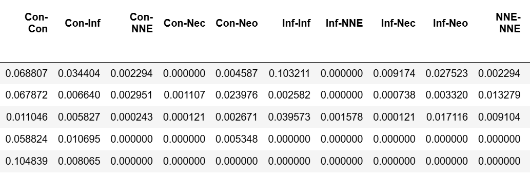
}df_interaction_abundance = pd.DataFrame() # patch的细胞相互作用丰度矩阵for pngfile in os.listdir("../input_dataset_tiles/"):
# pngfile = "baiyahui_16064_36032_0.png"infile = os.path.join("../input_dataset_tiles/",pngfile)original_rgb_image = io.imread(infile)image_height, image_width = original_rgb_image.shape[0], original_rgb_image.shape[1]infile= os.path.join("../output_tiles_Pannuke/overlay/",pngfile)if not os.path.exists(infile):continueseg_rgb_image = io.imread(infile)infile = os.path.join("../output_tiles_Pannuke/json",pngfile.replace(".png",".json"))json_data = json.load(open(infile, "r"))nuc_data = json_data["nuc"] # --- 准备 `gray_image` (原始的灰度图像) ---gray_image = color.rgb2gray(original_rgb_image)gray_image_uint8 = (gray_image * 255).astype(np.uint8)# --- 构建 `label_image` 和 `hovernet_nucleus_id_to_type` ---label_image = np.zeros((image_height, image_width), dtype=np.uint16)hovernet_nucleus_id_to_type = {}for nuc_id_str, nuc_info in nuc_data.items():nuc_id = int(nuc_id_str) # JSON中的键是字符串,需要转换为整数IDcontour_coords = np.array(nuc_info["contour"], dtype=np.int32)# contour_coords = contour_coords[:, [1, 0]] # 交换列,将[y,x]转为[x,y]cv2.fillPoly(label_image, [contour_coords], color=nuc_id) # color=nuc_id,将核ID作为像素值填充# 存储细胞核类型predicted_type_id = nuc_info["type"]hovernet_nucleus_id_to_type[nuc_id] = type_id_to_name.get(predicted_type_id, f'未知类型_{predicted_type_id}')# ---创建 `binary_nucleus_image` ---binary_nucleus_image = (label_image > 0).astype(bool)print(pngfile,len(nuc_data.keys()))if len(nuc_data.keys()) < 10:continueprint("--- 开始空间细胞-细胞相互作用分析 ---")# 识别所有15种细胞-细胞相互作用类型all_cell_types = list(type_id_to_name.values())# 生成无序的细胞类型对,例如('Neop', 'Inflamm') 和 ('Inflamm', 'Neop') 视为同一种,并且包括自身相互作用 (e.g., 'Neop', 'Neop')# N * (N + 1) / 2 = 5 * (5 + 1) / 2 = 15interaction_types = []for pair in combinations_with_replacement(sorted(all_cell_types), 2): # sorted保证顺序一致interaction_types.append(pair)# 初始化相互作用计数器interaction_counts = {pair: 0 for pair in interaction_types}# 用于存储已经记录过的细胞核对,防止重复计数 (例如 A-B 和 B-A )# 格式为 frozenset({nuc_id1, nuc_id2})recorded_nuc_pairs = set() # 定义膨胀核# 3x3的核进行1次膨胀,可以检测到8连通的邻居kernel = np.ones((3,3), np.uint8) all_nuc_ids = list(nuc_data.keys())total_nuclei_in_patch = len(all_nuc_ids)if total_nuclei_in_patch == 0:print("当前图像区域没有细胞核。")# 生成0值的丰度向量interaction_abundance_vector = pd.Series([0.0] * len(interaction_types), index=[f"{t[0]}-{t[1]}" for t in interaction_types])else:# (2) 检测每个细胞核与其他细胞核的直接接触print(f"正在检测 {total_nuclei_in_patch} 个细胞核之间的相互作用...")for i, nuc_id_str_i in enumerate(all_nuc_ids):nuc_id_i = int(nuc_id_str_i)# 创建当前细胞核的二值掩膜nuc_mask_i = (label_image == nuc_id_i).astype(np.uint8)# 膨胀当前细胞核的掩膜# 这会使细胞核的边界向外扩展一个像素,覆盖到相邻的像素dilated_nuc_mask_i = cv2.dilate(nuc_mask_i, kernel, iterations=1)# 获取膨胀区域内,且不属于当前细胞核的像素点对应的细胞核ID# 找到所有非零的细胞核ID在膨胀区域内neighbor_nuc_ids = np.unique(label_image[dilated_nuc_mask_i > 0])# 过滤掉自身ID和背景ID(0)neighbor_nuc_ids = [n_id for n_id in neighbor_nuc_ids if n_id != 0 and n_id != nuc_id_i]# 记录相互作用type_i = hovernet_nucleus_id_to_type[nuc_id_i]for nuc_id_j in neighbor_nuc_ids:type_j = hovernet_nucleus_id_to_type[nuc_id_j]# 使用 frozenset 来确保 (id1, id2) 和 (id2, id1) 被视为同一个对# 并使用 sorted tuple 来确保 ('TypeA', 'TypeB') 和 ('TypeB', 'TypeA') 被视为同一个类型interaction_pair_key = frozenset({nuc_id_i, nuc_id_j})if interaction_pair_key not in recorded_nuc_pairs:# 这是一个新的细胞核对之间的相互作用recorded_nuc_pairs.add(interaction_pair_key)# 获取规范化的相互作用类型 (例如总是按字母顺序排序)canonical_type_pair = tuple(sorted((type_i, type_j)))# 增加计数if canonical_type_pair in interaction_counts:interaction_counts[canonical_type_pair] += 1else:# 应该不会发生,因为我们已经预先生成了所有可能的组合print(f"Warning: Found unlisted interaction type pair: {canonical_type_pair}")# (4) 计算每种相互作用类型的丰度interaction_abundance = {}for pair_type, count in interaction_counts.items():# 分母是当前patch中的细胞总数# 如果没有细胞,之前已经处理过abundance = count / total_nuclei_in_patchinteraction_abundance[f"{pair_type[0]}-{pair_type[1]}"] = abundanceinteraction_abundance["patch_total_counts"] = len(nuc_data.keys())# 将结果转换为Pandas Series或DataFrame,便于查看interaction_abundance_vector = pd.Series(interaction_abundance)df_interaction_abundance = pd.concat([df_interaction_abundance,pd.DataFrame(interaction_abundance_vector,columns=[pngfile])],axis=1)
# print("\n--- 相互作用计数 ---")
# print(pd.Series(interaction_counts).to_string())# print("\n--- 相互作用丰度 (Abundance) ---")
# print(interaction_abundance_vector.to_string())print("\n--- 分析完成 ---")
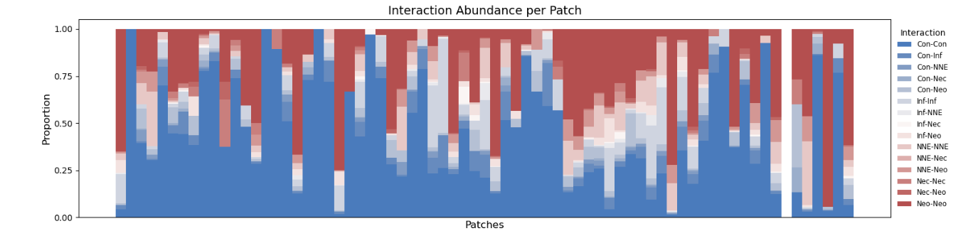
最终生成一个行为患者,列为相互作用类别的数据矩阵:
(4)代码-图展示
进一步通过分组展示差异并进行解释。
import pandas as pd
import matplotlib.pyplot as plt
import numpy as np
import seaborn as sns if_interaction_abundance = df_interaction_abundance.drop(["patch_id" ],axis=1) # ---  检查并归一化数据  ---
# 确保每一行的比例总和为1。如果您的原始数据不是这样,执行以下归一化步骤。
# 否则,请跳过此步骤。
row_sums = if_interaction_abundance.sum(axis=1)
# 仅对和不为0的行进行归一化,避免除以零错误
if_interaction_abundance = if_interaction_abundance.div(row_sums, axis=0).fillna(0)
# if_interaction_abundance.sum(axis=1) # 检查归一化后的行和,应该都接近1.0num_patches = len(if_interaction_abundance)
num_categories = len(if_interaction_abundance.columns)# 生成一个颜色调色板。Seaborn的"husl"或"tab20"等调色板通常能提供足够区分度的颜色。
colors = sns.color_palette("vlag", num_categories) # "husl" 是一种颜色均匀分布的调色板# ---绘制堆叠条形图 ---
fig, ax = plt.subplots(figsize=(18, 4)) # 调整图表大小以适应更多patch和颜色# 初始化 'bottom' 数组,用于堆叠每个条形图的起始位置
bottom = np.zeros(num_patches)# 遍历每个相互作用类别(DataFrame的列)并绘制它
for i, (column, color) in enumerate(zip(if_interaction_abundance.columns, colors)):ax.bar(x=if_interaction_abundance.index,  # x轴是patch的名称height=if_interaction_abundance[column], # 当前类别的比例作为高度bottom=bottom,                     # 堆叠的起始位置label=column,                      # 用于图例的标签color=color,                       # 当前类别的颜色width=1                            # 条形宽度,1表示紧密排列)# 更新 'bottom' 数组,为下一个类别做准备bottom += if_interaction_abundance[column].values# 设置y轴标签和范围
ax.set_ylabel('Proportion', fontsize=12)
ax.set_ylim(0, 1.05) # 稍微超出1.0,以便看到顶部边缘
ax.set_yticks([0.00, 0.25, 0.50, 0.75, 1.00]) # 设置y轴刻度,与示例图一致
ax.tick_params(axis='y', labelsize=10)# 隐藏x轴的刻度标签和刻度线(因为patch数量可能很多,显示会很混乱,如示例图)
ax.set_xticks([]) # 移除刻度线
ax.set_xticklabels([]) # 移除刻度标签
ax.set_xlabel('Patches', fontsize=12) # 可选:添加一个通用x轴标签# 添加图表标题
ax.set_title('Interaction Abundance per Patch', fontsize=14)# 添加图例
# 对于大量类别,将图例放在图表外部通常更好。
# bbox_to_anchor 指定图例框的锚点 (x, y), loc 指定图例框的哪个部分位于该锚点。
ax.legend(title='Interaction', loc='center left', bbox_to_anchor=(1, 0.5),fontsize='small', ncol=1, frameon=False) # ncol=1使图例垂直排列,frameon=False移除边框# 调整布局以确保图例不会与图表重叠
plt.tight_layout(rect=[0, 0, 0.85, 1]) # 调整右边距为图例留出空间# 显示图表
plt.show()plt.savefig('interaction_abundance_stacked_bar.png', dpi=300, bbox_inches='tight')
plt.close()